Does your portfolio have an airbag?

Does your portfolio have an airbag?

The December stock market correction was a timely reminder to get you thinking about whether your portfolio has enough built in safety features. But just like a car crash, it’s safer and smarter to worry about those features before you find out you really need them.

How much risk you’re prepared to take on in your portfolio is the single most important decision you’ll make. If you take on too much you’ll be lying awake at night worrying about when a market correction’s going to stop and battling the temptation to dump your shares and hide in cash, but if you don’t take on enough risk your portfolio could struggle to support the lifestyle you want.

The ‘risk’ in a portfolio largely comes from its exposure to growth-oriented investments, like shares and property, while the ‘air bags’ come from defensive assets, like bonds, cash and, sometimes, so-called ‘alternative investments’.

Obviously, a portfolio that’s split equally between growth and defensive assets is going to be far less volatile, but over the long-run will be expected to have lower returns, than one that’s 90 per cent growth and 10 per cent defensive.

Even defensive assets have their risks

Cash is pretty much the best air bag available for a portfolio: it has zero volatility; perfect liquidity, meaning you can access it whenever you like and in whatever amount you want; bank accounts up to $250,000 are government guaranteed, and it also has what you might call ‘option value’, in that it enables you to take advantage of opportunities if they arise.

The price you pay for that security is a low return, in fact, money held in an ordinary bank account is usually going backwards after accounting for inflation. Even the average return on a three-month term deposit after accounting for inflation has been only 0.4 per cent per annum over the past 5 years, and less if you’re paying tax on it.

Bonds are the next best defensive asset, but you need to be careful about what type of bonds they are: government or corporate.

Corporate bonds are issued by a company as a way to fund itself instead of going to a bank. Obviously there are big, safe companies that are far less likely to default on their debt obligations and they get a higher credit rating, like A-grade, and there are those that are not so safe and reliable that can get rated as ‘junk bonds’ or ‘high yield’, which is anything below a BBB rating.

It makes sense that the market’s view on a corporate bond will change in line with how that company’s performing. If a company’s struggling investors will demand a higher yield to compensate for the rising risk of default, which means the price of the bond goes down, so it’s entirely conceivable you can lose money on that company’s bond.

The problem is that same struggling company’s shares will probably also be going down at the same time. That means corporate bonds are often ‘positively correlated’ to equities, meaning they go up and down at the same time, which is the opposite of what you want from a defensive asset. Not surprisingly, corporate bonds are normally categorized as a growth, or semi-growth asset – no airbag there.

Government bonds will also have a credit rating, so if you buy the bonds of a steady, developed nation like Australia or the US, the chances of them defaulting are almost nil. Again though, the price you pay for lower risk is a lower return. But think of it like this: if you were told airbag A reduces the risk of injury by 50% and costs $500, whereas airbag B reduces the risk by 90% and costs $1,000, what would you do?

There are a few tricky parts to government bonds: first, to get exposure you’re going to have to use a fund of some sort, either an ETF which just follows an index, or a managed fund that tries to earn a bit extra; second, ‘real’ returns after inflation can be surprisingly low again – over the past five years Australian 10 year bonds have averaged a smidge over 1% – but remember their job is to be defensive; finally, and importantly, over time the correlation of bonds and shares can change.

Typically investors presume government bonds are going to zig when equities zag, meaning they are ‘negatively correlated’. A great example was in 2008 when Australian shares fell 38%, while Australian bonds rose 15% and international bonds went up by 9%. But the chart below shows that since 2001, while the average of the rolling six-month correlation between US shares and bonds was -0.35, it never stood still and covered a broad range, from -0.8 to 0.4. In other words, while government bonds tend to perform well during a share market correction, there’s no guarantee.

Does your portfolio have an airbag_chart

How did bonds go over the course of the recent correction?  US shares fell 20 per cent from their peak on 20 September to the December low, while the iShares Core US Aggregate Bond ETF rose 0.5 per cent over the same time.

Here in Australia the Accumulation Index (which includes dividends) fell 13 per cent from its August peak to the late December low, while the iShares Core Composite Bond ETF, which is about 90% government bonds, went up by 1.0 per cent.

As usual in investing, there is no perfect solution to finding an airbag for your portfolio, but the right exposure to the tried and true defensive assets of cash and government bonds should at least help stop you losing sleep worrying about the next crash.

Inequality: how it happened and what do we do about it?

Inequality: how it happened and what do we do about it?

Simply voting out Donald Trump won’t do it, nor will a soft or hard Brexit. The underlying anger, disillusionment and discontent that’s manifested as a rise in populist politics and boneheaded nationalism across the world is driven by a deep-seated dissatisfaction with the status quo. There are a lot of people pissed off that the world has apparently enjoyed decades of economic growth and they still feel like they’re struggling to make ends meet.

The ’neo-liberal’ philosophy of minimising the role of government and instead allowing free enterprise to unleash the potential of unbridled market forces was adopted by Margaret Thatcher and Ronald Reagan as the solution to another period of economic dislocation. The problem is, once the path toward recovery was established it’s been followed all the way to the other extreme, and extremes are rarely a good place.

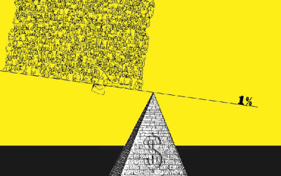
Some 30 years after neo-liberalism was seen as saving the developed world, labour’s share of the economic pie has shrunk to 60-year lows in Australia, 70-year lows in the UK and as low as it’s ever been in the US. This has contributed to inequality hitting levels that in the past underpinned social and economic upheaval, elevating it to the current buzz-topic across developed economies globally. However, effecting the change required to even things up again requires coming up with a way to undertake significant redistribution, which is almost always via the tax system, so it will either take brave and foresightful politicians, or some kind of popular revolt.

The start of neo-liberalism: a solution for the times

When Margaret Thatcher was voted in as the leader of Britain’s opposition Conservative Party in 1975, unemployment was super low at about 4% but the inflation rate peaked at an eye-watering 27%, and, after GDP growth had hit 7% in 1973, the country was in recession with growth at -2%. It was a time when unions regularly threw their weight around and paralysing strikes would hold the economy to ransom; the so-called ‘winter of discontent’ in 1978-79 saw almost 30 million working days lost to strikes, the most since 1926, which led to the May election where the Labour government suffered an almost record defeat.

People were demanding change and the new Thatcher government took power on a platform of confronting the unions and allowing markets to flourish by getting government out of the way. After a couple of bumpy years early on, characterised by sometimes violent conflicts over strikes, between 1982 to when her government was voted out in late 1990 GDP growth in the UK averaged 3.3% per annum, GDP per capita had more than doubled, the share market had more than tripled and inflation had fallen from 18% in 1980 to 9.5% in 1990.

Times were good and Thatcher’s neo-liberal philosophies were enthusiastically embraced across the Atlantic by President Reagan, with his now legendary assault on ‘big government’ and the unshackling of corporate and market power. In 1980, the year Reagan was elected, things were grim for the US: inflation was running at 13.5%, unemployment was 7.2% and rising and the economy was in recession. By the time Reagan left office in 1989, having pursued his ‘Reagonomics’ version of supply-side economics (which argues cutting taxes and reducing regulatory burdens leads to more growth and the benefits will ‘trickle down’ from the top all the way to the bottom), inflation was 4.6%, unemployment was 5.4% and GDP had averaged 4.4% per annum since 1983. The US stock market more than doubled during Reagan’s tenure and the go-go, get rich era of the ‘80s was captured by the inimitable words of Gordon Gekko: “greed is good”.

The concentration of money and power

With such a stunning turnaround in economic fortunes, why wouldn’t you continue on the same path? If a bit is good then more has to be better, right? Across the developed world, but especially in the Anglosphere, governments continued to reduce their role in markets by cutting back regulations and selling off publicly-owned assets and enterprises, allowing companies to go on to even bigger and better things.

In the US, hand in hand with the rollback of those pesky market regulations and the increasing concentration of wealth, the ultra-rich built an increasing political influence. In the landmark, and widely criticised, 2010 Citizens United ruling the Supreme Court paved the way for unlimited political donations through “PACs”, or Political Action Committees, not only by individuals but, almost incomprehensibly, by companies as well. According to The Harvard Magazine, so-called super-PACs accounted for 22% of total donations in the 2012 presidential race, but by 2016 it was 37%. What’s more, The Washington Post reported that only 50 donors accounted for almost half the funds raised. While there are a few very high profile left-leaning billionaires, like Warren Buffett, Jeff Bezos, Bill Gates and Michael Bloomberg, in a 2018 paper, academics from Columbia and Harvard concluded the vast majority of America’s top 100 billionaires quietly, but actively, support right-wing organisations. The most notorious of those are the Koch brothers, each worth an estimated $50 billion, and responsible for creating the super conservative Americans for Prosperity (AFP) group, which boasts some three million grass roots members and aggressively promotes a free market, small government agenda.

A key part of AFP’s activities has been campaigning for the emasculation of trade unions, which reaps a double harvest: it strengthens the corporate sector by dramatically improving the stability of labour markets, largely by preventing workers from being able to collectively bargain, plus it undermines one of the principal sources of funding for the Democrats and left-leaning causes. In 1983 more than 20% of US workers belonged to a union, and by 2016 it was less than 11%, and the number of private sector workers in a union had fallen to the lowest level since the Great Depression. This trend has been echoed in the UK, where by 2017 trade union membership had fallen to an all-time low and the 300,000 working days lost to strikes was amongst the lowest since records started in 1899. And in Australia union membership has fallen from 51% of all workers in 1976 to 14% today, the lowest in at least 70 years.

The Pew Research Centre writes that stripping workers of their collective bargaining power has resulted in widespread wage stagnation, with real wages for average workers in the US remaining virtually unchanged since 1979. For a stark illustration of the difference between the pre and post neo-liberal eras, between 1950-1980 real incomes for the bottom 20% of US wage-earners grew at an almost identical rate to the top 5%, but between 2000-2018, the top 10% saw five times the increase in real wages of the bottom 10%. Today in the US, the biggest companies can wield such extraordinary levels of power that 25% of workers are being subjected to non-compete clauses – even fast food workers! The Federal minimum wage has been set at US$7.25 since 1991 and we were reminded during the recent government shutdown that a 2017 survey found 78% of American workers live paycheque to paycheque, and last year a Fed survey found 40% of adult Americans would be unable to come up with US$400 in an emergency.

The story on wages reads quite similarly in Australia, where in the March quarter of 2017 labour’s share of national income fell to its lowest since 1960. Over the 12 months to the end of March 2017, Australian workers received less than 10 cents of each extra dollar in GDP that they produced, which was the slowest rate of flow through ever recorded.

The GFC – a step too far?

It’s possible a turning point came with the Global Financial Crisis in 2008, the epicentre of which lay in the American housing heartland. The finance industry, and most especially Wall Street bankers and the credit rating agencies, screwed up monumentally; outright greed, combined with negligence and fraud, culminated in a near death experience for the world’s financial system. The only way to save it was using the public purse – taxpayers’ money – to bail out the private banks, starting in the US, where the 2009 budget deficit blew out from an original forecast of US$407 billion to eventually hit US$1.4 trillion (these days the word trillion gets thrown around a fair bit and it’s easy to become a bit blasé about it, but to put that amount of money into its mind blowing perspective, one billion seconds is just short of 32 years, one trillion seconds is just short of 32,000 years).

And no sooner was the US economy off life support than Europe took its place with its ‘sovereign bond crisis’, thanks to a combination of either over-indebted governments that had gorged themselves on apparently cheap debt in vote-buying public spending campaigns, or governments that became over-indebted because they felt they couldn’t afford not to bail out private sector banks and property companies teetering on the edge of collapse.

Those people entrusted with the stewardship of entire countries had overseen a gargantuan mess and seemed to be making things up as they went. The result: economies all over the world were slammed into reverse, in 2009 US GDP growth fell to -2.8% and unemployment hit 10%, and EU growth was -5.4%, with unemployment eventually hitting 11% in 2013, while Spain and Greece both reached unemployment rates of 27%.

But despite plenty of evidence, and hundreds of candidates, nobody was found culpable for the greatest financial disaster in three generations. Although US banks were fined and had their lending wings clipped, Wall Street bonuses were back at record levels within a few years. What’s more, the remedy used to keep the markets from falling even further, where central banks from the US, Europe, Japan and the UK pumped unprecedented amounts of liquidity into the financial system, inflated the value of all kinds of assets, from shares, to property, to art collections, to fancy number plates – the kinds of things already wealthy people own.

Is it any wonder the average person was left feeling the system is rigged?

The growth, and growth, and growth of inequality

Inequality has become the topic du jour, but it’s worth revisiting some of the numbers. In the three decades after World War 2 the US enjoyed one of its strongest periods of economic growth as manufacturing took root and blossomed across the country. Households greedily consumed all the new-fangled appliances and most of them were “Made in the USA”, everything from washing machines, to televisions, to cars. An endless string of new factories provided well paid jobs for unqualified workers, and as the nation got richer, everybody benefited.

Then once neo-liberalism took hold things started to change. The US Congressional Budget Office found that between 1979-2011 the ‘market income’ for the bottom 80% of workers grew by 16%, or less than 0.5% per year; for the next 19% incomes grew three and a half times faster, at 56%, and for the top 1%, incomes grew almost 11 times faster, or 174%. In 1965, the average CEO earned 20 times the wage of the average worker, and by 2018 that number had exploded to 361 times for the CEO of an S&P500 company.

But that’s just income, the richest people also own lots of assets, often interests in companies, and the value of those assets has rocketed as well, especially since the GFC. In 1979 the top 1% in the US owned 24% of the total wealth and by 2012 that had increased to 42%, so not far off doubling. But what is far more telling, the share of wealth owned by the top 0.1% had sat around 10% for most of that glorious post-war period and bottomed out in (you guessed it!) 1979 at 7%, but then more than tripled to 22% by 2012! See chart 1.


Chart 1: The Top 0.1% wealth share in the United States, 1913-2012
Inequality how it happened and what do we do about it_chart1

But it’s more than just a US phenomenon. By 2017 the UK’s top 10% of income earners had increased their share of national income by 50% while all the other cohorts fell, and according to Oxfam, by 2016 the top 1% of UK households held 29 times as much wealth as the bottom 20%.

Australia is just as bad: according to Oxfam Australia’s top 1% has more wealth than the bottom 70% – see chart 2, and it has been growing over the past 20 years, while the bottom 50% has been steadily declining and now sits at 9%, the greatest wealth gap in generations.


Chart 2: Australian wealth distribution in 2018

Chart 3: Share of wealth in Australia held by the top 1% vs bottom 50%

And perhaps the most stunning stats of all: in Oxfam’s annual wealth report released to coincide with the Davos conference in January, they concluded the 26 richest people in the world have as much wealth as the poorest 3.8 billion, while in 2016 it took the top 61 billionaires. Fully 82% of the wealth created in 2017 went to the top 1%, and in 2018 their wealth increased by 12% while the bottom half’s went down by 11%.

What do you do when the status quo isn’t working for you anymore?

It can hardly come as a surprise that people started pushing back against the status quo that hasn’t been working for them for decades. It may well have helped Barack Obama get elected on a promise of hope; a promise of building a bridge to cross the political divide that would deliver radical changes; but promises that were ultimately choked by even greater partisan politics.

By the time Trump came along talking about how he’s going to ‘drain the swamp’, the contempt for politics as usual translated into embracing an iconoclast who didn’t talk like the others, and, even better, wasn’t a product of the same political machine. On the other side Bernie Sanders, the Democrat candidate who lost the nomination to Hilary Clinton, captured similar support despite being a self-described socialist. Both managed to push the right hot buttons, albeit in obviously different ways: Sanders talked about improving things for people by redistributing wealth away from the 1%, while Trump appealed to a nostalgia for when America was the undisputed champion and promised to improve peoples’ lives by bringing the factories back home and stopping immigrants from taking their jobs. It didn’t matter they were promises he could never keep, what mattered was he used simple messaging to reassure them he would challenge the status quo.

And so the thirst for change has rolled on, with voters seduced by messages of either radical change to make things better and fairer, like Brexit, or nationalistic scapegoating, like Turkey, Hungary, Poland, Italy, Austria, Sweden, The Philippines and Brazil.

The Shakespearean drama that has been Australian politics over the past five years (or longer) has in part been swept along by similar winds of change. The same resentment of the status quo has given rise to a cluster of far-right parties whose dog-whistle populism threatens to gain such traction in marginal seats that Malcolm Turnbull’s antagonists felt they had to try to outflank them, only to find their misreading of the broader public’s tolerance for screwing with the will of the people was as appalling as their inability to count party room votes.

At some point Australian politicians might realise the quality voters are desperate for is authenticity: the ability to answer a question without sticking to a message; to admit that not everything the other side says is automatically wrong; to acknowledge that compromise can mean progress rather than weakness.

The answer… is going to be hard

Simply voting Trump out of office, or changing all the right wing governments for left wing, or holding politicians to a higher standard won’t solve the underlying problems caused by growing inequality. Ultimately that requires redistribution, and that can only be done through the tax system. Obviously the chance for people to get rich is kind of essential to how capitalism works, but tax is the price we pay for living in a modern democracy where the government is responsible for providing a host of essential services. It’s a question of finding the right balance.

Understandably tax sets off a pretty visceral response in most people, especially those on the top Australian tax bracket who see 47% of their earnings taken out every month, already a high rate by international standards. But perhaps it won’t come as a surprise that over the period when inequality has widened, governments across the developed world have been reducing the top rate of both personal and corporate income tax, with the average top personal rate falling from 62% in 1970 to 38% in 2013 – see chart 4. Oxfam writes in its 2019 report on inequality:

As recently as 1980, the top rate of personal income tax in the US was 70%, whereas today it’s almost half that, at 37%. When you also account for the numerous exemptions and loopholes, the rates the super-rich and corporations actually pay are lower still. As a result, in some countries the richest people are paying the lowest rates of tax in a century. In Latin America, for example, the effective tax rate for the top 10% of earners is just 4.8%. In some countries, when taxes paid on income and consumption (like our GST) are both considered, the richest 10% are paying a lower rate of tax than the poorest 10%.

Chart 4: The declining tax rates for top income earners and companies

Before high income earners scream “not more bloody taxes!”, there is a far better target for their anger: it’s estimated the super-rich are hiding at least US$7.6 trillion from the tax authorities, avoiding an estimated US$200bn in tax revenues. Similarly, multi-national corporations exploit loopholes to avoid paying billions in tax as governments around the world have jostled for position as the lowest taxing country for big companies. Last year Apple reported Australian sales of $8 billion, and, after the money went through a merry-go-round of transfer pricing, a gross profit of $255 million. That works out to a gross margin of about 3%, compared to the average gross margin it reported to the US stock exchange over the four quarters to March 2018 of 38%. The $77 million of tax Apple paid in Australia amounted to less than 1% of turnover. That is not an isolated incident, again, according to Oxfam:

For four consecutive years since 2013-14, more than one in three of Australia’s largest corporations have not paid any taxes in Australia – and 281 companies have not paid a cent in tax for all four years.

This reduction in company tax has very real consequences for a country’s budget. Chart 5 shows the impact the ill-timed US corporate tax cut is expected to have on government revenues, it’s $150 billion that has to be made up from somewhere else.


Chart 5: Cutting the US corporate tax rate has a very real impact on government revenues

None of what these companies is doing is illegal, but as long as it goes on, governments have to find other ways to plug the giant hole in tax revenue required to run the hospitals, pay the nurses, teachers and firemen, build roads and bridges and pay pensions – all the things expected of a modern, democratic society. The problem is, if they can’t tax companies, then wage earners are the obvious and easiest targets to come after simply because they have far fewer places to hide. So if you don’t want have an even greater tax chunk taken out of your monthly wages, you’d better hope sense prevails with respect to company taxes.

Are we seeing the early signs of change?

Clearly inequality is now commanding a great deal of the political debate, but until recently there hasn’t been a lot of coverage on how to address it. Five years ago, Thomas Piketty caused waves with his book about inequality over the ages, but perhaps not surprisingly an 814 page tome by a French economist with the catchy title of Capital in the Twenty-First Century never really hit the main stream.

That appears to be changing. Elizabeth Warren, one of the almost 30 contenders for the 2020 Democratic Presidential nominee, has proposed a headline grabbing ‘wealth tax’ of 2% per year on those with more than US$50 million in wealth, and freshman congresswoman, Alexandria Ocasio-Cortez, caused conservative commentators’ heads to spin when she recently expressed support for a 70% tax on income above US$10 million per year (by the way, if you haven’t seen her recent dissection of the diabolical state of US politics you really should). Also, Dutch historian Rutger Bregman’s admonition to get serious about tax at last month’s Davos Conference went viral, catapulting him to international in-demand radio and talk show guest.

Re-empowering labour is another step, though it’s in nobody’s interest for a return to the excesses of the 1970s. Sir Angus Deaton, Professor of Economics at Princeton, who won the 2015 Nobel Prize for his work on inequality, acknowledges trade unions are economically inefficient insofar as they stop GDP being maximised, but the extreme alternative is that all the benefits of GDP growth accrue to the owners of the capital – also a recipe for disaster. Again, it’s a question of finding the right balance.

Inequality is an issue for our times (amongst others) and finding a solution will be devilishly complex. It’s taken almost 40 years to have lurched from one extreme to the other, so it’s unlikely anything will happen quickly. As we approach an election here in Australia and the US presidential race starts its amazingly long run up, it would hardly be surprising if inequality assumes a higher and higher profile, leaving the obvious question: what are you going to do about it?

Should you be worried about central banks unwinding QE?

Should you be worried about central banks unwinding QE?

A couple of weeks ago I attended a lunch where five out of the eight fund managers that presented basically tried to scare people into investing with them by talking about the ‘huge uncertainties created by central banks unwinding quantitative easing’, commonly referred to as QE. This is a common theme, particularly among fund managers trying to convince you the safest thing to do is leave your money with them. As always, it pays to be skeptical.

Tim Farrelly is an asset allocation consultant and one of the clearest thinkers about market issues that I know. He recently wrote the notes below about whether we really do need to worry about the reversal of QE, normally referred to as quantitative tightening (or QT). They appeared on his LinkedIn group, Just Saying and should be enough to have alarmists crawl back from the ledge.

How will we cope with the liquidity squeeze when Quantitative Easing becomes Quantitative Tightening?

This has been a worry for many in the markets – will there be a liquidity squeeze when Central Banks reverse tack and QE becomes QT?

To get a sense of how QT may play out, we need to think about how QE worked. Did you ever wonder what happened to all the cash that the Fed poured into the economy during QE? Where did it all go?

The charts here show both sides of the Fed’s balance sheet and give part of the answer. The new cash mostly ended up back with the Fed in the form of excess deposits from US Commercial Banks. Bond investors swapped their bonds for cash, they invested that cash with the Commercial banks, who then, rather than lend it out, put in on deposit with the Fed. We can see that excess reserves, that green section on the right chart, almost exactly matches the green section on the left chart – which is the amount of bonds bought in the QE process.

Now, excess deposits are just that; deposits that the banks do not want to lend out and do not need for reserves. So, as QE ends, the question the world is asking is what happens when that excess liquidity is removed from the system?

There are two ways of thinking about this excess liquidity. The popular one is thinking of QE as like a deluge which floods the landscape with more water than it needs and QT as a drought that follows after the flood waters recede – equally damaging, but in a different way.

What the chart indicates is that a better analogy is that QE was indeed like a deluge, but rather than one that flooded the landscape, it was one that filled all the dams with decades worth of water – excess reserves. Under this analogy, QT is the gentle emptying of those dams – nothing to worry about as there is more than enough liquidity to go around for years. Even a drought doesn’t worry us.

If the second analogy holds – and I believe it will – then the effects of QT on liquidity are nothing to worry about.

Should you be worried about central banks unwinding QE_chart 1

When Quantitative Tightening starts, who will buy all of the bonds?

In a previous post we showed that the cash created during QE mostly ended up as deposits with the US commercial banks which, in turn, ended up as excess deposits with the Fed. The chart here shows how the deposits of the US commercial banks with the Fed ballooned as QE kicked in and have gently subsided since. They are still a long way above their traditional levels of close to zero. 

While this chart helps answer the question of where all the QE cash went, it fails to answer another, equally important question; who owns all that cash on deposit with the commercial banks and why? This is critically important because when QT kicks in, the amount of cash in the system will reduce, which means that those excess deposits with commercial banks will slowly disappear. This, in turn, means all those entities with cash in the system right now, will need to find another home for their cash.

Let’s assume that those entities – whoever they are – quite like owning assets with cash like qualities. This seems reasonable as no entity is compelled to own vast quantities of cash against its will. If that is true, then they will seek out the closest asset to US cash that they can find. Short-dated US Treasuries or cash management funds that invest in US Treasuries seem to fit the bill. 

So maybe, QT becomes another massive asset swap – cash for short-term securities issued by a gleeful US Treasury. Now, this assumes that the US Treasury is happy to issue lots of short-term securities to fund its growing deficits. If it insists on issuing long-dated securities to a market that wants to buy short dated securities, we might see some interesting twists in the yield curve. 

Nonetheless, we know where much of the money will come from to finance QT – it’s the excess cash already in the system. Again, QT appears much more benign than the alarmists would have us believe.

Should you be worried about central banks unwinding QE_chart 2

Just how dumb are the bond markets?

As QE turns to QT, Central Banks are going to be effectively selling bonds instead of buying them. On top of this, we have the US Tax cuts dramatically increasing the size of the US budget deficit meaning that the US Treasury will also be selling a lot more bonds to finance that deficit. All that selling must push prices lower and bond yields higher.

The big question is: when that will occur? Most pundits suggest that the WHEN is in the future. Effectively, this narrative says that financial markets are really, really dumb. None of this information is a secret, so, unless all bond traders are monumentally stupid, the move should largely have already occurred.

Let’s look at some facts – as shown on the chart of US bond rates and the size of the Fed’s balance sheet. If the “markets are really dumb’ crew are correct, then periods when QE was on (the blue panels) should have coincided with falling bond yields and vice versa. What we see is quite different. During QE1 – in the middle of the GFC – bond yields did fall. However, as those with good memories will recall, there was rather a lot going on in the world at that time. During QE2, yields largely went sideways. Between QE2 and QE3 bond rates fell when the dumb market theorists felt they should have risen. And, during QE3, bond rates rose rather than fell. When QE3 ended, bond rates fell for some time rather than rose as the dumb market guys would have expected.

In recent times, US bond yields have had two major jumps – in October 2015 when the Fed announced that they would start increasing cash rates and again in October 2017 when the US Tax cuts and associated deficits became a reality.

In other words, all the evidence suggests that the dumb market theory is, well, really dumb.

If US Bond rates go higher from here it is likely to be in response to something we don’t yet know, rather than what is already out there. Markets are not perfectly efficient – but they are not nearly as dumb as many would suggest.

Should you be worried about central banks unwinding QE_chart 3

Geopolitical risk – to sell or not to sell?

Geopolitical risk – to sell or not to sell?

It seems there’s a constant stream of geopolitical issues forever leaving financial markets teetering on the brink of crisis. Not surprisingly each new episode invariably sees some investors ask themselves if they shouldn’t be reducing their exposure to riskier assets like shares, but looking back, reacting to geopolitical events has not been the right strategy.

Last week the US investor sentiment survey reported pessimism was above 40% for only the second time this year, with most respondents citing rising concerns about trade. There’s no doubt the risks presented by a full-on trade war between the US and its trading partners are huge and it’s difficult not to be concerned when you have a one man geopolitical event in charge of the US firing tweets at will. No wonder you’ve got commentators saying things like ‘the risks have never been higher’.

The fact is though, selling equities in anticipation of geopolitical fallout is fraught with risk. Just since the GFC there have been multiple issues of international significance, from military adventurism, natural disasters, diseases and financial crises, in each case any reasonable person would have been forgiven for thinking reducing risk exposure was the safe thing to do, but it turned out not to be the case, given the MSCI World index has risen 163% since then, or almost 11% per year – see chart 1.


Chart 1: Despite an apparent never-ending stream of disasters the MSCI has risen 163% over the past 9 years
Chart 1: Despite an apparent never-ending stream of disasters  the MSCI has risen 163% over the past 9 years

What usually makes markets fall is the prospect of declining company earnings. By and large most geopolitical scares don’t actually affect how much companies make outside of the immediate area of the threat and when something comes along that could, like a trade war, there’s still no way of really knowing how bad the effects will be.

Just think if your crystal ball had correctly told you that Trump would win the 2016 election, every commentator was arguing it would be a disaster for the US market, so you’d have felt pretty confident selling your US shares. Since then the S&P500 has risen 30%. Likewise, Brexit was described as the biggest own goal in the UK’s modern economic history, yet the FTSE has gone up more than 20% since.

Some people are confident they can sniff an approaching selloff and will be insightful and disciplined enough to buy back in when things are clear again, then again some people believe there are fairies at the bottom of the garden. When it comes to geopolitics and the financial markets, while it always pays to be alert, the last nine years have shown it rarely pays to be alarmed.