0399757070
The big spending that could keep the US out of recession

The big spending that could keep the US out of recession

In September last year, Bloomberg reported that 100 per cent of surveyed economists expected the US economy to recess in early 2023, and strategists were warning of calamitous markets ahead. Of course, that didn’t happen, and whilst GDP growth of a smidge above 2 per cent per year isn’t going to knock anybody’s socks off, it’s far from going backwards, and the US share market rose 20 per cent to the middle of 2023.

Economists tend to follow an approach where they try to fit today’s circumstances into a historical analogy, saying “I think what’s happening with inflation and interest rate rates today is not dissimilar to the 1970s/1980s/whatever period”, and base their forecasts on what transpired back then.

The thing is, none of those past rising interest rate episodes were preceded by the federal government shoving 25 per cent of GDP into household bank accounts, which was what happened with the COVID stimulus cheques. That massive fiscal injection had two effects: first, it set the economy on fire, sending unemployment levels to 50-year lows; and second, households had never enjoyed such a large savings buffer to cushion against rising prices. As a result, the US economy’s resilience took orthodox economists and strategists by surprise.

Once again, we are seeing a growing consensus that the US economy is going to recess next year, which brings with it the usual talk of America sneezing and the rest of the world wrestling with swine flu.

Concerns that the Federal Reserve is going to increase interest rates again, that rising bond yields will make shares increasingly less attractive, that the now long-standing inverted yield curve will somehow work its voodoo, that consumer confidence is falling, and households are running out of those excess savings, combine to paint a grim picture. Throw on top of all that a dysfunctional US congress and an approaching election plus the ongoing problems China is experiencing and it’s clear why the bears are once again on the prowl.

However, if you look hard enough, just like last year, there are some signs pointing in the other direction; signs that tend not to feature in most forecasts. And, again just like last year, they revolve around some significant fiscal injections and consumers that might be in a better spot than economists give them credit for.

The first of those fiscal injections is the interest the US government is paying on the more than USD33 trillion of bonds that are on issue, which has risen over the past three years from USD500 billion per year to more than USD900 billion. That may not be going into the pockets of the people who would spend it all, but it’s still going into the economy.

The second is the three signature pieces of legislation that have been dubbed ‘Bidenomics’, the CHIPS Act, the Infrastructure Act and the Inflation Reduction Act (IRA), which between them earmark more than USD2.25 trillion of government spending.

Between them, that amounts to more than 12 per cent of the US economy being injected through government spending programs, which are on top of the usual budget items. What’s more, the IRA, which basically invites any company with a decarbonisation project to apply for tax deductions, rebates or subsidies, is open ended, and Goldman Sachs estimates the amount being spent has increased from the original projection of USD780 billion to more like USD1.2 trillion.

When you add them up, it’s a ton of money being thrown into the economy, and those three government policies have catalysed a tsunami of corporate spending, with data from the US Treasury showing real manufacturing construction spending doubling to USD1.9 trillion over the year since they were passed – see the chart below – and non-residential construction spending in general is up 15% since the infrastructure bill. Overall, private sector spending has gone up three times more than public spending. In other words, the government’s policies are crowding in private sector spending.
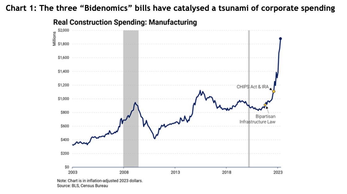
Table showing the 2022 share market returns in local currencies

Regrettably, Australia is in the opposite position, with the federal government boasting of a surplus, which is sucking money out of the economy at a time when households spending is coming under a lot of pressure.

As for US consumers, while it’s true they’ve almost run out of excess savings from COVID, there’s still a base level of savings, plus household bank deposits are more than four-fold higher than pre-COVID at USD4 trillion. Then there’s the 50 per cent rise in money market fund balances to around USD6 trillion and a similar rise in home equity to almost USD32 trillion.

In other words, American consumers have a lot left in the tank to maintain that legendary appetite for spending.

It’s still entirely possible the US economy will hit a recession-sized bump in the road, but it’s far from a certainty. Smart investors will know better than to put their faith in economists and strategists who get things wrong as much as they get them right.

AI: boom, bubble or both?

AI: boom, bubble or both?

Over the first half of this year the US’s tech heavy NASDAQ index had one of its best ever starts to a year, rising 32 per cent and even the much broader S&P 500 rose a barnstorming 17 per cent.

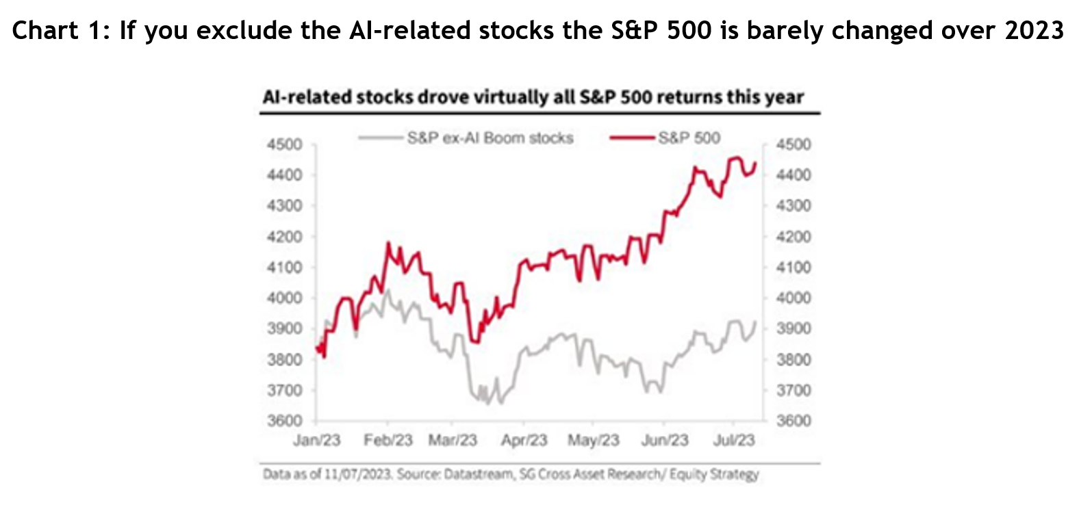
Investors could understandably be left wondering how the share market could be so positive when the vast majority of economists were still forecasting a US recession. While there’s always a bunch of reasons for why markets move the way they do, a huge component was the excitement generated by Artificial Intelligence, usually known by its shorthand of “AI”. In fact, SocGen calculated that if you strip out the AI-related stocks, the S&P 500 was only up by about 2 per cent over those six months – see chart 1.

Table showing the 2022 share market returns in local currencies

As often happens with new technology there’s no shortage of controversy around AI, but no lesser than legendary Silicon Valley investor Marc Andreessen wrote, “AI is quite possibly the most important – and best – thing our civilization has ever created, certainly on par with electricity and microchips, and probably beyond those.”

Not surprisingly, analysts are falling over themselves trying to work out the implications of AI on company productivity and earnings, but at such an early stage anything they say is no better than an educated guess. It’s little wonder then that comparisons can be drawn to the dotcom boom of the late 1990s, when the whole world got swept up in the heady possibilities of the internet, and we know how that ended.

The AI boom really took off in late May after AI’s pin up child, Nvidia, not only reported first quarter earnings 20 per cent above analysts’ forecasts, but also increased its second quarter revenue forecast by a mind-popping 50 per cent – all due to AI demand for its computer chips. The shares jumped 26 per cent that day and rose a staggering 190 per cent in the first half of 2023.

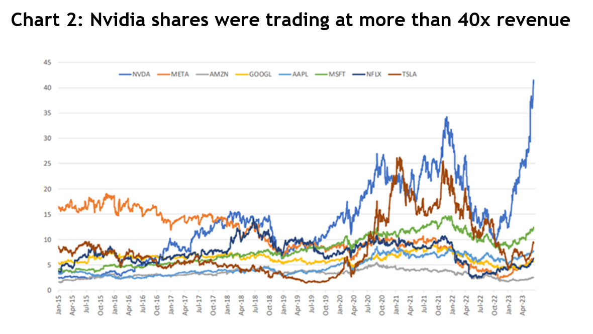
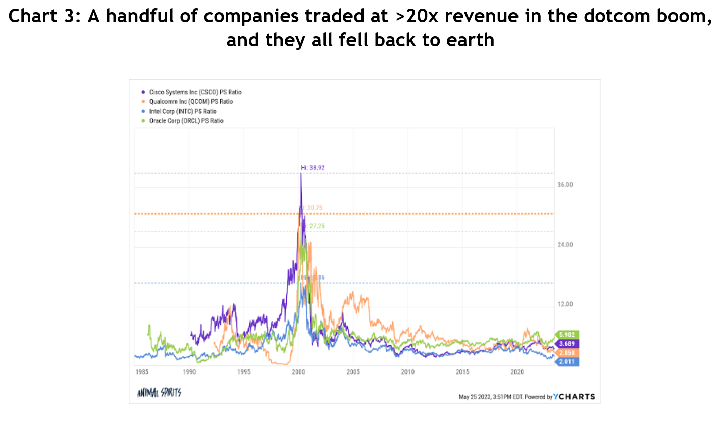
So here’s the ‘but’: Nvidia shares are trading around 40x revenue. That’s not earnings, it’s sales, before costs – see chart 2. There was a handful of companies that traded on similarly high price to sales ratios in the dotcom boom and they all came back to earth – see chart 3.

Bar graph showing the main negative influence of share prices was sentiment based on source of return 2022 AUD

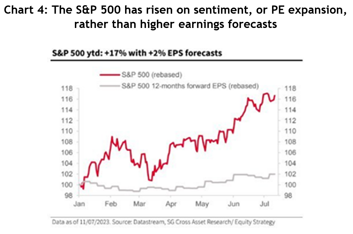
The rise in the US indices has been driven almost entirely by sentiment, the technical name for which is ‘PE expansion’. Theoretically, share prices should go up in line with the net earnings of companies, but sometimes markets get carried away over the short-term, especially when a new paradigm arrives.

Analysts currently forecast earnings will rise by 1 per cent in 2023, so the 17 per cent rise in the S&P 500 so far reflects the optimism being priced into AI – see chart 4. Share markets are always forward looking, but while the forecast for 2024 is for a respectable 12 per cent earnings growth, the S&P is already trading on a PE of 19x, a 27 per cent premium to its 20-year average of 15x.

Line graph showing the probability of recession over the coming 12 months in the Fed's Survey of Professional Forecasters

There are some other signs of a frothy market:

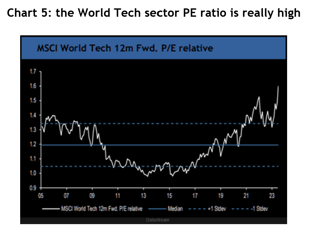
  • The forward PE ratio for the MSCI World Tech sector relative to the rest of the market is more than two standard deviations above its 20-year average, i.e. it’s really high – see chart 5.
Line graph showing the Morgan Stanley Leading Earnings Indicator against the Actual S&P 500 LTM EPS Growth Y/Y
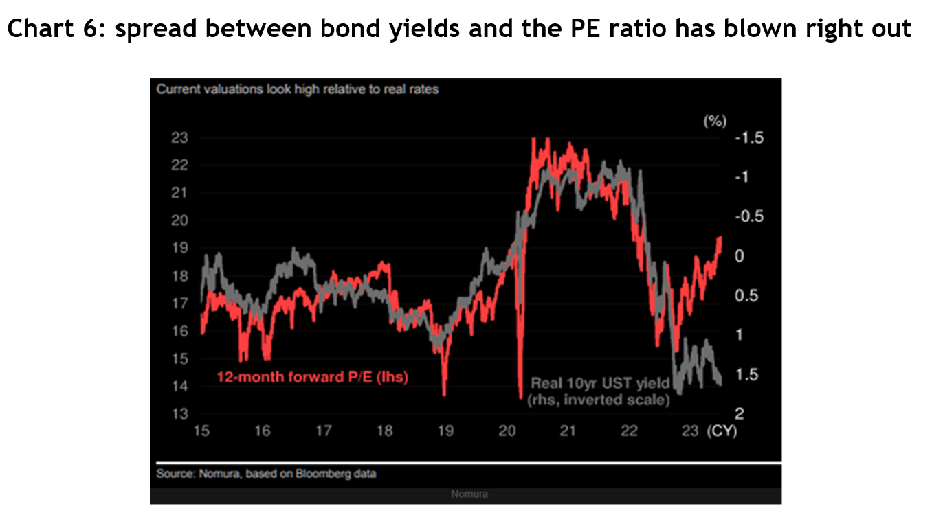
  • Very low bond yields and inflation pre-COVID supported higher PE ratios, especially for the growth-oriented tech companies. But now the gap between the US real bond yield and the S&P 500’s forward PE ratio has opened right up – see chart 6.
Line graph showing the US Bureau of Labour Statistics unemployment levels
  • The S&P 500 is more than 8 per cent higher than what strategists, on average, guessed it would be by the end of year, which is the second largest overshoot in 24 years.
  • Two of the best performing groups in the US year to date are non-profitable tech (+32 per cent) and the infamous ‘meme stocks’ from 2021 (+63 per cent).
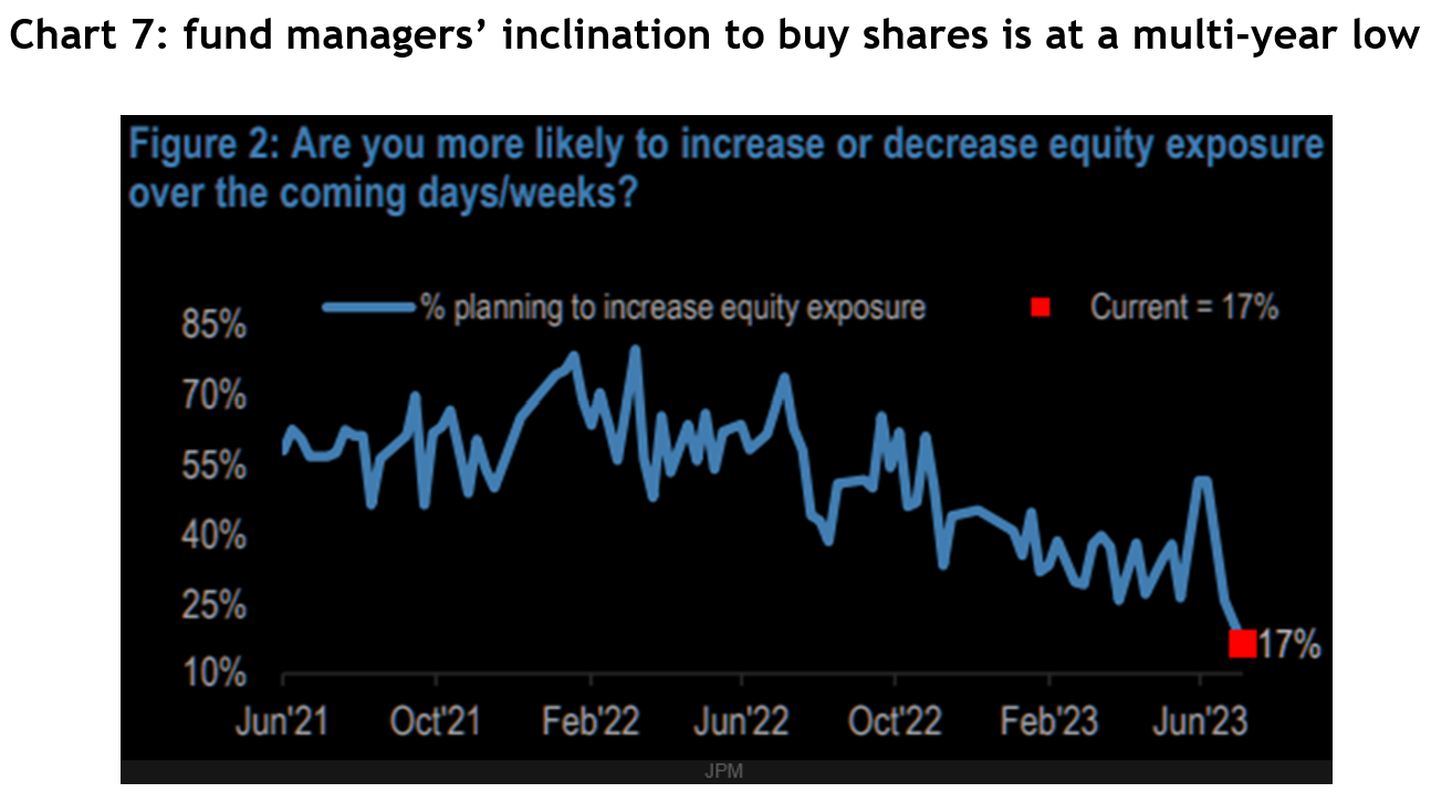
  • The weekly J.P. Morgan fund manager survey reported only 17 per cent of managers were planning to increase their equity exposure over coming weeks, down from 50 per cent at the end of May.
Line graph shows 10-year treasure yields minus 2-year yields (1980 - Present)
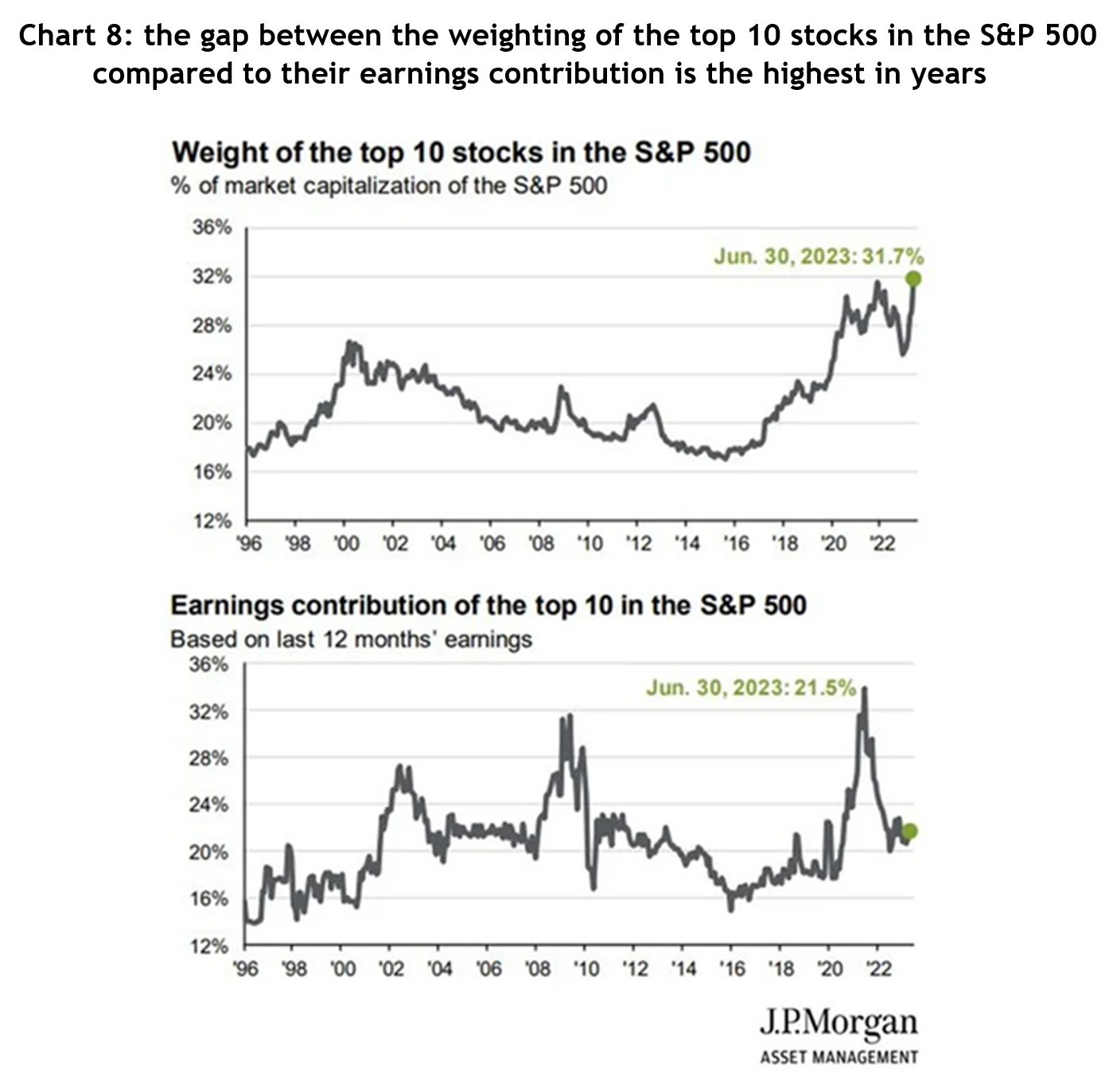
  • The weighting of the top 10 stocks in the S&P 500 at the end of June was the highest in more than 27 years at 32 per cent, but their contribution to earnings growth was the equal lowest in over 20 years at 22 per cent- see chart 8.
Bar chart showing US inflation stats throughout 2022

You only need to play around with Chat GPT to know that AI is very special and will be a game changer, and it is progressing astonishingly quickly. At the end of day, even if this AI-inspired rally really is a bubble, we know bubbles can last a lot longer and go a lot higher than anybody expects. Smart investors will know it’s worth having some exposure, but maybe just don’t bet the farm on it, yet.

Is the era of US share market dominance coming to an end?

Is the era of US share market dominance coming to an end?

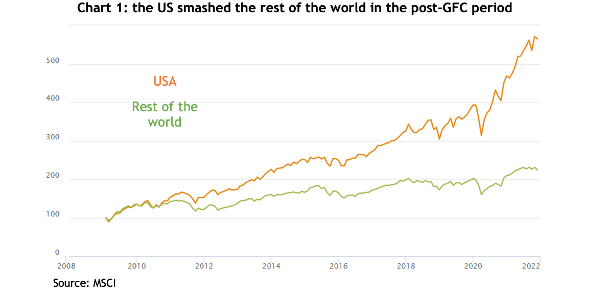
Between the end of the GFC in early 2009 to the end of the 2021 share market melt up, US shares returned an astonishing 486 per cent, a compounded annual return of 14.5 per cent. It was enough to make other share markets look positively pedestrian: Europe was up 228 per cent, the emerging markets 251 per cent, Japan 266 per cent and the laggard was Australia, at 198 per cent.

If you didn’t have some exposure to US shares you missed out on one of the greatest bull market runs in history. And much of that stellar performance was due to the tech sector: over the same period the Russell 1000 Technology Index rose by a whopping 1477 per cent.

Table showing the 2022 share market returns in local currencies

Regime change

Having gone through the pain of a bear market, it’s tempting to presume the markets and sectors that did best in the last rally will lead the way again, but in fact, often that is not the case.

Instead, the end of a bull market often sees a regime change and when that happens the former market leaders can underperform for years. For example, Japan has never regained its 1990 high, the NASDAQ took 14 years to recover its dotcom boom levels and some finance stocks that were in the S&P 500 top 10 in 2007 have yet to recover as well.

In other words, when a market or sector booms, the bust on the other side can take years to play out, especially when the leading sector ends a bull market on high valuations.

Are US shares expensive?

In short, compared to other markets, yes, and on various measures. The ‘CAPE’ ratio (Cyclically Adjusted Price to Earnings ratio) measures the last 10 years’ inflation adjusted earnings, and while it’s a terrible indicator for timing markets, it’s a good indicator of long-term valuations. At 28, the US is not only miles above its long-term median of 16 but is more expensive than any other market: with Europe on 16, Australia 17 and China 8.

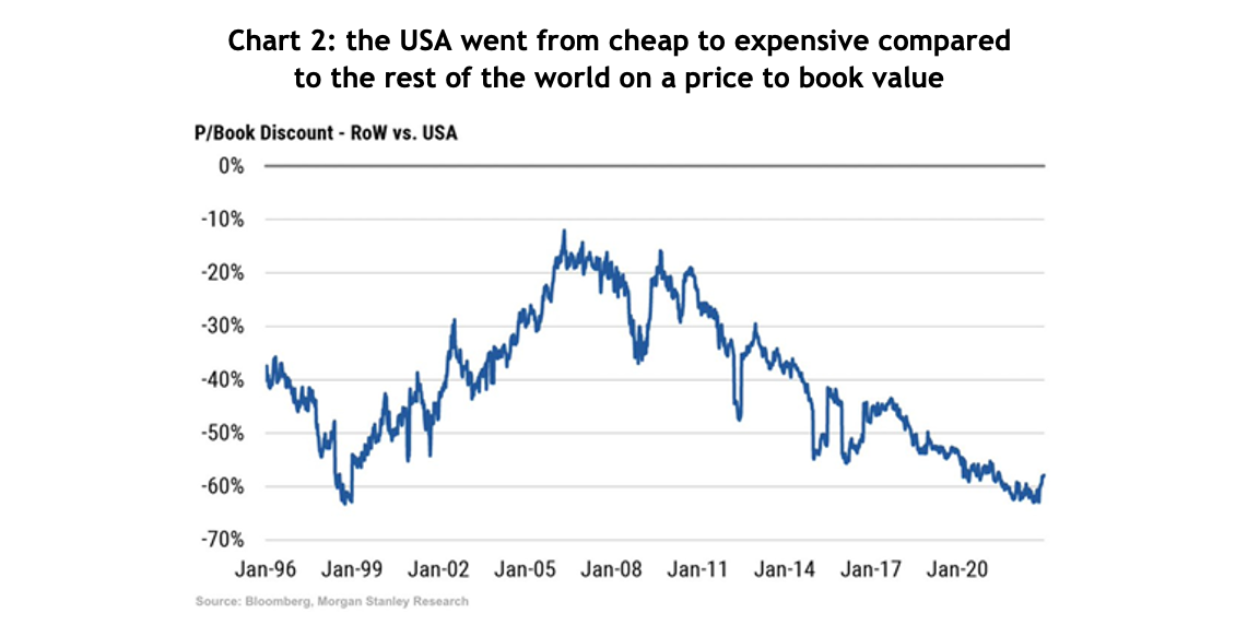
Similarly, Morgan Stanley calculated that on a price to book value measure, at the end of 2022 the rest of the world was trading at a 60% discount to the US, the lowest in almost 25 years.

Bar graph showing the main negative influence of share prices was sentiment based on source of return 2022 AUD

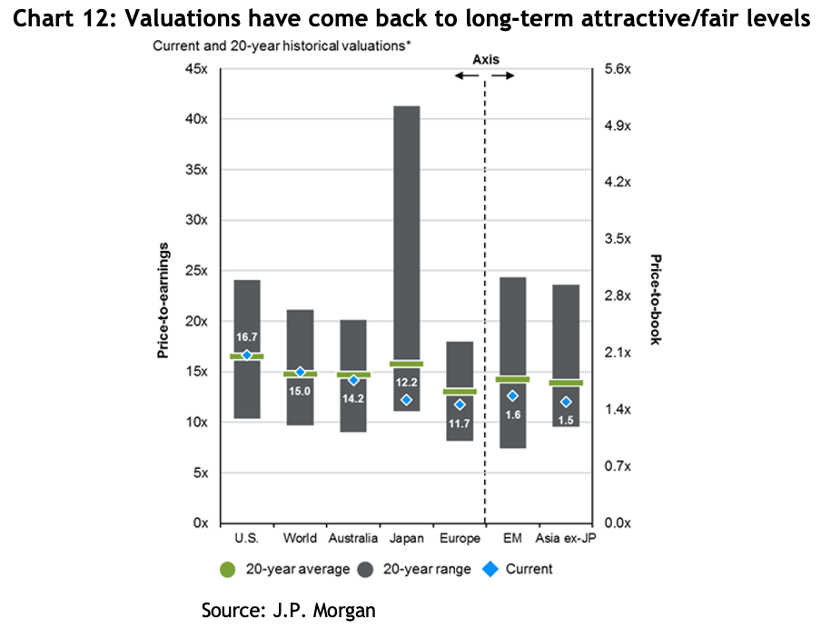
And JP Morgan estimates that at the same time, the US was trading on a price to earnings ratio of 16.7 times, bang in line with its 20-year average, compared to Australia on 14.2, Japan on 12.2 and Europe on a bargain basement 11.7.

A potential change in the top sector

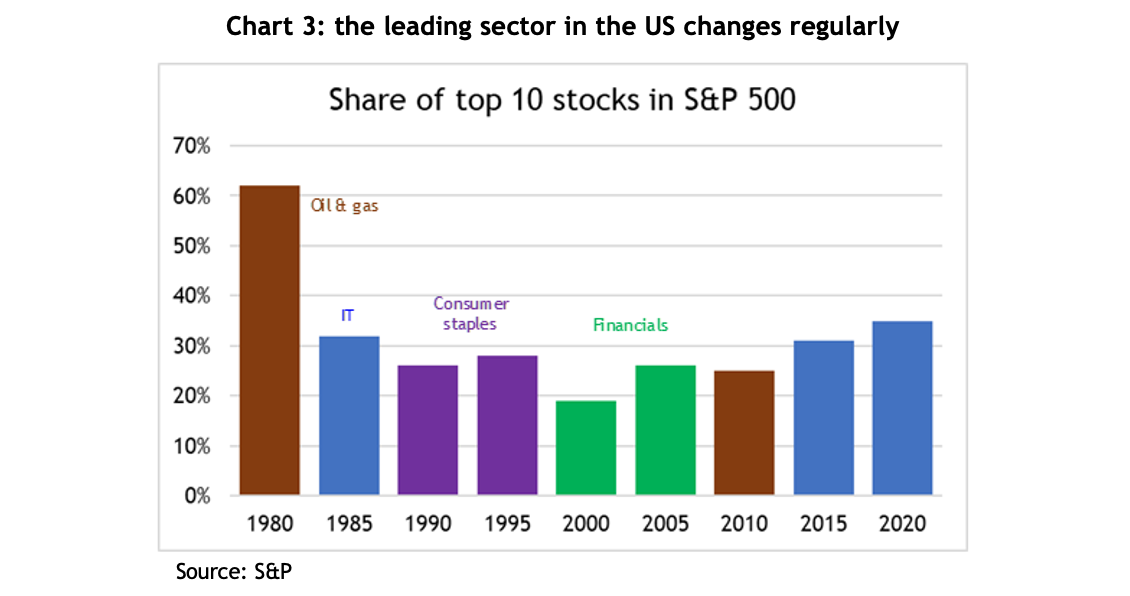
When the US market undergoes a regime change, it is not unusual for the leading sector in the index to change as well. In the 1990s consumer staples became the largest sector, then it was financials, and in the post-GFC period the tech sector became the dominant engine of growth.

Line graph showing the probability of recession over the coming 12 months in the Fed's Survey of Professional Forecasters

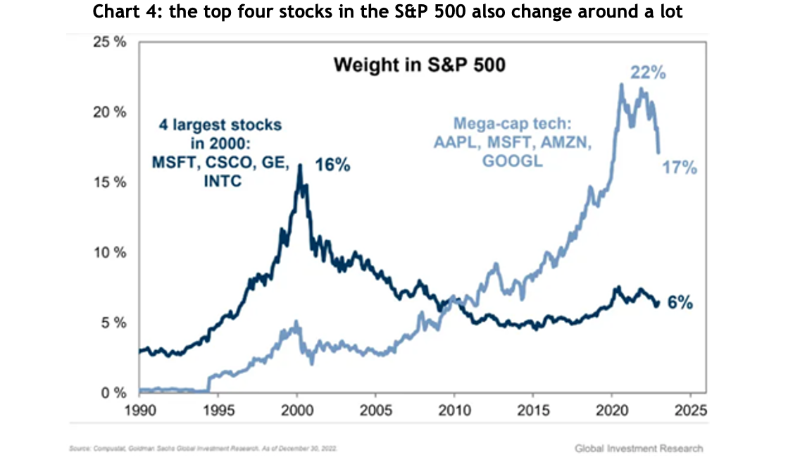
Likewise, the top companies change around as well, sometimes dramatically. In 2000 the four largest stocks in the S&P 500 were Microsoft, Intel, Cisco Systems and General Electric, boasting a combined weighting of 16 per cent of the total index. By the end of 2022, the same four had a combined weighting of 6 per cent, with Microsoft accounting for 5 of that.

At the height of the market in 2021, the top four companies accounted for 22 per cent of the S&P 500’s total market capitalisation. That has already dropped to 17 per cent, and if history’s any guide, it could have a lot further to fall.

Line graph showing the Morgan Stanley Leading Earnings Indicator against the Actual S&P 500 LTM EPS Growth Y/Y

Letting go can be hard

Financial markets are far more dynamic than many investors’ mindsets. Humans are usually reluctant to let go of a paradigm, presuming that what worked best in the last investment cycle will win out again.

That partly explains why the best performing stocks in the Russell 2000 index over January were unprofitable tech stocks, and those which had fallen the most: the presumption being that if the market’s rallying, just buy what’s been hit the hardest.

A regime shift doesn’t happen quickly, and it doesn’t mean you should sell all your US and tech holdings immediately. A smart investor understands these things are not binary, but more a question of relativities. Changing by increments can produce a better result.

What just happened and what lies ahead

What just happened and what lies ahead

2022 – the scorecard

By some measures, 2022 was one of the worst years for financial markets in the last century and it was all due to central banks aggressively tackling a sharp rise in inflation.

Global bond markets suffered their worst year ever, with the Bloomberg Bond Index falling 13%, compared to the previous worst fall of only 3%.

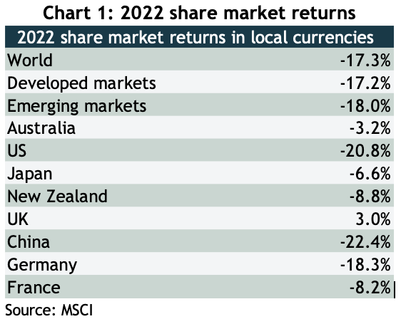
Share markets were very mixed, with previous laggards like Australia and the UK doing relatively well (though still falling), while the US, which had left the rest of the world in its dust over the past 13 years, recording its seventh worst year in the past 100 – see chart 1.

Table showing the 2022 share market returns in local currencies

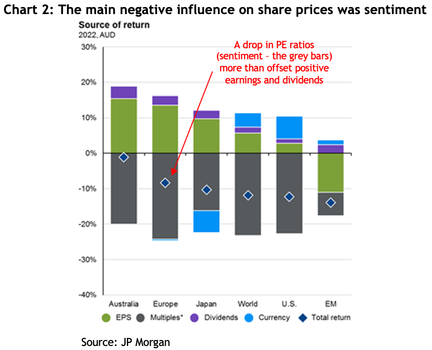
The big falls on global share markets was by and large because of ‘PE compression’, meaning the price to earnings ratio at which investors were prepared to buy stocks fell. That reflects a change in sentiment, as opposed to a fall in earnings (the opposite to what happened in the GFC). The grey bars in chart 2 show the extent to which that change in sentiment offset any positive contribution from earnings growth and dividends (the chart is in AUD which is why there’s a currency effect as well).

Bar graph showing the main negative influence of share prices was sentiment based on source of return 2022 AUD

The huge difference in returns was due to the resurgence of ‘value’ stocks, the old fashioned sectors like resources and industrials, smashing the ‘growth’ stocks, like tech.

Lessons from 2022

Financial markets throw up new lessons all the time, here are a few of the takeaways from last year.

Be wary of central banks: as late as November 2021 the Governor of the Reserve Bank of Australia, Philip Lowe, reiterated the board’s often repeated view that inflationary pressures were not a concern to them and interest rates in Australia would not rise before 2024, six months later they began the most aggressive rate rise campaign in decades, with eight consecutive monthly rate increases taking the cash rate from 0.1% to 3.1%, with the likelihood of more to come.

The US Federal Reserve was the same and was more or less bullied by financial markets into launching aggressive interest rate rises, with seven consecutive increases taking their cash rate from 0.25% to 4.5%.

Don’t trust forecasters: out of a survey of 16 US forecasters, the lowest estimate for how the S&P 500 would go over 2022 was a 3.5% fall, the highest was an 11.1% gain, with the average being a 3% increase. The final result was a fall of 19.4%.

This just shows how tough it is to make forecasts. It’s a truism that over the long-term share prices follow earnings growth + dividends, which, according to chart 2, was about +3%. So it’s pretty understandable the average estimate came in at that level, but any strategist will tell you they hate making one year forecasts because sentiment is invariably the swing factor, and that’s simply impossible to guess.

Bonds can lose money too: over the past 40 years, when interest rates were on a long-term downward trend, bonds provided a counter-correlated air bag against falls in share markets, but 2022 was dramatically different. Government bond yields fell to all time lows in 2021, which increased their sensitivity to a rise in inflation. And while corporate bonds offered a better yield, they were also susceptible to repricing on concerns that companies would be more likely to default in a rising rate environment.

Base decisions on what you think will happen, not on what you think should happen: there were plenty of strong arguments that rate increases, which are designed to reduce demand by increasing the price of credit, were not the right weapon to use against inflation that was driven mostly by a combination of supply bottlenecks and companies opportunistically increasing prices.

If interest rates hadn’t risen as much as they did, it’s unlikely share markets would have fallen as much as they did. But the fact is central banks made it clear they were going to hike rates, and that was especially going to affect the growth stocks.

The falling tide can affect almost all boats: when markets go into a broad reversal because of a PE derating, it doesn’t matter if you avoid the clearly overvalued parts of the market, like unprofitable tech stocks, because even ‘fairly’ valued sectors supported by solid earnings can get whacked too, as we saw with highly profitable tech companies like Apple and Microsoft.

The bulls vs the bears

There is, as always, a raging debate between the bulls and the bears as to what 2023 holds in store. While it’s always prudent to bear in mind what Yogi Berra apparently said that it’s always risky to make predictions, especially about the future, here are some observations.

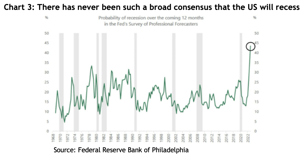
What the bears argue: the consensus view among investment banks and fund managers, especially in the US, is that the US economy will go into recession some time in 2023 – see chart 3, but that is not yet reflected in earnings forecasts.

Line graph showing the probability of recession over the coming 12 months in the Fed's Survey of Professional Forecasters

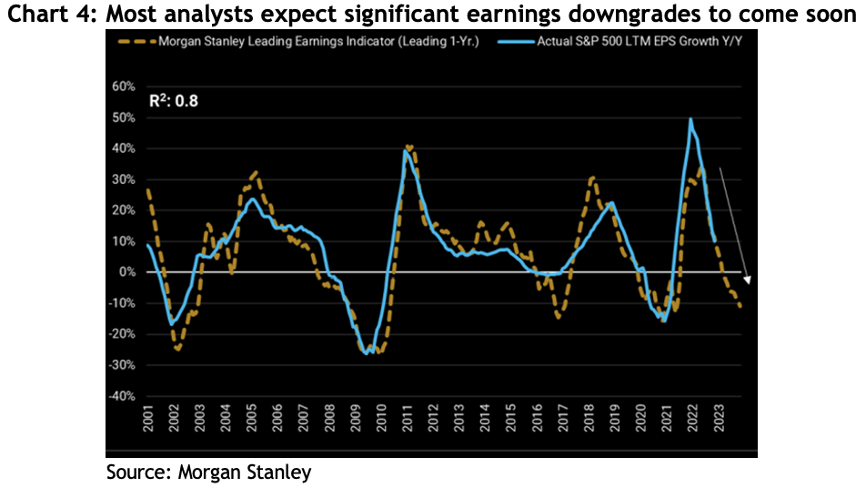
After recent downgrades, the consensus forecast for US earnings in 2023 is roughly flat, whereas in past recessions earnings have typically fallen 15-20% – see chart 4. As we pointed out above, markets normally follow earnings, so the consensus forecast for the S&P 500 this year is a 20-25% drop to new lows (between 3000-3300), before a recovery toward the latter part of the year (consensus is 4038 by year end).

Line graph showing the Morgan Stanley Leading Earnings Indicator against the Actual S&P 500 LTM EPS Growth Y/Y

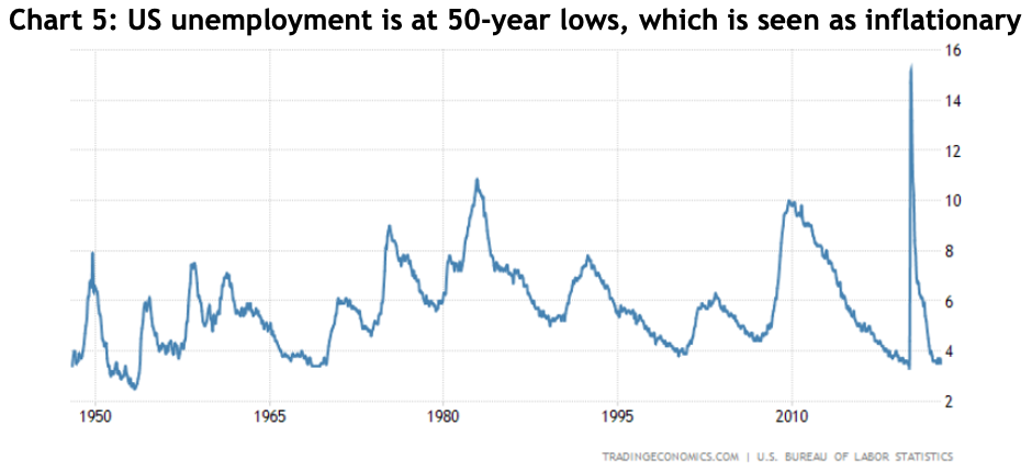
The expectation of a recession is based largely on the fact that there has never been an inflationary episode like we’re in now that hasn’t required the Fed raising rates so much that it drives the economy into recession. That view is reinforced by the US reporting its lowest unemployment rate in 50 years, which is generally seen as a harbinger of wage-driven inflation: orthodox economic theory argues there’s an inverse relationship between unemployment and inflation, and the Fed governors have repeatedly made it clear they are prepared to sacrifice jobs to reduce inflation, i.e. they will keep raising interest rates to choke the economy.

Line graph showing the US Bureau of Labour Statistics unemployment levels

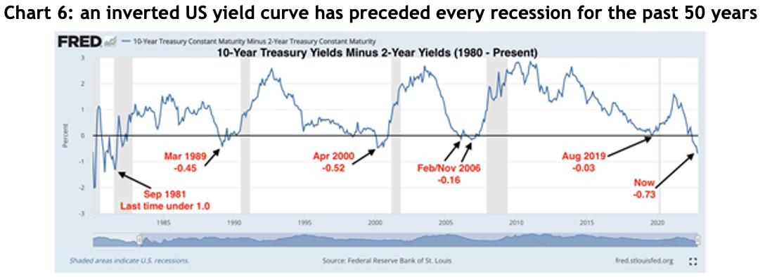
Finally, the bears point to the ‘inverted US yield curve’, meaning the yield on 2-year government bonds is higher than the yield on 10-year bonds – see chart 6. Every US recession for the past 50 years has been preceded by an inverted yield curve.

Line graph shows 10-year treasure yields minus 2-year yields (1980 - Present)

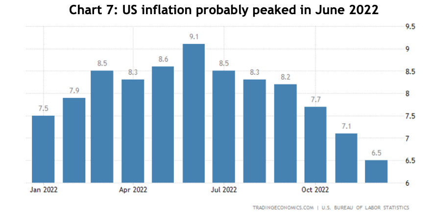
What the bulls argue: it looks for all the world like US inflation peaked in June last year, and it’s now declined for six consecutive months – see chart 7.

Bar chart showing US inflation stats throughout 2022

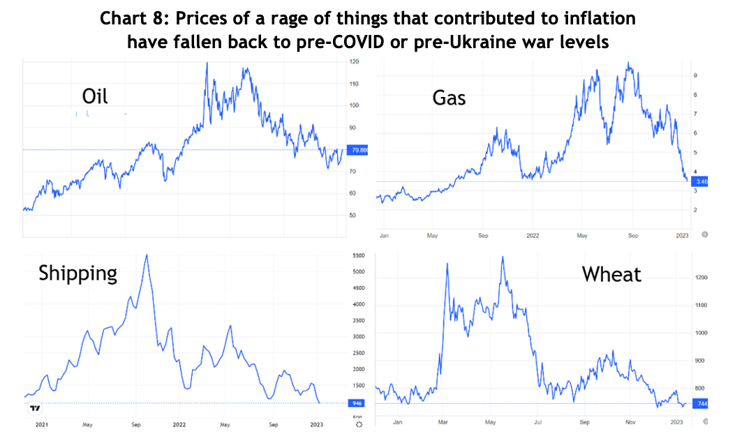
A range of things that caused prices to spike last year have fallen dramatically: freight costs are back to pre-COVID levels, oil and gas prices are back to pre-Ukraine war levels, as is wheat, semiconductor supplies have all but normalised, lumber is below where it was in 2020, etc. – see chart 8.

Line graphs showing the price ranges throughout 2022/23 for oli,gas,shipping and wheat

A quirk of how the US reports its inflation rate is that it compares the most recent month to what happened 12 months before. However, former Fed vice-chair Alan Blinder commented last week that if you instead annualise December’s monthly CPI number, which was -0.1%, the US is now experiencing disinflation!

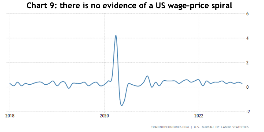
Also, the December US jobs report was full of good news: although the US economy added 223,000 jobs over the month, average hourly earnings growth was only 3.4% for the year, so lower than the inflation rate and slowing – see chart 9. There is absolutely no evidence of the wage-price spiral the Fed is so concerned about. These are all arguments militating against the Fed continuing to raise interest rates.

Line graph showing US wage prices

What about the risk of recession? US research group, Renaissance Macro, commented that “recessions don’t happen when real incomes net of government transfers (pension payments and the like) are on the rise and this is up 3.2% annualised since June.” In other words, households are doing OK, which should underwrite consumer spending.

Also, last year the US economy added 4.3 million jobs and Carson Investment Group pointed out that of the 17 previous years where the US added more than 3 million jobs, only once did the following year go into a recession, 1972.

What about the scary inverted yield curve? Last week, Professor Campbell Harvey, the economist who came up with the indicator, said he believes this time it’s a false signal.

What about the record that inflation has never fallen without the Fed pushing the economy into a recession? Two things: first, this inflationary cycle is different to previous ones insofar as it’s easier to identify the causes, like people being locked in quarantine only able to spend on goods and consequent supply chain bottlenecks, all of which are turning, or have turned, around, and second, there has never been a time when a rising interest rate cycle was preceded by a government injecting 25% of GDP directly into households. Even the lowest quartile of households are still sitting on net savings.

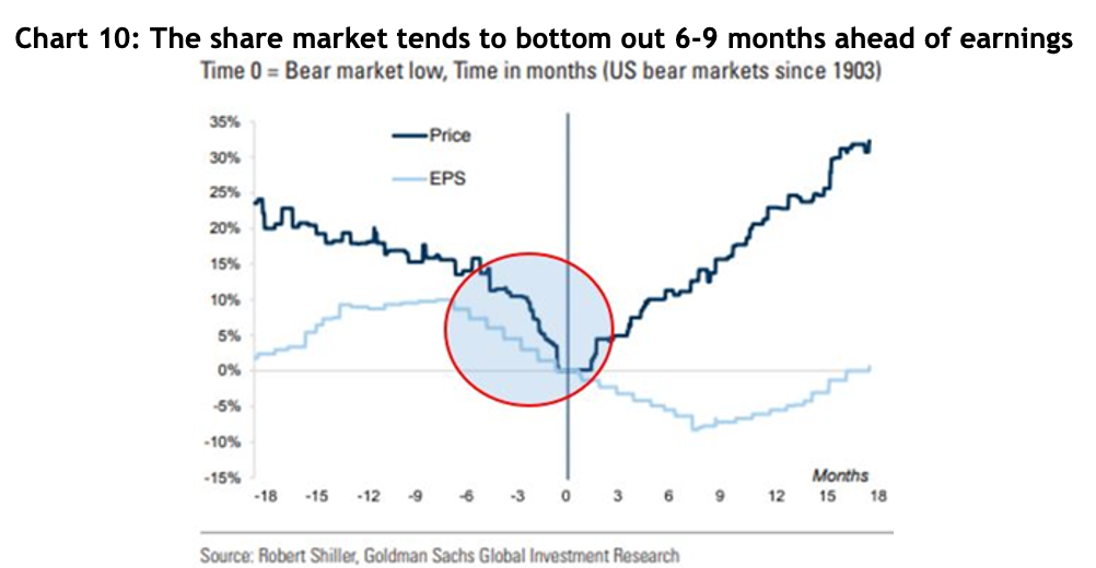
What about the prospects of earnings downgrades? Again, the ginormous amount of money from those fiscal injections is still bouncing around economies, which will help underwrite corporate earnings for a while yet. Also, historically the S&P 500 has bottomed out on average 6-9 months before corporate earnings – see chart 10. Another way of looking at that is the share market is a forward looking indicator and has a knack for factoring in all the news that’s out there well ahead of economists and analysts. The S&P 500 fell 27.5% at its worst, and it’s now down 17%, meaning it may well have already factored in all the nasty prospects of earnings downgrades.

Line graph showing Price vs EPS

Other economies and markets: I’ve focused on the US because that’s where all the best information and data is available. However, for Australia, the monthly inflation rate is still above 7% and hasn’t shown signs of slowing anywhere near as clearly as the US, partly because of the effects of floods on food prices, the reintroduction of the petrol excise and the high cost of housing. It’s considered a certainty the RBA will raise interest rates for the ninth time in a row when they next meet in early February, but Governor Lowe has indicated the board is prepared to be less aggressive and wait to see if their handiwork has had an effect. It’s difficult to find an Australian economist forecasting a recession.

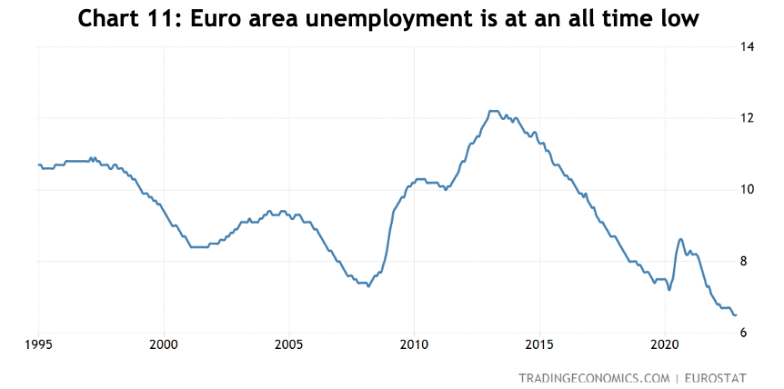
Europe was considered a basket case, but even there, a surprisingly mild winter has meant the nightmare scenario of energy shortages appears very unlikely and inflation also looks like it peaked in October and has fallen since. The natural gas price has fallen more than 60% from its peak in August and is now trading below where it was before Russia’s invasion of Ukraine. Unemployment in the Euro area is at its lowest since its inception and, although 6.5% is still significantly higher than the US or Australia, it is trending downwards – see chart 11. There are some brave souls arguing even Europe won’t go into recession.

Line graphis showing unemployment figures for the Euro area
China, which was one of the worst performing markets in 2022 because of the government’s strict COVID-zero policy and problems with the property sector, is bouncing back quickly. In late 2022 the government lifted almost all COVID restrictions following widespread protests, which was terrific from a libertarian and economic perspective, but clearly they had failed to put a comprehensive plan in place over the lockdown period and now infections are running wild. The government has already talked about stimulating the economy through fiscal and monetary measures, which will no doubt spur a recovery and contribute to global growth as well.

Thoughts on where to invest

A benefit of the global selloff is that valuations have come back to relatively attractive levels. They might not be as bargain basementish as after the GFC, but they’re a lot better than late 2021 – see chart 12, especially for Japan, Europe and the emerging markets.

Bar graph showing current and 20-year historical valuations

Not surprisingly given the Australian share market didn’t fall as much as others, it’s only just below the long-term average PE ratio and the US is a smidge above.

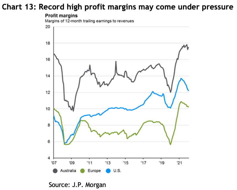
Record high margins: one issue is the record high level of margins in both the US and Australia – see chart 13. For the US that has largely come from the tech sector, not so sure about Australia, although it’s noteworthy that Australian margins have been higher the whole time. In 2021, of the 70% earnings growth reported by US companies, 50% came from margin expansion. It would not be surprising to see margins come under pressure.

Line graph showing profit margins of 12-month training earnings to revenues

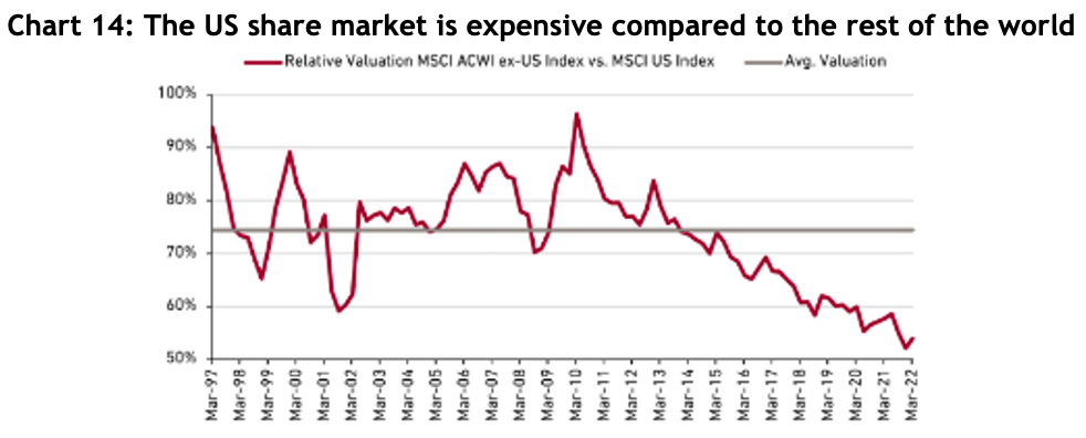
Outperformance of the US: since the GFC, US shares returned 14.1% p.a., which was 38% higher than Australian shares and 33% more than international. Chart 14 shows the extent to which the US has become expensive compared to the rest of the world, based on a combination of PE, price to book value and price to cash flow (the chart is only to March 2022 but it’s unlikely to have changed significantly since then). The point here is this chart has historically reverted to the mean, will it do so again?

Line graph showing relative valuation MSCI ACWI ex-US Index vs. MSI US Index

As always there are great arguments on both sides as to why the US should or shouldn’t continue to do well versus the rest of the world. It remains a source of corporate and financial innovation with the lion’s share of globally recognised brands. However, it is expensive compared to the rest of the world, and the Republican dominated congress looks like it will be held to ransom by a handful of extreme views that could well wreak havoc with the government’s finances.

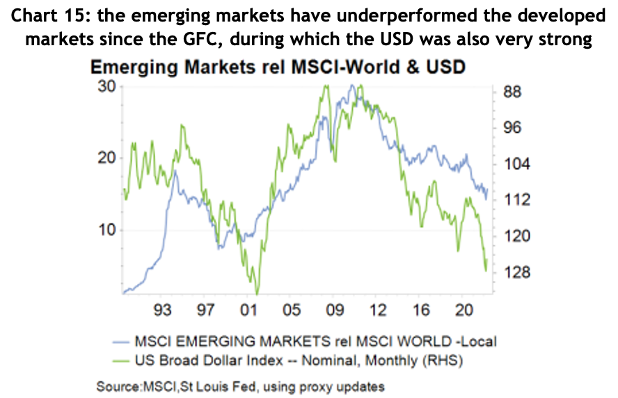
Will the emerging markets return to favour? Chart 15 shows the emerging markets smashed the developed markets over the 10 years up to the GFC (the rising blue line) and has underperformed since. At the end of 2022, the PE ratio for the emerging markets was 34% lower than the developed markets.

Line chart showing the correlation between emerging markets rel MSCI-World & USD

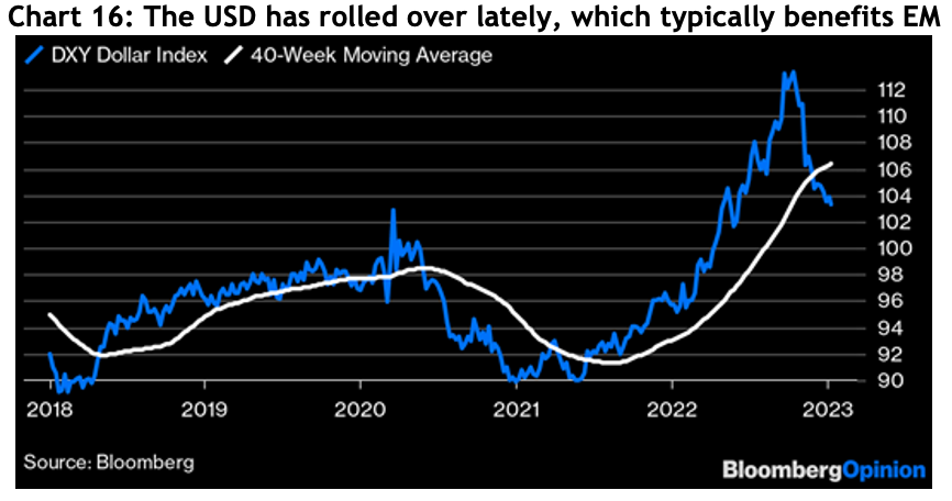
The emerging markets tend to do poorly when the USD strengthens, and it has just come off one of its strongest years ever, rising 22% at one point. Chart 16 shows the USD has rolled over dramatically, which should support EM.

Line graph showing the DXY Dollar Index / 40 week moving average

Looking ahead

As always, there are compelling sounding arguments on both sides. On balance, it would be surprising to see economies fall into a deep recession when unemployment levels are at 50-year lows and household incomes are healthy. Inflation appears to be falling at a rate that would justify central banks pausing, or at least slowing, to see what effects the interest rate rises they’ve already pushed through will have.

Having endured some significant losses in 2022, global markets have started 2023 strongly. Indeed, the ASX has had its best start to the year since 1988, three quarters of stocks in the S&P 500 are more than 20% off their lows, Europe has bounced 20% off its lows and the UK is only 2% off its all-time highs.

We know when markets turn positive it can be difficult to put your finger on why it’s happening at the time, but then they tend to run hard as investors play catch up. There is no assurance we won’t revisit the lows, but it’s looking less likely and after a tough year last year, you can see light in the proverbial tunnel.

The views shared in this article are the author’s views and don’t necessarily reflect those of the whole firm.

A bear market opportunity

A bear market opportunity

Winston Churchill’s admonition to never waste a good crisis is something all smart investors should keep in mind as financial markets wrestle with the potential for a recovery from the current bear market.

One opportunity not to waste is revisiting your weighting to Australian shares in an investment portfolio.

There is a well-recognised home country bias among investors all over the world, meaning most investors tend to be heavily overweight their own backyard, which is easy to understand given increased familiarity and ease of access.

For Australian investors two other factors have been important contributors to what Vanguard has previously estimated as an average of 73% allocation to domestic equities: the franking system which boosts dividend returns, and Australia’s economic record of avoiding recession for almost 30 years contributing to a perception of safety.

However, while franking credits are a terrific booster to returns, a better approach is to look at total returns from a portfolio, because it’s possible capital growth alone can far exceed the added return from dividends, especially in recovering markets.

And economic growth does not necessarily reflect in the share market, because its composition is very different to the broader economy, for example, the top 10 companies on the ASX 200 account for almost half the index, meaning it’s a heavily concentrated sample.

Harry Markowitz, one of the godfathers of modern portfolio theory, is famous for saying that diversification is the only free lunch in investing. Australia represents less than 3 per cent of global share market capitalisation, compared to the US being well over half and Europe around 20 per cent. This is where the opportunity lies.

Over the course of the current bear market, the drawdowns experienced by different countries have varied considerably. At the end of October, the ASX 200 was down 10 per cent from its highs, but the S&P 500 was off 20 per cent, the NASDAQ by 31 per cent, Europe 17 percent and the emerging markets 32 per cent.

There are many reasons behind that variability, but a big part of it is because this correction has especially impacted shares that were trading on higher PE ratios, which were often the more growth-oriented companies such as tech. Australia, and Europe for that matter, have a higher weighting to lower PE companies such as banks and resources.

This provides investors with the chance to take advantage of markets being on sale and rebalance portfolios to improve diversification by broadening what drives returns in the portfolio. For instance, at the company specific level, by the end of October there were household names that have no comparison in Australia that had been slashed from their recent highs: Nike was down by 48 per cent, Microsoft 33 per cent, Amazon 45 per cent, Disney 54 per cent, FedEx 49 per cent, Mercedes-Benz 32 per cent, Adidas 68 percent and Samsung 28 per cent.

It is entirely possible this correction is not over, and those names will get even cheaper, but trying to pick the bottom of a cycle is notoriously difficult, if not impossible. But there is no need to rebalance all in one hit, it can be done over time, in stages.

Likewise, at this point, it’s impossible to know which markets will perform best over the coming 10 years, but by spreading your bets you give yourself a better chance of avoiding the worst performing. For context, according to Vanguard, between 2010 and 2020, the Australian market returned 7.2 per cent per year, compared to the US market’s 15.9 per cent. Franking won’t double your returns.

If you would like to discuss your investment options, please get in touch.