0399757070
Are small cap companies still a bargain?

Are small cap companies still a bargain?

On 11 July, the US CPI data took the share market by storm. It was the fourth successive monthly decline, and at 3 per cent, it was the lowest annual inflation print in a year.

The fixed income markets had started 2024 expecting the US Federal Reserve would cut interest rates as many as four times over the year, but after some nasty surprises in March and April, there was even talk of another rate rise. The June print saw the odds of a September cut rocket and then the Federal Reserve Governor, Jerome Powell, all but confirmed it’s very much on the table.

So began what was being referred to as the Great Rotation as the market started to focus on those sectors and companies that would benefit the most from declining interest rates in an economy that was still expected to avoid falling into recession, and the hottest ticket in town was small cap companies.

The Russell 2000, one of two high profile US small cap indices, outperformed the NASDAQ and the S&P 500 by the most it ever has in a single day as well as over the following five days, rising by more than 10 per cent.

Then came the correction: higher than expected unemployment figures on 2 August saw perceptions about the risk of a US recession rise sharply, and the Russell 2000 gave back all those earlier gains.

In terms of their performance compared to their large cap peers, small caps have endured a rough past 10 years, with the Russell 2000 underperforming the S&P 500 by 32 per cent and the NASDAQ by more than 50 per cent – see chart 1.

Chart 2: the S&P 500’s PE ratio with and without the MegaCap 8

That outperformance by large caps has been underpinned by superior investment fundamentals, driven principally by the IT companies. Return on invested capital (ROIC) for large caps averaged about 10 per cent, double that of small caps, and free cash flow margins were 9 per cent compared to 2 per cent.

In other words, the large caps have been generating a higher return on every dollar they invest into their companies and ending up with more cash than their small cap peers.

On top of that, the small cap companies were, on average, carrying about four times the level of debt in proportion to their cash flow, so were more vulnerable to rising interest rates, especially given they averaged 40 per cent floating rate debt compared to the large caps at about 5 per cent.

But that was one of the reasons the Russell 2000 jumped so much when the market became convinced the next interest rate move is downwards, that leverage to interest rates becomes a good thing when they’re on the way down.

J.P. Morgan Asset Management recently wrote that a strong factor behind the small caps’ rally is that their valuations are as cheap as they’ve been this century, especially relative to large caps. The S&P 600, the other US small cap index, is on a forward PE ratio of 16x, versus a long-run average of 18x, whereas the S&P 500 is on 22x versus a long-run average of 17x.

The story for Australian small caps is slightly different. The Small Ordinaries index outperformed the ASX 200 quite handily right to the end of the post-COVID bull market in 2021 but has since given it all back during the period of rising interest rates. That underperformance over the last three years is despite the Australian large caps not having anything like the fundamentals or earnings growth of their US counterparts.

Chart 2: the S&P 500’s PE ratio with and without the MegaCap 8

The other consideration, of course, is that the Reserve Bank is not tipped to be cutting rates for a while yet, so more highly indebted companies are having to wait longer for relief.

So, are small caps still a bargain? The level of relative underperformance of Australian small caps versus large caps is almost as bad as it’s been in the past 30 years, and for the Russell 2000 versus the S&P 500, it’s about 20 years. If you’re a believer in mean reversion, you’d be looking for the catalyst and a reversal of the interest rate cycle might just be it.

On a straight PE ratio comparison, small caps again look cheap compared to large caps, but bear in mind the differences in fundamentals.

For smart investors who prefer a diversified portfolio, there’s always a solid argument for at least some weighting to small cap companies given that over the past 100 years they have, in total, handily outperformed their large cap peers. The phenomenal, albeit short, rally we saw in July is evidence that when small caps finally take off, they can move quickly.

Something to bear in mind about both US and Australian small caps is that one quarter of the companies in the Australian Small Ordinaries index, and about 45% of the Russell 2000, are loss making, so it’s one asset class where investing via an experienced fund manager with a strong track record can be beneficial.

A plain English explainer of what happened last week in global financial markets

A plain English explainer of what happened last week in global financial markets

Over the last couple of weeks global financial markets experienced one of those nasty corrections that leaves many investors wondering what the hell happened, and should I be worried.

Chart 2: the S&P 500’s PE ratio with and without the MegaCap 8

The lead up

Through to mid-July, US financial markets had been pretty cruisy. The S&P 500 had returned 19% year to date, with one pullback of about 5%, and the most commonly referred to measure of volatility, the VIX index, if anything was suggesting markets were complacent.

On 11 July, US inflation came in a little lower than expected and the markets got even happier, hitting a fresh all time high on expectations that the Fed would finally be able to start lowering interest rates while the rest of the economy still looked in reasonable shape, on target for the so-called ‘soft landing’, meaning the economy would make it through a rate tightening cycle without going into recession.

An unemployment speed hump

Then on 2 August, the US unemployment rate was reported at 4.3%, which was higher than had been expected and marked the fourth consecutive monthly increase. Suddenly the market swung around to worry that the US economy was heading for a recession, or a ‘hard landing’, and bond markets raised the likelihood of the Fed cutting rates in its September meeting to 100%.

On that Friday, the S&P 500 fell by 1.8%, but the Russell 2000 small cap index, which only a couple of weeks earlier had enjoyed a 10% rally over a few days when markets were counting on a soft landing, dropped 3.5% on the newfound risk of a hard landing.

The Bank of Japan increased interest rates

On 18 July, Japan’s inflation rate came in at 2.8%, which the Bank of Japan considers incompatible with a cash rate of 0.1%, so they raised rates to 0.25%.

Whilst that hardly sounds like it should cause much of a stir, it did, in large part because the Bank of Japan said there were more rate rises to come.

Enter the carry trade

Japan has had a zero or negative cash rate since October 2010. A popular strategy for hedge funds and traders has been the ‘carry trade’, where they borrow money in Japan at next to nothing, then invest the proceeds into other risk assets, like shares, bonds or currencies, often in offshore markets like the US.

It helps to understand the scale of the Japanese carry trade. Whilst nobody knows the exact number, Deutsche Bank estimated it to be around ¥20 trillion (more than A$200 billion).

A lot of these traders tend to make very similar bets, mostly following what’s called momentum strategies, which boils down to buying things that are going up and selling things that are going down, and mostly in very large, liquid assets. But because they’re using borrowed money, they operate under very strict stop loss restrictions, which means if the asset they’re invested in falls below a specific price, they have to sell.

One of the quirks (some would say problems) of today’s financial markets is that it’s estimated fundamental trading on global markets, that is, buying and selling of financial assets by long-term investors, accounts for only around 5% of daily turnover. In other words, those traders are mostly buying and selling off each other or robots.

 A simultaneous rush for the exit

The carry trade strategy worked really well, until the Bank of Japan started talking about higher rates at the same time that the US was factoring in lower rates. Suddenly, a lot of traders were facing margin calls on their Japanese loans, meaning they either had to stump up more cash to reduce the leverage or sell assets to pay down the loan. A lot of them chose (or were forced) to sell assets – and WHACK!

To settle the margin calls, they were selling their risk assets, such as US shares, and using the proceeds to buy back yen to repay their Japanese loans. That had the dual effect of share prices and sharply increasing demand for yen, causing the yen to appreciate massively against the US$, going from 162 to 144. 

 Mayhem in Japan

While the share market volatility certainly reverberated around the world, with the S&P500 down 6% from its highs at its worst and the NASDAQ down 11%, and the ASX 200 down 3%, Japan’s NIKKEI index dropped 25%! On Monday 5 August, the index fell 12.4%, which is its second biggest one day fall ever, after black Monday in October 1987.

That’s worth dwelling on for a moment: Japanese shares had a worse one day fall last week than they did during the GFC or COVID, or even during the post 1990 bubble correction. But it wasn’t due to any fundamental problem.

Notably, on Tuesday 6 August, the NIKKEI rose by more than 10%.

 Should we be worried?

In short, we don’t believe so. Wary, yes, worried, no.

Firstly, share markets have a long history of corrections, and they invariably pick themselves up, dust themselves off, and soldier on.

In the US, over the past 100 years, 94% of years have seen at least a 5% share market drawdown, 64% have seen at least a 10% drawdown, and 26% have seen at least a 20% drawdown. Indeed, over the past 40 years the average intra-year drawdown has been 14.2%.

In Australia, over the past 30 years the average intra-year drawdown has also been 14%.

Suffice to say, right now we don’t see any big, global imbalances that a represent systemic issue. Also, the Bank of Japan has said it will not be doing anything with interest rates while financial markets are volatile.

 Will the US recess?

It’s interesting to note that the very next week, the employment data in the US was better than expected. It appears the early August data was affected by Hurricane Beryl, which forced some people to stay home from work and caused a spike in temporary layoffs.

The recent data about the US services sector, in terms of both activity and employment, was unexpectedly strong, indeed it was also strong in Europe, Japan and China.

Also, the US government is running a budget deficit of more than 6% of GDP, which represents an awful lot of money going into the economy, making it harder to recess.

 What about Australia?

The numbers in Australia are not as strong. While the unemployment rate has remained at 4.1%, job ads have fallen for 9 of the past 11 months. The higher interest rates have a more pronounced effect on household spending because we have a high proportion of borrowers on variable rate home loans, and GDP growth per capita has been negative for five quarters in a row.

Is the US share market uninvestable?

Is the US share market uninvestable?

Last week I was at a conference about alternative investments, and I cannot tell you how many people I spoke to who had decided the US share market is nuts. They were piling all kinds of arguments behind that view:

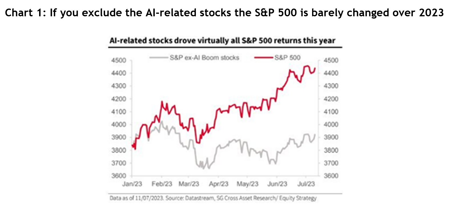
  • The S&P 500 has jumped 24% in just four months, but without the top tech stocks that return would be closer to 8%
  • Nvidia alone has gone up 95% over the same time, but it’s risen 420% since Chat GPT was announced in November 2022
  • Market concentration has never been greater with the MegaCap 8 stocks (Apple, Amazon, Alphabet, Meta, Microsoft, Netflix, Nvidia and Tesla) now accounting for 28% of the S&P 500
  • The MegaCap 8’s combined market cap would make it the second largest country stock exchange in the world
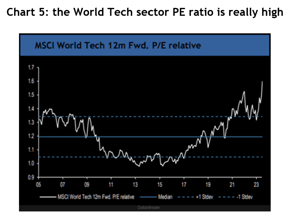
  • The S&P 500’s PE ratio is 28x, compared to a 30-year average of 17x
  • The Goldilocks US economy could crack any moment

Without digging any deeper, that’s a bunch of statistics that would be enough to have anyone wondering if the market’s gone a little mad.

So, let’s dig a little deeper.

Bears always sound smarter

First, before you go believing the people arguing everything’s turning to custard, just remember, the lizard part of your brain that’s hard wired to make sure you survived the thrills and spills of the savannah biases you to thinking what those people are saying is smarter and more trustworthy. It’s the survival instinct, designed to make us think twice and stop us from being reckless.

Then there’s what behavioural economists call second level thinking, where you take a breath and think for a moment, that can prevent you from just swallowing what people say without giving it some thought.

It’s the fundamentals

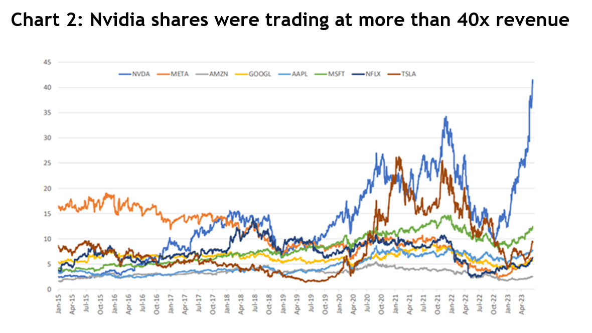
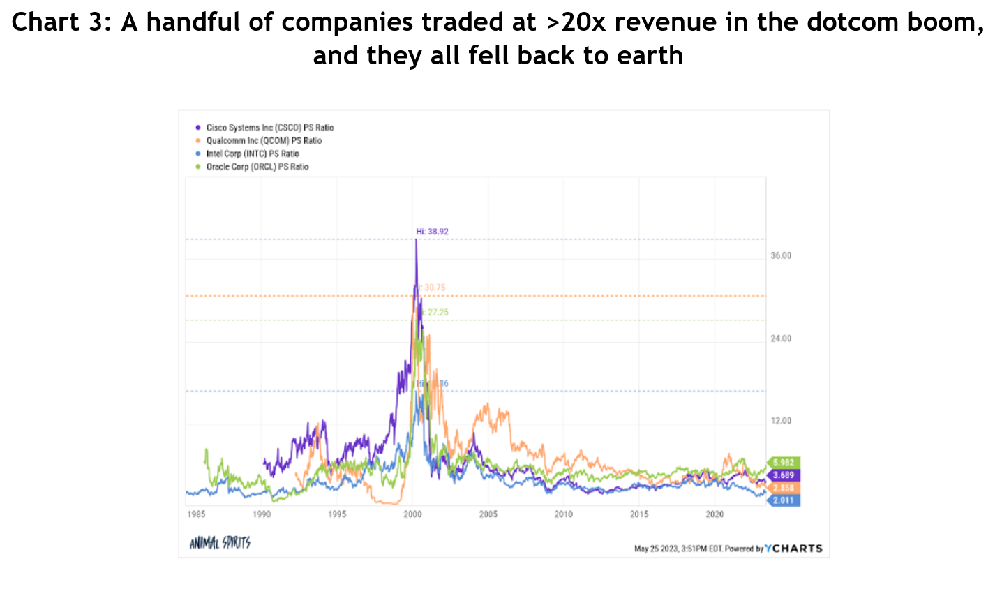
There have been lots of calls that the current AI boom is reminiscent of the dotcom bubble that popped in 2000, and it took the S&P 500 seven years to get back to that level.

But is it? The dotcom bubble was largely hypes and dreams, with almost no actual earnings to back it all up.

Compare that to Nvidia, which recently reported its fourth quarter results that smashed analysts’ forecasts:

  • Revenue up 265.3% to US$22.1 billion, 8.2% ahead of consensus
  • Data centre revenue up 408.8% to US$18.4 billion, 6.9% ahead of consensus
  • Gross margin up 1,064 bps to 76.7%, 128 bps ahead of consensus
  • Earnings per share up 486.4% to $5.16, 3.6% ahead of consensus

From the start of 2022 to 21 February this year, Nvidia’s earnings have grown 231%, but the stock price had risen only 130%, because the PE multiple, which is a measure of how much sentiment is driving the share price, actually detracted by 102%. In other words, there’s less hype in the share price over that time.

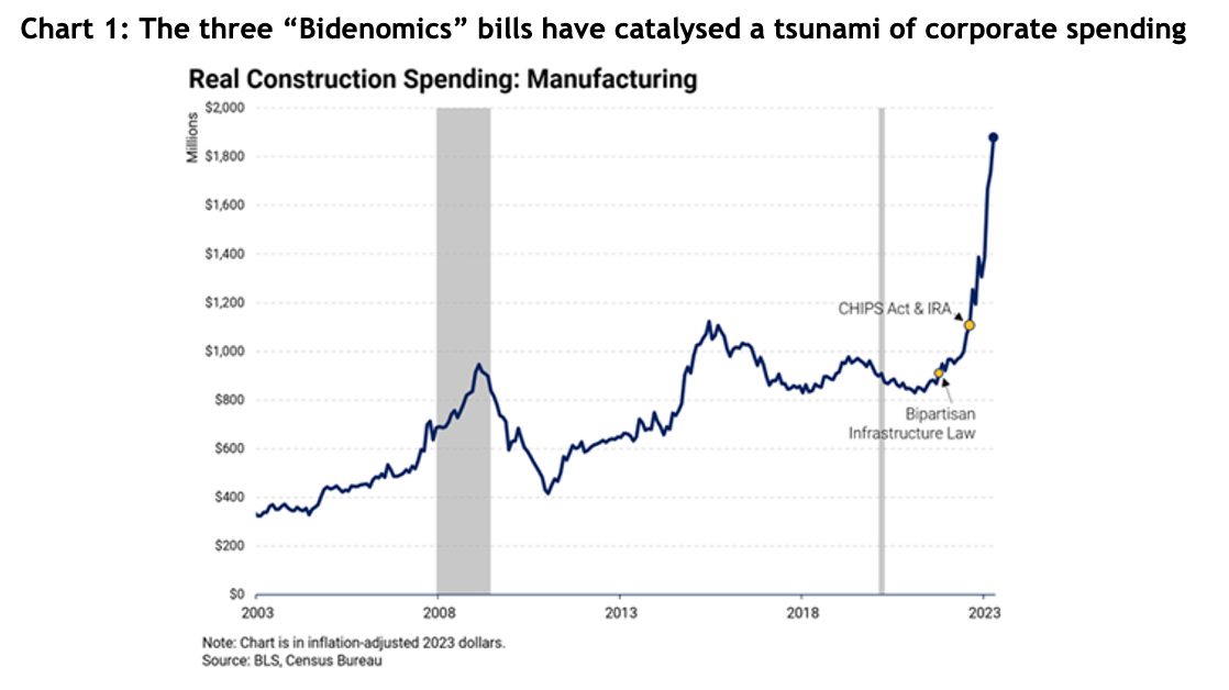
AI has certainly captured the market’s imagination, but it’s no fairytale, there’s real money behind it. Of course, we don’t know if the earnings and revenue growth are going to keep going, but check chart 1: spending by US companies on computers and electronic stuff had already got a big boost from Biden’s CHIPS Act and the Inflation Reduction Act, both passed in August 2022. But you can see the huge jump after Chat GPT was launched in November 2022 – US companies are clearly spending up in a race to incorporate AI into their businesses.
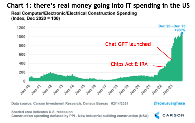
Chart 1: there’s real money going into IT spending in the US

Anyone who’s witnessed the magic of AI through Chat GPT or Google’s Gemini has to admit it’s a mind-bending experience, and those consumer-oriented models are the proverbial tip of the iceberg. There’s a website called Hugging Face, which calls itself “The AI community building the future” that has more than 520,000 AI models available.

AI is definitely here to stay. It’s definitely going to have far reaching impacts. And it’s only going to get bigger and better (and possibly scarier).

Market concentration ain’t all it’s cracked up to be

There’s been a lot of talk about the fact that the top 10 stocks in the S&P 500 have never represented such a high proportion of the overall index, usually followed by dark warnings about concentration risk.

Here’s a bit of context: the top 10 stocks in the US account for 34% of the S&P 500; in Australia, it’s 47% of the ASX 200; in the UK it’s 49%; Germany and France it’s 58% and in Italy it’s 66%.

In other words, it’s not a big deal. Yes, if the bigger companies fall hard it will impact the index by more, but clearly that’s not unique to the US.

There are two other important indicators for the broader US market. First, the industrials index, which represents old fashioned companies that manufacture stuff, has hit an all-time high, and the S&P 500 equal weighted index, which ignores market caps so all companies carry the same weight and influence (so it neutralises the MegaCap 8), is also close to an all-time high. They are both indicators telling us the rally is gradually becoming broad based.

How representative is the PE ratio?

Yardeni Research says the S&P 500’s PE ratio for the next 12 months was 20.4x on 15 February. For the MegaCap 8 it was 28.0x and for the other 492 stocks in the index it was 18.2x – see chart 2.
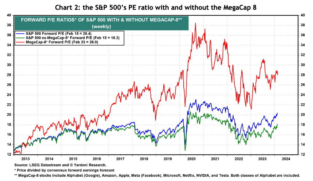
Chart 2: the S&P 500’s PE ratio with and without the MegaCap 8

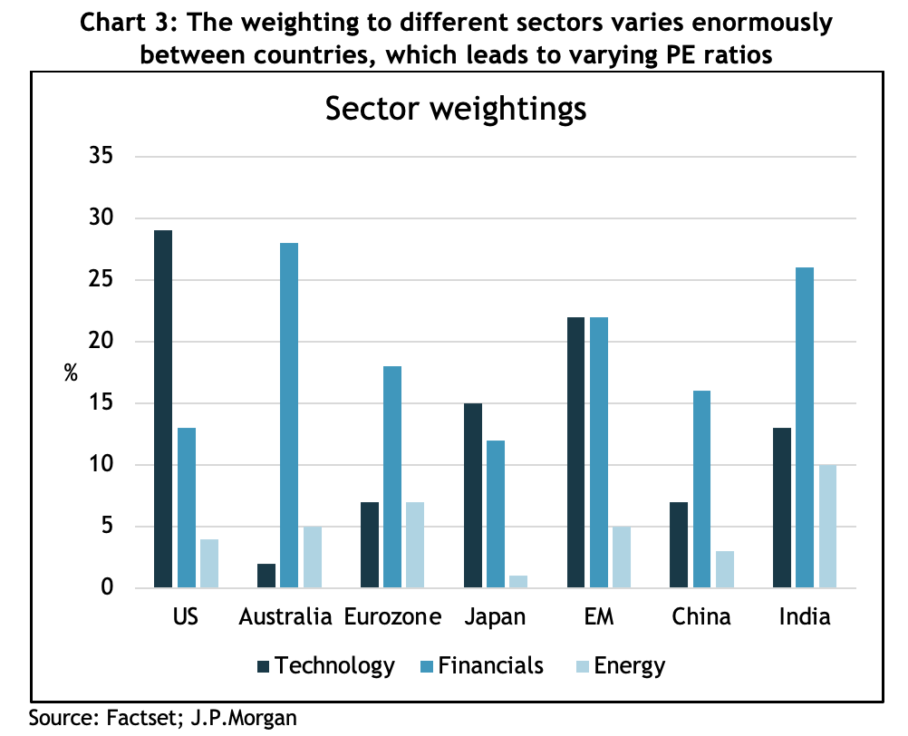
First, I wrote an article for the AFR about this a few weeks ago, explaining how the US index has a much higher proportion of high growth tech companies than any other index in the world, so comparing the PE for the US to, say, Australia, where more than half our market is taken up by low growth banks and resources companies, is like comparing the proverbial apples and oranges.

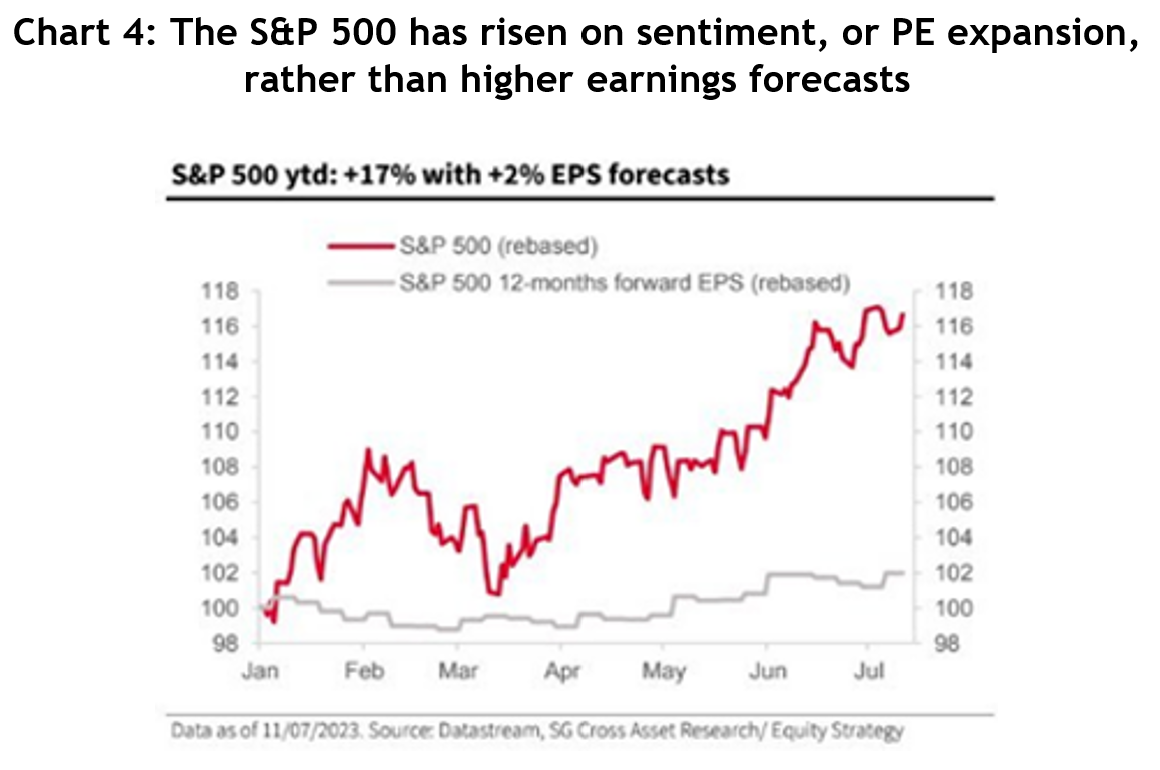
For a bit more context, a company’s PE ratio is determined by a combination of how much the earnings are expected to grow and how positive or negative sentiment toward the company is. Forecasting earnings growth is hard enough, but forecasting sentiment is, well, impossible.

Suffice to say though, Yardeni reckons the 3-5 year earnings growth for the MegaCap 8 is forecast to be 38.9%. That’s really high, and if they can pull it off (admittedly a big if), maybe a 28x PE ain’t so bad after all.

The second part to this argument is that paying 18x for the rest of the US market might not be so bad either. It’s a smidge over the 20-year average PE of 17x, but, again, the US index has changed enormously over those 20 years. In 2003 financials was the biggest sector in the US at 20% and technology was 17%, but now financials is only 13% and tech is 30%. So, to suggest that the index should be trading on the same PE as it was when the composition was very different doesn’t make sense.

Looking into the almanac

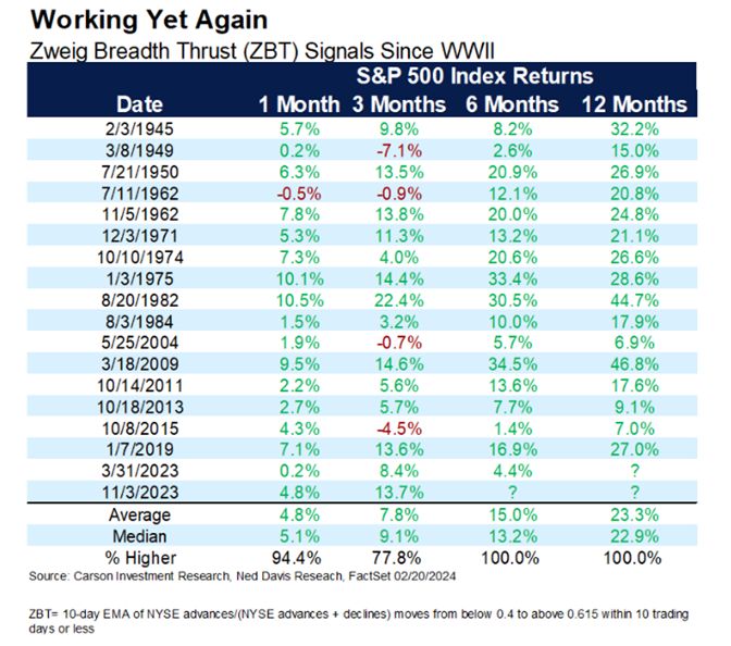
There’s a group in the US called Carson Investment Research, and they trawl through data about the US share markets to spot trends and patterns, something I call almanac investing. I’ve highlighted two out of the many positive points they’ve raised about the S&P 500.
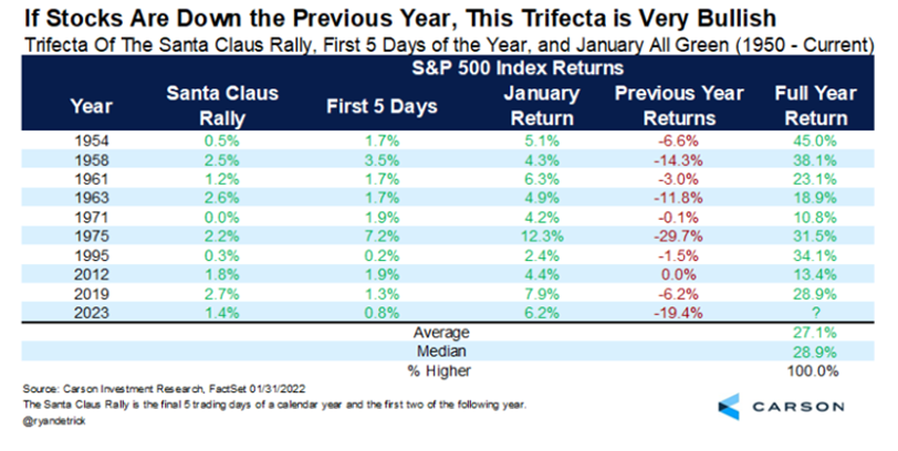
The santa claus rally
Zweig Breadth Thrust (ZBT)

You could understandably dismiss both of these observations as not much more than coincidences and say precedents like these are just made to be broken.

However, the reason I highlighted them is that I think they reflect a pattern of investor behaviour, which in large part is the all important swing factor of sentiment.

The US economy is still strong

The US economy defied a hugely overwhelming consensus that there was going to be a nasty recession last year. Whilst now consensus is that there will be a “soft-landing” (a soft way of saying they were wrong), there are still some bears holding out for a downturn.

Look, they may turn out to be right, if there’s one lesson we all should have learned by now it’s that forecasting the macro economy (things like inflation, unemployment, etc) is really difficult, but there are a few indicators of what’s happening in the real economy that I find persuasive.

First, real wages have grown steadily since COVID, and people having more money to spend is an unequivocal positive.
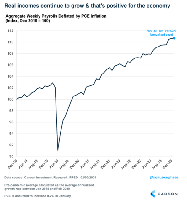
Aggregate weekly payrolls deflated by PCE inflation

Importantly, most of the growth in wages is going to the lowest paid workers, who are far more likely to spend it.
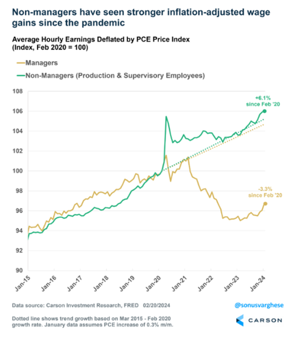
Graph: Average hourly earnings delated by PCE price index

Inflation in the US looks like it’s now well within the Fed’s target range of 2-3%, especially if you exclude housing (which they call shelter).
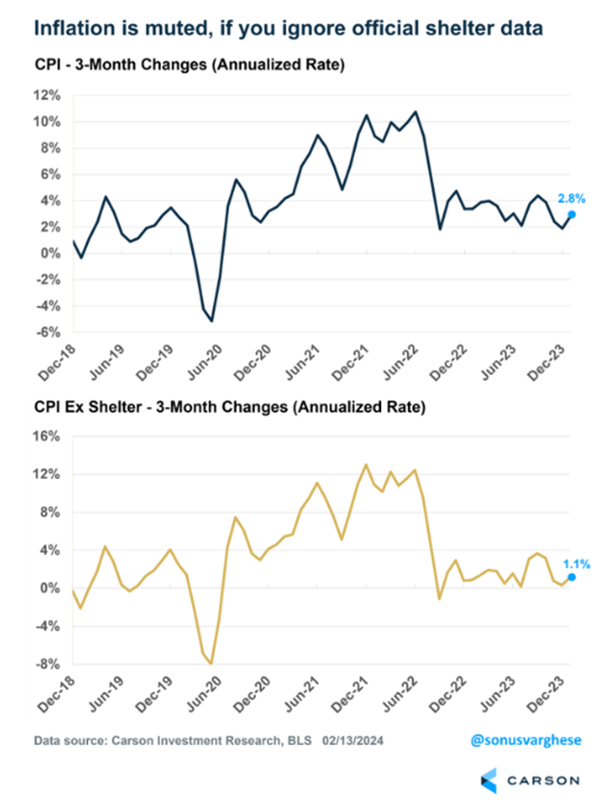
CPI Changes

Why would you do that? Because the Bureau of Labour Statistics, which calculates the CPI, uses a reading for shelter which every man and his dog knows is about 12 months behind the real market. The Fed knows it too, so why they persist remains a mystery.

The chart below shows the Zillow (the US equivalent of realestate.com) rental index advanced by 12 months. In other words, the Zillow index peaked in the middle of 2022 and has been declining ever since. Price increases on apartment rentals have fallen so much they’ve gone negative, meaning rents are dropping. Overall, real world evidence suggests housing costs are way below where the Fed is presuming they are, and they’re still going down.
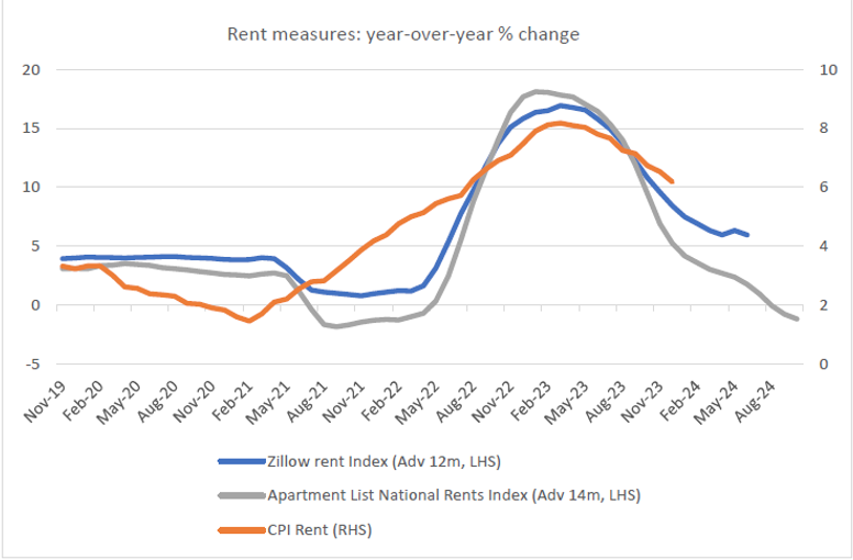
Graph: rent measures year over year % change

And why is it important? Because shelter accounts for about 30% of the CPI number, and 40% of the so-called “Core CPI”, which excludes food and energy costs and which the Fed says it watches more closely.

In turn, the critical follow on from that is interest rates do not need to stay so high if inflation is back in the target zone. The prospect of the Fed eventually lowering interest rates is a big part of what’s got the share market excited.

Finally, another bit of real-world evidence that the economy is pretty strong is shown in the incredible rise of manufacturing construction spending, which has taken off in response to the Biden administration’s Inflation Reduction Act, which throws a bunch of different subsidies at anything that resembles an energy transition project.
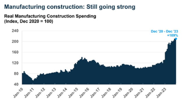
Graph: Real manufacturing construction spending

The bottom line

It’s true the US share market has notched up some strong returns and has hit a new all-time high, but that doesn’t have to mean it’s on the verge of falling again. There’s plenty of anecdotal, technical and fundamental evidence to back the move.

Nor does it mean the index can’t go through a serious correction. On average, the US market experiences a 14% intra-year decline every year.

At the end of the day, trying to time a market by selling and buying back again is really, really difficult. Take comfort that the bears have been wrong since the market bottomed in October 2022, why should they necessarily start being right now?


Maybe the US share market isn’t as expensive as you think

Maybe the US share market isn’t as expensive as you think

The US share market has just hit a new all-time high and its returns have smashed the rest of the world for the past 15 years. But US shares also trade on valuation multiples that are much higher than the rest of the world, leaving investors who already own US companies wondering if they should lighten off, and those who don’t wondering if they should wait for prices to fall before buying in. But maybe the US market isn’t as outrageously expensive as most commentators would have us think.

America: home of the best companies, land of innovation

America is uniquely positioned, making it very difficult to bet against in the long run. Goldman Sachs points out that not only is it the biggest economy in the world, accounting for 26 per cent of global GDP, it is bestowed with an abundance of natural resources. It has the most arable land of any country and is now the world’s largest exporter of agricultural commodities, and, at 20 million barrels per day, it is also the world’s biggest oil and gas producer and exporter, with daylight to Saudi Arabia at number two with 12 million.

It also has the most favourable demographics of any developed country, the most productive labour force, and boasts the deepest capital markets, more than seven times the next biggest.

Since the late nineteenth century, the US has been at the forefront of technical innovation, boosted by some of the best universities in the world. In 2022, it was the global leader in R&D, spending US$879 billion, more than the next five countries combined.

And with exports accounting for only 12 per cent of GDP, the US economy is more resilient than most large economies because it’s less affected by cyclical downturns in its trading partners. By comparison, exports are 21 per cent of China’s GDP, 26 per cent of Australia’s and 51 per cent of Germany’s.

This is not to say the US doesn’t have its problems: it practices a brutal form of capitalism that results in a more limited social safety net, its health outcomes are an embarrassment, and its sclerotic, highly partisan political system is heavily influenced by wealthy lobby groups. Ironically, all of those problems are the result of prioritising making money.

World beating returns

It’s no coincidence that most of the best companies in the past 100 years came out of the US, culminating in today’s mega cap tech monsters.

If a smart investor had sunk $100,000 into the US’s S&P 500 index at the trough of the GFC in March 2009, and reinvested the dividends, it would have grown to be worth $946,000 by the end of 2023. The same investment in the ASX 200 would have been worth $524,000, even after including franking credits. That’s a difference of more than 80 per cent.

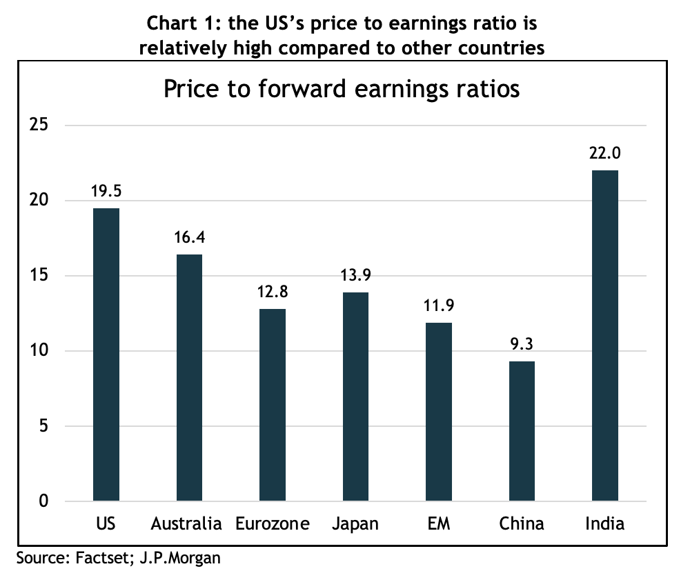
However, that incredible run has left the US share market looking expensive compared to the rest of the world. Using the most common valuation measure for shares, the price to earnings (PE) ratio, the S&P 500 trades at 19.5x 2024 forecast earnings, compared to Australia’s 16.4x, Europe’s 12.8x and the emerging markets’ 11.9x – see chart 1.

Chart showing bond yields trended down, resulting in a 40-year bull market, which went into reverse in mid-2020

Understandably, on that basis, almost every analyst and strategist recommends an underweight position in US shares.

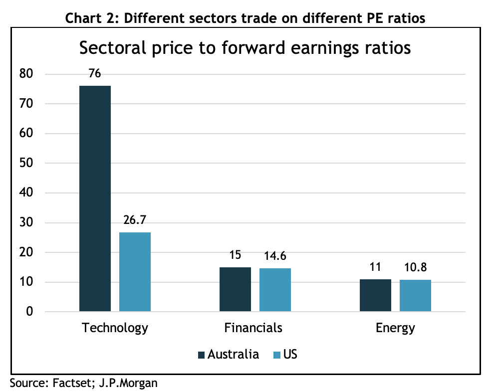
However, a simple comparison of PE ratios fails to account for the huge differences in the structure of the US market compared to others. For example, the tech sector has a 29 per cent weighting in the S&P 500, and is on a forward PE ratio of 31x, which looks very pricey, but the index has had compounded annual returns of more than 21 per cent for the past 10 years. The two biggest companies, Apple and Microsoft, have both returned 26 per cent for those 10 years, and the third biggest, Nvidia, an eye popping 63 per cent per year. It’s also worth noting that the technology index doesn’t include other mega caps such as Google, Amazon, Netflix or Meta.

Chart showing the Australian government bond, GSBG33, has experienced higher 
volatility than what many would associate with a defensive investment

By contrast, the biggest sector in the ASX 200 is the financials, at 27 per cent of the index. Its 10-year return has been 8 per cent per year, and it’s on a forward PE of 15x. So that’s 60 per cent lower returns but only a 50 per cent lower PE. If the Australian index had the same sector weightings as the S&P 500, its PE ratio would almost double.

Chart showing the Australian government bond, GSBG33, has experienced higher 
volatility than what many would associate with a defensive investment

J.P. Morgan also argues that because free cash flow margins are 30 per cent higher than they were only 10 years ago, a higher PE is justified, and fund manager, GMO, points out that since 1997, US profits, as measured by the average return on sales, have increased by 40 per cent.

It’s very difficult to mount a case that US shares are cheap, but it helps to have context around why they’ve enjoyed an outstanding 10 years of returns. There’s no way of telling if those returns will continue to be anywhere near as high over the next 10 years, but it’s hard to argue against American exceptionalism when it comes to making a buck.

2024: What just happened and what lies ahead

2024: What just happened and what lies ahead

2023 – the scorecard

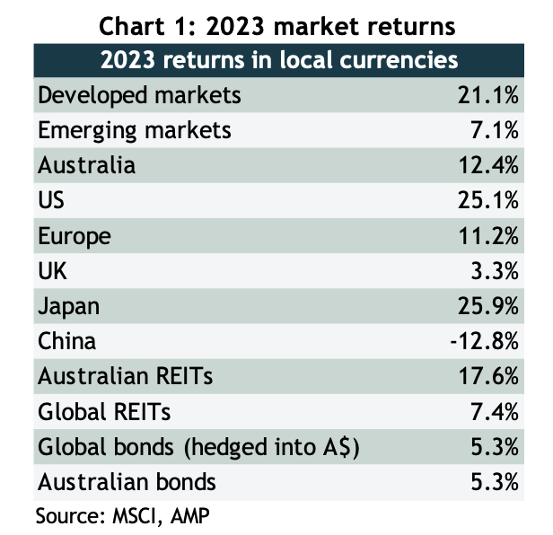
2023 started off with all kinds of dire forecasts, there had never been such an overwhelming consensus that the US economy would slump into recession and take share markets with it. But not only did the economy power through, so did share markets, and despite a choppy start to the year, they finished with a powerful rally that saw respectable returns across the board – see chart 1.

As well as a strong performance out of the US, Japan had a storming year on the back of solid earnings growth, finishing at the highest since its legendary boom of the 1980s, and Germany, where the economy continues to flirt with recession, is also trading at all-time highs, as is India.

Chart showing bond yields trended down, resulting in a 40-year bull market, which went into reverse in mid-2020

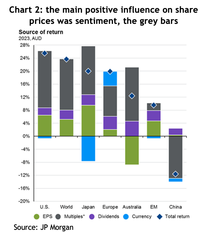
The story of last year was pretty much the mirror image of the previous year: 2022 saw markets fall because of negative sentiment, known as “PE compression”, whereas 2023 was largely about PE expansion, or positive sentiment. What that means is that theoretically share prices should go up (or down) by the same amount as earnings growth + dividends, and anything more or less than that is attributable to sentiment, that is, whether investors are feeling bullish or bearish, which is measured by changes in the price to earnings (PE) ratio that people are willing to pay. The grey bars in chart 2 show just how much of a contribution that positive change in sentiment added to returns in 2023.

Chart showing the Australian government bond, GSBG33, has experienced higher<br />
volatility than what many would associate with a defensive investment

It was all about inflation

The positive change in sentiment was all driven by changes in the outlook for inflation and interest rates, or more specifically, the market’s perception of whether central banks have finished increasing rates and, if so, when will they start cutting them?

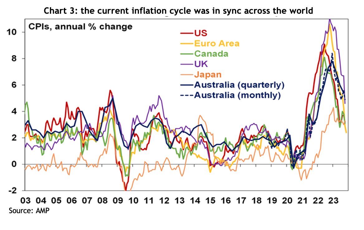
Inflation rates across the world have indeed fallen considerably, but how much of that is attributable to central banks increasing interest rates is unclear. It’s pretty conspicuous that, despite the variability in when and how different central banks responded, the cycle we’ve just experienced has played out similarly across the developed world: inflation rates started rising sharply in 2020, peaked for most countries around the middle of 2022, and have been falling at a pretty similar pace since – see chart 3.

Chart showing the Australian government bond, GSBG33, has experienced higher<br />
volatility than what many would associate with a defensive investment

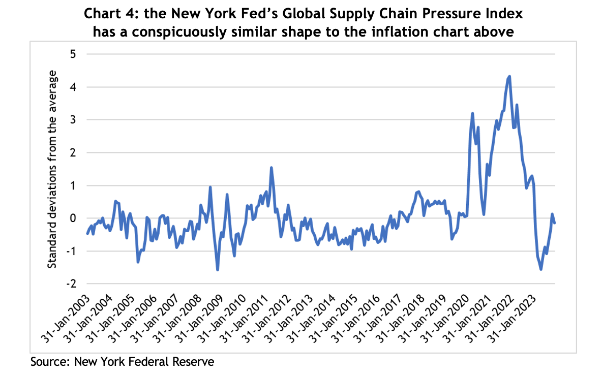
There’s a school of thought that disruptions to the supply chain were a significant contributor to inflationary pressures. The New York Federal Reserve Bank compiles an index that tracks pressure across global supply chains, see chart 4, and it traces a similar path to the inflation chart above. For a little context, the COVID-induced bottlenecks in the supply chain saw the index peak at almost 4.5 standard deviations above the average, which puts it so far out of the norm that the theoretical likelihood of it happening is close to zero. That kind of event is inevitably going to have serious consequences.

Chart showing the Australian government bond, GSBG33, has experienced higher<br />
volatility than what many would associate with a defensive investment

Likewise, raising interest rates aims to control inflation by reducing demand, but in the US, demand has remained very strong, indeed, GDP growth was 5.1% in the September quarter! So with demand going up, it’s hard to argue inflation coming down is because of higher interest rates.

Critically, in its last meeting for 2023, the US Federal Reserve acknowledged they think rates have peaked and the next move will be down. That lit a fire under financial markets, with both share and bond prices jumping, and kicking off furious speculation as to when the first cuts will come and how deep they’ll be.

Here in Australia, speculation is rife as to whether the Reserve Bank has also finished with rate rises, with some economists forecasting rate cuts before the end of 2024.

Lessons from 2023

As always, there are lessons to be learned (and perhaps relearned) from what happened in financial markets last year.

Macroeconomic forecasting is really hard (if not useless): at the end of 2022, there had never been such an overwhelming consensus among economic forecasters, and central bankers, that economies across the developed world were headed for recession. Forecasts for inflation were uniformly high, and for GDP growth, uniformly low. They weren’t even close.

There were dark mutterings from economists and central bankers reaching for the orthodox textbooks that unemployment rates were way too low for inflation to fall, and our new RBA Governor, Michelle Bullock, suggested Australia would need a jobless rate of 4.5% to relieve inflationary pressures, or a lazy 140,000 workers losing their job. Yet inflation rates have come down and unemployment rates remain at multi-decade lows.

The takeaway: the US Fed has hundreds of PhD economists and still can’t guess where inflation, unemployment or GDP growth will be less than a year out, but they continue to dominate headlines. You’re better off ignoring them, and certainly don’t let them influence your financial decisions.

It’s also worth bearing in mind, given markets have rallied on speculation of rate cuts, for that to happen implies not only that central banks believe inflation is under control, but that economic growth is softening to the extent it needs a boost from lower interest costs. There’s no guarantee on that.

Geopolitics is noise: there has been no shortage of geopolitical headwinds for financial markets to negotiate over the past couple of years. The Russian invasion of Ukraine was supposed to crush economic growth because of higher commodity prices, tension between the US and China had the media in a froth, and then another war in the middle east threatens to escalate. Yet markets have gone onwards and upwards.

The fact is, while wars are tragic and terrible and sabre rattling might keep us up at night, markets will only suffer enduring effects if corporate earnings take a hit.

Market concentration is not necessarily a bad thing: by the middle of last year, the US market had risen about 20%, but it had come entirely from the top 10 stocks. Bearish commentators were warning that investors in the US market were taking bigger and bigger risks because the weighting of the top 10 companies in the S&P 500 had never been so high, hitting 32%. By the end of the year, those 10 stocks had risen 62%, while the bottom 490 had gone up by a far more pedestrian 8%.

Australian investors should have no concerns about market concentration, given the top 10 companies in the ASX 200 account for more than 46% of the index.

It’s entirely possible the top 10 companies in an index could underperform or even fall, but if the rest of the rest of the companies in the index perform strongly, it will generate a good return. If a portfolio was comprised of nothing but the top 10 companies, obviously the risks are different, but some simple diversification can address those problems.

Bonds can be just as volatile as shares: traditional portfolio construction includes an allocation to bonds based on the theory that they reduce portfolio volatility and can act as a counter-correlated airbag to share markets.

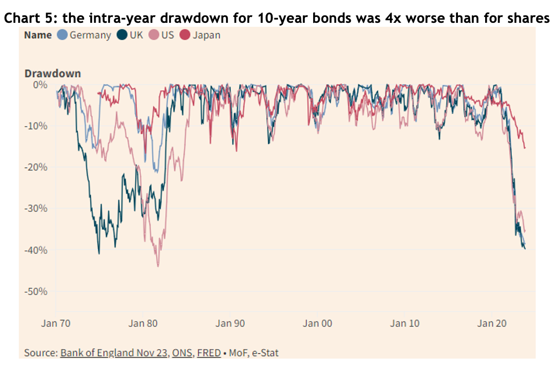
While 2023 was nowhere near as bad for bonds as the record losses of 2022, they were still far more volatile over the year than shares, indeed, as chart 5 shows, the intra-year drawdown for US, German and UK 10-year bonds was around 40%, more than four times the drawdown of the S&P 500 and ASX 200 at their worst.

Chart showing the Australian government bond, GSBG33, has experienced higher<br />
volatility than what many would associate with a defensive investment

The outlook for 2024

While there are still a few bears growling about potential recessions, most forecasts are for equity markets to rise in 2024, and it’s even easier to find bond market bulls (though a lot of them are bond fund managers, so you have to be wary).

Australia

Australian company earnings dropped by more than 8% in 2023, having gone up by 16% the year before. One of our asset allocation consultants, farrelly’s, estimates long-term trend earnings growth for Australian companies at 3% per year, so given the recent fluctuations, it’s hardly surprising the current forecast is for about 1.2% earnings growth for 2024.

Of course, Australian shares typically pay a generous dividend by international standards, of about 4.4%, add 1.2% to that and you’d get a 6.6% return, which compares to a 30-year average annual return of 9.2%. We could reach that higher number if the PE ratio continues to expand, or if earnings are better then forecast. Of course, for those who benefit from franking credits, you can add an extra 1.4% to those numbers.

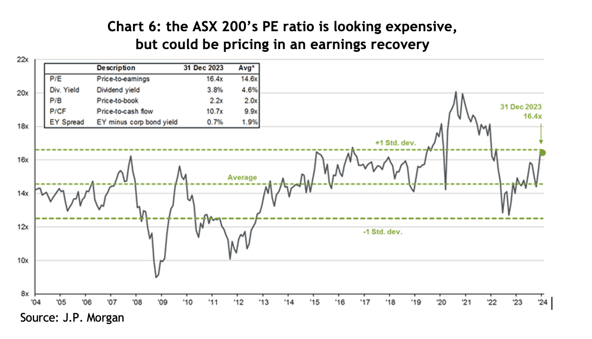
The ASX 200 finished 2023 on a forward PE ratio of 16.4x – see chart 6, which compares to a 20-year average of 14.6x. On that basis, it looks a little expensive, but it could simply be the market factoring in an earnings recovery.

Chart showing the Australian government bond, GSBG33, has experienced higher<br />
volatility than what many would associate with a defensive investment

United States

This is where things get really interesting. As noted above, in 2023 the US market was dominated by a handful of mega-cap tech companies, while the ‘bottom’ 490 stocks were pretty pedestrian by comparison.

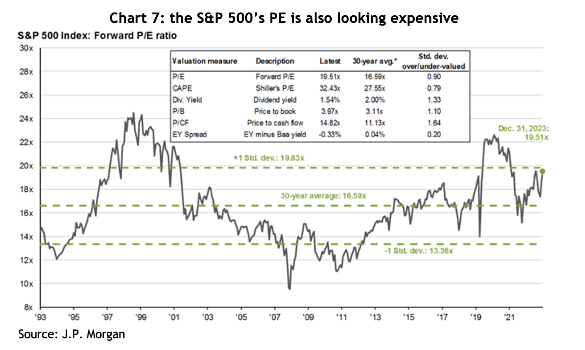
The S&P 500 finished 2023 on a PE ratio of 19.5x, a hefty 17% premium to the 30-year average of 16.6x – see chart 7. However, if you break that down, the top 10 companies were on a PE of 27x, while the rest were on 17x. In other words, the ‘rest’ of the market is not expensive by historical standards.

Chart showing the Australian government bond, GSBG33, has experienced higher<br />
volatility than what many would associate with a defensive investment

J.P. Morgan argues the market is not especially expensive given companies reported free cash flow margins 30% higher than they were only 10 years ago, with a lot of that growth coming from the big tech companies. US funds management group, GMO, also points out that US corporate profitability, as measured by return on sales, has averaged 7% since 1997, compared to 5% before that – that’s a whopping 40% higher.

For 2024, the average forecast for the US market across 20 different international financial groups is a gain of 10.2% – for what that’s worth (which isn’t much). Of more relevance, corporate earnings are forecast to grow by 11.5%, plus the S&P typically pays a dividend yield of around 1.5%, which comes to 13%, roughly in line with the last 15 years average return of 13.8%, but comfortably above the 30-year average of 10.1%.

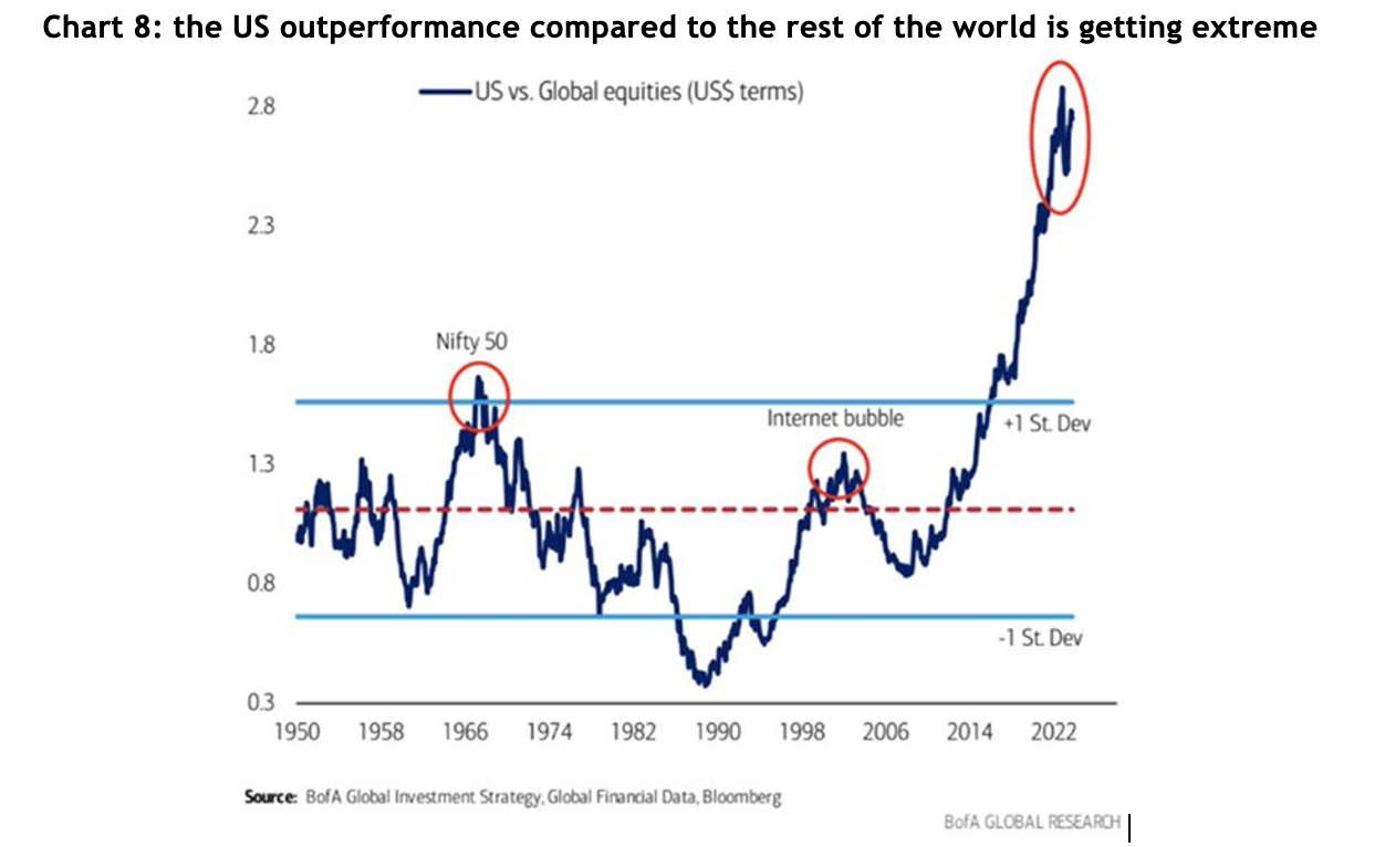
Something that plays on every asset allocator’s mind is chart 8 – which shows how extreme the US’s outperformance compared to the rest of the world has been since the GFC. Not surprisingly, most allocators look at that chart and immediately reduce the weighting to US shares. There are many explanations for the outperformance, not the least of which is that areas like Europe have been mired in an austerity mindset since 2009. There are, of course, two ways the gap could close: the US could fall heavily, or the rest of the world could make huge gains – or the trend could keep going. Unfortunately, there is no way of knowing.

Chart showing the Australian government bond, GSBG33, has experienced higher<br />
volatility than what many would associate with a defensive investment

Notably, in terms of valuations, the rest of the world (ex the US), is trading on a PE ratio of 12.9x, compared to a 20-year average of 13.1x, so fractionally on the cheap side. However, that’s a 34% discount to the US, which is the highest in at least 20 years.

Here are a few interesting observations, based on historical return for the US:

  • In late November last year, the S&P 500 made a new high since January 2022, i.e. it had been more than a year, and on the 14 previous occasions that’s happened, the market rose by an average of 14% over the following year and was positive 93% of those times
  • Since 1928, when the S&P has gone up by more than 20% in a calendar year, the average gain the following year was 11.4%, and it was positive 65% of the time
  • Since 1933, the fourth year of the presidential cycle has seen an average return of 6.7%, and is positive around 70% of the time
  • Deposits into money market funds last year were 13x more than what went into equities, taking total deposits to a record US$6 trillion, which on their own are expected to generate US$300 billion in interest income

Emerging markets

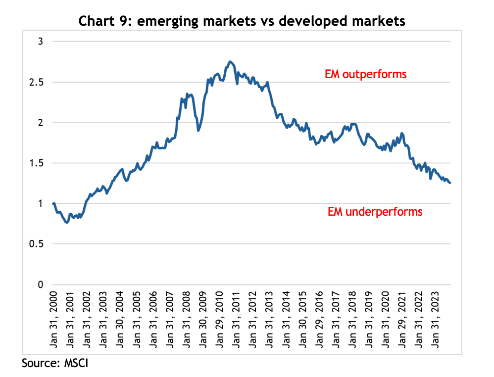
With a forward PE ratio of only 11.9x, the emerging markets look cheap compared to developed markets, however, that number is bang on the 25-year average and they’ve looked cheap for years and have underperformed the developed markets badly since the end of the GFC – see chart 9.

Chart showing the Australian government bond, GSBG33, has experienced higher<br />
volatility than what many would associate with a defensive investment

At a 26% weighting in the EM index, China is the 600-pound gorilla in the asset class, and it had a miserable 2023, falling almost 13%. Much of that is because the government refused to inject COVID stimulus at the household level, unlike western governments, forcing families to draw on their savings to get through extended lockdowns, and leaving consumers reluctant to spend once restrictions were lifted.

On top of that, the property sector, which was estimated to have contributed as much as 20% to GDP growth, is in disarray. The government has actively supported the rapid development of the electric vehicle industry, and now China makes more EVs than the rest of the world combined. It is possible that will be a strong new source of growth for the economy over the coming years.

By contrast, India, which is 17% of the index, is shooting the lights out, returning 20.3% in 2023 and hitting a new all-time high, and 15.8% per annum for the last three years. A combination of favourable demographics and a booming tech sector has proven to be a terrific tailwind.

Emerging markets returns tend to go in long cycles and appear to be linked to long-term trends in the US$, and trying to guess where currencies are going is even harder than share markets. The bottom line is that when an asset class is as cheap as EM is at the moment, it makes sense to have at least some weighting.

Real assets

Traditionally one of the more interest rate sensitive sectors, real assets, like property and infrastructure, have been beaten up badly over the course of the current interest rate cycle, but they turned sharply at the first hint that rates have peaked. In late October last year, the VanEck Global REIT ETF (REIT) was down by almost 40% from its peak, but then rallied more than 40% by the end of the year.

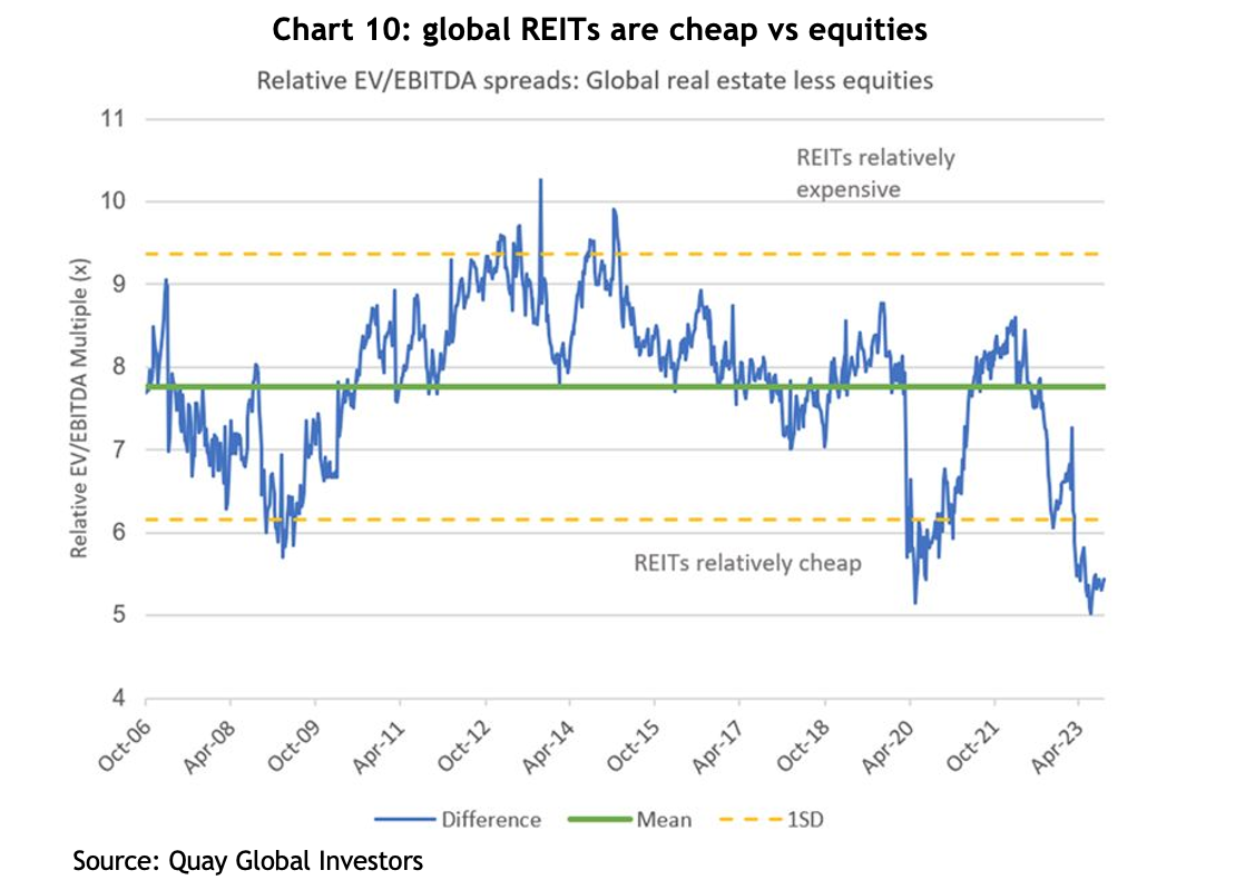
Chart 10 shows the relative earnings multiple that global REITs is trading on compared to equities puts them very much on the cheap side relative to the long-term average. The level of EBITDA hasn’t changed significantly, but the multiple it’s trading on has been derated to levels similar to the GFC and the COVID sell off, which is all sentiment-driven.

Chart showing the Australian government bond, GSBG33, has experienced higher<br />
volatility than what many would associate with a defensive investment
Small cap companies

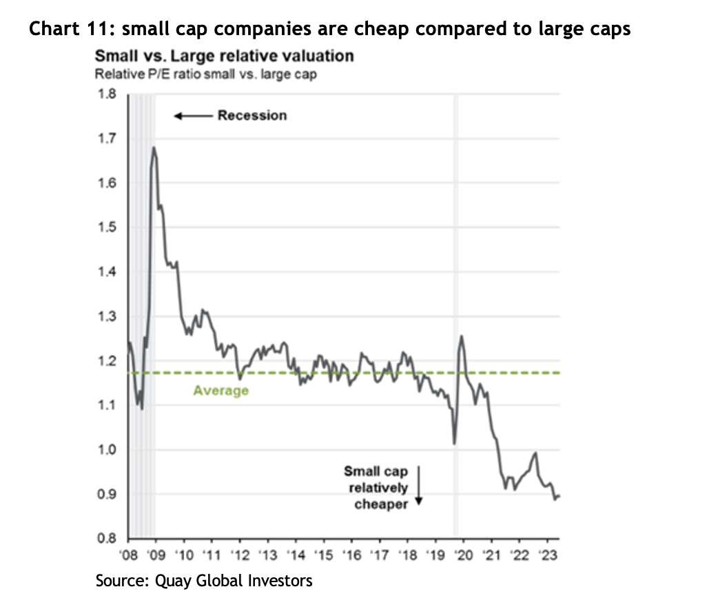
Small cap companies is another asset class that has been brutalised over the past couple of years, both in Australia and internationally, to the point where they are now trading at multi-decade lows relative to large caps – see chart 11.

Chart showing the Australian government bond, GSBG33, has experienced higher<br />
volatility than what many would associate with a defensive investment

Notably, the US small cap index, the Russell 2000, jumped 26% from its lows at the end of October. Once again, since the index’s inception in 1979, there have been 21 previous occasions where it has rallied more than 20% in 50 days, and the average increase one year later was 16.5%, and it has never been lower. That compares to the average 12 month return of 10.5%.

Again, given how relatively cheap small caps are, it makes sense to have at least some allocation.

Fixed income

One of most popular sayings in financial markets recently has been, “Bonds are back!” The argument is that investors are now receiving a yield to invest in government bonds, unlike a few years ago where yields were approaching zero and, in many cases, actually went negative!

The prospects for bonds depends entirely on what happens with interest rates and inflation. Being paid to hold them is a start, but bond prices can be quite volatile – as discussed above.

Private credit continues to grow its share of the commercial lending market in the US, Europe and Australia. We remain strong supporters of well managed private credit backed by strong levels of security and low LVRs, with returns comfortably above those offered by bonds and, typically, zero volatility in the underlying unit price.

Conclusion

Financial markets have a knack for surprising, and 2023 was a great example of that. The headwinds that caused mayhem a couple of years ago have dissipated, but whether they become the tailwinds the market is hoping for is yet to be seen.

After what turned out to be a year of good returns in 2023, there are sound fundamental arguments to support a positive view on share markets for 2024, and there are certainly asset classes and sub-sectors that look relatively cheap.