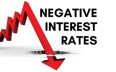
It’s one of the great mysteries of our time: how on earth can we have negative interest rates? Right now about 40% of global sovereign bonds are trading on a negative yield – you have to pay the government issuing the bond to look after your money. There are even some companies that are able to borrow at negative interest rates. It’s an entirely counter-intuitive situation.
I’ve read lots of articles commenting on how bizarre, if not absurd, the situation is but Tim Farrelly’s article below is the first to offer a rationale for negative interest rates.
Interest rates are low, naturally.
Economists have a concept of the natural rate of interest which was first developed by Swedish economist Knut Wicksell in 1898. Today the natural rate of interest is generally considered to be the rate of interest where employment is full but inflation is contained. If interest rates are below the natural rate, then economic activity picks up and unemployment falls until wage inflation breaks out. If the rate of interest is above the natural rate, economic activity slows and unemployment rises.
With this definition in mind, what can we make about the claim that interest rates are artificially low in Europe, the United States and here in Australia? Well, if we accept that artificially low means unnaturally low, then we should be seeing resurgent inflation, a rapid pickup in business activity and very low unemployment. In fact, we see none of these things.
The closest we get is in the US where unemployment is getting back to normal levels, inflation is contained and GDP growth remains slow. In fact, in the US you could make a good argument that interest rates are at their natural level, and, in Australia and Europe, rates are still too high.
Why the natural rate is so low is another story. High global debt levels and poor demographics are likely suspects. But regardless of the cause, it seems fanciful to argue that interest rates are unnaturally low.
They are what they are. We should get just used to them.
Every day you can read or hear someone talking about how volatility in the financial markets has taken off, or is just about to, and advising unsuspecting investors to buckle up for a bumpy ride. Volatility, which refers to how much a market rises and falls, is seen as one indicator of how risky a market is – the higher the volatility, the higher the risk. So just how volatile are markets these days compared with times gone by?
Morgan Housel of The Motley Fool wrote a great piece looking at this and the conclusions might surprise you. Here are the charts showing the daily, weekly, monthly and annual volatility of the S&P500 in the U.S. going back over each decade to the 1920s.
So what you may be surprised to find is that on all time periods, volatility over the past few years has been well below the average of close to the last 100 years:
Note the whopping difference of 33% and 42% respectively for the monthly and annual volatility.
There was also a terrific article by Ben Carlson recently looking at the volatility of GDP growth, again in the U.S. but it will be pretty indicative for many developed nations and very indicative in terms of financial market signals. We are constantly told the economy is in all kinds of danger and that the unprecedented monetary policy experiments will usher in economic Armageddon, and yet…
Once again, the volatility of GDP growth, even around the GFC, hasn’t been especially high, and over the last couple of years it’s been amongst the lowest on record.
There’s no end of commentators who connect volatility in the economy to volatility in financial markets, but as we’ve written before, and as the chart below shows, there is no correlation between the two.
The takeaway is that when markets bounce around, which they always do every year without fail, it can feel like a scary ride at the time, and the incessant media noise can make it feel worse. It’s when you take a step back and look at the evidence that the real story comes out.
It’s pretty easy to get your hands on financial market commentary these days, between newspapers, websites, podcasts, tip sheets, broker reports and even dedicated financial TV channels. The thing is most of them focus on the story of the day: they’re like a windsock showing which way the wind is blowing at the time. When it comes to explaining why global financial markets have corrected heavily in the past six months, so far they’ve attributed it to oil prices, Chinese growth, recession fears in the U.S., rising U.S. dollar, the falling Chinese renminbi, declining earnings, monetary policy excesses. So what is really driving markets?
Bear markets are usually attributable to some kind of catalyst, there is normally something pretty definite to point your finger at, but this time it’s not so clear. That’s not to say there’s no reason, it’s just more that it looks like there’s a bunch of them all working together. Let’s look at some candidates.
Some equities markets peaked around April/May last year:
But the S&P500 really fell out of bed in August 2015, having gone sideways for quite a while.
So what happened back then? Was it the oil price? Interestingly, around the time the Australian and U.K. markets started to fall oil was in the middle of an almost 50% rally, which peaked on 23 June. It then fell 40%, finishing that downward leg on 24 August. Also interestingly, the S&P500 fell 11% between 17-25 August – perhaps no coincidence?
Then again, oil had suffered a big tumble before that, falling 58% between June 2014 and January 2015, during which time the S&P500 went up 6%:
When oil finished that first (precipitous) leg down in January 2015 I don’t recall any talk of credit defaults or EM problems, so it’d be kind of surprising if that was behind the equities markets deciding to start tumbling.
Tellingly, the correlation between oil and equities has now spiked to almost 1, meaning the prices move up and down in lock step (-1 means they go in the exact opposite direction to one another):
Correlation between the S&P 500 and Brent crude Oil, monthly
But then two points: first, back in August the correlation was about 0.6, so why did the equities market start to fall? Secondly, does that number really tell us anything? I mean, isn’t it part chicken and egg (is oil following equities or the other way around?) and part ‘correlation doesn’t equal causation’?
Does U.S. GDP give us a hint? It peaked at 2.7% in the March quarter of last year and then started heading downwards:
Whilst that would be very convenient, a couple of points to remember: GDP data doesn’t get reported until the month after the period to which it refers, so the fact that the June quarter was lower than March wasn’t reported until 30 July. So the timing doesn’t account for non-U.S. markets and the S&P didn’t really start falling until two weeks later – why would there have been a delayed response? Also, believe it or not, the long-term correlation between GDP and the stock market is zero – they bear no relation to one another.
How about Earnings Per Share, after all, that’s what you’re buying at the end of the day. According to the chart nelow earnings started to drop off a good 12 months before the S&P500 started its nasty correction.
Was it Chinese growth? Admittedly Chinese economic statistics are probably not the most reliable, but for what it’s worth the GDP data didn’t look disastrous at the time; definitely a downward trend but no gapping down to cause such a big hissy fit surely:
Also, U.S. exports to China account for less than 1% of GDP. On that basis China’s manufacturing data barely affects the U.S.
Was it the rising U.S.$?
The U.S.$ started rising sharply around July 2014, a full year before the S&P500’s correction.
Now here’s a genuine looking culprit for triggering a selloff: the Chinese currency devaluation, the first leg of which took place on Monday 10 August 2015. The S&P’s correction started 17 August – a bit odd they waited a week if this was the catalyst, but it’s the closest thing so far.
So why would that be such a cause of concern for the S&P500? Frankly, I’ve no idea. According to JP Morgan however, the initial reaction to the August renminbi devaluation set off a string of stop losses, that is the market fell through a specific level that forced traders to sell even more and so setting off a chain reaction. They claim the end result was a whole lot more about that than China.
Final attempt: there has been a huge correction in credit markets. Hopefully you’ve been reading our blog articles which talked about this, but the commodities selloff sparked concern that a bunch of companies that had borrowed money either on the bond or loans markets would struggle to meet repayments. That of course increases the likelihood of default, which causes the spreads to blow out, i.e. the margin of safety demanded by lenders to those companies. This is also reflected in the Credit Default Spreads, which are like insurance policies that you can buy that pay out if a company defaults on a loan. The higher the price of the insurance, the more the market thinks the company is going to default. The chart below measures CDS costs in Australia, but the picture is the same offshore as well.
The problem is, once again the timing doesn’t really match up.
The bottom line then is that it’s really hard to find a single reason to hang your hat on as to why financial markets have been so weak over the past six months. It really does look like there’s a bunch of factors working together, and when there are so many moving parts, you’re never going to know when things have bottomed out.
Which brings me back to our standard response: we can’t tell you when markets will bottom (and neither can just about anybody else), but we can tell you if we think there’s value. Here are the most recent tipping point tables from our asset allocation consultant with current levels marked in and showing the projected 10 year annualised returns.
When markets are projected to return better than 10% p.a. compared with a risk free investment returning about 3%, it tells you there is value there.
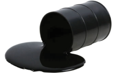
If you hear or read a market commentary these days it seems the oil price is constantly being quoted to explain day to day moves. Once again we seem to be in one of those strange, counter intuitive episodes where the markets are celebrating when the oil price goes up. So what’s going on?
Crunch
We’ve published the oil price chart (see below) many, many times, but it never fails to amaze.
Oil price over the last 5 years
The price collapsed by two thirds after the Saudis decided to put the squeeze on U.S. shale producers by not reducing their output.
The problems
One issue is that the oil exporting nations are suffering a real squeeze on revenues. For example, Saudi Arabia is now running a deficit of 15% of GDP. Nobody’s going to be weeping for them, but those producers are in a vicious circle: the price has fallen so their revenues go down, so they have to increase production to maintain revenues, which increases supply and makes the price fall, and so on. That’s putting pressure on sovereign credit ratings and government budgets and has forced some sovereign wealth funds to sell assets, like shares.
The other big issue is that there were a lot of energy-related companies that raised debt over the past seven years by either issuing corporate bonds or taking out loans. Clearly, those debts become harder and harder to service when the price of the company’s underlying commodity is falling. Consequently the markets are now worried we’re going to see a spike in defaults, so those loans and bonds are being dramatically repriced. You may have read about ‘spreads’ on high yield bonds rising, what that means is the gap between the cash rate and the interest rate people demand to compensate for the increasing risk of default is going up, so the gap, or spread, between the two rates is widening – see the chart below.
Why is the widening spread a problem?
Companies have been using the credit market (bonds and loans) to raise money to fund operations, capex or, in quite a few cases, to buy back their own shares. If the credit market tightens up, or even worse shuts down, there’s going to be a lot of companies that will struggle to get the finance they need to conduct business as they would like to. That would, of course, eventually be reflected in company profits. Share markets, as always, are trying to look in to the future and reflect what could happen.
Can’t they just borrow from the banks?
Whilst some banks have lent money to energy companies, by and large the sector has been trying to rebuild their balance sheets since the GFC, so they’re not particularly enthusiastic to lend. A couple of weeks ago some of the big U.S. banks announced increased bad debt provisions for energy company loans, so it’s very unlikely they’ll be taking more on right now.
What’s going to happen?
This is the classic situation where analyst forecasts will be fervently quoted in the media. Whilst some of them will sound very knowledgeable, at the end of the day they’re guessing, because nobody really knows what’s going to happen. What we can say is that both equity and high yield credit markets have corrected heavily and a lot of value has been restored. When banks are offering 2-3% interest rate, being able to get 9-10% from the right loans looks very attractive.
What are we doing with portfolios?
Fortunately we got rid of our exposure to the credit market and at risk debt midway through 2015. We have also spoken to the low risk debt fund managers we deal with and we’re satisfied they have very little, if any, exposure to the high yield sector. The correction across equity markets has also made forecast 10 year annualised returns look very attractive. While there is value returning to the credit markets, we are not hurrying to reinvest right now as we’d prefer to wait to see if the default rates do in fact creep up.
There’s nothing like a bit of long-term perspective to put things into context. The chart below is the IMF’s Commodities Index going back 23 years.
IMF Commodities Index
Source: IMF
The first thing we would point out is that we are not commodities experts, so these comments are from the standpoint of an interested observer. Mind you, the track record of experts’ forecasts in the commodities space beggars belief that they can still be called experts!
A first observation is that before China began to seriously ramp up its industrialization program (China boom Mk I), commodities prices traded in a fairly restricted range. The effects of China’s urbanization program on commodities demand were obviously profound: that’s going to happen when more than 20 million people move from the countryside into cities every year for more than 10 years and they have to be housed, have work places and be able to get to and from them. Just think about that: it’s the equivalent of having to build five Melbournes every year from scratch. One mind blowing estimate is that in the three years to 2013 China used 40% more cement than the US did in the entire 20thcentury, so you can presume the amount of steel and what have you wouldn’t be too different. In fact steel production in China this year was estimated at 823 million tonnes; between them, the US, Japan and Russia never got close to 200 million tonnes.
The second observation is that the period of growth after the GFC (marked above as China boom Mk II) was after the government launched an economic package equivalent to about 6% of GDP aimed almost entirely at investment. That would be the equivalent of Australia launching well over $100 billion worth of construction programs today. That boom in Chinese demand saw a huge increase in commodities production capacity across the world. For example, iron ore supply more than doubled between 2000-2014, an annualised growth rate of more than 6%. The problem is, that rate of increase in demand was never going to last for ever, despite all that talk of the commodities ‘super cycle’, and now overall global economic growth is about half of what that growth is supply has been. In other words, there was a massive structural shift in demand for commodities, supply responded thinking it was a permanent change, but it wasn’t and now we have an oversupply.
And as we’ve written many times before, the composition of China’s economic growth is changing: the government is engineering a deliberate shift toward consumer spending to drive growth rather than fixed asset investment. Moreover, this year marked the first time the number of people moving to the city from the country didn’t grow. All of that means a slowdown in the rate of growth of China’s commodities demand, just at a time when growth in the rest of the world is also very low.
Reversion to mean is one of the immutable laws of financial markets. It is possible that’s what we’re seeing in the commodities space: reversion to a time when commodities prices traded in a fairly restricted range.
Like this article? view more in our News & Learning blog