Is China the world’s biggest ever credit bubble?

Is China the world’s biggest ever credit bubble?

The entire world has benefited from the Chinese economic miracle and is praying it will continue. This article by US hedge fund Crescat Capital calls China the world’s biggest ever credit bubble, and argues, like all credit bubbles, it is bound to finish ugly, with serious knock on effects to those countries leveraged to Chinese growth – like Australia.

The China growth story is not likely a miracle of communist government central planning; it’s a massive credit bubble, almost certainly the largest ever. China’s impressive growth has come overwhelmingly and almost exclusively from unsustainable credit expansion combined with extensive, largely unprofitable domestic infrastructure expansion. In the last two decades, China has seen the largest construction boom in any country ever.”

It’s worth pointing out the article ‘talks Crescat’s book’, that is, their funds are positioned to profit if China falls over. Nevertheless, on an objective view some of the numbers they quote give pause for thought:

  • Much of China’s economic growth has been founded on an enormous expansion of credit, with household and corporate debt rising from 110% of GDP in 2009 to 210% today.
  • They argue there has been an enormous misallocation of capital to often unprofitable Fixed Asset Investment, that is, infrastructure projects, to prop up growth, starting at 23% of GDP in 2000 to 87% in 2016.
  • Much of that capital allocation has been in the form of loans to inefficient State Owed Enterprises (SOE’s).
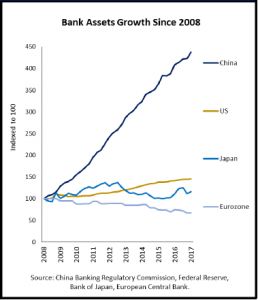
Is China the world’s biggest ever credit bubble_chart1
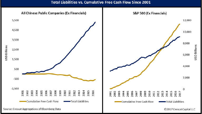
  • Between 2008 to 2017 the assets in China’s banking system (that is, loans made to customers that sit on their balance sheets), increased four-fold to US$35 trillion.
Is China the world’s biggest ever credit bubble_chart2
  • Based on banking assets as a proportion of GDP, China’s “banking bubble” is three times the size of the US’s just prior to the GFC.
  • Using what they consider to be conservative estimates, non-performing loans that have to be written off could be almost US$9 trillion. That would wipe out the Chinese banks’ capital base twice over, and government reserves are currently US$3 trillion. To recapitalize the banks through money printing would require the government to issue 37% of the total money supply.

As we’ve said in the past, China could carry on for years. But it pays to be vigilant.

12 months on from Brexit: the lesson for investors

12 months on from Brexit: the lesson for investors

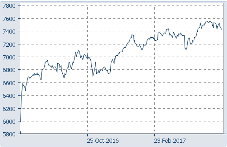
The UK’s stock market has risen 25% since Brexit

The UK’s stock market has risen 25% since Brexit

Twelve months ago, contrary to most expectations, the UK voted to leave the European Union. At the time it was generally described as a victory for populist politics and an economic disaster for the UK. The Financial Times wrote:

“The fall in sterling, the slide in stock markets and the freeze in investment are all indications that the short-term impact will be serious.”

 Likewise, The Economist newspaper forecast a slump in domestic demand would pull the UK into recession and the loss of hundreds of thousands of jobs would see a rise in unemployment. So far, they are both very wrong, and the whole episode has been a great lesson for investors.

GDP growth in the UK to the end of the March quarter 2017 was 2% per annum. Whilst it’s hardly knocking the ball out of the park, there are very few developed economies that are and it’s a long way from recession.

Meanwhile unemployment hit a 42 year low of 4.6% and at 2.9% inflation is at a level many central banks would kill for. Not that the financial markets appear to be worried by that given the 10 year bond yield is a smidge above 1%.

After very grim forecasts for the UK stock market, in fact the FTSE100 has risen more than 25% over the past year. Over that year the pound Sterling has done what floating currencies are supposed to: by falling from U.S.$1.34 in late June to U.S.$1.21 by early October it made the UK’s exports about 10% cheaper, underpinning an increase in exports by roughly the same amount. It’s now settled back at U.S.$1.27.

As an investor if your crystal ball had have been working and given you the heads up of the referendum result a week out, and you had sold everything in anticipation of what many of the main stream pundits had forecast, 12 months on you’d have been looking and feeling pretty dumb. Likewise with the U.S. election result.

Making those kinds of calls as an amateur investor is really hard. For the pros, they will typically hedge their positions and have stop-losses in place so they don’t get torched. The investing lesson is: there’s a lot of noise in financial markets that is best ignored and a well diversified portfolio really is one of the few free lunches in investing.

The UK government has now triggered Article 50 to exit from the EU and the really hard work has only just begun. Nobody knows what the future holds, and it usually pays not to try to guess.

Inflation to stay low. But how low?

Inflation to stay low. But how low?

This article was written by our asset allocation consultant, Tim Farrelly. Inflation is a critical determinant of the direction of interest rates and bond yields, which in turn affects how pretty much every asset is valued. If inflation goes up, so do bond yields, which drives down asset values. So it follows that one of the reasons both bonds and equities have done well over the past seven years is because inflation has been low, but how long will that last?

By Tim Farrelly

What drives inflation?

In 1970, Milton Friedman had the answer…

“Inflation is always and everywhere a monetary phenomenon in the sense that it is and can be produced only by a more rapid increase in the quantity of money than in output.”

– Milton Friedman 1970

But, by 1978, the answers didn’t seem quite so straightforward…

“Inflation is obviously a serious problem. What is the solution? I do not have all the answers. Nobody does. Perhaps there is no complete and adequate answer.”

– Jimmy Carter 1978

The historical record provides a lot of seemingly contradictory evidence as to what drives inflation. Soaring oil prices seemed to trigger the 1970s inflation episode but had little impact in the decade from 1998 to 2008 where the oil price increased by over 13 times and, yet, inflation averaged just 3% per annum.

Huge deficit spending was a key driver of the German hyperinflation in the early 1920s but seems to have had no impact on Japanese inflation over the past two decades.

More recently, Zimbabwean hyperinflation was associated with a rapid increase in the money supply but we have seen no impact on US or European inflation from the huge money supply growth over the past decade driven by Quantitative Easing.

At this point Jimmy Carter’s “It’s complicated” seems a better framework than that of Friedman. However, farrelly’s believes inflation is quite a bit simpler than Jimmy Carter believed. It would appear that there are three main causes of inflation that can act independently or in concert:

  • Excessive wages growth;
  • A shortage of goods and services; and/or
  • Currency debasement.

Excessive wages growth

In most developed economies, wages are the key to inflation because they make up some 60% to 70% of the cost base of the economy. Excessive wages growth causes the costs of producing goods and services to rise, and businesses are forced to pass on those increases as higher prices or go out of business. Those higher prices drive a high rate of CPI inflation which employees then demand is factored into subsequent wage increases, which in turn drives cost and price increases – and so on. Welcome to the wage-price spiral.

Wages growth is not excessive where productivity growth matches or exceeds wages growth. Then we don’t get the pressure on costs or the need for price increases and so the wage-price spiral is broken. This relationship between wages and productivity was not lost on either party to the Accord between the Hawke Labor government and the Trade Union movement in the 1980s. Linking pay increases to productivity increases played a significant part in bringing Australian inflation under control in the 1990s.

Excessive wages growth can be a result of demand and supply imbalances. If an economy grows too fast, a shortage of labour can result in rising wages as businesses bid up the price of scarce workers. Typically, this is when central banks raise interest rates to take heat out of the economy and the imbalances are corrected over time.

Excessive wages growth can also come about where well organised unions create an artificial shortage of labour leading to wage increases and a wage-price spiral. This is particularly an issue in a closed economy, where offshore outsourcing is difficult. Opening up an economy to global competition significantly weakens employees’ ability to command out-sized wage increases.

A shortage of goods and services

When goods are in short supply, their price goes up. If the shortage is structural, as in a war-torn or otherwise failed economy, then the price rises are likely to be permanent and a wage/price spiral can set in.

In most developed markets, for most goods and services, this simply has not been an issue for decades. Commodities are an exception as they continue to be subject to large medium-term fluctuations in demand and supply. Prices do fluctuate wildly as a result but these imbalances tend to correct over time.

To illustrate the potential for commodity prices to influence inflation, students of the 1970s point to the twin OPEC oil shocks as the catalyst for a prolonged period of high, world-wide inflation. Between 1972 and 1980, oil prices rose from US$1.85 to over US$40 per barrel – an increase of 2100%.

Many wonder why the 1250% increase in oil prices between 1998 and 2008 had so little effect by comparison. The answer is because the 1970s increase was much larger and impacted a much larger part of the economy.

Firstly, the 13 times increase in oil prices from 1998 was from the very bottom of the market to the very top of the market, but neither the peak nor trough prices lasted for long. If instead we compare the 12-month average prices, we find an increase of seven times between 1998 and 2008 – still substantial, but a lot less than the 22 times oil price increase during the 1970s.

The second difference is that the world has become a lot more efficient in its energy use since the 1970s. It is estimated that it now takes 60% less energy to produce a unit of GDP than it did in the early 70s.

Put the two together and we have a much lower impact on costs and prices.

With energy at around 12% of the world’s cost base in 1968, a 22 times increase would cause the cost base to increase by a total of 280%, or 17% per annum, over eight years – but only if the world continued to use energy as it did before the oil shock, which of course it did not. We became much more efficient. So much so that, by 1998, the cost base of energy was closer to 5% of the economy and the seven-fold increase over the subsequent 10 years resulted in upward pressure on costs of around 35% or 3% per annum. Very different. That higher efficiency partly explains why the CPI didn’t increase by at least 17% per annum and 3% per annum following these oil price increases. In addition, businesses were not able to pass on all the cost increases and, in the 1970s at least, profitability plummeted. Finally, the 1998-2008 commodity boom was driven by the entry of China on the world stage and the opening up of markets worldwide. The price of many manufactured goods plummeted, offsetting the increased costs of energy related inputs.

Commodity prices can still cause medium-term spikes in costs but, in a world awash with capacity, resulting inflationary pressures tend to be muted and temporary.

Currency debasement

This has definitely been a factor in many inflationary episodes. Essentially, this occurs where there is a substantial increase in the amount of money in circulation without a corresponding increase in the supply of goods and services.

Normally, currency debasement is associated with deficit spending by governments on transfer payments – payments for which the government gets little or nothing in return. Transfer payments include things such as unemployment benefits, healthcare payments, unfunded pension payments and, arguably, military spending.

However, currency debasement is not just about government spending and is not just about paper money. The Spanish Price Revolution in the 16th and 17th centuries occurred where gold and silver, the currency of the day, poured into the Spanish economy, predominantly from their New World conquests, Peru and Mexico. No new goods or services were produced and, as a result, the purchasing power of gold and silver fell substantially. The more gold that was plundered, the less it became worth.

When thinking about currency debasement, we need to be very careful about what we consider to be money. Most common definitions of money include cash in circulation, at call bank accounts and very short-term deposits. Unfortunately, these definitions can be very unhelpful when thinking about currency debasement.

When it comes to thinking about whether or not a currency is being debased, farrelly’s finds it useful to think about what is happening to balance sheets – and, in particular, what is happening to household net worth in nominal terms.

Take QE as an example. We all now know that QE has not been inflationary, but many are still confused as to why this has not been the case. Thinking about balance sheets really helps.

Consider an investor who owns $1 million worth of bonds and sells them to the Fed. The investor now has $1 million of cash and, in net terms, is no better off. The investor puts the cash on deposit with their bank who in turn gives it back to the Fed. The Fed now has an additional $1 million of assets, being its bonds and a matching liability, the $1 million it owes to the commercial bank. On day one, it too has no increase in net wealth. Finally, the commercial bank has an extra $1 million in assets, being its deposit with the Fed, and an additional $1 million of liabilities, the amount owed to the depositor. Again, on day one, the bank is no better off.

In nominal terms, no-one is any richer and so there is no debasement of the currency. In this case, government bonds should also be thought of as money – and narrow definitions of money that exclude bonds confuse rather than clarify the situation.

The role of floating exchange rates

Floating exchange rates have two major impacts on inflation. They can protect one economy from importing inflation from another country and, secondly, if large, exchange rate moves can impact costs and inflation in the home country.

In the days of fixed currencies, such as the 1970s, when one country experienced inflation, it exported it to its trading partners. In a floating exchange rate environment, when one country has high inflation, its currency falls in value with the result that its trading partners don’t feel the impact in terms of higher prices for their imported goods.

The recent Japanese experience illustrates both impacts. When Shinzo Abe was elected in Japan and promised higher inflation, the Yen fell by over 20% and importers of Japanese goods saw their prices fall by 20%. Even assuming that Abe is successful in getting inflation back to 2% per annum, it will take 10 years for importers to see their prices rise. For Japan, that rapid currency depreciation meant that the cost of imported goods rose substantially and, for a while at least, they did get a burst of inflation.

In this way, an exchange rate shock can generate an inflationary shock in the country experiencing that currency fall. Consider an economy for which imports make up 20% of GDP. A fall in the currency from $0.75 to $0.50 would have the impact of raising the cost of all those imports by 50%, for an overall increase in the nation’s cost base of 10%. This will almost certainly translate into an increase in prices, however perhaps not by the full 10%. Firstly, the impact often takes time. Importers often hedge their currency exposures and wear some of the increase by way of reduced profit margins. Further, there are substitution effects where local products takes the place of imports, or low cost substitutes are found for the same goods. Finally, manufacturers double their cost cutting efforts so as not to price themselves out of business. Nonetheless, there is a price impact and it can be significant.

The challenge is to ensure that the one-off shock does not become the catalyst for an ongoing wage-price spiral, which is where the central banks enter the picture.

The role of central banks

Most central banks today have an explicit inflation target – generally between 2% and 3% per annum. This is a relatively new phenomenon. Germany led the way in the 1970s when it successfully began using monetary policy to informally target inflation. In terms of adopting a formal inflation target, New Zealand led the world when, in 1989, the Reserve Bank of New Zealand became the first central bank in the world to adopt an explicit inflation target. The RBA followed suit in 1993.

One of the strengths of the inflation targeting approach is that it helps ward off the onset of a wage-price spiral following a one-off shock to prices such as a rapid currency depreciation or an external commodities price shock.

To date, central banks around the world have been extremely effective in using formal inflation targeting to bring inflation under control – some would argue too effective, but that is a discussion for another time.

When it all goes wrong – the Weimar Republic, 1919 – 1923

Excessive inflation is rarely a result of just one thing going wrong – like a plane crash, there needs to be a series of errors. To get to hyper-inflation, everything has to go wrong.

Germany in the early 1920s just about collected the full set. A combination of strong labour unions, large deficit spending, a complacent Central Bank and external shocks in the form of major currency devaluations all created a wage-price spiral financed by ever faster printing of money. The end result was that inflation went from 37% per annum in 1920, to 3000% per annum in 1922, to a total collapse of the currency and economy in 1923. But we are a long way from any of that today.

Where are we today?

Australian investors should be mainly interested in Australian inflation and NZ investors in NZ inflation. Domestic inflation will drive domestic interest rates and domestic real returns. It is also useful to keep an eye on the US, as monetary policy there clearly impacts markets worldwide.

Going forward, the inflation outlook in Australia, New Zealand and the US is relatively straightforward. We have minimal currency debasement and the prices of manufactured goods are generally continuing to fall as globalisation and technology drive down costs.

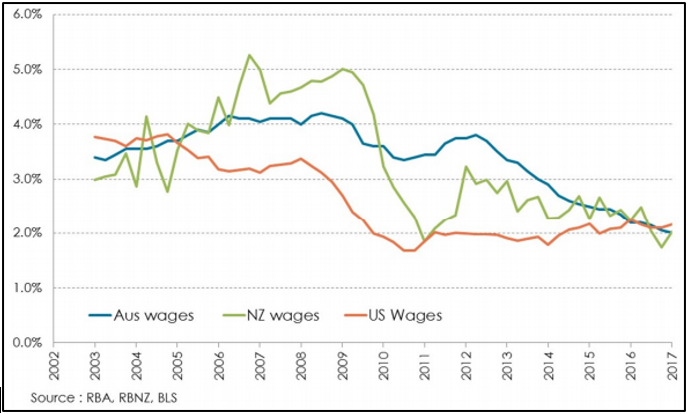
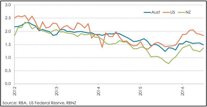
From today’s standpoint, wage inflation is the key to inflation – and it is falling. Figure 1 shows average two-year wage inflation in Australia, New Zealand and the US. We use the two-year change to take out some of the noise in the data and to show this very clear picture – wages growth is at historically very low levels in Australia and New Zealand and, in fact, in most of the developed world.


Figure 1 : Wages growth %pa (two-year average)

To see any pick-up in inflation, we will need to see faster wages growth or, perhaps, a sizable external shock. If added to complacent central banking, we could see a significant inflation surprise. But how likely is any of that?

Australian inflation outlook

Not only is wages growth low in Australia, it is falling. It seems the wage-price spiral is working in reverse – lower inflation means lower wages growth which means lower cost growth, lower price inflation, and so on.

In the near future, it is hard to see much change to this picture. The Australian economy has grown by 2.5% or less in each of the past four calendar years. This sub-par growth has largely been a result of the end of the construction phase of the resources boom where the winding down of capital expenditure has been a major headwind for the economy. Fortunately, the impact has been muted by the East Coast residential construction boom. However, as the impact of the mining capital expenditure slowdown finally starts to abate, it appears as if the residential construction boom will come to an end – another headwind for the economy.

The end result is that it looks like three of four more years of sub-par growth is in prospect for the Australian economy. In turn, that means stubbornly high unemployment and continued low real wages growth. Not much of an inflation stimulus here.

Potential for inflation shocks

The risks of high-impact one-off shocks seems low. Commodity prices are probably near their medium-term highs, so it is difficult to see much of an impact, particularly as the impact of commodity prices on general price levels is quite muted in any event.

A large, one-off fall in the Australian dollar could have an impact. As suggested earlier, a fall from US$0.75 to US$0.50, while unlikely, could potentially add around 10% to the cost base of the economy. In practice, as discussed earlier, the impact on inflation is likely to be a good deal lower. In all, such a fall would probably add 4% to 5% to prices, or around 1.5%per annum spread over two or three years.

A more likely currency scenario would be a fall to around US$0.65, which would add around 0.5% to inflation for a few years. This is not our central case, but it is one way that inflation could rise above the current level of around 1.5% to 2.0% per annum.

The RBA is anything but complacent

Our sense is that, despite all the downward pressure on inflation, the RBA would love to raise interest rates if only they could find an excuse. Currently, there appears no reason whatsoever to raise rates. However, it is very difficult to see the RBA waiting too long to respond to any increase in inflationary pressures. And, with record high household debt levels, it would not take too much by way of rate increases to dampen demand. There appears little prospect of a break out above the top of the RBA’s 2% to 3% per annum inflation range any time soon.

Australian inflation forecast of 2.1%pa for 2017-2027

Which brings us to our forecast going ahead, which at 2.1% per annum is slightly lower than the prior forecast of 2.25% per annum, largely as a result of a slower than expected return to more normal growth. Now, this is clearly out of step with the bond market which expects 1.5% per annum inflation over the next decade, as is shown in Figure 2.


Figure 2 : Bond market 10-year inflation expectation (%pa)

While the bond market has done a better job than farrelly’s in forecasting inflation over the past three years, a forecast of just 1.5% per annum for the next decade seems overly pessimistic. Sometime in the next three to four years, the Australian economy should return to something like normal growth and full employment. In that environment, a 2.5% inflation rate is a reasonable expectation, particularly if we see some catching up in wages growth after a number of years of very low growth.

Nonetheless, if this forecast is wrong, it will be too high.

New Zealand inflation prospects

These are not dissimilar to Australia. As we see in Figure 1, wages growth is very low and has been falling since 2012 – again, the wage-price spiral in reverse. With a stronger economy than Australia and falling unemployment levels, we would have expected better wage growth outcomes than seen.

For their part, the RBNZ has been very accommodative and have cut rates in an endeavour to get inflation rates back into their target range. This should be interpreted as the RBNZ being very serious about their mandate. Kiwis should be in no doubt about how quickly the RBNZ would move to raise rates if inflationary pressures surfaced.

Again, the bond market expectations are for very low inflation going ahead – less than 1.4% per annum for the next decade. And, again, farrelly’s expectation is that this will prove a little too pessimistic. Note from Figure 2 that, in the middle of 2016, the bond market forecast average inflation for the next decade as low as 0.7% per annum after just two years of annual CPI growth below 0.5% per annum. It was surely a case of what has been described elsewhere as premature extrapolation.

We will stick with our 2.0% per annum forecast for NZ inflation – that is, a little reflation compared to the last two years inflation at 1.2% per annum, but not much.

US inflation prospects and the Fed’s response

In the US, there are some – barely perceptible – signs of a pickup in wages growth as employment gets back to full levels. However, as can be seen in Figure 1, US wages growth has been very, very low at around 2% per annum since 2011 – much lower than in Australia or in New Zealand.

As the US employment market tightens, it should result in wages growth closer to 3% per annum or perhaps higher. However, between 2000 and 2008, wages growth in the US (and Australia for that matter) grew in the 3% to 4% per annum range without triggering an inflation break-out.

Nonetheless, we should expect somewhat higher inflation than the 1% per annum inflation that the US has experienced on average over the past four years. The big question is how the US Federal Reserve will respond to rising wages and inflation. To date, the response has been quite straightforward – they have raised interest rates. farrelly’s expectation is that they will continue to raise interest rates until conditions normalize somewhat. The critical issue is, how far?

Figure 3 shows the rate increases implied by the current shape of the US yield curve. It shows a very gentle increase, with cash rates not getting above 2.0% until 2021.

Inflation to stay low But how low_chart3

There is every chance that if the labour market tightens quickly in the US, the Fed will go more quickly than this. The catalyst would probably be wages growth above 3.0% or 3.5% per annum. All markets could be expected to respond to such a move.

So, it is all eyes on wages growth for the next few years.

Trump: some background to why he won

Trump: some background to why he won

Whether you like or loathe him, respect or dismiss him, below is a collection of facts about the US (sourced where available) that paints some of the background to the political upheaval behind the election of Donald Trump. Also following is an article by a legend of the financial industry, Jeremy Grantham, which also contains some wonderful and disturbing insights. If nothing else, it gives a flavor of why so many Americans voted in favor of disrupting the status quo.

Working Class Wages: according to the Pew Research Centre and the Bureau of Labor Statistics real average hourly wages in the US rose by a compounded average rate of 0.15% p.a. between 1964-2014, or from $19.18 in 2014 dollars in 1964 to $20.67 in 2014. By comparison, average real weekly wages in Australian rose at 1.2% p.a. between 1969-2016, that’s 8 times faster.

CEO Wages: according to a 2014 report by the Economic Policy Institute, in 1965 CEO pay averaged 20 times the average worker’s ($832,000 vs. $40,200), by 2014 it was 307 times ($16.316 million vs. $53,200). That’s a CAGR of 6.3% vs. 0.6% – more than 10 times the rate.

Wall Street Wages: the amount of money that was given out in bonuses only on Wall Street in 2015 was twice the amount all minimum-wage workers earned in America combined.

Inequality: according to the US National Bureau of Economic Research in 2012 the top 0.1% of the US population had as much wealth as the bottom 90%. In 2014 Credit Suisse estimated the average American adult had $301,000 of net wealth, placing them fourth in the world, but the median wealth was just $45,000, placing them 19th. By comparison Australia’s median wealth was estimated at $220,000.

Wealth Demographics: the median wealth of people under 35 has dropped 68% since 1984. The median wealth of older Americans has increased 42%.

Tax Rates: tax rates for the middle class have remained essentially unchanged since 1960 while tax rates on the highest earning Americans have fallen from 70% in 1981 to just under 40% today.

Poverty: according to the US’s National Centre for Children in Poverty 21% of America’s children are living in poverty (less than $24,000 household income p.a.). This places 27th out of 31 wealthy OECD nations.

Incarceration: the US has the highest incarceration rate in the world with more than 2.3 million inmates, 40% higher per capita than the next highest, Cuba and Rwanda. A young, black male without a high school diploma has a 37% chance of being imprisoned.

Wars: Americans have been at war for twenty two out of the last twenty five years. The average American believes the associated pain and cost of these conflicts has created no tangible benefit for their country.

The Road to Trumpsville1: The Long, Long Mistreatment of the American Working Class

An extraordinary, large exit poll run by Reuters/Ipsos in which 45,000 people participated took place in the early evening on election day in the US. To say this was a detailed poll is an understatement. The spreadsheet for each question in small print runs the length of a generous dining room table, 11 feet! It will tell you how the American Hindu sample of 172 voted. The poll’s early results of 9,0002 inputs also revealed on the night before the election, when the bookies’ odds3 against Trump were 5 to 1, that the odds were wrong. The critical statement polled, in my opinion, was this: “America needs a strong leader to take the country back from the rich and powerful.”

From my perspective, the pushback against the rich and powerful for several decades has been very unexpectedly wimpy. “Occupy Wall Street” aside, the average voter had sat still for a series of major tax cuts for the higher tax brackets and on capital – capital gains and dividends. The lower-income workers had paid the cost of outsourcing and labor-saving technology but had received no material help, while corporations and corporate officers and owners were the beneficiaries. In fact, money spent on worker training and education declined relative to foreign competitors. This shows up clearly in declining educational standards where today the US global rank is, to be friendly, mediocre. Most scarily in this regard, the average Chinese 20-year-old now ranks 2 full years ahead of his American counterpart in math proficiency! So, all in all, we can say that global forces pushed wages down and politics pushed them deliberately lower. The combined result is shown in Exhibit 1: The share of GDP going to labor hit historical lows as recently as 2014 and the share going to corporate profits hit a simultaneous high. Similarly, Exhibit 2 shows that the share of all income going to the top 0.1% rose well beyond any previous record and approached 100% of all the recovery in total income since the lows of 2009!
Exhibit 1 and 2

The “rich and powerful” not only increased their share of income and capital at an unprecedented rate in recent decades, but they also increased their grip on politics through a rising tide of political spending, including lobbying and the new Super PACs, courtesy of the Supreme Court’s ruling in Citizens United. Even before this ruling, Princeton University Professors Gilens and Page had reported4 on the complete lack of influence that voter opinion had on the probabilities of any bill passing through Congress. If favored by the public the average 31% chance of passing rose to a dizzying 32%. If not favored, it fell to 30%, justifying the nickname given to the influence of the average citizen: “Gilens’ Flatline.” When favored by the richest 10%, bills passed at a 65% rate – there is inertia after all. But when opposed by the wealthier and supported by inertia, the passing rate was essentially nil. Those hoping that there is any life at all left in representative democracy have to hope that some critics of this work are right when they claim that the data is complicated to sort out and the conclusions may be overstated. Anecdotal evidence on such issues as the minimum wage and gun laws, though, suggests that majority opinion is, shall we say, easily offset. Scarily, Gilens’ work does not include the post Citizens United data on political spending that is shown in Exhibit 3. I could not resist throwing in political contributions from unions, which are often cited by right-wingers as somehow balancing the books. And once upon a time they did. But, as unions have been severely weakened by the same combination of global forces and politics previously described, political contributions from unions have become a rounding error, offsettable by a mere handful or less of billionaires.

Exhibit 3

The Citizens United ruling reminds me of what a good ally of the “rich and powerful” and corporatism the Supreme Court’s majority has recently been, particularly in its strange assumption that corporations are human and deserve the same constitutional protections as we humans. It turns out, though, that humans are quite often cooperative and altruistic for no apparent self-advantage. Corporations, tied as they are these days to the single-minded goal of profit maximizing, seem to be close to saying that altruism, or the common good, when it compromises profitability, is a dereliction of their duty. In a human this would be considered pathological. (I wonder what the Founding Fathers would really have thought of this odd idea of corporate humanity. Or the equally odd idea that unlimited spending by corporations on elections is the moral equivalent of free speech.)

It is data like this that has led me over the last 10 years to believe that this country does indeed need to be saved from “the rich and powerful”; to believe that corporate interests were coming to dominate the public good; to believe that when in conflict corporations would, perhaps under the usual career risk pressure we all know so well, choose short-term profit maximizing over the well-being of workers. Nowhere was this better demonstrated than in their dispensing with the jewel in the crown of the old social contract, the defined benefit plan. This was done on the stated grounds of unaffordability even as corporate profits hit unprecedented high levels of GDP. Pensions that guaranteed a share of final salary were always going to be expensive and in hindsight we should perhaps consider it remarkable that it was ever voluntarily done at all…a testimonial to the old days when labor, cities, and countries of origin were also considered to be stakeholders of corporations. Worse yet, when deciding between their grandchildren’s well-being in a climate-controlled world or maximizing profits in a climatedamaging world, so far at least, they have collectively chosen short-term profits. In fact, the erosion of democracy began in earnest in the mid 70s when Senator Lawton Chiles (D. Florida) began his successful crusade to shine light in the dark places of government. His “Government in the Sunshine” legislation opened the door to vastly more effective lobbying by those with the means to pay, because the spotlight his legislation cast on government work, such as Committee mark-ups of Congressional bills, enabled lobbyists to pay fully only for loyalty they could actually observe.

The data on rising inequality also led me to check what others had thought and written on this issue and made me realize that a self-destructive streak in capitalism had been well-noted in the past. A particular surprise to me was Schumpeter – he of “creative destruction fame” – who believed capitalism in its current form would eventually fail through overreaching, using its increasing power to dispense with regulations designed to protect the public good (that has a painful echo today doesn’t it?) until pushback FDR style (or Teddy Roosevelt style) results in a more controlled mix, which Schumpeter called socialism. There was also a suggestion in his work and that of Keynes that excessive corporate power would weaken the demand from ordinary workers and hence weaken the economy. This last point is also emphasized more recently by Mancur Olson, who argued that “Parochial cartels and lobbies tend to accumulate over time until they begin to sap a country’s vitality. A war or some other catastrophe sweeps away the choking undergrowth of pressure groups,” as The Economist rather eloquently summarized his thinking in his obituary of March 1998.

To promote a pushback against excessive corporatism (and elements of oligarchy) one needs first of all to recognize the problem. Given the rather apathetic response from what used to be called “the workers” to the last 30 years of relative slide, there appears to have been no such recognition. But then on the eve of the election I realized that the point had finally been made. For an astonishing 75% of those first 9,000 polled agreed that, yes, we did indeed need to be saved from the rich and powerful. From now on, in my opinion, we live in a different world from the one we grew up in. A world in which a degree of economic struggle between the financial elite, perhaps 10% but more likely 1%, and all the rest is finally recognized. The wimpy phase is probably over. The question now is which path will this struggle take? Will it be a broad societal effort through established political means to move things back to the 1950s to 1960s when a CEO’s pay was 40x his average employee’s pay and not today’s over 300x; when corporations never dreamt of leaving the US merely to save money; when investment banks set the standard (and a very high one) of ethical behavior? Or do we try to do it through the other historically well-used method, and a much more dangerous one – that of resorting to a “strong leader?” Strong leaders work out just fine if we end up with a Marcus Aurelius, the mostly benevolent and wisest of Roman Emperors. But when things go wrong, as they often do, we could more easily end up with Caligula.

As I read the poll on election night, “recapturing the country from the rich and powerful” seemed a long overdue cry from the broad public. The kick in the stomach, however, was the “strong leader” bit. On feeling that kick, a more dynamic betting man than I would have realized how wrong the 5 to 1 odds against Trump were and would have made a big wager on him. He not only would have scored higher on the “strong leader” bit than his rival, but despite his personal wealth, the words “rich and powerful” were much more closely aligned with “establishment” for candidate Clinton, almost a “Ms. Establishment 2016” in the minds of supporters and opponents alike.

I felt the pain from the “strong leader” bit because, like almost all in my age cohort, I am fanatically well-disposed to democracy. We were born, after all, at a time that overlapped the trio of nightmarish, strong leaders of the 1930s and 1940s, Hitler, Mussolini, and Stalin. But I believe this fanaticism has weakened in other age cohorts born less close to these three as they have receded steadily into history. A recent report5 captured this decline: Of those born, as I was, in the 1930s, fully 75% gave a 10 out of 10 for extreme support for democracy. But each younger cohort felt less enthusiastic: 62%, 57%, 50%, and 43% for each younger cohort by decade until by the time we get to those born in the 1970s, the 40-year-olds, extreme support is down to 32%! And this is not the worst of it. The same report listed those who were actually against democracy as a “bad” or “very bad” way to “run this country.” Shockingly, in the period from 1995 to 2011, the percent of each age group agreeing to that proposition doubled. From 5.5% to 12% for those over 65 rising to a frightening 24%, up from 12.5% for the 16- to 24-year-olds.

By this time some readers may be asking for a profile of the 74% of the final 45,000 who voted against the rich and powerful. Who are these people? Well, they are us. All of us. I have never heard of a vote so uniform: whether Republican 72% or Democrat 77%; Male 74% or Female 75%; White 75% or Black 74%; Rich 70% or Poor 79%; Christian 74% or Muslim 72%; Graduates 68% or not 76%; they all agreed. They have all had it with the rich and powerful. And as for me, I don’t blame them. I think capitalism has lost its way. And has badly diluted the value of democracy along the way. We can only hope it is very temporary.

Trump recognized this streak of strong opinion and played to it, clearly stating his intention to look after the forgotten workers. Clinton diffused her message as looking after almost everyone and, I suppose, that includes you workers – as it were. To move the dial in the right direction is very important: Measures of income equality are correlated positively with everything valuable in a cohesive society. Exhibit 4 shows nine of these clear correlations, for which the US shows poorly in all! How far away this is from the widely-held belief that the US is best or nearly best at everything that matters. The way to improve this situation, though, is fortunately straightforward: Increase taxes on capital and on the very rich, perhaps slowly over a number of years, and increase the effort on worker training and education. These actions will by no means be a total cure for long-term job displacement but they would be a great and necessary improvement.

Exhibit 4

The real challenge in promoting less inequality is to increase the share of GDP going to labor. Almost certainly, for any given increase in their share of GDP there must be a decline in the share going to corporate profits. How does the program of the new strong leader stack up on this one? He is surrounded by capitalists and billionaires who, to further advantage corporations and the super rich, are apparently prepared to wage war on the already sadly diminished regulations that defend ordinary people (and, yes, with no regulations corporations would make more money). The war would also include direct tax cuts for the rich and corporations, which would further increase the share of the pie going to corporations. This is a strategy that if successful in the long-run – despite its current market appeal – could not possibly be worse for the workers if he tried. Perhaps they, the workers, will feel betrayed as their share drops in order to further fatten corporations. Perhaps they will be bamboozled enough not to notice the betrayal. For bamboozlement of the working poor has become an art form in the last 30 years, with bamboozlement defined as an ability to persuade people to vote against their own economic interest for one reason or another. For example, 62% of voters do not like the sound of “death tax,” which in the form of estate tax is paid by only 1-2% of American families. An astonishing 35% of those earning less than $10,000 a year do not approve of increasing taxes on the rich. Does it get any richer than that? It has been called the Homer Simpson effect,6 whereby the poor voter reacts negatively to the idea of tax, which like death has little appeal, but does not get the point that a tax decrease for the rich has unpleasant implications for them. But, the gods willing, you probably can’t bamboozle enough of the people enough of the time. And the Reuters/Ipsos poll clearly shows that the worms have turned. The lack of class war or economic war in the US has always been a fiction, but it has been mostly hidden, and deliberately so, by the side so completely winning the undeclared war. Perhaps the 74% vote was indeed a public declaration that the war is now official.

Post Script

The Republican Administration seems to feel that it received a broad mandate and perhaps it did. But my guess is that this poll provides the real mandate that waits to be addressed. And it is a narrow, focused one: Save me, oh leaders, from the rich and powerful! It looks so far as if this point has been largely missed. If it has been, there will likely be powerful and sustained pushback from the poor and not yet quite powerless.

1 Located between Pottersville and Bedford Falls, NY.

2 With 9,000 inputs, the accuracy is already high at about +/-1%.

3 Lucinda Shen, “Here’s How Much You Could Have Won Betting on Trump’s Presidency,” Fortune, November 10, 2016.

4 Martin Gilens and Benjamin I. Page, “Testing Theories of American Politics: Elites, Interest Groups, and Average Citizens,” Perspectives on Politics, September 2014, Vol. 12/No. 3, Princeton University.

5 Roberto Stefan Foa and Yascha Mounk, “The Danger of Deconsolidation: The Democratic Disconnect,” Journal of Democracy, July 2016. https://www.journalofdemocracy.org/article/danger-deconsolidation-democratic-disconnect

6 Larry M. Bartels, “Homer Gets a Tax Cut: Inequality and Public Policy in the American Mind,” Perspectives on Politics, March 2005, Vol. 3/No. 1.

Steward Wealth market review September 2016

Steward Wealth market review September 2016

Monthly Roundup

table-sept


For once the month wasn’t all about the central banks, this time commodities and the banking sector were jostling for a bit of the spotlight.

A rude awakening

At one point during September America’s S&P500 index, which, by virtue of having 500 companies in it compared to the Dow’s 30, is far more representative of what’s going on in the broader U.S. economy, had experienced an unprecedented lack of volatility. For more than 40 days the index see-sawed in an amazingly tight band of just over 1%, which saw the volatility index, known as the VIX, trade down to 20 year lows. Market commentators were warning of complacency.

Then, as usual these days, a jolt of reality hit as concern over what the central banks are going to do with interest rates saw the markets fall 2.5% in a day and the VIX jumped more than 50% in a week. Worry took over from complacency, for a while.

The ‘VIX’ volatility index – back to running below long-term averages

vix


Will they, won’t they… they didn’t

The market’s favorite sport of trying to second-guess the U.S. Federal Reserve built to a crescendo with the September meeting of the Federal Open Markets Committee, the group that actually decides where interest rates should be. After much anticipation Governor Janet Yellen announced they had again decided not to raise rates because they want to see more evidence the economy is humming along strongly enough that a rate rise won’t cause it to stall.

With unemployment running at about 5% and wages growth finally showing signs of life, there were certainly some members of the FOMC that felt a rate rise was appropriate. Yellen made it pretty clear the Fed intends to raise rates at the December meeting, which means 2016 could turn out just the same as last year: finish the year with a single 0.25% rate rise having started out the year threatening three or four.

Then it was the bank of Japan’s turn. Having run the most aggressive quantitative easing program over the past five years, the BOJ signaled a change in direction: rather than just flood the market with liquidity they are instead going to target a particular level of bond yields. The negative camp immediately cried that this is proof the central banks are running out of ideas and the efficacy of QE is waning.

The BOJ insisted it’s as determined as ever to boost inflation and prop up growth – they still intend to spend about A$1tn a year buying bonds – but indicated they are simply trying to accommodate the banks and insurance companies that are having a tough time making any money with zero interest rates.

It all sounds a little like we’re still on the wrong side of the looking glass…

Why are interest rates so low?

That has been the subject of an endless stream of reports, blog articles and speeches. Thankfully there’s not enough space here to go into great depth, but suffice to say there’s a very good argument that rates are low right now because of good old fashioned market forces: there’s simply not a lot of demand for bank credit.

Interest rates are effectively the price of borrowing money, and like any product, if demand goes down but supply stays about the same (or even rises) then the price is going to fall.

There’s no shortage of commentators calling low or negative interest rates an ‘artificial environment created by central bank interference’. While that argument is intuitively appealing because we’ve seen central banks do some pretty extraordinary things over the past six or seven years, the fact is there is simply not a lot for demand for credit.

This is shown in the two charts below, the first being U.S. household debt to GDP and the second being private sector credit in the Euro area. Both have flattened right off, meaning the demand for money is low.

debt-to-gdp

private-credit


And companies aren’t borrowing as much because they’re not spending on new factories at the rate they used to and when they do they can issue bonds at lower rates than most CFO’s would have ever dreamt possible. In fact, during September, two European companies issued bonds at negative yields; that’s right, investors were paying the companies to take their money.

The San Francisco Federal Reserve published a paper arguing the ‘natural rate of interest’, that is the rate where you have optimal use of resources without pushing inflation up, is about 1% in the U.S. at the moment. Until people are ready to borrow heavily again, expect rates to stay low.

Jostling for the spotlight

A few years ago Saudi Arabia thought it would teach those pesky U.S. oil fracking companies a lesson and declared open season on oil production, which sent the price tumbling down (see, another example of markets at work). Instead of going out of business the frackers gritted their teeth, cut costs to the bone and toughed it out waiting for prices to rise, which they eventually did, a little.

Last week OPEC declared the first production cut in years and the markets responded like a scalded cat, with the oil price jumping 10% in a couple of days.

The NYMEX crude oil price

crude-oil


Before we get too excited and rush off to fill up the car before it’s too late, it’s worth remembering OPEC’s record of sticking to production cuts is pretty bad. Also, Iran has said it’s reluctant to cut production and Russia isn’t even in OPEC and, as always, strictly does what suits Russia. Lastly, and by no means least, the higher the oil price goes the more U.S. fracking will come back on line.

The other market focus for the month has been the global financial industry, well mainly the big international banks really, and, well, mainly Deutsche Bank, whose shares have sunk to an all time low.

Deutsche Bank shares – trading at an all time low

db


Deutsche’s problem stems from a belief that, unlike its U.S. and UK counterparts, it never properly rebuilt its capital position after the GFC. In other words, it doesn’t have enough equity capital to fall back on if something goes badly wrong, in which case it would either have to be bailed out by the German government (which is technically illegal under EU provisions), or it would have to raise capital on the stock market which could only happen at fire sale prices, or it goes to the same place in banking heaven as Lehmann Brothers.

Things haven’t been looking good for Deutsche for a few years and then it started 2016 by announcing its first loss since the GFC. Then last week the U.S. Department of Justice announced it’s seeking a lazy U.S.$14bn in fines form Deutsche relating to shenanigans back in the GFC. That fine is not much less than the bank’s entire market capitalization at the moment. Thus the concern.

Added to that was an announcement by the second largest German bank, Commerzbank, that it is going to sack 20% of its work force in an ongoing effort to rebuild its balance sheet. Not surprisingly there are dark mutterings that the German banking industry is structurally flawed and too fragmented. It doesn’t help that they were overly ambitious and expanded too quickly when times were good and now they face zero interest rates, a lack of credit demand and quieter markets.

The sour taste was made worse by revelations that the darling of the U.S. banking system, Wells Fargo, had been creating unnecessary and in some cases artificial accounts, all in an effort by its employees to hit business targets. Wells Fargo’s shares have dropped 18% this year and the European bank index is down 24%

Australia, 25 years and counting

Australia has clocked up a remarkable 25 years without a recession, having reported GDP growth of 0.5% for the second quarter and 3.3% for the year. But before we pat ourselves on the back too heartily, again the disappointing devil was in the detail. Growth in consumption spending, which is generally seen as the engine of growth in a modern, tertiary economy, halved quarter on quarter to a pretty measly 0.4%. The savior was government consumption spending, which rose 1.9% and government investment spending, which jumped 15.5%. While you’ll always take good news where you can get it, we can’t afford to be too sanguine.

Interestingly, in the post-reporting season wash up September saw a lot of the year’s best performing shares take a bit of a hammering. The so-called bond proxies, stocks that have a strong and steady yield, gave back a bit of the strong performance we’ve seen over the last few years. For example, Transurban, which has tripled in the last five years, dropped 13% from its peak.

Transurban – giving a bit back

tcl


Telstra dropped 11%, property trusts also fell, for example Shopping Centre Group was down 12%, and Sydney Airports, which has risen four-fold in the last five years, also slumped 13%. Over the same period, the resources stocks, which for ages couldn’t find a buyer, have become flavor of the month, with BHP rising 13% over the month and RIO 10%.