The 2020 recession, why this time is different.

The 2020 recession, why this time is different.

There are number of things that make the global economic recession of 2020 different to any other we’ve seen, and while you’d never wish to go through an experience like it, there are definitely some silver linings.

The government forced the economy into recession

This was the first time in living memory that governments deliberately threw economies into recession. If you close down all but a few sectors and tell workers to stay home, obviously economic activity is going to crash.

Previous recessions have been attributable to the business cycle: typically there is a speculative build up which causes an imbalance that eventually tips over, and the worst recessions are those fueled by debt.

The standout example of this is, of course, the GFC. Building activity reached frenziewd levels in the US because buyers were able to access debt way too easily. The adjustment process was long and painful because credit, which is the lifeblood of a modern economy, all but seized up.

This time there were no baddies

When a recession is caused by excess building in some part of the economy, there is normally going to be a culprit you can point to. It might be banks, or it might be investors, but there’s a group that cops the blame and derision for crashing the economy.

That’s when the philosophy of ‘moral hazard’ argues if the culprits just get bailed out there’s no lessons learned to stop the same thing from happening again. Politicians and the media will often argue the responsible group should somehow be punished, perhaps with tighter regulations or even criminal charges.

This time (ignoring arguments about how COVID started and who or what is responsible), there is no real culprit to punish.

No holds barred support program

Because the government was responsible for switching off the economy and there was no concern about moral hazard, both they and central banks were able to throw the proverbial kitchen sink at supporting the economy.

Central bankers learned valuable lessons from the GFC that they had to make sure credit could continue to flow. The range of measures undertaken was unlike anything we’d seen before, and while things were ugly for a short time, markets were once again reminded how powerful central banks can be.

Remarkably, US financial markets have clearly recovered strongly despite the Federal Reserve barely tapping a range of the programs they announced – see chart 1 below.


Chart 1: US financial markets have recovered despite many of the Fed’s announced measures barely being utilized
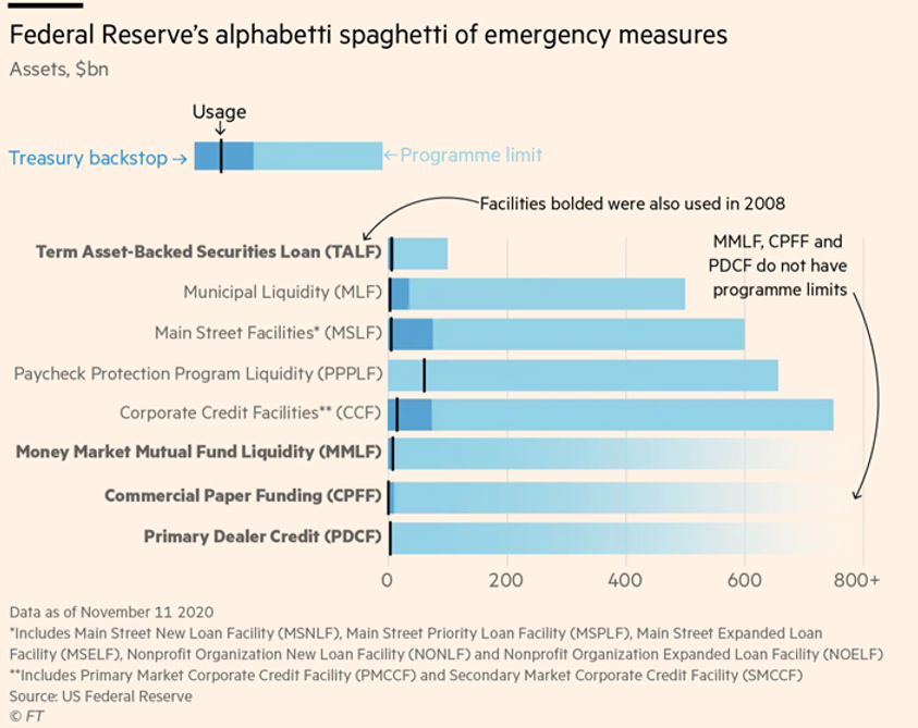
Chart 1

The Bazooka

By far the most important support measures were from governments. One after another, governments wre throwing massive amounts of newly created money into their economies. Programs like JobKeeper in Australia and its equivalents overseas were critical in supporting families that otherwise would have been in dire financial circumstances.

The critical part is that it was newly created money, which governments can do directly, but central banks can’t. The central bank programs can help create new money by encouraging people to borrow (loans also create money) but that was going to be tough when the media was full of stories about the global economy crashing.

This is the opposite to what happened after the GFC, where, especially in Europe, governments preached from the gospel of austerity. Spending cutbacks sucked money out of economies and saw them slow to a grinding crawl.

Economies are on fire

Some of the data showing how sharply economies are bouncing back is remarkable. Here in Australia, we’re seeing restaurant bookings up to 50-80% compared with the same time last year, new car sales leaped 12% from last year and Commonwealth Bank credit card sales were up 11%. They are huge numbers and it’s not just because lockdown restrictions were eased.

The Australian government’s COVID support programs amounted to 13% of GDP. It’s hard to overstate how massive that is. In the wake of the GFC, the Chinese government ‘rescued’ much of the developed world by announcing a spending package equivalent to 12% GDP (clearly the absolute amounts are hugely different, it’s the proportion that’s significant). The early withdrawal of superannuation adds anotehr 2% to that. The household savings ratio hit almost 20% in the June quarter, only a fraction less than the highest it’s been in the past 60 years.

That’s an awful lot of pent-up spending power.

The silver lining

Ever since the end of the GFC, central banks have pleaded with governments to raise fiscal spending to help increase economic growth. But most governments, including Australia’s, were obsessive about balancing budgets and instead were more intent on reducing spending (the obvious exception to that was $1.2 trillion Trump tax cuts, which helps explain why the US economy was doing so much better than most others).

It’s taken the unique circumstances of the pandemic to show the power of fiscal spending to drive economic activity: low income families suddenly had enough money to go to the dentist and get the car fixed, and the money they spent doing that got spent again and again.

If governments take the lessons on board, it’s possible it could be the first step toward abandoning the flawed dictums of neoliberalism and addressing the massive wealth inequalities that lie at the heart of so many other problems we face. That would be a great silver lining.

Want to take advantage of the expected economic growth?

Call Steward Wealth today on (03) 9975 7070 to learn how.

The Post-Pandemic Boom

The Post-Pandemic Boom

    2021 is shaping up to be a year of strong economic growth, and, right now, the indicators are looking good for financial markets as well.

Australia

    • The government response to the COVID shutdowns  was swift and big. In total, the federal government is spending $272 billion, equivalent to 14% of GDP, and the states $122 billion. All that newly created money has to go nowhere.
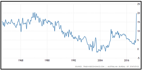
    • Early on, households saved a lot of the extra cash. The June quarter savings rate hit 19.8%, 8x higher than the year before and only 0.5% below the 60-year peak set in 1974. The Commonwealth Bank estimates households will have about $100 billion of savings, or 5% of GDP, that has been accrued between the start of COVID and December.
Image1
      • To that you can add $34 billion of super withdrawals so far, with Treasury estimating an eventual total of $44 billion.
      • After a record plunge to 76 in April, consumer confidence has now had 11 consecutive weekly gains to 108.
      • It now appears Australians are spending those gains. Commonwealth Bank reported credit card spending jumped 11% year on year in mid-November. Restaurants in New South Wales enjoyed seated dining numbers 55% higher than a year ago, while Queensland was a whopping 79% and even shellshocked Victoria was up 54%
      • Retailers have seen record spending in the Black Friday sales, prompting Gerry Harvey to say, “This is like the greatest boom I’ve ever seen in my lifetime”.

US

      • The US fiscal package injected 13% of GDP and pushed the personal savings rate to almost double what it was at the start of the year.
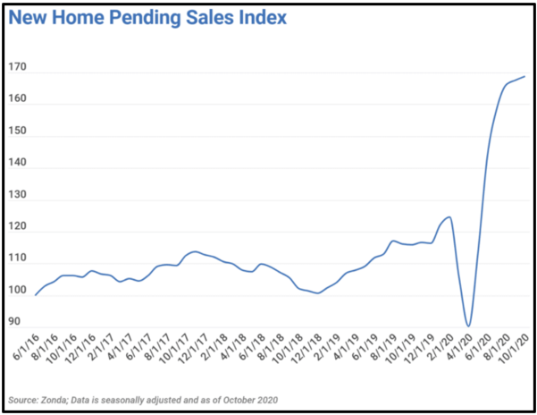
      • Low interest rates have ignited the US housing market, where prices are now 10% above the pre-GFC levels. Homeowners’ equity is at a record high and the increase in the pending sales index is parabolic.
Image2
      • More than 80% of stocks in the S&P 500 are trading above their 200-day moving average, a sign of positive market breadth that has only been seen twice in the past 20 years.
      • We are seeing 52-week highs in share markets across the world, from China, to Japan, to Europe, to Australia.
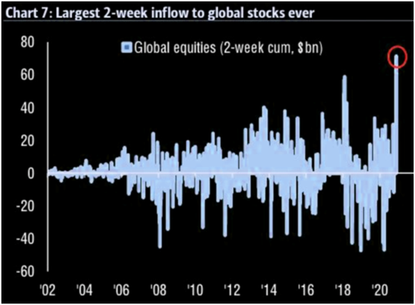
      • Global equities have seen a record inflow post the COVID vaccine announcements.
Image3

While the indicators are stacking up well, there are, of course, no guarantees that markets will play ball and they sure do have a way of wrong-footing us. However, it’s noteworthy that nothing in the economy was ‘broken’ going into the pandemic downturn; there was no particular sector on the cusp of being crushed by excessive debt and while valuations were not cheap, they were certainly defensible.

Now is not the time to be sitting on lots of cash.

A plain English guide to the financial market effects of the ‘Virus Crisis’

A plain English guide to the financial market effects of the ‘Virus Crisis’

With the inundation of COVID-19 news coverage we’re all having to live through, I thought I’d jot down a few thoughts on a bunch of different topics related to financial markets. Short and sweet(ish).

How does this bear market compare?

While every bear market’s different in terms of the cause, depth and duration, this one stands out because it’s a rare occasion where it started in the real economy and transmitted to the financial markets, rather than the other way around. You could argue the 1970’s OPEC-related slump was similar, but even there, the macro picture was very different with high inflation. That makes it harder to get a grasp of how things might play out and how effective the rescue measures from governments and central banks will be.

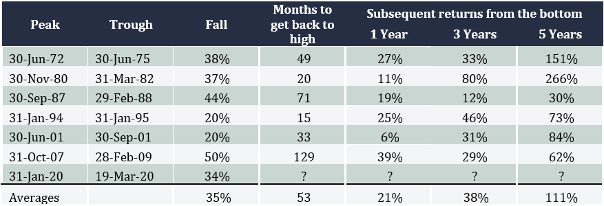
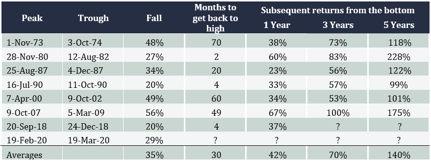
Over the last 50 years we’ve seen seven bear markets in Australia (that is, falls of more than 20%), including the current one, with an average decline of 35%. The US has also seen six with an average fall of 42%. The current ‘virus-crisis’ has seen our market drop 34% to the close on 19 March and 29% for the US.

One of the things that makes this different is because the crunch is coming from both the supply side and the demand side. When China shut down, those companies that rely on Chinese manufactured goods for their own business were struggling to fill the gap. And now that more and more of the world is going into quarantining and isolation, consumers aren’t spending. So the proverbial double-whammy.

Where are we up to with this one?

What level of economic slowdown is being priced in by share markets right now is tough to say with any accuracy.

Asset allocation consultant, Heuristic Investment Systems, reckons for the US, in an ‘average recession’ where GDP drops by 2%, a bear market tends to see the S&P 500 fall by 25-30%, and in a deeper recession, like the GFC, the average fall is 40-50%. On that basis, the markets are currently pricing in an average recession.

By contrast, the Bloomberg Chief Equity Strategist, Gina Martin Adams, says the S&P 500’s ‘trailing price to earnings (PE) ratio’, which refers to the earnings that were reported by companies over the past year, which at least has some certainty, is now about 15. Compared that to her ‘fair’ multiple, it implies a worse than average recession with earnings declining 22% over the next year.

What happens after bear markets?

The tables below show how far Australian and US share markets have fallen during each bear market over the past 50 years, how long they took to get back to where the index started, and then what returns were like 1, 3 and 5 years after.

For Australia, the average three year compounded annual return works out to be more than 11%, and in the US it’s an amazing 19%. Given it appears interest rates are likely to stay very low for a long time, that represents an attractive return, and is one of the arguments in favour of a sharp rebound in shares.

Australia bear markets since 1970: extent of falls and subsequent returns
A plain English guide to the financial market effects of the Virus Crisis image1
US bear markets since 1970: extent of falls and subsequent returns
A plain English guide to the financial market effects of the Virus Crisis image2

Why has this bear market been so volatile?

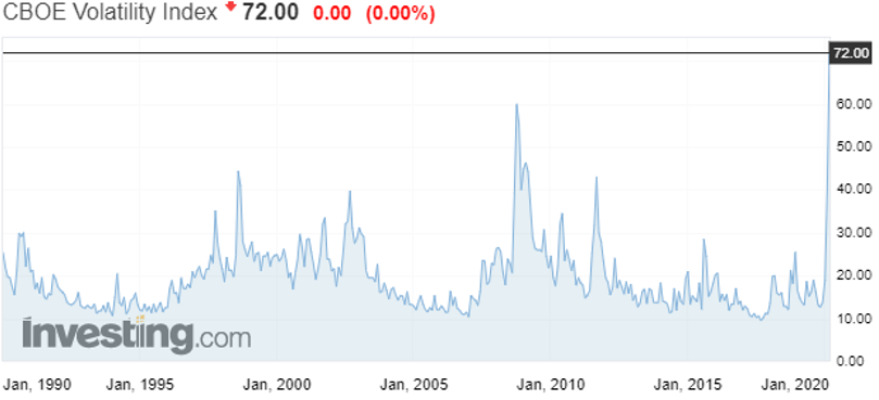
The VIX index in the US measures share market volatility, and the chart below shows it’s hit eye-popping levels in the past couple of weeks, every bit as stomach-churning as the GFC.

Share market volatility has spike to all-time highs
A plain English guide to the financial market effects of the Virus Crisis image3

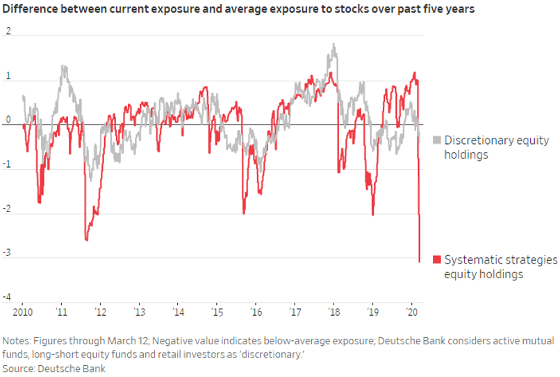
While it’s almost impossible to get definitive numbers, it appears much of the volatility is coming from so-called ‘systematic strategies’, essentially computer-driven funds that trade automatically depending on all kinds of different variables, like momentum or volatility or depending on what’s happening in other markets like bonds or commodities, and then there are the ‘high frequency trading’ funds that aim to jump in ahead of any trades at all. The chart below shows how sharply some funds have dumped their equity positions.

Computer-driven funds have been very active
A plain English guide to the financial market effects of the Virus Crisis image4

What’s happening in bond markets?

Bond markets have been every bit as crazy as share markets, but in a scarier way. Credit markets facilitate the flow of money around the financial system, with trillions of dollars’ worth of deals being done around the world on a day to day basis. It’s these markets that keep the banking system working properly.

Last week, however, the flow was getting choked off because companies were frantically trying to get their hands on cash. Large companies will typically arrange lines of credit with their banks that they can draw on when needed. If companies think there’s a risk they might need cash urgently, because, for example, their business has all but closed down during a quarantine, they’ll go to their bank and draw all that cash out. But there’s a limit to how much cash banks will have on hand, so when they started getting hit up by their customers, they had to go to the credit markets and try to raise cash by selling bonds. However, when everyone’s trying to raise cash at the same time, a market can quickly run out of buyers, so the risk premium they’re willing to trade at rockets (another way of saying the price they offer to buy at goes down), as shown in the chart below, and that’s how the financial flows were getting choked up.

Credit markets were running out of buyers, reflected by risk premia rocketing
(Chart is of the US High Yield Index Option-Adjusted Spread)
A plain English guide to the financial market effects of the Virus Crisis image5

Fortunately, the central banks were able to ride to the rescue and pump liquidity into the system to calm things down a bit, but we’ve seen similar huge jumps in what’s called ‘credit spreads’ across the whole credit market, right around the world, which is seeing a sharp repricing of corporate bonds.

What are central banks and governments doing?

In current markets, central banks and governments have quite different roles to play.

Central banks are focused on keeping credit markets operating, and between them they’ve promised to inject trillions of dollars to make sure that happens. That was a big part of the package of measures the Reserve Bank announced this week, which included cutting interest rates to 0.25% to reduce the cost of credit and basically saying the rate will stay there for as far as we can see, and it’s making some $90 billion of funding available to banks to lend out for which it will charge them only 0.25%. It also said it’s going to try to make sure the Australian 3 year bond trades at a yield of 0.25% and finally announced it’s going to join the quantitative easing brigade.

The US Fed has also cut rates to basically 0%, so has the Bank of England and the Reserve Bank of New Zealand. The ECB was already there (in fact their rates are negative) plus it said it will expand its balance sheet by €750 billion and allow qualifying banks to borrow up to €2 trillion at a rate of -0.75% – that’s right, they’ll pay banks to take the money from them!

There will be howls from free marketeers criticising the central banks for supporting asset prices, but that’s an unfair characterisation of what they’re doing, which is more like keeping the financial plumbing open to provide a bridge to governments’ fiscal spending.

And governments have certainly said they’ll spend. After years and years of central banks begging governments to open their wallets, we’ve seen what looks like massive programs being announced: $1.2 trillion in the US, £330 billion in the UK, €1 trillion from European governments to guarantee business loans, and, of course, what appears to be a relatively paltry $17 billion here in Australia. While they sound like huge numbers, rest assured, governments will need to do more if they want to backstop their economies.

This may finally be the time for governments and economists all over the world to wrap their heads around Modern Monetary Theory.

When will the market recover?

We’ve been fielding lots of inquiries from clients asking when they should buy but unfortunately there’s absolutely nobody on the planet that can give you a good answer to that question. What I think I can say is the market will start to recover once it believes the odds that we’re through the worst of it go to 50.1%, from 49.9%, but exactly how that can be judged I don’t know. It could be a slowdown in the rate of new cases, or even confirmation that current treatments are indeed working, or acceptance that governments will indeed spend enough to backstop economies.

Given the hopeless execution by the Trump administration in the US you’d have to think they have a long way to go, and here in Australia numbers are still doubling every 2-3 days.

A huge opportunity

One thing’s for certain, share markets are very cheap once again, and the further they go down the higher will be the returns on the other side. If you’re in the lucky position of being able to invest, don’t fall for just buying the most beaten up stocks, who knows, some of them may never recover. Similarly, if you already own shares, you should ask yourself if you’d buy the same ones now. Rather, my suggestion would be to think about the portfolio you wished you’d owned just before things went pear-shaped, and target that.

It’s impossible not to sound cliched, but these are genuinely extraordinary times, especially for Australia. Having endured a summer where it felt like the whole country was on fire, we now have a global pandemic wreaking economic havoc. I wish you all the best and stay safe.

Why ‘slowing growth’ does not have to mean ‘sell shares’

Why ‘slowing growth’ does not have to mean ‘sell shares’

n the face of it, it makes sense: the economy looks like it could slow down a bit, which would have to affect companies, so you figure you should lighten off your share exposure and go a little more defensive. Unfortunately though, it’s not that straight forward: it turns out stock market returns over the short-term have little, if any, relationship to the most popular measures of economic activity. Even if you’re convinced the economy is going to slow down, your portfolio could still go up.

How many times have you read the headlines that the stock market seems to defy logic by going up on bad news? Trying to pin down what drives the share market in the short-term, let alone get ahead of it in anticipation of good or bad economic news, turns out to be a great way to wrong-foot yourself and potentially lose money.

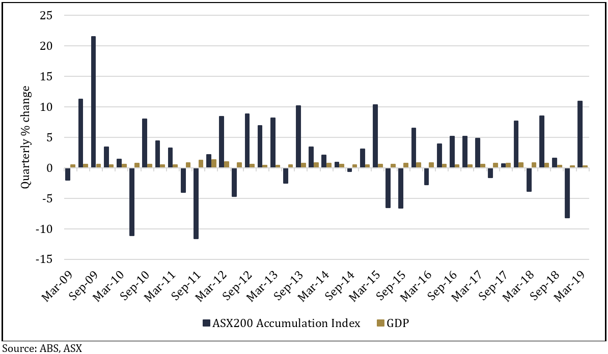
The chart below shows there’s no correlation between the quarterly changes in the ASX200 Accumulation Index (which includes dividends) and GDP figures over the last 10 years.


 Chart 1: Quarterly changes in the ASX20 Accumulation Index vs GDP
Chart 1: Quarterly changes in the ASX20 Accumulation Index vs GDP

There wasn’t a single quarter of negative GDP growth, but there were 13 negative quarters on the share market; the highest quarterly GDP growth figure was 1.3% and the lowest was 0.3%, whereas the highest return from the share market was 21.5% and the lowest was -11.6%. There isn’t even any discernible pattern from the direction of changes in GDP growth and the direction of the market.

There’s a bunch of reasons why the level of economic growth that’s reported might not resemble the returns seen out of the stock market. A major one is the stock market is not particularly representative of the overall economy, for example, financial companies account for 32% of the ASX200 but only 10% of GDP, and ‘materials’ (which includes mining) is 18% of the index but only 9% of GDP.

Another is that companies gear up their balance sheets with debt, meaning they can earn a higher return on their equity than they would get from just leaving it to the broader economy. For example, if a company has $100 of assets and earns $10 profit, that’s a return on equity of 10% (100/10), but if the assets are funded 50% by the company’s own equity and 50% by debt, then the $10 profit is a 20% return on equity (50/10).

That leverage finds its way down to the earnings per share a company reports, along with a host of other variables, which can the affect the biggest, and most unpredictable reason for the differences: sentiment. While the share market’s dividend yield and earnings tend to change relatively slowly over time, sentiment, which is reflected by the market’s price to earnings (or PE) ratio, can jump all over the place.

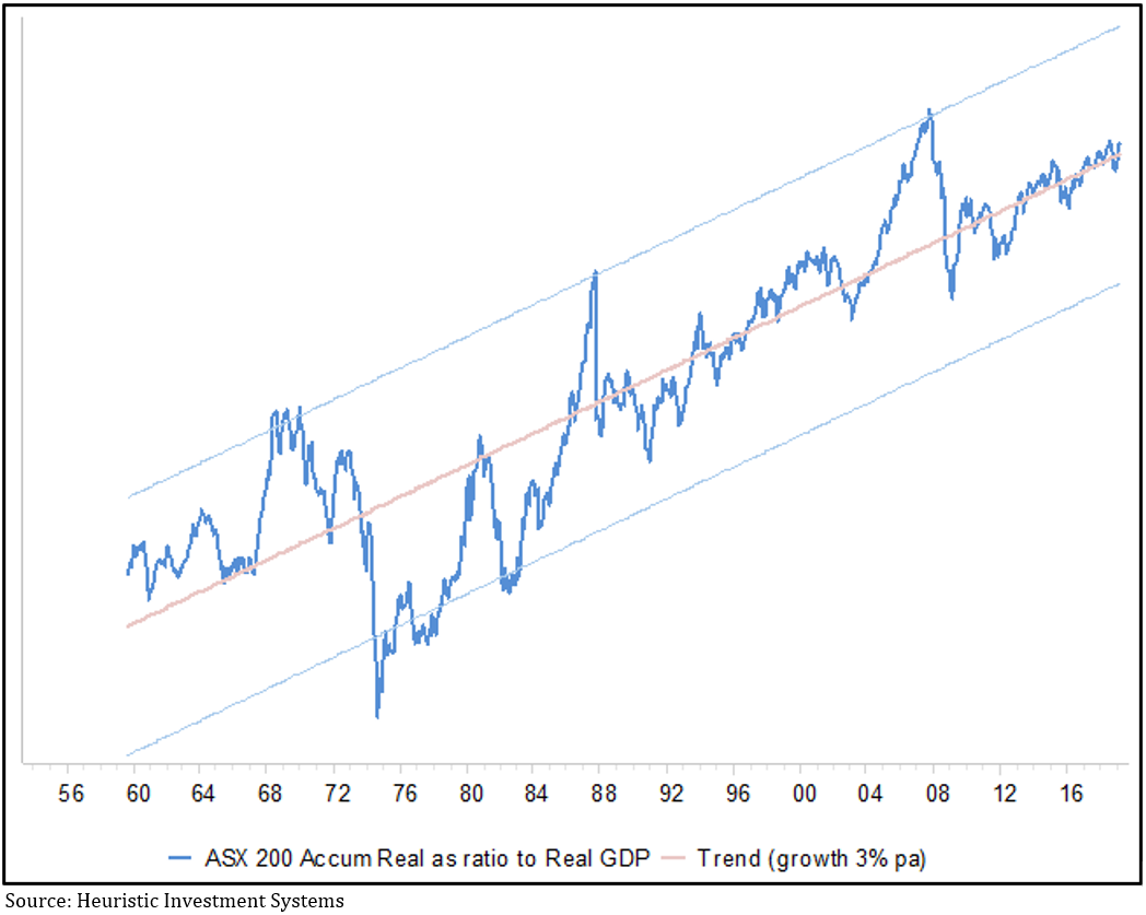
Don’t for a minute think economic growth is irrelevant for investors, in a healthy economy both trend upwards over time. However, chart 2, which shows the ratio of growth in the share market compared to GDP over the last 60 years, tells us the relationship never sits still: there are times when the share market can get way ahead of itself, only to inevitably fall back again and typically overshoot, before climbing back to the average.


 Chart 2: Ratio of real growth in the ASX200 Accumulation index vs Australian GDP
Chart 2: Ratio of real growth in the ASX200 Accumulation index vs Australian GDP

There are three interesting takeaways from this chart: first, like chart 1, it confirms the relationship between GDP growth and share market returns is very jumpy, so trying to predict it will be difficult; second, the post-GFC period has been notably stable, and third, to the extent the chart can be used to indicate when share market valuations get out of whack, it doesn’t look especially expensive right now.

There are other economic data that measure things like the change in industrial production, or inventories, or trade volumes – in fact the menu is enormous. Some fund managers dedicate enormous resources to using those data to make short-term forecasts of what the market will do, with PhD’s building complicated models, but very few of them are consistently reliable. That’s because the most important part of the puzzle is the least predictable: sentiment, which is a function of a countless number of people reacting to a countless number of factors.

An added risk of paying attention to economic activity is you invariably find yourself relying on economists, who, frankly, can be pretty patchy when it comes to making good forecasts. Last year the IMF released a study covering 63 countries between 1992-2014 which found 97% of economists failed to forecast a recession less than six months before it began. In 2015, 23 of the US’s leading economists published a letter in the Wall Street Journal warning the Fed’s quantitative easing program risked ‘debasing the currency and causing inflation’, four years later, the opposite is the case. And in January of this year, not one of the 69 economists surveyed by the Wall Street Journal correctly forecast the 10-year bond yield would go below 2.5% less than six months later.

There are two key lessons for investors: stop fretting about economic growth, because while it has a clear long-term relationship to share market returns, don’t be so sure you can second-guess how the share market will react to changing economic prospects in the short-term; and be wary putting too much faith in economic forecasts, especially when they’re about the future.

Just how worried should you be about the sharemarket?

Just how worried should you be about the sharemarket?

Have you noticed how many articles have appeared recently scaring investors into thinking “markets have never been so uncertain” as they rattle off the well-worn reasons we should be worried: geopolitical tensions, elections, stretched valuations, extended cycles, the inverted yield curve. If you didn’t know any better, it’s enough to leave you thinking the best solution would be to find shelter and stock up on tinned food.

But many of these articles tend to be absurdly one-sided, you just have to look a bit deeper to find sound arguments to justify where share markets are trading.

1. The bond market is smarter than the share market and bonds say sell

The bears argue: While last year’s share market tumble bottomed around Christmas, bond yields around the world continued to fall, signalling the bond market expects economic growth to slow in the future. What’s worse, share markets have rallied at the same time as forecast company earnings have been going down. How can that make sense?

It’s not just economic growth perceptions that cause bond yields to fall, it’s also the perception of inflation and the fall in global yields is partly a reflection of the ongoing very low inflation we’re seeing around the world and the expectation that it’s likely to continue. For example, over the last 30 years Australia’s core inflation rate has averaged 3.8%, but the latest reading was less than half that at 1.3%.

If you look back over the last hundred years, when inflation is low share markets attract a higher valuation, as measured by a basic price to earnings (PE) multiple. At the end of March, the ASX200 was trading on a PE of 15.6 versus its average ‘low inflation PE’ of 16.5. On that basis, while you wouldn’t argue the share market is exactly cheap, nor is it overly expensive.

Another valuation measure to look at, especially for income-seeking investors in a low interest rate environment, is the share market’s dividend yield minus the 10-year Australian government bond yield. At 2.9% the dividend yield is at its equal highest margin above the government bond yield in the last 25 years – see chart 1.

 Chart 1: the ASX200 dividend yield minus the Australian government
10-year bond yield is at an equal high for the last 25 years

1

More importantly, after accounting for inflation, at less than 0.5% the ‘real’ bond yield is getting perilously low, whereas the 3.4% real yield on shares is almost two and a half times its 25-year average of 1.4% and more than seven times higher than the real bond yield – see chart 2.

 Chart 2: the real yield on shares is more than seven times higher than the real bond yield

2


Another measure is the Earnings Yield of the share market, which is technically the inverse of the PE ratio and essentially tells you the return on equity you should get from investing in shares, a focus for those aiming to generate a capital return on their investments. At 6.4%, it’s bang in line with the 25-year average, another indicator that the market is around fair value, but nevertheless attractive in the context of a low return environment.

Finally, the Equity Risk Premium (ERP) for the Australian market, which tells you how much extra return you should get from investing in shares rather than risk-free government bonds, sat at 4.9% at the end of March, comfortably above its 21-year average.

If you say a market’s expensive, you have to say relative to what. In the context of super low bond yields and an environment where the risk-free return barely leaves you with anything after inflation, equities start to look pretty attractive even if underlying company earnings are a bit weaker.

2. The inverted yield curve

The bears argue: Over the last 50 years every recession in the US has been preceded by an ‘inverted yield curve’, which is where the yield on longer-term bonds is lower than that on shorter-term bonds. Last month the 10-year bond yield snuck below the three-month yield, and we all know when the US sneezes the world catches a cold.

No less an economist than Nobel Laureate Myron Scholes wrote a piece arguing that forecasting a recession will automatically follow an inverted yield curve is no more than ‘data mining’ (an expression used to condemn either lazy analysis or the torturing of data to arrive at a pre-determined outcome). He points out that previous inversions came about because the Fed raised cash rates to an average of more than 2% above inflation in a deliberate effort to slow the economy, whereas in this cycle of nine rate rises it’s never been more than 0.3% above inflation.

In other words, the bond yields themselves don’t cause a recession, it’s what causes the yields to move that matters. In the past, recessions have coincided with the Fed actively trying to slow the economy, whereas this time around, they’ve said they’re trying not to.

3. The cycle is extended

The bears argue: Come June this economic cycle will be the longest on record.

So what, cycles don’t die of old age. Period.

Cycles normally die because of some kind of excess in the economy, and it’s hard to spot any of those right now, or because the central banks have to stomp on the brakes, again, no sign of that.

4. Geopolitical tensions

The bears argue: Pick your poison: Brexit, Trump’s trade war, any other capricious Trump crusade, Russian hacking.

Political shenanigans is a perpetual favourite of share market doomsayers, but the fact is, over the past 10 years the markets have sailed through whatever’s been thrown at them.

The UK share market has risen 11% since the Brexit vote, unemployment is at a more than 40-year low of 3.9% and GDP growth is the same as Switzerland and much better than both of Germany and France.

Trade wars are horrible, but the US’s S&P500 is up 11% since tariffs were proposed in April last year and in fact just hit a record high, the Chinese index is up about 1% over the same period, and the ASX200 has hit a 12-year high and is closing in on its all-time high too. By no means are trade issues inconsequential, but neither is it turning into a disaster as yet.

The bottom line

There are always reasons to worry about markets, but one of the most disingenuous expressions is “it’s never been more uncertain”, because in truth, markets are never, ever certain.