Why banning short selling is a bad idea

Why banning short selling is a bad idea

The experience of a nasty share market sell off can be made even more stressful for an investor who learns their beloved shares are being short sold by rapacious hedge funds and gun slinger traders. Not surprisingly, with many share markets around the world enduring their worst start to a calendar year for decades, suggestions to ban short selling have resurfaced again.

But research shows such bans are not only ineffective at stopping share price declines, they can even be counterproductive.

Short selling is where an investor sells shares that they don’t yet own, so it’s essentially the reverse of normal share trading. The reason they would do that is because they believe the share price is going to fall, and the profit they stand to make is the difference between the selling price and the price they buy the shares back at. So, if a share is sold at $15 and bought back at $10, the profit is $5, or 33 per cent.

The practice of short selling is often seen as predatory, and the traders who do it as no better than vultures. At the height of the GFC, short selling was banned on various international stock exchanges, including the US, UK and Australia, in an effort to improve market confidence and reduce volatility. ASIC eventually limited the ban to short selling financial stocks.

Then in response to the sharp stock market falls in March 2020, at least seven countries banned short selling again.

However, a number of studies carried out after the GFC to analyse the effectiveness of banning short selling concluded it had little effect on prices but did reduce market efficiency. For example, in 2011 the Federal Reserve Bank of New York concluded that “banning short selling does not appear to prevent stock prices from falling”, but instead “lowered market liquidity and increased trading costs”. The European Systematic Risk Board reached similar conclusions.

The increased trading costs were attributed to the buy-sell spreads on shares widening, in other words, investors paid higher prices to buy or received lower prices when selling. Other studies have found that being able to readily short sell is associated with markets that are more technically capable and boast higher turnover, which is generally seen as a proxy for better ‘liquidity’, that is, the ease with which investors can trade.

Indeed, in an interview at the end of 2008, when the then chairman of the US Securities Exchange Commission was asked about the success of their short selling ban, he said “knowing what we know now, I believe on balance the commission would not do it again.”

In a sophisticated stock market like Australia’s, short selling plays a critical role for many funds that hedge their risk. For example, a ‘market neutral’ fund aims to drastically reduce the volatility of its returns by pairing long positions against short positions and ‘long-short’ funds will use short selling to either protect investors’ capital and/or increase returns.

Funds like these can produce terrific results for their investors, which include mums and dads and SMSFs. For example, one of Australia’s leading long-short funds has a record, over the long-term, of not participating in market falls but capturing all of the market rises.

Because the ASX reports short selling on a stock by stock basis, it doesn’t reflect that most short selling has a corresponding long position paired with it. For example, a fund might buy BHP and hedge the position by selling RIO, not because they think RIO will necessarily go down, but simply that it will underperform BHP.

As for predatory short selling, that is very difficult in Australia because all short positions have to be ‘covered’, meaning the seller has to borrow shares from an existing holder, which incurs costs. So the risk of a hedge fund attacking a small cap company is greatly reduced because borrowing shares in small companies is much harder and more expensive.

Share prices eventually always reflect fundamentals. Successful short selling requires skill, just like successful long investing does. If an investor has the skill to identify that a company’s share price doesn’t match its fundamentals, then it makes sense they should be able to profit from that knowledge. And modern share markets do smart investors a disservice if they ban it.

Have things changed for growth stocks?

Have things changed for growth stocks?

Amidst the carnage of one of the worst starts to a calendar year for share markets around the world, ‘growth stocks’ have taken a ferocious beating.

Growth stocks are those companies whose earnings are expected to be able to grow independently of the broader economy. The classic example is tech companies, where global reach of products and platforms can underwrite revenue and earnings growth even when economic growth is negligible.

The other broad grouping is ‘value stocks’, which are those whose earnings go up and down with the economic cycle.

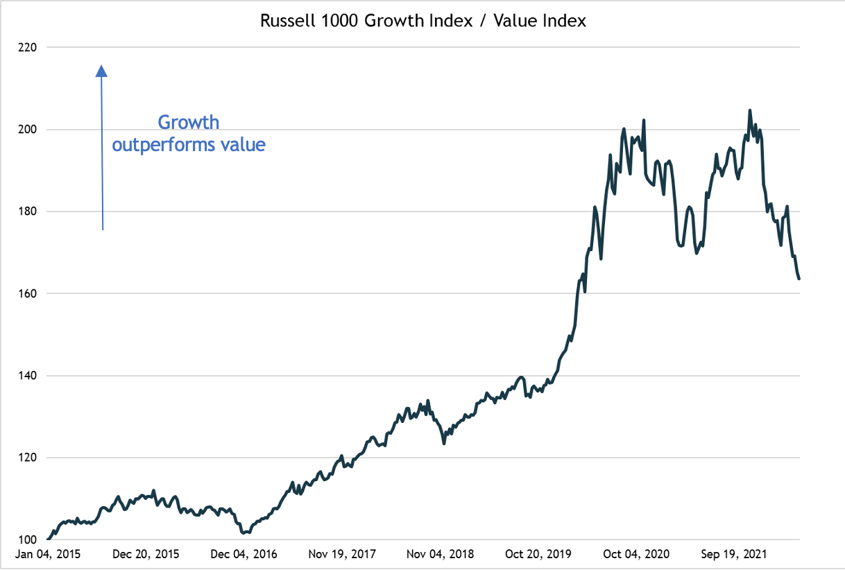
In the aftermath of the GFC, global growth rates were consistently low and growth stocks dominated share market returns to the point where value stocks experienced their worst ever period of relative underperformance. In the United States, the Russell 1000 growth index more than doubled the return of its value counterpart between the start of 2015 and November 2021.

However, since late 2021, that has sharply reversed with the growth index lagging the value index by around 40 per cent. Some of the highest profile growth stocks that peaked during the COVID lockdown period, such as Peloton and Shopify, fell by more than 90 per cent.

Russell 1000 Growth Index / Value Index

After the shakeout we’ve seen, any smart investor who is remotely contrarian will be sniffing potential bargains. However, before piling into heavily sold growth stocks it’s worth looking at some history and what made the growth stocks perform so strongly in the first place.

First, the history: growth stocks smashed value in the late 1990s until the bursting of the dotcom bubble, and then underperformed for more than a decade. So these cycles can go for a long time. Much depends on the macro factors at work.

And those macro factors, in particular what’s happening with inflation, help explain why growth did so well over the past 10 years. When inflation is declining it will normally mean that interest rates and bond yields are also going down. It is also well established that lower inflation helps to support higher PE (price to earnings) ratios, which is what happened through to late last year.

Also, lower bond yields will help support higher share price valuations. When analysts do a discounted cash flow (DCF) valuation on a company’s shares, they will typically base their discount rate on the 10-year bond yield (plus or minus a bit for risk). The lower the discount rate, the higher is the current value of future cash flows, meaning the higher is the price you’re prepared to pay for the shares today.

When inflation started rising sharply, those tailwinds reversed into mighty headwinds. The US 10-year bond yield shot up from lows of about 0.5 per cent to a recent peak of 3.2 per cent, radically transforming the valuation equation for growth stocks, which has been very clearly reflected in plunging share prices.

Over the past 10 years, every time the growth stocks suffered a setback they quickly bounced back, conditioning investors to buy the dip. What might be different this time is the outlook for inflation. If inflationary pressures persist, that will continue to be a headwind for growth stocks.

It’s frustrating to be told the arguments for inflation persisting are pretty equally stacked, but that’s the case. For example, the increase in globalisation that helped to reduce costs over the past 20 years may well be reversing as companies reassess the benefits of more robust supply chains. Also, the very low unemployment level in both the US and UK has seen wages growth settle at around double the pre-COVID level.

Similarly, if Europe follows through on reducing its reliance on Russian gas and oil, that could impact energy prices, plus resources could be diverted to building more renewable energy generation.

On the other hand, the more renewable energy capacity that gets built, the lower will energy costs be, reducing the cost of production. Plus, over the past 50 years betting against technology has not been wise and technologies such as AI and 5G could be transformative.

The upshot is nobody can be certain where inflation will be in a year or two, meaning nor can we be certain that growth stocks will bounce back like we’ve seen in the past. There are definitely bargains, and we may well see a bounce back from oversold levels, but for sustained performance, smart investors could be well advised to hedge their bets by retaining a balance between growth and value stocks.

Have share markets seen the bottom in this correction?

Have share markets seen the bottom in this correction?

Every share market correction throws up opportunities to pick up some bargains. And while those opportunities can make a significant difference to a portfolio, any investment will be tinged with trepidation that the correction isn’t yet over, and no sooner will the buy button be pressed than markets suffer another leg down.

Whilst there is absolutely nobody on the planet that can be certain, a very sound argument can be made that, on the balance of probabilities, it is likely we have seen the bottom in this current correction. That one sentence contains three caveats, which is to underline that no matter how sound the argument appears to be, it is no more than conjecture.

First, that call is much braver in relation to the US market than the Australian, which has benefited enormously from a relatively large weighting in commodity-related companies. Given the US’s influence on global financial markets, this argument focuses on the US.

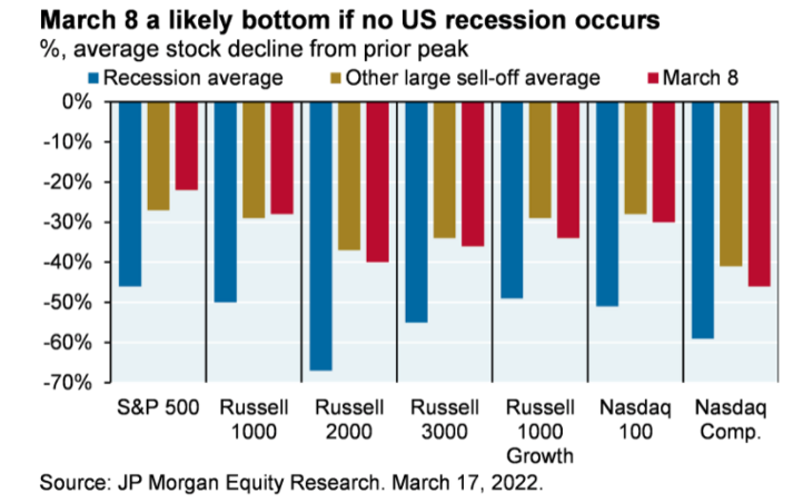
JP Morgan points out the average share price decline of US stocks to the recent low on 8 March is pretty comparable to past large corrections, as long as the economy doesn’t go into recession. For instance, the average share price decline in the S&P 500 was about 22 per cent (note, that’s different to the decline in the overall index, which was just under 14 per cent), compared to the average seen in previous large selloffs of 28 per cent. For the much broader Russell 3000 the average stock fell 36 per cent this time versus previous averages of 34 per cent, and for the NASDAQ it was 48 per cent this time versus 41 per cent previously.


Bar graph 1: % average stock decline from prior peak if no US recession occurs


The catch is if a recession occurs, the average share price decline for the S&P 500 is 46 per cent, for the Russell 3000 it’s 55 per cent and for the NASDAQ it’s 59 per cent. So the question is whether the US likely to recess?

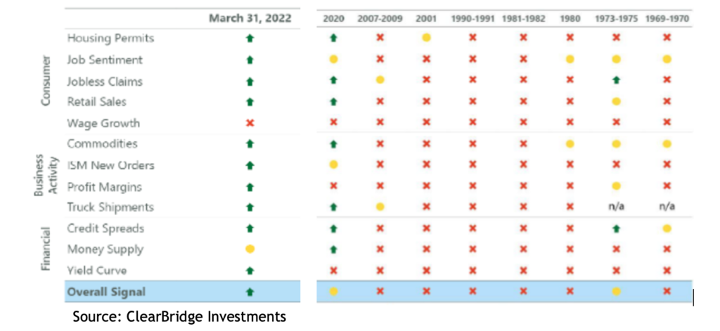
ClearBridge Investments publishes a Recession Risk Dashboard, comprised of 12 different variables that is updated monthly. At the end of March only one of those variables was flashing red, and one was yellow. Over the past eight recessions, the average was nine red indicators and one green.

Table 1: Recession Risk Dashboard

Source: ClearBridge Investments

But what about the much discussed ‘inverted US yield curve’, which is where the yield on a shorter dated government bond is higher than a longer dated one, indicating the bond market expects growth to slow between those periods, and the fact every US recession for the past 50 years has been preceded by such an inversion?

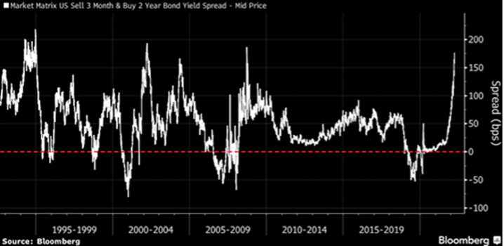
Critically, there are dozens of different US government bonds and a myriad of different yield curve relationships. The focus, and noise, has been on the 2-year/10-year bonds, where the gap was recently the lowest in 15 years. However, the most reliable recession indicator is the 3-month/10-year curve, where, at the same time, the gap was at its highest positive differential in 15 years.

Graph 1: Market Matrix US

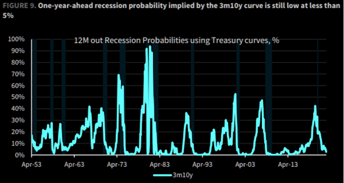
Bespoke Investment Research of the US points out that, based on historical data, the 3-month/10-year yield curve implies a less than 5 percent likelihood the US will be in recession in 12 months’ time.

Graph 2: 12M out Recession Probabilities using Treasury curves %

Source: Bespoke Investments

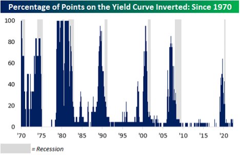
It also pointed out that currently about 5 per cent of the possible yield curves are inverted, whereas going back to the 1970s, it’s hit about 80 per cent prior to a recession. That is not to say a recession is impossible, but it seems unlikely.

Graph 3: % of points on the Yield Curve Inverted: Since 1970

Source: Bespoke Investments

In any case, for share prices to suffer the extra leg down, the economy needs to be either in, or on the cusp of, recession. Over the last five recessions (not including 2020, where the government pulled the plug on the economy) the average gap between the US yield curve first inverting and the economy recessing was 17 months, and while those recessions did coincide with significant declines in the S&P 500, the average gain between the yield curve inverting and the market starting to decline was a massive 43 per cent.

Not surprisingly, when Professors Eugene Fama and Kenneth French undertook a study of the predictive power of yield curve inversions they found there “is no evidence that inverted yield curves predict stocks will underperform Treasury bills for forecast periods of one, two, three, and five years.”

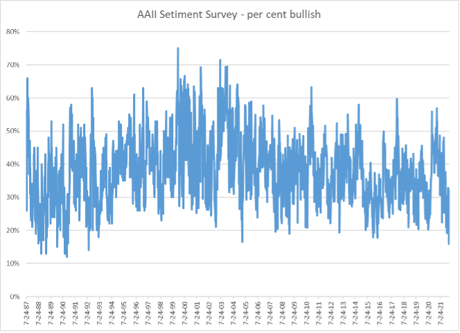
A final indicator is the AAII (American Association of Individual Investors) Sentiment Survey, which is based on a weekly poll of its more than two million members. The proportion of respondents who are bullish about the market outlook over the next six months fell to less than 16 per cent, which is one of its 10 lowest readings since inception in 1987, and the lowest level in almost 30 years.

Graph 4: AAII Setiment Survey - % bullish


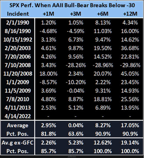
This is recognised as a strong contrarian indicator. US investment group, Jefferies, looked at the S&P 500’s performance after the ‘bull-bear spread’ (the bullish sentiment reading minus the bearish) dropped below -30 and found the average six-month return is 8.3 per cent and was positive 91 per cent of times (if you take out the GFC it was 12.6 and 100 per cent respectively).

Table 2: SPX Perf, When AAII Bull-Bear Breaks Below -30

The thing is, even if global share markets have seen the bottom for this correction, that doesn’t mean they will look the same as they did. For now at least, inflation has re-entered the investment equation and central banks are threatening multiple interest rate rises, which could see a change in the kind of companies that outperform. Smart Investors would do well to be mindful of the balance between ‘growth’ and ‘value’ stocks.

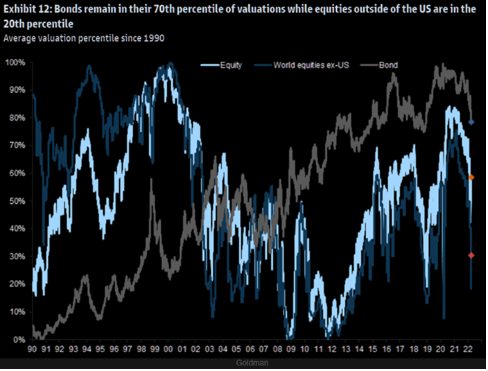
So where should you look for those bargains? Despite suffering their worst quarterly return in 40 years, bonds are still trading in the 70th centile of their historical valuations (i.e. they are expensive), whereas equity markets are around their 60th, and if you exclude the US, they’re in their 20th. So non-US equities appear to be cheap.

Graph 5: Average valuation percentile since 1990

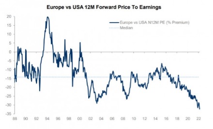
Indeed, if you use a very basic measure like the next 12 months’ price to earnings ratio (PE), Europe is as cheap as it’s ever been versus the US. 

Graph 6: Europe vs USA 12M Forward Price to Earnings

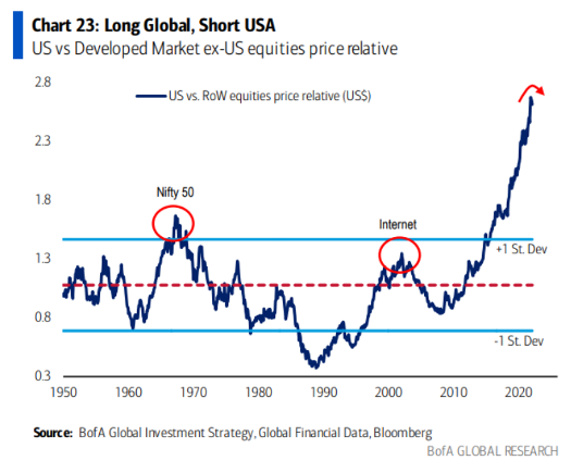
While technically the US still has much of the momentum, there’s an old saying in financial markets that ‘trees don’t grow to the sky’.

Graph 7: Long Global, Short USA

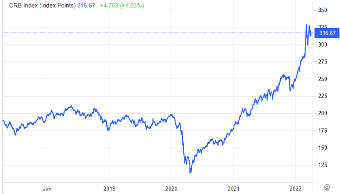
One area that is more value oriented is resources and commodities, which Australia obviously benefits from. The CRB (Commodity Research Bureau) Index, which covers a broad range of commodities, has risen 28 per cent year to date, and 62 per cent over the past 12 months.

Graph 8: CRB Index

The current correction, like all before them, is definitely throwing up some bargains. The most common risk investors face is waiting for clarity before investing. Financial markets always involve uncertainty, and by the time things are clearer, those bargains are likely to be long gone.

Why it’s not always worth trying to hedge against geopolitical risk

Why it’s not always worth trying to hedge against geopolitical risk

In times of geopolitical risk, it’s understandable that investors’ thoughts turn to what effects it will have on a carefully nurtured portfolio and whether there are ways to protect it.

That kind of protection is referred to as a “hedge” – ideally it will increase in value at times when markets are vulnerable to a fall in risk assets, such as equities.

There are many assets that can act as a hedge – for example, investing in real assets like property or art can provide a return that has no correlation to shares. However, not all portfolios are large enough to be able to diversify into expensive assets like these.

For more average-sized portfolios, the most commonly used hedges are those that trade on financial markets, such as gold, government bonds or the US dollar. All three can be accessed through ETFs that trade on the ASX.

However, there is no guarantee that what looks and sounds like a sensible hedging strategy will work. It can end up costing money.

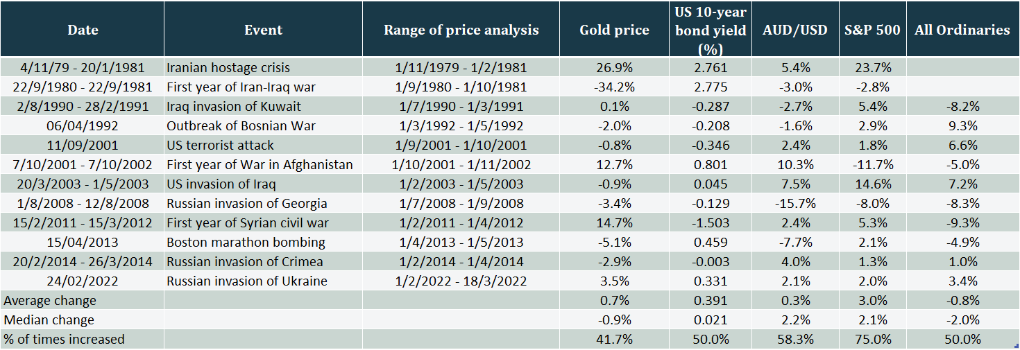
The accompanying table looks at 12 of the most significant geopolitical events over the past 40-odd years, including wars and acts of terrorism, and how these three popular hedges performed during each of them. One caveat, as with any investment, is that the price of the different hedges is influenced by a variety of factors that are impossible to anticipate, so it’s unlikely the prices were influenced solely by the associated geopolitical events.

Changes to asset valuations during war and terrorist attacks

Why its not always worth trying to hedge against geopolitical risk_table

Gold is often touted as a safe haven investment when risk assets are sold off. It is interesting to note the average change in the gold price during the 12 events was a rise of only 0.7 per cent. However, with a range of negative 34 per cent to positive 27 per cent, the median change of -0.9 per cent is probably more helpful. To underscore just how unpredictable buying a hedge can be, it went up only 42 per cent of the time.

The performance of US government bonds is also surprising, given the role bonds are often perceived to play as being negatively correlated to shares. The average change was an increase in yield, meaning the price of the bonds went down. And once again, it was an even bet as to which direction the price would go.

Buying US dollars was also a pretty even bet, for a very low average return.

When you analyse the level and likelihood of returns from those three popular hedges, one message is clear: it’s really difficult to pick where markets will go and the trading costs to jump in and out could eat up a significant portion of any benefit.

Perhaps unexpectedly, the best performing asset in the table was US shares, which rose by an average of 3 per cent and the odds of a rise were much better at 75 per cent.

In another analysis of the effects of geopolitical events on the US benchmark share index, the S&P 500, LPL Research considered 22 separate events going all the way back to the Japanese attack on Pearl Harbour in July 1941.

Across a variety of wars, assassinations and terrorist attacks, the average decline in US shares was 4.6 per cent. Incredibly, the average time it took to recover all the losses was only 43 days. In other words, share markets have demonstrated tremendous resilience over many decades of turmoil.

During geopolitical events, such as Russia’s invasion of Ukraine, it can be difficult not to be swept up in the inevitable noise of expert commentators and media coverage.

It can feel like you should be doing something with your portfolio, but that’s not necessarily the case.

Hindsight bias, which makes things look obvious in retrospect, can make hedges seem like a great idea. But the data suggests a portfolio that is diversified across different regions and asset classes is a strong alternative. Smart investors should always remember that, over the long term, financial markets have a history of taking geopolitical events in their stride.

4 new super contribution opportunities

4 new super contribution opportunities

For older Australians, it has been more difficult to build up their superannuation balances. Once you are 67 years of age, there is a requirement to meet a ‘work test’ in order to continue to contribute. This work test forced you to work 40 hours over 30 consecutive days in order for you to make a lump sum contribution (known as a non-concessional contribution) of up to $110,000.

With these restrictions, it was important to carefully plan your superannuation strategy from a younger age.

However, the Federal Government sought to amend these restrictions.

May 2021 Federal Budget

In the May 2021 Federal Budget, the government announced a number of initiatives to assist Australians in building up their superannuation.

These included:

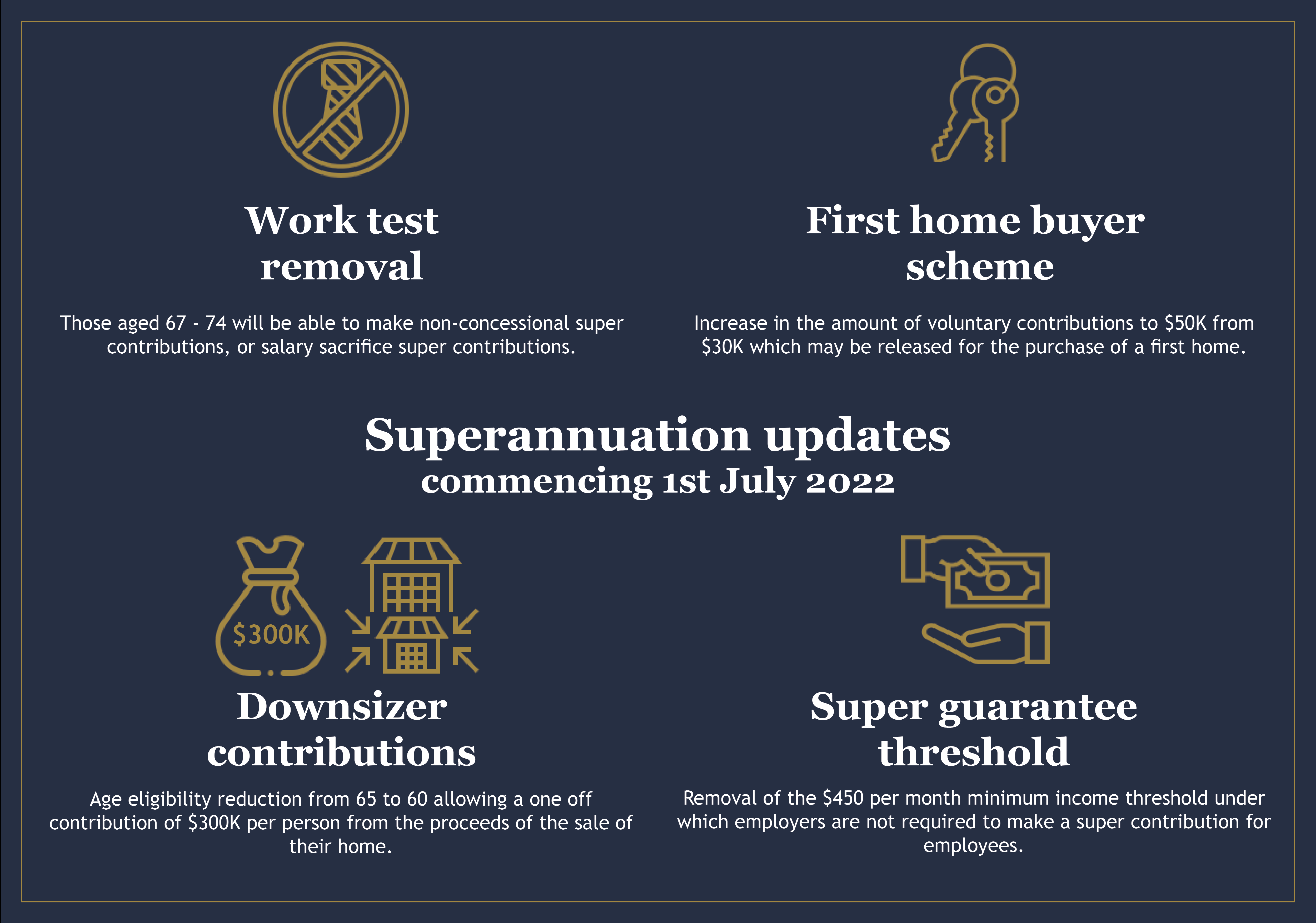
  • Removal of $450 monthly income threshold for super contributions.
  • Reduction in age to 60 for the downsizer contributions.
  • Removal of the work test for people aged 67-74.

It also increased the withdrawal limit for First Home Super Saver Scheme (FHSS).

Legislation has now passed both houses of parliament and will apply form 1 July 2022.

4 new super contribution opportunities

Removal of $450 monthly income threshold

The government has finally scrapped the $450 superannuation guarantee threshold. This should make approximately 300,000 people eligible for super contributions from 1 July 2022.

Lower Age for ‘Downsizer’ contributions

In selling the family home, couples have the ability to contribute $300,000 each into superannuation as a personal contribution. The age for this contribution was 65, however, it has been lowered to 60. As of May 2021, 22,000 Australians have taken advantage of this opportunity to boost their retirement balances. It should also be noted that these contributions are not restricted by the $1.7m transfer balance cap.

The lowering of age to 60 will come into effect from 1 July 2022.

First Home Super Save increased capacity

This is a great opportunity for couples who are saving for their first home. This scheme allows people to make voluntary contributions to superannuation to save for this purchase. The current caps on these contributions are $15,000 a year and $30,000 in total.

However, it has been passed to allow voluntary contributions (both post tax or through salary sacrifice) up to $50,000 in total.

So a couple will have access to $100,000. It’s important to remember compulsory employer contributions are excluded. Only voluntary contributions may be withdrawn.

This will commence from 1 July 2022.

Removal of work test for 67-74 year olds

The most significant superannuation opportunity announced in the May 2021 Federal Budget was to allow 67-74 year olds to make a personal contribution to superannuation without meeting the current work test. This has now been passed and will come into affect on 1 July 2022.

However, not only will older Australians be able to make a personal contribution of $110,000 pa, but they will also be able to take advantage of the bring forward rule and contribute $330,000 as a lump sum.

No need for investors to fear QE taper

No need for investors to fear QE taper

At last month’s Portfolio Construction Forum summit in Sydney, almost every presenter – from economists to fund managers – was critical of central banks for “artificially inflating asset prices” with “excessive liquidity”, leaving financial markets “addicted to easy monetary policy”.

Indeed, US journalist Christopher Leonard recently published a book called The Lords of Easy Money: How the Federal Reserve Broke the US Economy, which “tells the shocking, riveting tale of how quantitative easing is imperilling the American economy”.

On the face of it, the numbers are confronting. Before the start of the COVID-19 crisis in February 2020, the US Federal Reserve’s balance sheet stood at $US4.4 trillion. Two years later, after a program of buying government bonds and mortgage-backed securities known as quantitative easing (popularly referred to as QE), it has more than doubled to $US8.9 trillion ($12.3 trillion).

Similarly, the Reserve Bank of Australia has also conducted its own QE program, expanding its balance sheet from $180 billion before the pandemic to about $650 billion.

It sounds intuitive and seductively simple: central banks print money; they’ve expanded their balance sheets by trillions of dollars; all that newly printed money has inflated asset prices. Unfortunately, it is dead wrong but, as is often the case in financial markets, it’s the prevailing narrative that’s been repeated so often that people believe it.

In his book, Leonard describes how, under the QE program, the Fed will buy bonds off a bank by crediting that bank’s “reserve account”, which, in simple terms, is a special account that only banks who transact directly with the central bank can have. He then claims those banks are free to use those reserves “to buy assets in the wider marketplace”.

That just isn’t how it works.

What really happens is far more complicated, and far less exciting. Those reserves, which in Australia are called exchange settlement reserves, are a special kind of currency that is only transacted between the central bank and other commercial banks to make sure the billions of transactions the banks undertake daily settle every day. Those reserves are not the same as the cash used in the real world.

Central banks will also buy bonds from other institutions that don’t have a special reserve account with them, in which case they do settle with normal cash. However, according to the Reserve Bank’s website, those institutions are all credit unions, smaller banks or insurance companies. If an institution like that is holding bonds in the first place, which are classified as a defensive, fixed income asset, it is pretty much guaranteed they are not going to take the money and punt it on cryptocurrencies.

So what caused financial markets to rebound so aggressively if it wasn’t central banks printing money? It was governments, by injecting trillions of dollars, pounds, euros, yen and other currencies into economies to support them during the COVID-19 crisis.

That money was created out of thin air and is still circulating around their respective economies. In fact, governments create money in a keystroke via fiscal policy every day, with things like social security payments or any other spending program.

Many will argue it was central bank QE programs that allowed governments to run deficits – but this is not true either. Just like before QE, it’s the government spending money into existence that provides the cash for banks and others to buy the bonds. Central banks are not required to do anything other than conduct their normal daily monetary operations of targeting interest rates.

That the central bank QE programs did not drive the share market means the tapering of QE, or allowing their balance sheets to shrink, does not necessarily have a negative impact on the share market.

Chris Bedingfield, a portfolio manager at Quay Global Investors, points out that in the first three QE programs, the S&P 500 went up by an average of 2.2 per cent in the month after a QE “event”, be that the commencement, announcement of tapering, or conclusion of QE. On average, regardless of whether the announcement indicated an easing or tightening of central bank policy, a month later US equities were higher.

That does not mean share markets cannot fall – but if they do, it will have more to do with other factors, like valuations, fear, geopolitics or even inflation rather than central bank actions.