he GFC left the US equities market bleeding and battered by the side of a deserted road. It was, of course, the perfect time to buy. For those brave enough and willing to look beyond the worst bear market in 80 years the returns have been spectacular: 312% in nine years, that’s an incredible 17% compounded at a time when a bank account has paid you next to nothing. But now the US equities market has tipped over to expensive territory and the risks are increasing.
The US equities market is looking expensive
One of the most popular measures of whether a stock market is expensive or not is the ‘Cyclically Adjusted Price to Earnings’ ratio (commonly known as the CAPE ratio). It was devised by Nobel Laureate Robert Shiller and tries to take a long-term view of valuations by using 10 years of earnings adjusted for inflation, that way the effects of the business cycle are less accentuated.
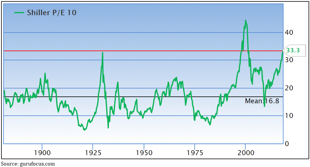
Chart 1 shows the US’s current CAPE ratio of 33.3 is now the second highest peak since the data series started almost 150 years ago. It was at a similar level in 1929 before the market had its worst ever meltdown of more than 80% during the Great Depression, and it’s only ever been higher during the frothy days of the dotcom boom when it reached 44.2 before the market dropped about 50%. Before you panic, I am not arguing we’re about to see anything like that happen again now.
Chart 1: The US’s CAPE ratio is at its second highest peak in almost 150 years
There’s been lots of research into the historical relationship between buying in at a particular level of CAPE ratio and the next 10 years’ returns, and, no surprise to anybody, the higher the entry level the lower the next 10 years of returns – see chart 2. What’s striking is that all the dots to the right of the blue line are from the dotcom boom.
Chart 2: The higher the CAPE the lower the 10-year real return
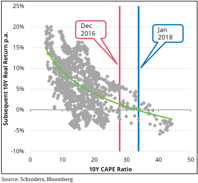
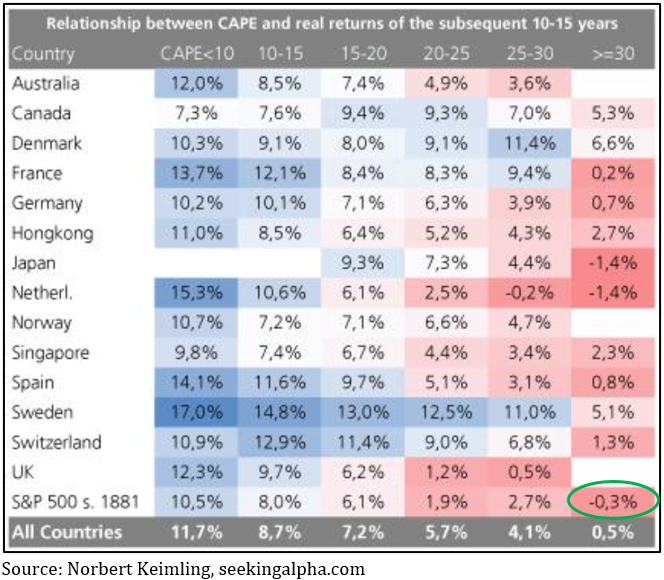
Chart 3 shows that since 1881 the average 10-year return for the US market around its current CAPE level has been -0.3% per annum.
Chart 3: The higher the CAPE ratio the lower the next 10 years’ returns
The CAPE ratio causes lots of arguments
CAPE sceptics are easy to find, led by Professor Jeremy Siegel of Wharton Business School and they come up with some pretty compelling sounding arguments.
The first thing they point out is the CAPE ratio is a truly terrible timing tool (not that there are a whole lot of good ones). Many CAPE advocates like to talk in terms of how far above the long-term average of 16.8 the US market is at the moment, as if that’s some kind of fair value marker. But the sceptics quite rightly argue that since 1996 the US CAPE has been above that average 96% of the time, yet the S&P 500 has risen about 260% over that period. But even Professor Shiller says the CAPE ratio is a lousy timing tool, it’s a valuation tool.
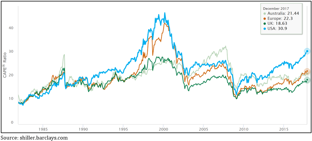
Recently Rob Arnott and a couple of his mates from Research Affiliates wrote a paper arguing the CAPE ratio is still a very relevant valuation tool and tackled the other arguments of the sceptics, such as changes in demographics and structurally lower interest rates justify a higher PE ratio. Arnott understandably points out that if that is true, why is it that the CAPE ratios for other countries facing similar conditions have not gone nearly as high as the US’s – see chart 4.
Chart 4: Other countries have faced the same low interest rate environment but have not seen the same CAPE expansion as the US
Another strong argument against the CAPE ratio is that changes to accounting rules over the last 30 years bias the earnings part of the price to earnings equation downwards, making the CAPE ratio appear higher. But Arnott cites a 2013 study that concluded if you rebase the historical earnings to the new accounting rules the CAPE’s signal doesn’t change.
Another argument is that the crash in earnings per share during the GFC is about to roll out of the 10-year window used to calculate the CAPE ratio, which will raise the earnings figure (the denominator) and lower the overall number. While this is true, Barrons calculated it is likely to reduce the number by 10%, which would still leave it trading at a historically high level.
Price to Book Value looks expensive too
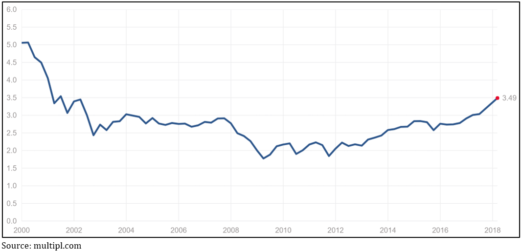
Another classic valuation measure is comparing a market’s current value to the ‘book value’ – the higher the multiple the more expensive the market is trading. An advantage of this measure is that book value doesn’t jump around nearly as much as earnings, so it’s more consistent. Chart 5 shows the current price to book value for the US market is as high as it’s been since 2002.
Chart 5: The US price to book value measure is also elevated
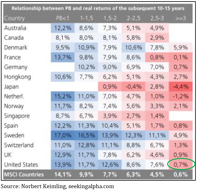
Again, studies have calculated what you can expect for 10-year annualised returns at different levels of price to book, as shown in chart 6, it’s not a rosy picture for the US again.
Chart 6: The average 10-year annualised return for the US market at current price to book valuations is less than 1%
And finally…
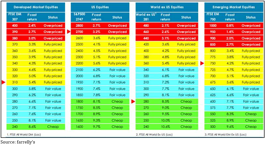
Our asset allocation consultant, Tim Farrelly, who’s one of the smartest blokes you’ll ever meet, recently found the US market to be overpriced – the first time since 2001, see chart 7.
Chart 7: According to farrely’s US equities are overpriced for the first time since 2001
So what could make the US market fall?
I’m as guilty as anyone of saying it’s hard to find the catalyst that would make the markets drop at the moment because there are no obvious debt bubbles, but thinking about it I reckon that view smacks of anchoring bias: the last really big correction (in 2008) was because of a debt blow out, so we presume the next one has to be as well. But that’s simply not true, markets can correct just because they get overvalued.
The classic example of this was the dotcom bust in 2000. The market rise hadn’t been fuelled by debt (except for some margin lending), rather it was investors buying in to the new paradigm that the old rules of valuing companies had changed because of new technology. (Can you hear the faint echo of that in the arguments mounted as to why the CAPE ratio is no longer relevant?)
A similar correction was 1987, especially in Australia’s case: valuations got too high but there wasn’t a debt bubble underlying it. Interestingly, by contrast, the US’s CAPE ratio in the lead up to the GFC was 27.3, almost 20% below where it is now.
The question is, what could be the thing to make the market to suddenly conclude things are overdone? Unfortunately, there’s not a person on the planet who can do any more than guess about that. It could be more data showing US inflation is on the rise, who knows?
What should investors do in the meantime?
Valuation measures rarely provide any reliable insight to timing, and typically they encourage you to move early. From a capital preservation point of view that may not be a bad thing, but bear in mind the last time the US CAPE ratio was at current levels in a rising market was July 1997. If you’d sold all your US shares then you’d have missed out on 50% upside to the peak – ouch!
The smart thing to do in these circumstances is to begin reducing your exposure to the US. If the US is about 60% of the MSCI global indices, you might start by moving to 40-50% with the objective of slowly reducing over time to all but zero if it doesn’t fall in the meantime.

