
Tim Farrelly interview
Tim discusses why he’s still overweight growth assets and whether that’s because of growing earnings or just changing valuations, the low interest rate environment and the significance of negative bond yields.

Low inflation is a global phenomenon that has central bankers tearing their hair out: nobody can tell you exactly what’s causing it and, so far, nothing seems to be able to stop it. And its effects on financial markets, and therefor every investor’s portfolios, are profound. In fact, this very low inflation environment can explain an awful lot of what seems to be peculiar in markets at the moment.
Australia’s ‘core CPI’, which excludes the more volatile prices like food and energy, averaged 3.7% since 1983, compared to the June reading of 1.6%. That’s not far off one-third of the average.
The poster child for low inflation is, of course, Japan, where, over the past 20 years, the core CPI has averaged -0.2%.
Inflation is like kryptonite for bonds: the higher inflation is, the weaker are bond prices, and vice versa. Across the world bond yields are plumbing record lows, including Australia where our 10-year bond yield is comfortably (or is that uncomfortably?) below 1%.
You might read how low bond yields indicate the bond markets are pricing in disastrous economic growth scenarios. In fact, what they’re pricing in is low inflation, and conventional economics dictates that you only get low inflation as a consequence of low economic growth. That may or may not happen, the truth is, nobody knows.
There are experienced bond fund managers saying negative bond yields make no sense at all and pointing the finger at ‘central bank manipulation’. Bond markets are massive, reflecting the wisdom of a very big crowd, and they’re driven by a combination of human sentiment and some pretty funky mathematics.
If an investor has a view that disinflation (where inflation rates decrease over time) is here for the foreseeable future, then it’s perfectly rational to prefer the certainty of losing 0.4% of the value of their capital by buying a negative yielding bond, than sticking it under the mattress and losing 0.5%.
Investing 101 will tell you that a share price is supposed to reflect the net present value of a company’s future cash flows. To make that calculation you need to use a ‘discount rate’ that you apply to those future cash flows so you can work out what they’re worth in today’s money, the lower the discount rate the higher the valuation in today’s money.
That discount rate will normally be based on the ‘risk free rate’, which is typically the 10-year bond yield, but most analysts will add a bit extra to account for what they think might happen to bond yields going forward, or to reflect what they reckon might be added risks associated with the company they’re analysing.
In a recent interview, the well-known Magellan fund manager, Hamish Douglass, explained how small changes to your discount rate can have a magnified effect on a stock valuation: by reducing your risk free rate from 5% to 4%, the valuation of a business with 4% earnings growth increases by almost 20%, and a reduction from 4% to 3% sees a 25% increase.
Nothing else has changed, just your view on how long inflation will stay low, but now you’re prepared to pay significantly more for the same share. No wonder a talented fund manager friend of mine likens a DCF valuation to the Hubble telescope, where the tiniest shift can have you looking at a whole new galaxy.
Now imagine the pressure on fund managers across the world this year, with bond yields grinding downwards, forcing them to wrestle with whether or not they lower their discount rate and increase their valuations.
Over the past nine years, so-called ‘value’ stocks have substantially underperformed ‘growth’ stocks, for example in the US by almost bang on 100%.
It’s probably not a coincidence that, according to Mercer, in the 2019 financial year, 87% of large cap Australian equity fund managers underperformed the ASX200, and in the 2018 calendar year it was roughly the same in the US. Not surprisingly, you’ll also read confounded fund managers, sounding like jilted lovers, complaining that markets are super expensive and being driven by a narrow cohort of sometimes defensive and sometimes growth stocks.
The problem is, if your frame of reference for valuations is the last, say, 40 years, you’re comparing a time of radically different inflation rates and bond yields – and therefor valuation metrics. It would not be surprising to find a lot of those underperforming fund managers are either resolutely (stubbornly?) sticking to their higher discount rate valuations or chasing their valuations higher as they begrudgingly accept lower and lower bond yields.
Those fund managers complaining about markets being expensive may end up being right, maybe inflation will go up and things will look like they used to once again, a process they call ‘normalisation’. Then again, maybe it won’t, and they’ll be left failing to adapt.
Because we can’t be sure of what’s caused inflation to be so low, nor can we be sure of how long it will stay that way. Who knows, this time next year we might look back wistfully on the days when we worried about inflation not being high enough, or in 10 years we may look back on the days when inflation was positive.


Have you noticed how many articles have appeared recently scaring investors into thinking “markets have never been so uncertain” as they rattle off the well-worn reasons we should be worried: geopolitical tensions, elections, stretched valuations, extended cycles, the inverted yield curve. If you didn’t know any better, it’s enough to leave you thinking the best solution would be to find shelter and stock up on tinned food.
But many of these articles tend to be absurdly one-sided, you just have to look a bit deeper to find sound arguments to justify where share markets are trading.
The bears argue: While last year’s share market tumble bottomed around Christmas, bond yields around the world continued to fall, signalling the bond market expects economic growth to slow in the future. What’s worse, share markets have rallied at the same time as forecast company earnings have been going down. How can that make sense?
It’s not just economic growth perceptions that cause bond yields to fall, it’s also the perception of inflation and the fall in global yields is partly a reflection of the ongoing very low inflation we’re seeing around the world and the expectation that it’s likely to continue. For example, over the last 30 years Australia’s core inflation rate has averaged 3.8%, but the latest reading was less than half that at 1.3%.
If you look back over the last hundred years, when inflation is low share markets attract a higher valuation, as measured by a basic price to earnings (PE) multiple. At the end of March, the ASX200 was trading on a PE of 15.6 versus its average ‘low inflation PE’ of 16.5. On that basis, while you wouldn’t argue the share market is exactly cheap, nor is it overly expensive.
Another valuation measure to look at, especially for income-seeking investors in a low interest rate environment, is the share market’s dividend yield minus the 10-year Australian government bond yield. At 2.9% the dividend yield is at its equal highest margin above the government bond yield in the last 25 years – see chart 1.

More importantly, after accounting for inflation, at less than 0.5% the ‘real’ bond yield is getting perilously low, whereas the 3.4% real yield on shares is almost two and a half times its 25-year average of 1.4% and more than seven times higher than the real bond yield – see chart 2.

Another measure is the Earnings Yield of the share market, which is technically the inverse of the PE ratio and essentially tells you the return on equity you should get from investing in shares, a focus for those aiming to generate a capital return on their investments. At 6.4%, it’s bang in line with the 25-year average, another indicator that the market is around fair value, but nevertheless attractive in the context of a low return environment.
Finally, the Equity Risk Premium (ERP) for the Australian market, which tells you how much extra return you should get from investing in shares rather than risk-free government bonds, sat at 4.9% at the end of March, comfortably above its 21-year average.
If you say a market’s expensive, you have to say relative to what. In the context of super low bond yields and an environment where the risk-free return barely leaves you with anything after inflation, equities start to look pretty attractive even if underlying company earnings are a bit weaker.
The bears argue: Over the last 50 years every recession in the US has been preceded by an ‘inverted yield curve’, which is where the yield on longer-term bonds is lower than that on shorter-term bonds. Last month the 10-year bond yield snuck below the three-month yield, and we all know when the US sneezes the world catches a cold.
No less an economist than Nobel Laureate Myron Scholes wrote a piece arguing that forecasting a recession will automatically follow an inverted yield curve is no more than ‘data mining’ (an expression used to condemn either lazy analysis or the torturing of data to arrive at a pre-determined outcome). He points out that previous inversions came about because the Fed raised cash rates to an average of more than 2% above inflation in a deliberate effort to slow the economy, whereas in this cycle of nine rate rises it’s never been more than 0.3% above inflation.
In other words, the bond yields themselves don’t cause a recession, it’s what causes the yields to move that matters. In the past, recessions have coincided with the Fed actively trying to slow the economy, whereas this time around, they’ve said they’re trying not to.
The bears argue: Come June this economic cycle will be the longest on record.
So what, cycles don’t die of old age. Period.
Cycles normally die because of some kind of excess in the economy, and it’s hard to spot any of those right now, or because the central banks have to stomp on the brakes, again, no sign of that.
The bears argue: Pick your poison: Brexit, Trump’s trade war, any other capricious Trump crusade, Russian hacking.
Political shenanigans is a perpetual favourite of share market doomsayers, but the fact is, over the past 10 years the markets have sailed through whatever’s been thrown at them.
The UK share market has risen 11% since the Brexit vote, unemployment is at a more than 40-year low of 3.9% and GDP growth is the same as Switzerland and much better than both of Germany and France.
Trade wars are horrible, but the US’s S&P500 is up 11% since tariffs were proposed in April last year and in fact just hit a record high, the Chinese index is up about 1% over the same period, and the ASX200 has hit a 12-year high and is closing in on its all-time high too. By no means are trade issues inconsequential, but neither is it turning into a disaster as yet.
There are always reasons to worry about markets, but one of the most disingenuous expressions is “it’s never been more uncertain”, because in truth, markets are never, ever certain.
anyone had have told you US companies would report 26% earnings growth in 2018, which is about four times their long-term average, and profit margins would hit record highs, most people would have guessed the stock market would go up, possibly by a lot. Instead, of course, the S&P500 fell almost 5%.
How did that happen? The PE ratio (price to earnings), which is simply a measure of sentiment – the higher it is the more enthusiastic investors are – started 2018 at 21 and fell to 16 by the end. Another way of looking at that is in 2017 the market anticipated the earnings growth coming down the pipeline and (presumably) in 2018, anticipated earnings growth will slow.
2017 was also the least volatile year ever for US stocks, with the volatility index (VIX) averaging 6%, and the market went up every single month for the first time in history. In 2018 volatility almost tripled to 17%, which actually just brought it back to the long-term average and there were four negative months averaging a hefty 5.5%.
There’s no shortage of reminders that this year’s started with a lot of uncertainty, with geopolitical issues taking centre stage: the ramifications of Trump’s trade war is definitely top of the pops, but the astonishing mess that is Brexit is wreaking its share of havoc too. Throw in concerns about debt levels in both Chinese and US companies and it’s no wonder markets are skittish.
I have absolutely no idea if stock markets have seen their near-term bottom, and for that matter, neither does anyone else. What is certain though is the market selloff at the end of last year has restored value and we’ve had a couple of hints, in the form of ‘contrarian indicators’, that returns could be ok for the next year or so.
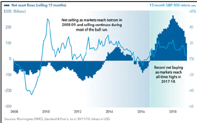
First, at the end of last year equity managed funds in the US experienced their biggest outflows since 2008 as people panicked that markets were going to keep falling – see chart 1.

Perhaps counter-intuitively, when you get big outflows from equities it’s typically a harbinger of an improved market – it’s simply a classic example of Warren Buffett’s aphorism: be fearful when others are greedy and be greedy when others are fearful – see chart 2.

The second hint is the US investor sentiment survey, which hit a multi-year bottom in December 2018 and has since bounced back to be close to its long-term average – see chart 3. Interestingly, just over 12 months ago it was at a multi-year high. Investor sentiment is more like a weather vane, telling you which direction the wind is blowing right now, rather than giving you any idea where it’s about to go.

At best these two ‘hints’ are indicators and there are dozens you can point to on both sides of the bull and bear arguments. At the end of the day the primary determinant of whether you should invest in growth assets is whether they represent good value. Right now the Australian equities market has an earnings yield (that’s the inverse of the PE, so earnings divided by price, and it tells you how what return you’re getting on a dollar invested in equities) of about 7%, which compares to a term deposit of about 2.5%. In Europe, the same equation is about 7.5% vs 0.25%. While value is in the eye of the beholder, you’d have to be pretty cock-eyed not to think that’s attractive.
One thing’s for sure, if you’re waiting until the uncertainty has cleared before investing in equities, by the time the newspapers are telling you the coast is clear the market will be a long way from where it is now.