Are Australian shares expensive?

Are Australian shares expensive?

There’s something innately comfortable about investing in companies you know and a market you’re familiar with, so it’s hardly surprising Australian investors, like their peers all over the world, have a bias to investing in their home market.

And Australia has some great world class companies, like the mining giants BHP and RIO, CSL, Cochlear, Goodman Group and James Hardie, to name a few. Plus, there’s a host of terrific domestically focussed companies that are household names too, like JB Hi-Fi, Commonwealth Bank and Woolworths.

Throw in the benefits of Australia’s famously high dividends and the bonus of imputation credits, and it’s little wonder Australian investors will typically have a weighting to ASX listed companies way in excess of the 2.5% they account for in total global share markets.

But it does pay to keep a careful eye on whether Australian shares represent good value compared to investing into international shares.

Over the long run, share markets tend to follow the growth in company earnings, but in the short run, sentiment can be extremely influential. Changes in sentiment are captured in the price to earnings (PE) ratio.

If earnings for the overall share market grow by 10 per cent in a year, and the market has risen by 10 per cent, then the PE won’t have changed (ignoring dividends for the moment). That means sentiment hasn’t played any part in the returns enjoyed by investors.

However, if earnings growth was 10 per cent and the market went up by 20 per cent, then the PE ratio has doubled, meaning sentiment has played a big role in returns.

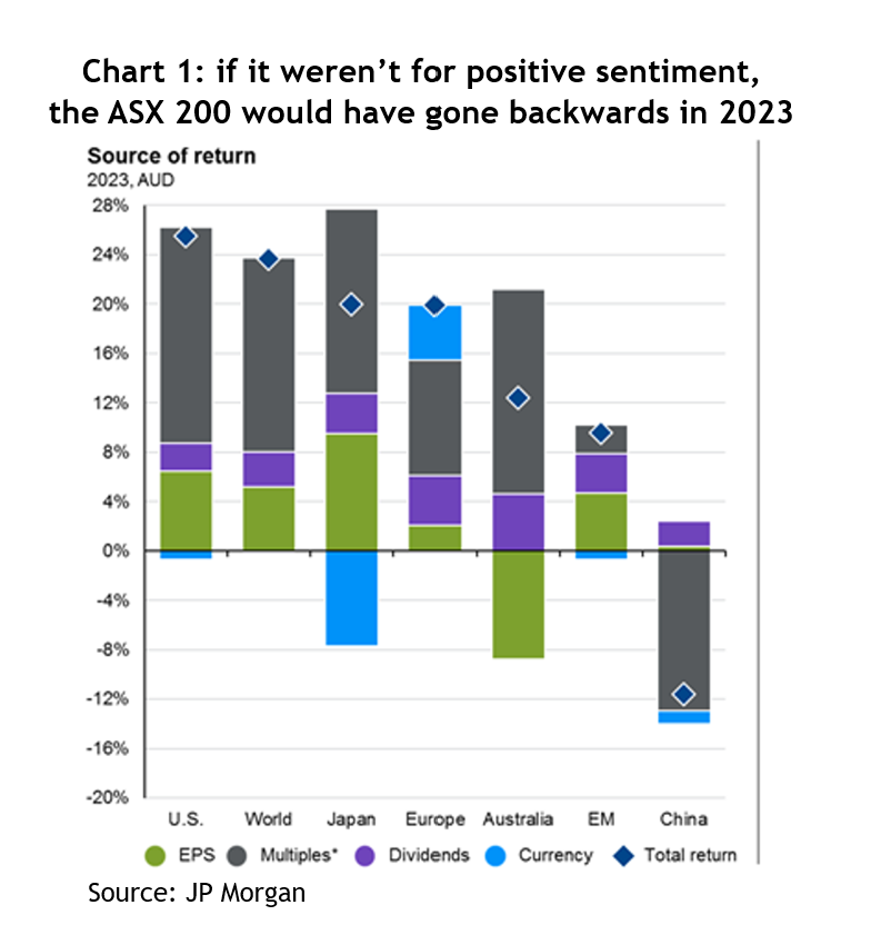
In 2023, PE ratios went up strongly across the world, in part bouncing back from being whacked in 2022. But for Australia, it was particularly important. Of the 12 per cent return from the ASX 200, a positive change in sentiment contributed about 16 per cent and dividends about 4 per cent. That means earnings growth was minus 8 per cent; not real flash when you compare it to the US’s 6 per cent, Japan’s 9 per cent, and even Europe managed 2 per cent – see chart 1.

Chart 2: the S&P 500’s PE ratio with and without the MegaCap 8

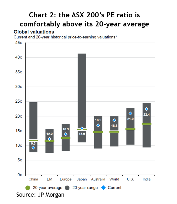
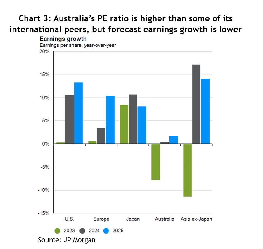
At the end of March this year, the ASX 200 was trading on 16.9 times forecast earnings, which makes it pretty pricey compared to its 20-year average of 14.9 – see chart 2. But that optimistic outlook isn’t matched by what analysts are forecasting earnings growth will be, which for the calendar year of 2024 is barely above zero and for 2025 is about 2 per cent.

The santa claus rally

Meanwhile, other international markets have much more favourable metrics. While the US is trading on a higher PE of 21x, its forecast earnings growth for 2024 is 11 per cent and for 2025 it’s 13 per cent. Europe is trading on 13.9x, with earnings growth forecasts of 3 per cent and 10 per cent. For Japan, it’s 15.9x, 11 per cent and 8 per cent – see chart 3.

Aggregate weekly payrolls deflated by PCE inflation

Even if you add the 1.4% average extra return from imputation credits, it still leaves Australia looking expensive compared to other international markets.

How much to allocate to international markets and how to do it are the obvious questions. The amount, or weighting, depends on a bunch of different considerations, like how any change would be funded. Does it mean selling holdings that would crystallize a capital gain? Do you have an income target for the portfolio? If yes, how much comes from fixed income versus dividends? If you have to make regular withdrawals from the portfolio, such as a pension, would you be comfortable funding that through a combination of income and harvesting capital gains?

As for the how, there’s an enormous range of exchange traded funds (ETFs) available on the ASX that enable a smart investor to lift their international allocation. If you’re happy just to follow an index, Vanguard gives you a one-stop solution with its Global Shares ETF (VGS), or you can get US exposure to the S&P 500 or NASDAQ.

Alternatively, there are ETFs that use an algorithm to work out what holdings it will buy. A very popular one is VanEck’s International Quality ETF (QUAL), which holds 300 of the world’s highest quality companies and includes the likes of Microsoft, Apple, Nvidia, Nike, Johnson & Johnson and Unilever.

There’s no shortage of ways to help break free from the home country bias, it just takes a bit of digging, or, if you don’t feel confident to do that, ask an adviser.

2024: What just happened and what lies ahead

2024: What just happened and what lies ahead

2023 – the scorecard

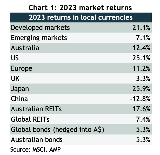
2023 started off with all kinds of dire forecasts, there had never been such an overwhelming consensus that the US economy would slump into recession and take share markets with it. But not only did the economy power through, so did share markets, and despite a choppy start to the year, they finished with a powerful rally that saw respectable returns across the board – see chart 1.

As well as a strong performance out of the US, Japan had a storming year on the back of solid earnings growth, finishing at the highest since its legendary boom of the 1980s, and Germany, where the economy continues to flirt with recession, is also trading at all-time highs, as is India.

Chart showing bond yields trended down, resulting in a 40-year bull market, which went into reverse in mid-2020

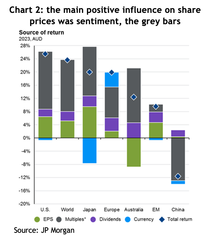
The story of last year was pretty much the mirror image of the previous year: 2022 saw markets fall because of negative sentiment, known as “PE compression”, whereas 2023 was largely about PE expansion, or positive sentiment. What that means is that theoretically share prices should go up (or down) by the same amount as earnings growth + dividends, and anything more or less than that is attributable to sentiment, that is, whether investors are feeling bullish or bearish, which is measured by changes in the price to earnings (PE) ratio that people are willing to pay. The grey bars in chart 2 show just how much of a contribution that positive change in sentiment added to returns in 2023.

Chart showing the Australian government bond, GSBG33, has experienced higher<br />
volatility than what many would associate with a defensive investment

It was all about inflation

The positive change in sentiment was all driven by changes in the outlook for inflation and interest rates, or more specifically, the market’s perception of whether central banks have finished increasing rates and, if so, when will they start cutting them?

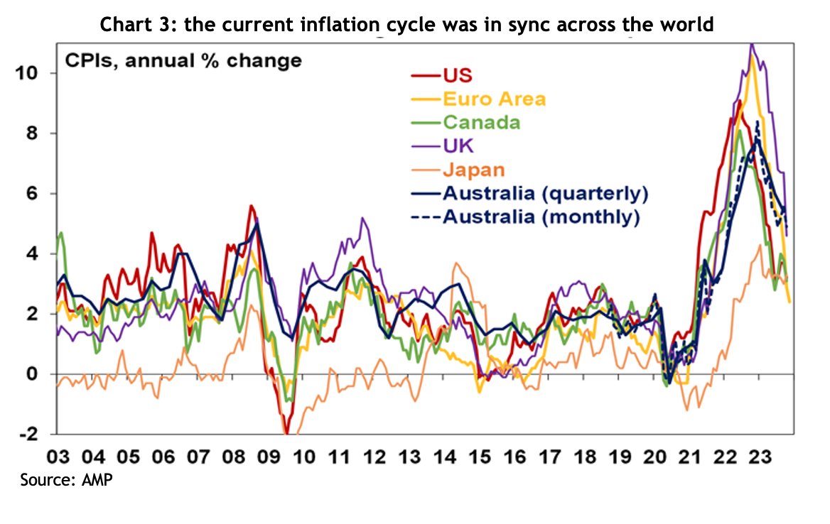
Inflation rates across the world have indeed fallen considerably, but how much of that is attributable to central banks increasing interest rates is unclear. It’s pretty conspicuous that, despite the variability in when and how different central banks responded, the cycle we’ve just experienced has played out similarly across the developed world: inflation rates started rising sharply in 2020, peaked for most countries around the middle of 2022, and have been falling at a pretty similar pace since – see chart 3.

Chart showing the Australian government bond, GSBG33, has experienced higher<br />
volatility than what many would associate with a defensive investment

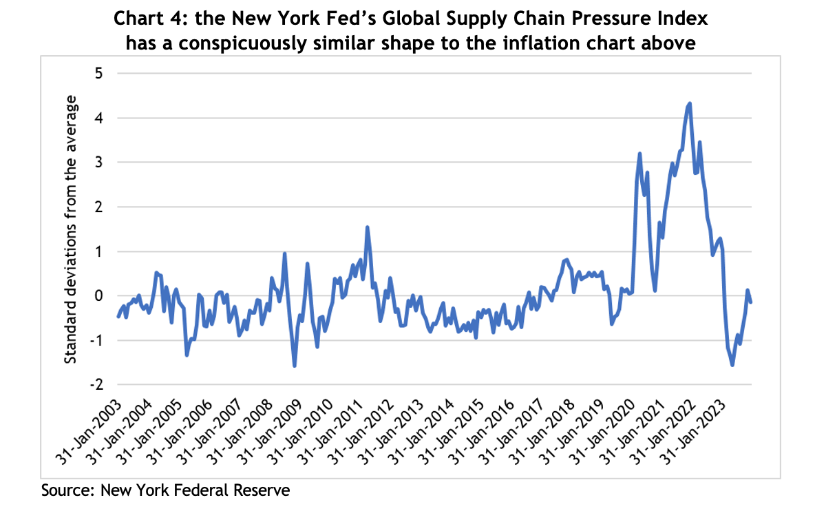
There’s a school of thought that disruptions to the supply chain were a significant contributor to inflationary pressures. The New York Federal Reserve Bank compiles an index that tracks pressure across global supply chains, see chart 4, and it traces a similar path to the inflation chart above. For a little context, the COVID-induced bottlenecks in the supply chain saw the index peak at almost 4.5 standard deviations above the average, which puts it so far out of the norm that the theoretical likelihood of it happening is close to zero. That kind of event is inevitably going to have serious consequences.

Chart showing the Australian government bond, GSBG33, has experienced higher<br />
volatility than what many would associate with a defensive investment

Likewise, raising interest rates aims to control inflation by reducing demand, but in the US, demand has remained very strong, indeed, GDP growth was 5.1% in the September quarter! So with demand going up, it’s hard to argue inflation coming down is because of higher interest rates.

Critically, in its last meeting for 2023, the US Federal Reserve acknowledged they think rates have peaked and the next move will be down. That lit a fire under financial markets, with both share and bond prices jumping, and kicking off furious speculation as to when the first cuts will come and how deep they’ll be.

Here in Australia, speculation is rife as to whether the Reserve Bank has also finished with rate rises, with some economists forecasting rate cuts before the end of 2024.

Lessons from 2023

As always, there are lessons to be learned (and perhaps relearned) from what happened in financial markets last year.

Macroeconomic forecasting is really hard (if not useless): at the end of 2022, there had never been such an overwhelming consensus among economic forecasters, and central bankers, that economies across the developed world were headed for recession. Forecasts for inflation were uniformly high, and for GDP growth, uniformly low. They weren’t even close.

There were dark mutterings from economists and central bankers reaching for the orthodox textbooks that unemployment rates were way too low for inflation to fall, and our new RBA Governor, Michelle Bullock, suggested Australia would need a jobless rate of 4.5% to relieve inflationary pressures, or a lazy 140,000 workers losing their job. Yet inflation rates have come down and unemployment rates remain at multi-decade lows.

The takeaway: the US Fed has hundreds of PhD economists and still can’t guess where inflation, unemployment or GDP growth will be less than a year out, but they continue to dominate headlines. You’re better off ignoring them, and certainly don’t let them influence your financial decisions.

It’s also worth bearing in mind, given markets have rallied on speculation of rate cuts, for that to happen implies not only that central banks believe inflation is under control, but that economic growth is softening to the extent it needs a boost from lower interest costs. There’s no guarantee on that.

Geopolitics is noise: there has been no shortage of geopolitical headwinds for financial markets to negotiate over the past couple of years. The Russian invasion of Ukraine was supposed to crush economic growth because of higher commodity prices, tension between the US and China had the media in a froth, and then another war in the middle east threatens to escalate. Yet markets have gone onwards and upwards.

The fact is, while wars are tragic and terrible and sabre rattling might keep us up at night, markets will only suffer enduring effects if corporate earnings take a hit.

Market concentration is not necessarily a bad thing: by the middle of last year, the US market had risen about 20%, but it had come entirely from the top 10 stocks. Bearish commentators were warning that investors in the US market were taking bigger and bigger risks because the weighting of the top 10 companies in the S&P 500 had never been so high, hitting 32%. By the end of the year, those 10 stocks had risen 62%, while the bottom 490 had gone up by a far more pedestrian 8%.

Australian investors should have no concerns about market concentration, given the top 10 companies in the ASX 200 account for more than 46% of the index.

It’s entirely possible the top 10 companies in an index could underperform or even fall, but if the rest of the rest of the companies in the index perform strongly, it will generate a good return. If a portfolio was comprised of nothing but the top 10 companies, obviously the risks are different, but some simple diversification can address those problems.

Bonds can be just as volatile as shares: traditional portfolio construction includes an allocation to bonds based on the theory that they reduce portfolio volatility and can act as a counter-correlated airbag to share markets.

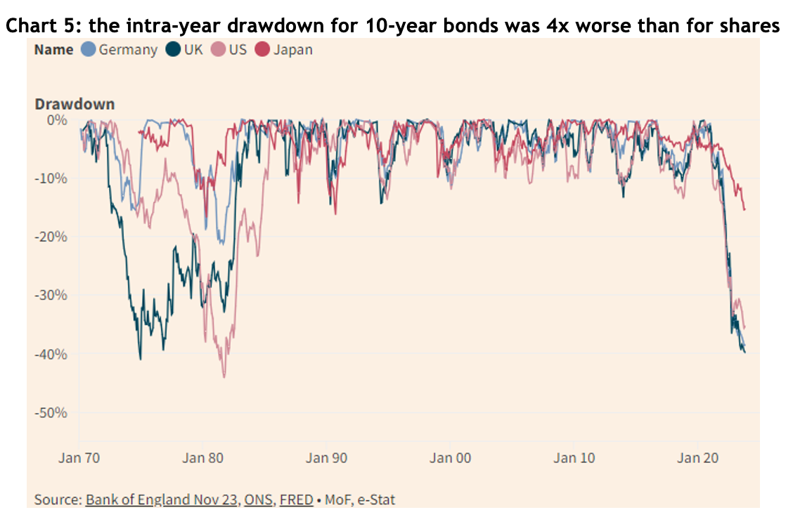
While 2023 was nowhere near as bad for bonds as the record losses of 2022, they were still far more volatile over the year than shares, indeed, as chart 5 shows, the intra-year drawdown for US, German and UK 10-year bonds was around 40%, more than four times the drawdown of the S&P 500 and ASX 200 at their worst.

Chart showing the Australian government bond, GSBG33, has experienced higher<br />
volatility than what many would associate with a defensive investment

The outlook for 2024

While there are still a few bears growling about potential recessions, most forecasts are for equity markets to rise in 2024, and it’s even easier to find bond market bulls (though a lot of them are bond fund managers, so you have to be wary).

Australia

Australian company earnings dropped by more than 8% in 2023, having gone up by 16% the year before. One of our asset allocation consultants, farrelly’s, estimates long-term trend earnings growth for Australian companies at 3% per year, so given the recent fluctuations, it’s hardly surprising the current forecast is for about 1.2% earnings growth for 2024.

Of course, Australian shares typically pay a generous dividend by international standards, of about 4.4%, add 1.2% to that and you’d get a 6.6% return, which compares to a 30-year average annual return of 9.2%. We could reach that higher number if the PE ratio continues to expand, or if earnings are better then forecast. Of course, for those who benefit from franking credits, you can add an extra 1.4% to those numbers.

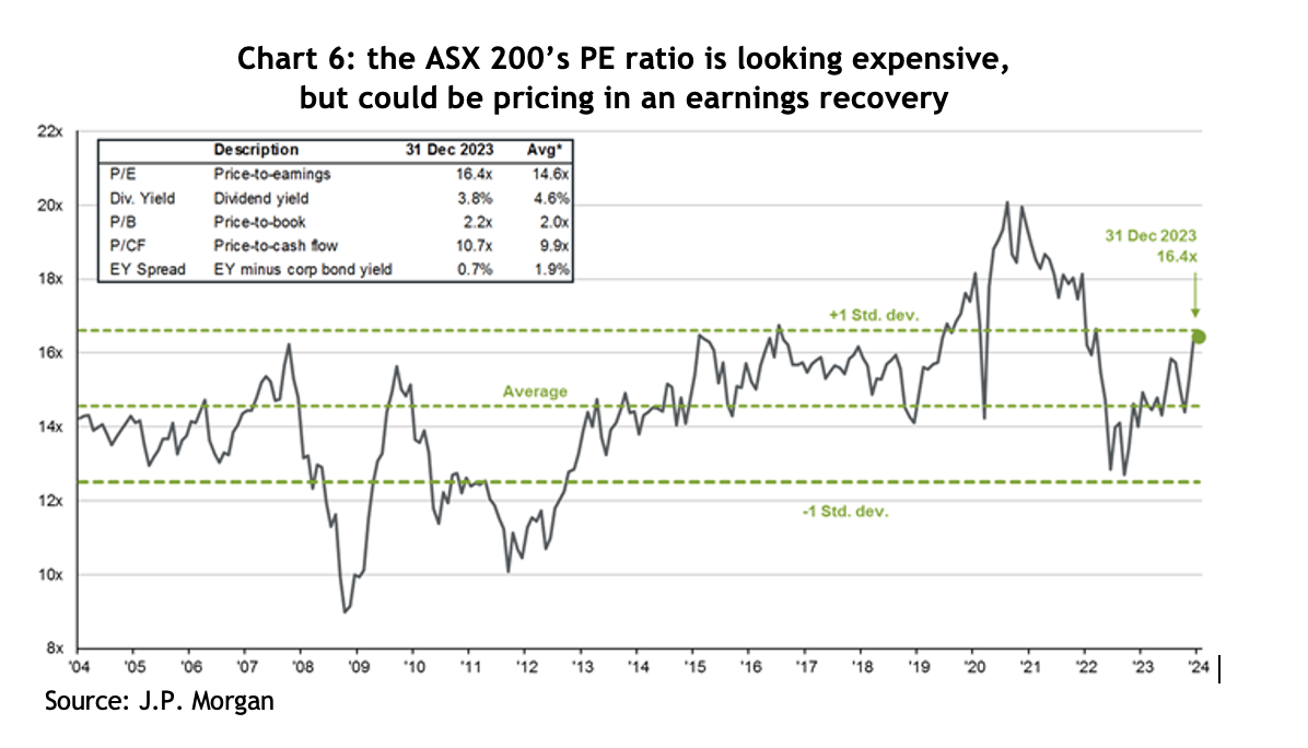
The ASX 200 finished 2023 on a forward PE ratio of 16.4x – see chart 6, which compares to a 20-year average of 14.6x. On that basis, it looks a little expensive, but it could simply be the market factoring in an earnings recovery.

Chart showing the Australian government bond, GSBG33, has experienced higher<br />
volatility than what many would associate with a defensive investment

United States

This is where things get really interesting. As noted above, in 2023 the US market was dominated by a handful of mega-cap tech companies, while the ‘bottom’ 490 stocks were pretty pedestrian by comparison.

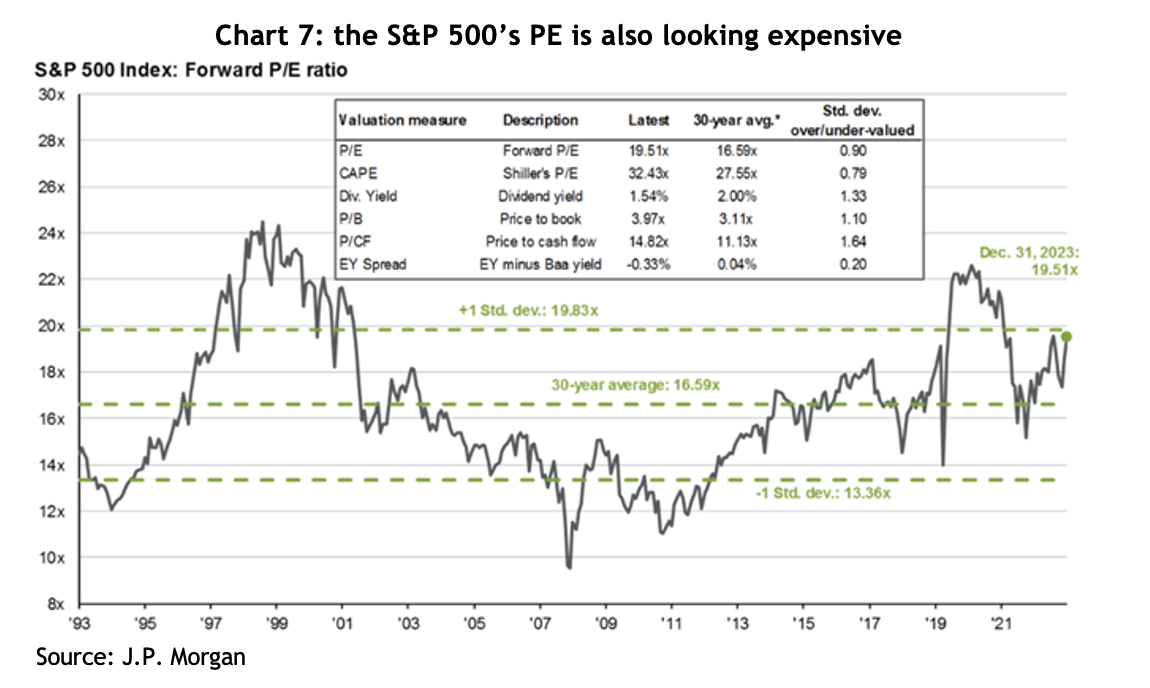
The S&P 500 finished 2023 on a PE ratio of 19.5x, a hefty 17% premium to the 30-year average of 16.6x – see chart 7. However, if you break that down, the top 10 companies were on a PE of 27x, while the rest were on 17x. In other words, the ‘rest’ of the market is not expensive by historical standards.

Chart showing the Australian government bond, GSBG33, has experienced higher<br />
volatility than what many would associate with a defensive investment

J.P. Morgan argues the market is not especially expensive given companies reported free cash flow margins 30% higher than they were only 10 years ago, with a lot of that growth coming from the big tech companies. US funds management group, GMO, also points out that US corporate profitability, as measured by return on sales, has averaged 7% since 1997, compared to 5% before that – that’s a whopping 40% higher.

For 2024, the average forecast for the US market across 20 different international financial groups is a gain of 10.2% – for what that’s worth (which isn’t much). Of more relevance, corporate earnings are forecast to grow by 11.5%, plus the S&P typically pays a dividend yield of around 1.5%, which comes to 13%, roughly in line with the last 15 years average return of 13.8%, but comfortably above the 30-year average of 10.1%.

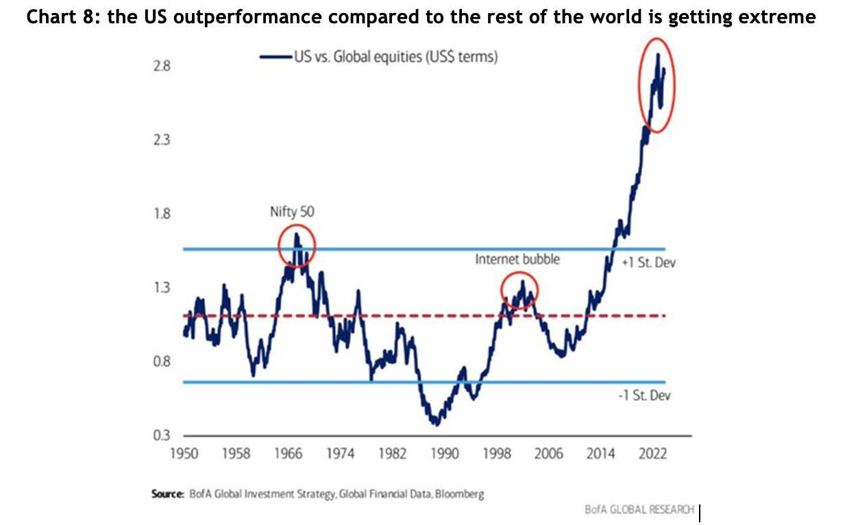
Something that plays on every asset allocator’s mind is chart 8 – which shows how extreme the US’s outperformance compared to the rest of the world has been since the GFC. Not surprisingly, most allocators look at that chart and immediately reduce the weighting to US shares. There are many explanations for the outperformance, not the least of which is that areas like Europe have been mired in an austerity mindset since 2009. There are, of course, two ways the gap could close: the US could fall heavily, or the rest of the world could make huge gains – or the trend could keep going. Unfortunately, there is no way of knowing.

Chart showing the Australian government bond, GSBG33, has experienced higher<br />
volatility than what many would associate with a defensive investment

Notably, in terms of valuations, the rest of the world (ex the US), is trading on a PE ratio of 12.9x, compared to a 20-year average of 13.1x, so fractionally on the cheap side. However, that’s a 34% discount to the US, which is the highest in at least 20 years.

Here are a few interesting observations, based on historical return for the US:

  • In late November last year, the S&P 500 made a new high since January 2022, i.e. it had been more than a year, and on the 14 previous occasions that’s happened, the market rose by an average of 14% over the following year and was positive 93% of those times
  • Since 1928, when the S&P has gone up by more than 20% in a calendar year, the average gain the following year was 11.4%, and it was positive 65% of the time
  • Since 1933, the fourth year of the presidential cycle has seen an average return of 6.7%, and is positive around 70% of the time
  • Deposits into money market funds last year were 13x more than what went into equities, taking total deposits to a record US$6 trillion, which on their own are expected to generate US$300 billion in interest income

Emerging markets

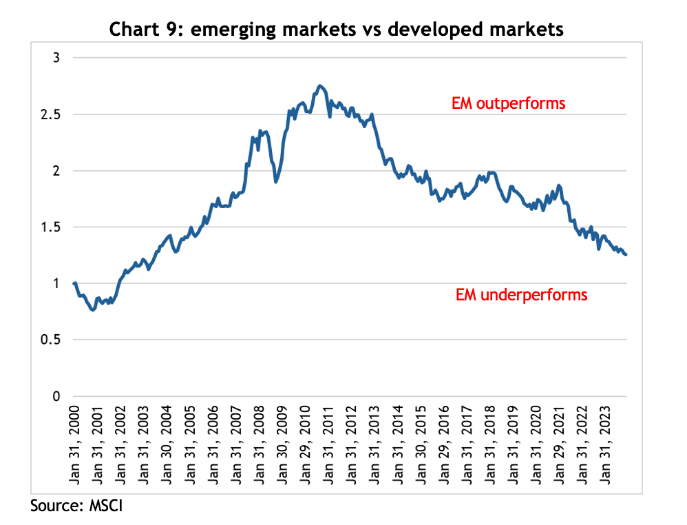
With a forward PE ratio of only 11.9x, the emerging markets look cheap compared to developed markets, however, that number is bang on the 25-year average and they’ve looked cheap for years and have underperformed the developed markets badly since the end of the GFC – see chart 9.

Chart showing the Australian government bond, GSBG33, has experienced higher<br />
volatility than what many would associate with a defensive investment

At a 26% weighting in the EM index, China is the 600-pound gorilla in the asset class, and it had a miserable 2023, falling almost 13%. Much of that is because the government refused to inject COVID stimulus at the household level, unlike western governments, forcing families to draw on their savings to get through extended lockdowns, and leaving consumers reluctant to spend once restrictions were lifted.

On top of that, the property sector, which was estimated to have contributed as much as 20% to GDP growth, is in disarray. The government has actively supported the rapid development of the electric vehicle industry, and now China makes more EVs than the rest of the world combined. It is possible that will be a strong new source of growth for the economy over the coming years.

By contrast, India, which is 17% of the index, is shooting the lights out, returning 20.3% in 2023 and hitting a new all-time high, and 15.8% per annum for the last three years. A combination of favourable demographics and a booming tech sector has proven to be a terrific tailwind.

Emerging markets returns tend to go in long cycles and appear to be linked to long-term trends in the US$, and trying to guess where currencies are going is even harder than share markets. The bottom line is that when an asset class is as cheap as EM is at the moment, it makes sense to have at least some weighting.

Real assets

Traditionally one of the more interest rate sensitive sectors, real assets, like property and infrastructure, have been beaten up badly over the course of the current interest rate cycle, but they turned sharply at the first hint that rates have peaked. In late October last year, the VanEck Global REIT ETF (REIT) was down by almost 40% from its peak, but then rallied more than 40% by the end of the year.

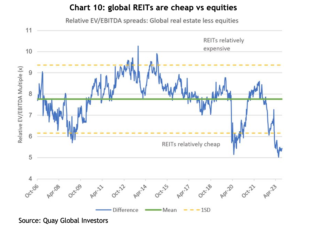
Chart 10 shows the relative earnings multiple that global REITs is trading on compared to equities puts them very much on the cheap side relative to the long-term average. The level of EBITDA hasn’t changed significantly, but the multiple it’s trading on has been derated to levels similar to the GFC and the COVID sell off, which is all sentiment-driven.

Chart showing the Australian government bond, GSBG33, has experienced higher<br />
volatility than what many would associate with a defensive investment
Small cap companies

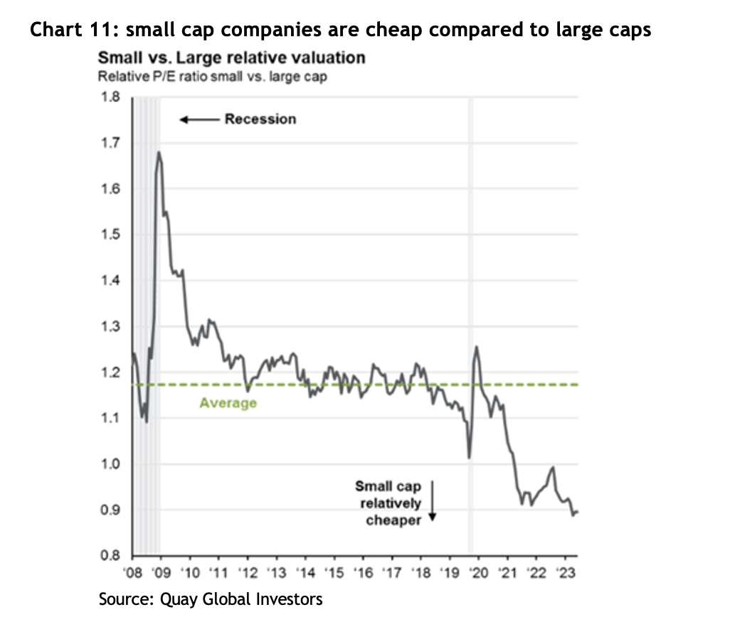
Small cap companies is another asset class that has been brutalised over the past couple of years, both in Australia and internationally, to the point where they are now trading at multi-decade lows relative to large caps – see chart 11.

Chart showing the Australian government bond, GSBG33, has experienced higher<br />
volatility than what many would associate with a defensive investment

Notably, the US small cap index, the Russell 2000, jumped 26% from its lows at the end of October. Once again, since the index’s inception in 1979, there have been 21 previous occasions where it has rallied more than 20% in 50 days, and the average increase one year later was 16.5%, and it has never been lower. That compares to the average 12 month return of 10.5%.

Again, given how relatively cheap small caps are, it makes sense to have at least some allocation.

Fixed income

One of most popular sayings in financial markets recently has been, “Bonds are back!” The argument is that investors are now receiving a yield to invest in government bonds, unlike a few years ago where yields were approaching zero and, in many cases, actually went negative!

The prospects for bonds depends entirely on what happens with interest rates and inflation. Being paid to hold them is a start, but bond prices can be quite volatile – as discussed above.

Private credit continues to grow its share of the commercial lending market in the US, Europe and Australia. We remain strong supporters of well managed private credit backed by strong levels of security and low LVRs, with returns comfortably above those offered by bonds and, typically, zero volatility in the underlying unit price.

Conclusion

Financial markets have a knack for surprising, and 2023 was a great example of that. The headwinds that caused mayhem a couple of years ago have dissipated, but whether they become the tailwinds the market is hoping for is yet to be seen.

After what turned out to be a year of good returns in 2023, there are sound fundamental arguments to support a positive view on share markets for 2024, and there are certainly asset classes and sub-sectors that look relatively cheap.

The stock market doldrums

The stock market doldrums

Ancient sailors dreaded The Doldrums, a region near the equator whose atmospheric peculiarities would rob them of wind, leaving boats becalmed while the crew watched their supplies dwindle and cabin fever took hold. It took patience and faith that conditions would eventually improve, to see them through without doing anything they’d regret.

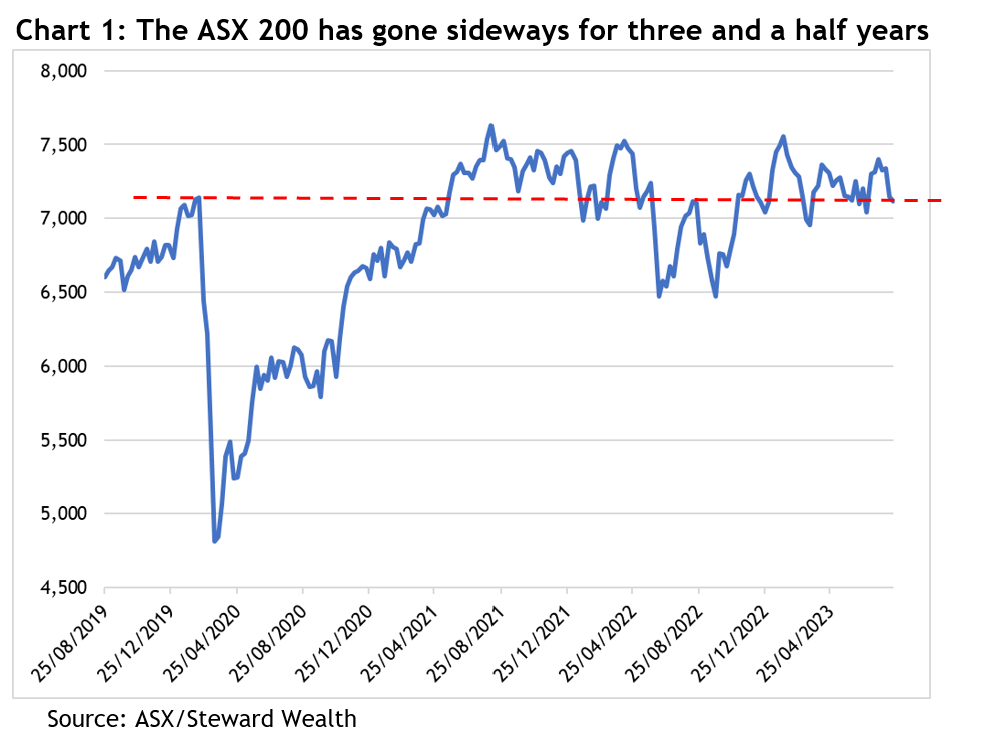
As the ASX 200 approaches the end of August, it is not only at the same level it was in May 2021, so two years in the doldrums, it’s also at the same level as immediately prior to the COVID correction of February 2020, that’s a full three and a half years of going sideways – see chart 1.


Table showing the 2022 share market returns in local currencies


But as anyone who’s been invested over that time, and as the chart makes obvious, the Australian share market has been through some eye-popping gyrations in the meantime, enough to test the patience of plenty of investors.

It is no doubt frustrating that the ASX 200 has been trading in a 500 point, or 7 per cent, range for the better part of the last two and a half years and disheartening that the market appears to be in the grip of another correction after such a promising June and July, but a look at history gives some helpful perspective.

First, markets going sideways is not at all unusual. After the Australian All Ordinaries (the predecessor to the ASX 200) fell 25 per cent in the famous crash of October 1987, it took six and a half years to get back to a new high. Then after the horror of the GFC, the peak from late 2007 wasn’t revisited for almost 12 years. Despite those and a few other noticeable spells in the doldrums, over that 42-year period, the index has grown at a compound rate of 6.5 per cent per year, meaning investors will have (on average) doubled their money every 11 years.

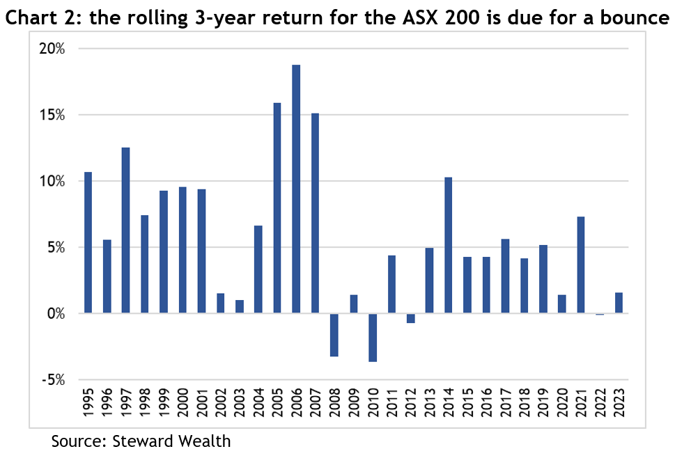
Second, if you look at the rolling three year returns over the past 30 years (so add the returns from 1993, 1994 and 1995 and divide by 3; then 1994, 1995 and 1996; and so on) the average has been a return of 5.9 per cent (which, coincidentally, is the same as the average annual return over the same period). The rolling three-year return to early August (well, not quite a full three years) has been 2.6 per cent, less than half the average, and it follows -0.1 per cent last year – see chart 2. In other words, while there are no guarantees about what will happen, history shows you can’t keep a good market down for ever.


Bar graph showing the main negative influence of share prices was sentiment based on source of return 2022 AUD


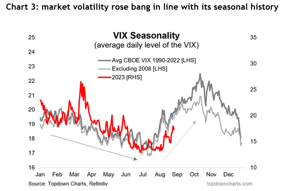
As for the correction markets are going through, the volatility arrived bang on its seasonal schedule. The US Volatility Index, referred to as the VIX, normally goes through a gradual decline from 19 to 17 between January to July, then rises sharply to peak at 22 by the beginning of October – see chart 3.


Line graph showing the probability of recession over the coming 12 months in the Fed's Survey of Professional Forecasters


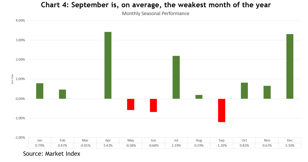
For the ASX, August is usually the fourth lowest monthly return, and we still have September to look forward to, which is the lowest – see chart 4.

    Line graph showing the Morgan Stanley Leading Earnings Indicator against the Actual S&P 500 LTM EPS Growth Y/Y


    Also, prior to the pullback, the US market had risen 19 per cent between mid-March to the end of July, without a serious pullback. The sheer weight of accumulated trading profits together with sentiment readings hitting extreme bullishness primed the market for a breather.

    But even the pullbacks we’ve had this year have been a bit doldrumy. The biggest drawdown for the ASX 200 so far has been 8 per cent, back in March. Over the past 30 years, the average drawdown during a calendar year has been more than 12 per cent. That kind of volatility should be considered as part and parcel of investing.

    Now for the silver linings. All those return statistics so far have ignored dividends. Over the past five financial years, the capital return from the Betashares A200 ETF (the cheapest ETF of the top 200 Australian shares available on the market), averaged 3.3 per cent per year. Adding dividends took that to 7.6 per cent, and franking credits made it a respectable 8.9 per cent. Dividends matter.

    The other safeguard investors can take advantage of is portfolio diversification. Different parts of the world grow at different rates, for example, the State Street S&P 500 ETF (SPY), returned 17.8 per cent per year over the same five-year period, exactly double the ASX.

    Similarly, an allocation to fixed income such as private credit, offered attractive yields of as much as eight per cent.

    Share markets go up, down and sideways, but thankfully, over the longer-term, they invariably trend upwards. In times when markets are becalmed, smart investors should be like the ancient sailors: be patient and have faith, a tailwind will come along again.

    Are Australian banks safe?

    Are Australian banks safe?

    Spoiler alert: Australian banks are safe and what’s happened in the US and with Credit Suisse over the past week does not represent a threat to your bank deposits nor to the Australian economy in general.

    The US

    Silicon Valley Bank (SVB) was the sixteenth largest bank in the US, with $209 billion in assets, and collapsed last week largely due to poor management.

    With the explosion in venture capital investing over the pre-COVD period, SVB had experienced incredible growth by banking standards: deposits had quadrupled in five years. However, it had a massive concentration of depositors, 93% were corporate compared to a median of only 34% in the US’s 10 largest banks, and most were venture capital-backed businesses with relatively large deposits. This left the bank vulnerable to an old-fashioned run on its deposits.

    In an effort to make a bit of extra money, SVB had invested a lot of those deposits into US government bonds, which are super safe, but some were long dated, out to a few years. If they had have invested in 3-month bonds, there wouldn’t have been a problem, but the bank chased the higher yield of 3 and 5-year bonds. This left the bank vulnerable to a rise in interest rates, which reduces the value of bonds. Given SVB’s CEO sat on the board of the San Francisco Fed, which had been warning of ongoing rate hikes, you can see how poor management was.

    With venture capital investors slowing their rate of handing out money since last year, some of those depositors were forced to draw on their deposits to run their companies and fund basic working capital.

    SVB was forced to sell some of its government bonds and take a loss on them, which was reported to the market and they unsuccessfully tried to tap shareholders for $2.25 billion in new equity. This caused some of the venture capitalists to worry that if more and more depositors started wanting their money back, SVB wouldn’t be able to meet the demand, so they jumped on Twitter or sent text messages telling their investee companies (the depositors) to get their money out ASAP. This caused that old fashioned bank run to snowball, and at one point SVB had copped $42 billion worth of withdrawals in six hours.

    By Thursday of last week, it was lights out for SVB. The Federal Deposit Insurance Corporate (FDIC) moved in that day, stayed all night assessing the state of withdrawal requests, and announced it had taken control of the bank by Friday. That’s the day all hell broke loose for US banking shares, with the regional bank index falling some 16%. By Sunday night the Federal Reserve announced all depositors would be made good, but equity investors will lose their money, which is exactly the way it’s supposed to work: depositors have faith a bank will look after their money, while investors take on the risk of a company screwing up.

    In summary, the SVB situation was idiosyncratic, i.e. a situation peculiar to that bank. There have since been two other smaller US banks closed down by the FDIC, mainly because they had excessive amounts of deposits tied up in crypto assets. Certainly, it wouldn’t have happened if the Fed had not been raising rates, but there’s a popular expression on Wall Street that the Fed keeps raising until something breaks.

    It’s worth bearing in mind, the US banking industry is structured very differently to ours. There are literally hundreds of small banks, a legacy of the Great Depression era. Since 2001, there have been 563 banks go belly up in the US, with about 500 of those as a result of the GFC. If Australia’s banking system was able to withstand that, it will be fine with what’s happening now.

    Credit Suisse

    Credit Suisse has been a mess for years, with a string of scandals and poor investments going back over decades, which culminated in a growing number of clients taking their money and business elsewhere by the end of last year. The bank’s CEO tried to woo back customers, but last week the Securities and Exchange Commission (SEC) in the US (equivalent to ASIC here), queried the bank’s annual report. Combined with the SVB situation, panic started to set in.

    Then on Wednesday, CS’s biggest shareholder, the Saudi National Bank, said it wasn’t going to be able to invest any more into the bank because it was hitting regulatory limits. That caused CS’s share price to plunge, and they asked the Swiss central bank to issue a statement of support, which it did.

    However, other banks around the world started worrying about counterparty risk, in other words, looking at contracts where CS was on the other side, and trying to buy protection. Pretty soon, the cost of that protection skyrocketed, implying a high likelihood of default.

    A you can imagine, a lot of investors started having flashbacks to the death of Lehman Brothers in 2009, and worrying what threats CS poses to the global banking system. However, CS has substantial liquid assets it can call on as well as access to central bank lending facilities. The CEO has said it has sufficient cash-like liquid assets to pay back half its deposit liabilities and loans from other banks.

    Subsequently, the Swiss National Bank has said CS “meets the higher capital and liquidity requirements applicable to systemically important banks” and it stands ready to provide CS with liquidity. CS has announced it will borrow SFR50 billion to meet any liquidity demands from depositors and buy back a bunch of debt that was trading way below its issue price.

    Is this the start of another GFC?

    No, it’s a very different situation. However, stress levels in financial markets have certainly risen which is being reflected in bond market dislocation, which will result in higher funding costs for banks. It depends on how markets and central banks respond to a crisis, and so far, the US Fed and the Swiss National Bank have done very well.

    How will it affect Australian banks?

    In 2016, the Australian bank regulator, APRA, announced it wanted Australian banks to have “the strongest balance sheets in the world”. At the time the banks pushed back, but lost, and now their balance sheets are indeed very strong.

    Their funding costs may rise a bit, and access to capital markets may be restricted while markets are unsettled, but there is no risk of any bank failures in this country.

    As for depositors, the federal government already guarantees deposits up to $250,000 and we’ve seen the US regulator increase that to pretty much no limit for the SVB depositors.

    A silver lining?

    It is entirely possible this will cause central banks around the world to pause their interest rate rises while markets are in turmoil.

    The link between lending and property; what’s in store for 2023?

    The link between lending and property; what’s in store for 2023?

    The correlation between lending approvals and property prices has long been established as providing a 4-6 month ‘crystal ball’ into future property prices. The relationship can be clearly seen in the following chart which plots each data series over the past 20 years.


    The correlation between lending approvals and property prices has long been established with loan approvals generally providing a 4-6 month ‘crystal ball’ into future property prices. The relationship can be clearly seen in the following chart which plots each data series over the past 20 years. Source: ANZ      Property prices declining Let’s first establish where the property market currently sits. CoreLogic’s national Home Value Index (HVI) fell for the sixth consecutive month, as values across the nation retreated a further -1.2% in October. Annual declines are currently isolated to Sydney, Melbourne and Hobart yet there is some evidence the rate of decline is now gathering pace in the other capital cities, especially Brisbane.    Source: CoreLogic It was not only the capital cities which experienced the pullback. CoreLogic’s Regional Market Update showed residential property values in six of the twenty-five most popular lifestyle markets recorded falls of 6% or more last quarter. This included Richmond-Tweed (-11.7%), Southern Highlands and Shoalhaven (-7.1%), Sunshine Coast (-7.1%), Gold Coast (-6.4%), Illawarra (-6.1%) and Newcastle and Lake Macquarie (-6.0%). From September 2020 to April 2022, national house values rose 32.5%, while unit values rose by a milder 16.1% over the same period. Since peaking in April, house values are now reversing at a more rapid rate, falling -5.3%, while values across the medium to high-density sector have declined by a more moderate -3.0%.  How does borrowing capacity affect overall lending? The amount a bank will lend a prospective borrower is largely determined by two factors; interest rates and credit policy. In 2019, in response to the pandemic, The Reserve Bank of Australia (RBA) quickly cut its official interest rate to 0.1%. At the same time the banking regulator, APRA, removed the minimum 7.25% interest rate required to be used when banks assess the serviceability of a loan. In a short space of time borrowers had access to much higher levels of debt and overall lending accelerated to all-time highs. Since May, the RBA has raised the official interest rate by 2.75%. To put this in perspective, a joint household with disposable income of $150,000 and expenses in line with the Household Expenditure Measure (HEM) has had their borrowing capacity lowered by 20-25%. To further add to the tightening, the buffer used for the assessment of a loan has been increased from 2.5 to 3.0% above the offered rate.   What does the current lending data tell us? Whilst borrowing capacity is not an exclusive influence on overall lending, The Australian Bureau of Statistics’ September Lending Indicator’s report show that the value of new borrower loan commitments has fallen 18.5% over the first three quarters of this year, with owner-occupier loans contributing most to the decline. These falls are notably more than that seen in property prices over the same period.    Source: Australian Bureau of Statistics, Lending Indicators September 2022    Source: Australian Bureau of Statistics, Lending Indicators September 2022 During September 2022, in seasonally adjusted terms for owner-occupier housing loan commitments, largest falls were recorded in the Northern Territory (25.2%), Queensland (13.8%) and Western Australia (13.2%) further reinforcing that the softening is now spreading outside of the two largest markets of Sydney and Melbourne.   Source: Australian Bureau of Statistics, Lending Indicators September 2022  Investor lending also saw declines, however not to the degree of owner-occupied commitments. Tasmania led the way with a 26.6% decline followed by the ACT (12.2%) and Western Australia (8.7%). This goes some way to partly explaining the more modest declines in units versus house values across the nation.    Source: Australian Bureau of Statistics, Lending Indicators September 2022  Crash or correction? With overall property values now 6% lower than their peak and an aggressive interest rate tightening cycle, many commentators warn that a housing market crash is imminent.  For a property market to

    Source: ANZ


    Property prices declining

    Let’s first establish where the property market currently sits.

    CoreLogic’s national Home Value Index (HVI) fell for the sixth consecutive month, as values across the nation retreated a further -1.2% in October. Annual declines are currently isolated to Sydney, Melbourne and Hobart yet there is some evidence the rate of decline is now gathering pace in the other capital cities, especially Brisbane.


    Core logic change in swelling values

    Source: CoreLogic


    It was not only the capital cities which experienced the pullback. CoreLogic’s Regional Market Update showed residential property values in six of the twenty-five most popular lifestyle markets recorded falls of 6% or more last quarter. This included Richmond-Tweed (-11.7%), Southern Highlands and Shoalhaven (-7.1%), Sunshine Coast (-7.1%), Gold Coast (-6.4%), Illawarra (-6.1%) and Newcastle and Lake Macquarie (-6.0%).

    From September 2020 to April 2022, national house values rose 32.5%, while unit values rose by a milder 16.1% over the same period. Since peaking in April, house values are now reversing at a more rapid rate, falling -5.3%, while values across the medium to high-density sector have declined by a more moderate -3.0%.


    How does borrowing capacity affect overall lending?

    The amount a bank will lend a prospective borrower is largely determined by two factors; interest rates and credit policy. In 2019, in response to the pandemic, The Reserve Bank of Australia (RBA) quickly cut its official interest rate to 0.1%. At the same time the banking regulator, APRA, removed the minimum 7.25% interest rate required to be used when banks assess the serviceability of a loan. In a short space of time borrowers had access to much higher levels of debt and overall lending accelerated to all-time highs.

    Since May, the RBA has raised the official interest rate by 2.75%. To put this in perspective, a joint household with disposable income of $150,000 and expenses in line with the Household Expenditure Measure (HEM) has had their borrowing capacity lowered by 20-25%. To further add to the tightening, the buffer used for the assessment of a loan has been increased from 2.5 to 3.0% above the offered rate.


    What does the current lending data tell us?

    Whilst borrowing capacity is not an exclusive influence on overall lending, The Australian Bureau of Statistics’ September Lending Indicator’s report show that the value of new borrower loan commitments has fallen 18.5% over the first three quarters of this year, with owner-occupier loans contributing most to the decline. These falls are notably more than that seen in property prices over the same period.


    Lending indicators

    Source: Australian Bureau of Statistics, Lending Indicators September 2022


    new loan commitments

    Source: Australian Bureau of Statistics, Lending Indicators September 2022


    During September 2022, in seasonally adjusted terms for owner-occupier housing loan commitments, largest falls were recorded in the Northern Territory (25.2%), Queensland (13.8%) and Western Australia (13.2%) further reinforcing that the softening is now spreading outside of the two largest markets of Sydney and Melbourne.


    new loan commitments owner occupier

    Source: Australian Bureau of Statistics, Lending Indicators September 2022


    Investor lending also saw declines, however not to the degree of owner-occupied commitments. Tasmania led the way with a 26.6% decline followed by the ACT (12.2%) and Western Australia (8.7%). This goes some way to explaining the more modest declines in units versus house values across the nation.


    new loan commitment investor housing

    Source: Australian Bureau of Statistics, Lending Indicators September 2022


    Crash or correction?

    With overall property values now 6% lower than their peak and an aggressive interest rate tightening cycle, many commentators warn that a housing market crash is imminent.

    For a property market to “crash” a large number of owners are forced to sell into a falling market, with limited buyers, as they can no longer afford to make their mortgage repayments. The rate of delinquency loans, or loans in arrears for more than 30+ days, is a key metric in predicting a crash.

    The latest data released by Fitch Ratings, show mortgages that are 30 and 90 days in arrears were down by 0.07% to 0.82% and 0.04% to 0.4% respectively for the 3 months to June 30 – the lowest level since tracking began in 2002. As more recent data is released, delinquency rates will be something to watch as the aggressive tightening cycle further filters through to the broader economy.


    What will 2023 bring?

    The value of new lending will be largely dependent on where the RBA take interest rates over the next year, however, if lending continues to act as a precursor for property, we can expect house prices will continue to ease at least throughout the first half of 2023.

    If you’d like to discuss your specific circumstances, or simply interested in what lending options are available, please do get in touch.