Bubble Trouble Brewing

Bubble Trouble Brewing

This article by Jason Todd, a strategist at Macquarie Wealth, takes a measured look at whether the Australian share market is overvalued, and whether the tech sector is in a bubble.

The bulls versus the bears

When equity markets began to rise back in late March, we had no problem thinking that liquidity would do the ‘heavy lifting’ as long as COVID-19 cases were not still rising and economic expectations were not still falling. It was right to take this stance. Now the equation seems much harder to solve. COVID-19 cases are rising again but markets do not seem particularly concerned even though valuations have expanded by an extraordinary amount. There appears to be two schools of thought emerging to explain the current backdrop.

The first, suggests that markets are becoming irrational and are in the midst of a liquidity-fuelled rally that is fast taking on bubble-like characteristics. This view argues that investors are being driven by the fear of missing out (FOMO), paying an unjustified scarcity premium for earnings growth and that momentum rather than fundamentals matter. 

The alternative view is that markets are pricing in a combination of record low bond yields, an unwavering commitment by policy makers to keep economies and the financial system afloat and the willingness to pay a premium for structural growth. This is pushing valuations higher in areas where COVID-19 has accelerated change such as technology while pushing valuations lower in areas under downward pressure such as traditional retail and property.

It is hard to say which view will ultimately prevail as we think there are elements of truth to both sides. The risk-reward for certain pockets of the market are becoming hard to justify, but in general, we do not see broad signs of “bubble trouble” across equities. Traditional warnings signs such as speculation activity are not broadly evident even if tech valuations are looking troublesome.

Are equities in a bubble?

A ‘bubble’ is defined as a rapid rise in the price of an asset that is not supported by fundamentals. A typical sign of a bubble is a sharp increase in valuations to extreme levels. For the Australian market, valuations are high but outside of a reversion in the drivers supporting risk assets in general, we don’t think they have reached a self-correcting level.

The 12-month forward P/E multiple for the Australian market has risen sharply since 23rd March and now sits at a near-record high of 19.1x. However, the P/E multiple has been boosted by the COVID-19 induced collapse in earnings which we think is not a permanent hit. In addition, the CAPE is only 15.9x. This is well below previous peaks and is below its long run average of 16.6x. So far so good…right?
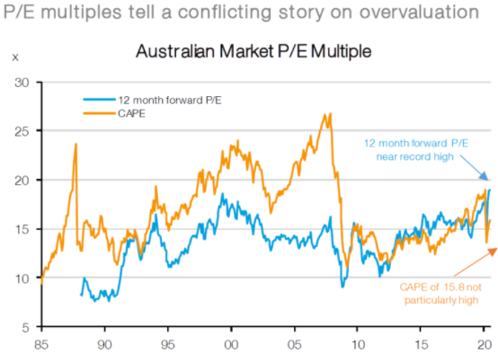
Bubble Trouble Brewing image1
Source: Factset, IRESS, MWM Research, July 2020

Is there bubble trouble in pockets of the market?

We do not think Australian equity valuations are anywhere near bubble territory and nor do we think other traditional indicators of bubble-like behaviour are evident. However, we cannot say the same for Australian technology stocks which are now trading on an eye watering 60x forward earnings!

These valuation metrics look even more concerning when only the WAAAX stocks are considered (Wisetech, Afterpay, Appen, Altium and Xero). These 5 stocks have seen prices rise more than 500% over the past 3 years versus the broader ASX200 index which has barely risen above 0% over the same period. This has pushed 12-month forward P/E valuations for WAAAX to a new all-time high of 168x versus a paltry 19x for the ASX200.
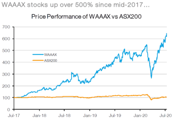
Bubble Trouble Brewing image2
Source: Factset, IRESS, MWM Research, July 2020

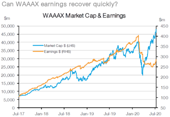
Part of the extraordinary price appreciation and valuation re-rating has been due to a much stronger and less cyclical earnings outlook, but it has also been fuelled by record low interest rates which disproportionately benefit high multiple/long earnings duration stocks. In fact, the WAAAX stocks have seen earnings grow 2.5x over the last 3 years – an impressive outcome versus the broader market which has seen earnings decline. However, this has been dwarfed by the near 6-fold increase in share prices over the same period!
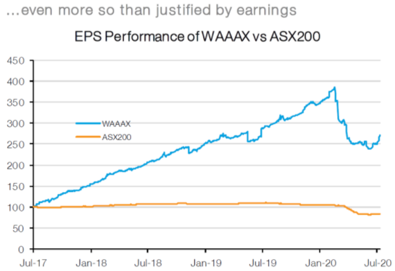
Bubble Trouble Brewing image3
Source: Factset, IRESS, MWM Research, July 2020

To put this in context, the WAAAX stocks have seen earnings increase by A$181m and their market cap expand by a staggering A$41bn. Back in 2017 investors were willing to pay 71 for each $1 of earnings and now these same stocks are commanding 168 for each $1 in earnings. In other words, investors have been willing to ‘pay up’ for the superior earnings performance of WAAAX stocks but at an increasingly higher and higher rate.  

Is there a global growth stock bubble?

The re-rating of growth stocks is not unique to Australia. The WAAAX ‘bubble’ is part of a larger issue relating to the willingness of investors to bid up stocks which have a strong, structural, and/or transparent earnings growth outlook. ‘Growth’ stocks (of which WAAAX is a component) have been fiercely bid up as one of the few sources of structural earnings growth in the Australian market.

In other words, in a world where earnings growth is scarce, any earnings growth has become more valuable. This has also been seen in the recent performance of the FAANG’s (Facebook, Apple, Amazon, Netflix and Alphabet – formerly Google). This collection of stocks has also seen valuations ratios explode in recent years with momentum rising even faster in recent months because of an acceleration in their earnings outlook thanks to COVID-19. 
Bubble Trouble Brewing image4
Source: Factset, IRESS, MWM Research, July 2020

The other big factor, ultra-low interest rates, has also played a part. All other things equal, a lower discount rate would not only increase the fair value P/E multiple of the market generally but would also increase the dispersion between high and low P/E stocks. However, the current unprecedentedly high P/E dispersion exceeds the extremes seen during the Tech bubble of late 1999/early 2000, which suggests caution may be merited.

What’s the right price for “scarcity” value?

In a world where earnings growth is scare, what is the right price for the rarest of structural earnings stocks like technology, which the market is assuming can access that growth? Is it 50x future earnings, 100x future earnings, an eye watering 168x future earnings or something even higher? Only time will give us the right answer, but we think it is worthwhile trying to determine what conditions would need to prevail in order for these stocks to maintain these multiples (or the alternative – what would need to change for these stocks to suddenly lose their scarcity premium?). Gavekal’s Louis Gave believes there are 4 factors that would drive this reassessment:

  • An improvement in the macroeconomic growth outlook and higher interest rates.
  • Markets stop seeing technology companies as having scarcity value (i.e. government regulation).
  • Another scarce asset becomes popular (i.e. gold? Bitcoin?); and
  • Technology stocks disappoint.

We think equity markets are optimistically priced and waiting for economic fundamentals to catch up, but they are not at an extreme (bonds are even more expensive). Similarly, retail sentiment is bullish but not exuberant, cash levels have come off their highs, but remain exceptionally elevated and capital raisings are still being gobbled up (predominately by institutional and not retail money). On the other hand, there have been some anecdotal signs of rising market ‘madness’ in the US with investors fiercely bidding up bankrupt companies, retail account openings have exploded (in part because many have been stuck at home) and some daily price moves have been extreme.

The technology sector is another kettle of fish. In the US, valuations are high but nothing in comparison to our own WAAAX stocks. On the other hand, there are still few signs of speculative activity stretching more broadly into financial assets and the scale of global (and domestic) liquidity injections is nothing we have seen before. We are not saying that fundamentals don’t matter because in the end they always do, but it is quite possible that the combination of easy money and a slightly better cyclical outlook push multiples for both technology and the broader market even higher!

Over the coming 12 months, we think investors should maintain a pro-growth portfolio allocation (overweight equities versus bonds and cash) and be prepared to look through any near-term fluctuations or use weakness to reallocate back into the equity market. Despite near-term risks, we think the downside risks are more likely to slow the recovery rather than put the cyclical recovery at threat. This could lead to a more drawn out rebound, but if economic growth and corporate earnings continue a path back to trend, then, in combination with record low interest rates, this will be sufficient to propel markets higher. In addition, while valuations for equity markets are not overly appealing, they are even worse for the bond market with yields not far from their lower bound and as a result bonds continue to give away a substantial yield premium to equities.

Lessons from previous bear markets

Lessons from previous bear markets

There’s an old saying that the stock market goes up by the stairs and down by the elevator, except this time it’s been more like jumping out the window. The ASX 200’s gut-wrenching 30% plunge from its late February peak was clocked up in a brutally quick 17 trading days and has left punch drunk investors wondering if things will ever get better and occasionally even wondering if they can continue to bear the pain. Let me assure you, things will get better, regrettably, however, nobody knows when.

Every investor needs to have a plan, or a strategy, that reflects their ability, willingness and need to take on risk. If share markets didn’t face the risk of falling, they would not offer long-term returns above cash. While bear markets will always test an investor’s resolve, hopefully some historical context will be helpful, not just in terms of how bad it can feel at the time, but the inevitability of recovery afterwards.

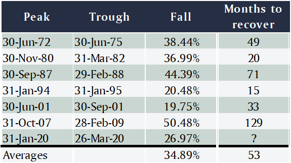
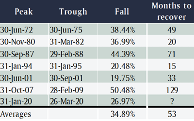
Notably, this hasn’t been the sharpest selloff we’ve ever had in Australia, that ignominious title goes to 1987, a near five month correction that saw the All Ordinaries almost halve and included Black Monday (which was actually a Tuesday when the tsunami of selling hit Australia) where shares dropped 26% in a single day.

Then there was the GFC, where the All Ordinaries fell 55% over an excruciating 14 months from its peak in November 2007 to its final bottom in early March of 2009.

All up, if you use the rule of thumb that a bear market is a fall of at least 20%, over the past 60 years Australian shares have experienced seven of them, including the current one. The average time it took to recover the losses was 53 months, though it’s varied between 15 in the mid-1990s to more than 10 years after the GFC (the length of the recovery period is highly influenced by how overvalued the market was going into the selloff). That means the average return over the recovery period has been better than 10% per annum, or almost 13% if you exclude the GFC as an outlier.

Lessons from previous bear markets_chart1

Again, for some context, in the US there have been 12 bear markets since 1965 with an average fall of 31%, and an average recovery period of 21 months (less than half Australia’s). That means once the bear market is finished the average returns over the recovery period have been more than 23% per annum.

The question everyone’s asking is when will the current correction stop, and the honest, but entirely frustrating, answer is nobody knows. The analysts at Heuristic Investment Systems have looked at the history of US share market corrections and concluded that mid-sized recessions have typically resulted in the market falling 25-30%, which is where we are now. Deeper recessions, like the GFC tend to see falls of 40-50%, so arguably the market’s pricing in a 60% chance of a deep recession.

Looked at another way, company earnings typically fall 15% in an average recession and the ‘forward price to earnings multiple’, that is the PE ratio the market trades on based on forecast earnings for the year ahead, can go down between two and seven points. From where the US market was immediately prior to this correction starting, a 15% cut in earnings and the PE dropping to 15 would take the S&P 500 to 2,250.

An alternative way to assess how share valuations stack up is the ‘equity risk premium’ (ERP), which measures the extra return shares are offering compared to a risk-free investment in bonds. Even after accounting for expected cuts in earnings forecasts, for the ERP to be as high as it was during the GFC and the European debt crisis would imply 2,600 on the S&P 500.

What those estimates tell you is the share market is already pricing in a serious economic slowdown. Even though there are some commentators arguing this slowdown could be worse than the GFC, we’ve had 10 years of slow but steady growth in between, so don’t expect the index to retreat all the way back to the same level. Plus, central banks and governments, having learned from the GFC, are coordinating their efforts to throw the kitchen sink at supporting economies.

For those that have not sold their shareholdings, there is arguably a lot of value in shares at current levels and to sell now would simply lock in a loss, and for those lucky enough to be holding cash, you have the kind of opportunity that comes along maybe once a decade to build a great, rest-of-your-life portfolio.

If you’re wondering when to invest, don’t for a minute think you’ll be able to pick the bottom, the odds on that are about the same as winning the lottery. And remember, the market will start to turn when the odds of recovery are 50.1%, as opposed to 49.9%, so if you wait for certainty, the market will have taken off well ahead of that point. You should also bear in mind, you don’t have to be all in or all out so you can hedge your bets: if you think there’s a 30% chance the market has bottomed, then you can invest 30% of your resources.

Portfolio update

Portfolio update

With market volatility hitting multiyear highs on the back of the implications of COVID-19 and the oil price dropping, we convened an extraordinary meeting of the Investment Committee yesterday to talk about what’s going on and whether any action needed to be taken.

The noise level is reaching fever pitch, with all forms of media talking about little else – see the chart below – which exacerbates the sense of panic, and footage of women wrestling over toilet paper drives home the astonishing effect this is having on people.


Media mentions of COVID-19

Last weekend Russia and Saudi Arabia were unable to agree on production cuts, which saw the oil price fall almost 30% over the following week and then on Monday was blamed for a rout on international share markets. Whilst the lower oil price will have clear implications for energy companies and whatever debt they might have, you’d have thought it should otherwise be a good thing for most companies and pretty much all consumers.

Obviously the greatest concern for share markets is the impact the various quarantining measures will have on company earnings and global economic activity, and that is, as yet, completely unknown, and unknowable. Share markets have fallen anywhere from 10-20% from their recent peaks, setting records for the fastest retreat from all time highs in history, which could well be overcompensating for potential earnings declines or not enough. Likewise, government bond yields have plummeted to the point where all US bonds, all the way up to 30 years, have a yield of less than 1%.

In considering whether any action should be taken on portfolios, there are many, many factors at play, and it’s full of ‘on the one hand, but on the other’. For example, we know governments and central banks have indicated they will provide support, but on the other hand, we don’t how effective those actions will be. The challenge is to focus on those things we can be sure of, as opposed to those where we are just guessing.

Another important factor is how a portfolio is structured and what’s called its ‘beta’, which is simply the technical name for how sensitive it is to the changes in share markets. A beta of 1 means a portfolio is perfectly correlated to share markets, and a beta of zero means it has no correlation at all. Steward Wealth’s portfolios include investments that are designed to reduce beta, such as the alternatives and non-secure debt, and, of course, secure debt (which is the very low volatility, ‘cash-plus’ funds).

Also, not all share markets have been as weak as the Australian, which has been a terrific example of the benefits of geographic diversification. For example, after Monday’s correction the ASX200 had declined 20% from its peak, but the Japan ETF in the portfolio (UBJ.ASX) had fallen only 8%, and the Europe ETF by 10%. Those results have been helped by the Australian dollar weakening against the big three currencies: since the start of the year it’s fallen 6% against the US$, 7% against the Euro and 11% against the Yen.

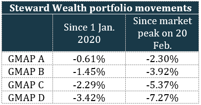
The table below summarises the movement in the four benchmark GMAP portfolios from the start of the year and since markets peaked on 20 February. This data is as at the close of business on 10 March and doesn’t include adviser charges.

Portfolio update_chart2

We hope you are as pleased with that outcome as we are.

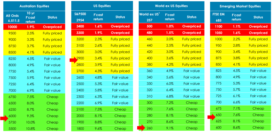
Another thing we can have a little more certainty about is valuations, which is where our asset allocation consultant, farrelly’s, is very helpful. As you’ll remember, we take a long-term approach to examining relative value, between asset classes as well as geographies. The latest tipping point tables indicate markets are uniformly offering attractive value, again, with the exception of the US.

Portfolio update_chart3

As we keep saying, there is no way of knowing when the current market volatility will subside, or where markets will be once it does, which makes trying to time ducking in and out of the market very risky. We much prefer to base portfolio moves on valuations, but we feel there are buffers in place to protect portfolios from the worst of what’s happening.

As always, please do call us if you’d like to discuss your portfolio or have a chat about what’s going on.

Why ‘slowing growth’ does not have to mean ‘sell shares’

Why ‘slowing growth’ does not have to mean ‘sell shares’

n the face of it, it makes sense: the economy looks like it could slow down a bit, which would have to affect companies, so you figure you should lighten off your share exposure and go a little more defensive. Unfortunately though, it’s not that straight forward: it turns out stock market returns over the short-term have little, if any, relationship to the most popular measures of economic activity. Even if you’re convinced the economy is going to slow down, your portfolio could still go up.

How many times have you read the headlines that the stock market seems to defy logic by going up on bad news? Trying to pin down what drives the share market in the short-term, let alone get ahead of it in anticipation of good or bad economic news, turns out to be a great way to wrong-foot yourself and potentially lose money.

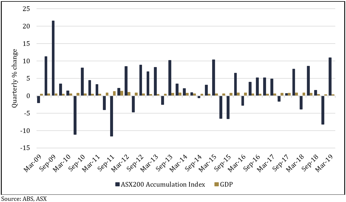
The chart below shows there’s no correlation between the quarterly changes in the ASX200 Accumulation Index (which includes dividends) and GDP figures over the last 10 years.


 Chart 1: Quarterly changes in the ASX20 Accumulation Index vs GDP
Chart 1: Quarterly changes in the ASX20 Accumulation Index vs GDP

There wasn’t a single quarter of negative GDP growth, but there were 13 negative quarters on the share market; the highest quarterly GDP growth figure was 1.3% and the lowest was 0.3%, whereas the highest return from the share market was 21.5% and the lowest was -11.6%. There isn’t even any discernible pattern from the direction of changes in GDP growth and the direction of the market.

There’s a bunch of reasons why the level of economic growth that’s reported might not resemble the returns seen out of the stock market. A major one is the stock market is not particularly representative of the overall economy, for example, financial companies account for 32% of the ASX200 but only 10% of GDP, and ‘materials’ (which includes mining) is 18% of the index but only 9% of GDP.

Another is that companies gear up their balance sheets with debt, meaning they can earn a higher return on their equity than they would get from just leaving it to the broader economy. For example, if a company has $100 of assets and earns $10 profit, that’s a return on equity of 10% (100/10), but if the assets are funded 50% by the company’s own equity and 50% by debt, then the $10 profit is a 20% return on equity (50/10).

That leverage finds its way down to the earnings per share a company reports, along with a host of other variables, which can the affect the biggest, and most unpredictable reason for the differences: sentiment. While the share market’s dividend yield and earnings tend to change relatively slowly over time, sentiment, which is reflected by the market’s price to earnings (or PE) ratio, can jump all over the place.

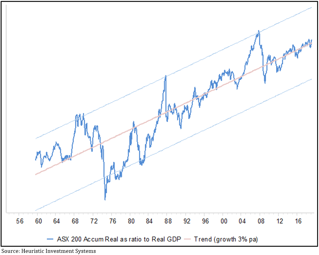
Don’t for a minute think economic growth is irrelevant for investors, in a healthy economy both trend upwards over time. However, chart 2, which shows the ratio of growth in the share market compared to GDP over the last 60 years, tells us the relationship never sits still: there are times when the share market can get way ahead of itself, only to inevitably fall back again and typically overshoot, before climbing back to the average.


 Chart 2: Ratio of real growth in the ASX200 Accumulation index vs Australian GDP
Chart 2: Ratio of real growth in the ASX200 Accumulation index vs Australian GDP

There are three interesting takeaways from this chart: first, like chart 1, it confirms the relationship between GDP growth and share market returns is very jumpy, so trying to predict it will be difficult; second, the post-GFC period has been notably stable, and third, to the extent the chart can be used to indicate when share market valuations get out of whack, it doesn’t look especially expensive right now.

There are other economic data that measure things like the change in industrial production, or inventories, or trade volumes – in fact the menu is enormous. Some fund managers dedicate enormous resources to using those data to make short-term forecasts of what the market will do, with PhD’s building complicated models, but very few of them are consistently reliable. That’s because the most important part of the puzzle is the least predictable: sentiment, which is a function of a countless number of people reacting to a countless number of factors.

An added risk of paying attention to economic activity is you invariably find yourself relying on economists, who, frankly, can be pretty patchy when it comes to making good forecasts. Last year the IMF released a study covering 63 countries between 1992-2014 which found 97% of economists failed to forecast a recession less than six months before it began. In 2015, 23 of the US’s leading economists published a letter in the Wall Street Journal warning the Fed’s quantitative easing program risked ‘debasing the currency and causing inflation’, four years later, the opposite is the case. And in January of this year, not one of the 69 economists surveyed by the Wall Street Journal correctly forecast the 10-year bond yield would go below 2.5% less than six months later.

There are two key lessons for investors: stop fretting about economic growth, because while it has a clear long-term relationship to share market returns, don’t be so sure you can second-guess how the share market will react to changing economic prospects in the short-term; and be wary putting too much faith in economic forecasts, especially when they’re about the future.

Just how worried should you be about the sharemarket?

Just how worried should you be about the sharemarket?

Have you noticed how many articles have appeared recently scaring investors into thinking “markets have never been so uncertain” as they rattle off the well-worn reasons we should be worried: geopolitical tensions, elections, stretched valuations, extended cycles, the inverted yield curve. If you didn’t know any better, it’s enough to leave you thinking the best solution would be to find shelter and stock up on tinned food.

But many of these articles tend to be absurdly one-sided, you just have to look a bit deeper to find sound arguments to justify where share markets are trading.

1. The bond market is smarter than the share market and bonds say sell

The bears argue: While last year’s share market tumble bottomed around Christmas, bond yields around the world continued to fall, signalling the bond market expects economic growth to slow in the future. What’s worse, share markets have rallied at the same time as forecast company earnings have been going down. How can that make sense?

It’s not just economic growth perceptions that cause bond yields to fall, it’s also the perception of inflation and the fall in global yields is partly a reflection of the ongoing very low inflation we’re seeing around the world and the expectation that it’s likely to continue. For example, over the last 30 years Australia’s core inflation rate has averaged 3.8%, but the latest reading was less than half that at 1.3%.

If you look back over the last hundred years, when inflation is low share markets attract a higher valuation, as measured by a basic price to earnings (PE) multiple. At the end of March, the ASX200 was trading on a PE of 15.6 versus its average ‘low inflation PE’ of 16.5. On that basis, while you wouldn’t argue the share market is exactly cheap, nor is it overly expensive.

Another valuation measure to look at, especially for income-seeking investors in a low interest rate environment, is the share market’s dividend yield minus the 10-year Australian government bond yield. At 2.9% the dividend yield is at its equal highest margin above the government bond yield in the last 25 years – see chart 1.

 Chart 1: the ASX200 dividend yield minus the Australian government
10-year bond yield is at an equal high for the last 25 years

1

More importantly, after accounting for inflation, at less than 0.5% the ‘real’ bond yield is getting perilously low, whereas the 3.4% real yield on shares is almost two and a half times its 25-year average of 1.4% and more than seven times higher than the real bond yield – see chart 2.

 Chart 2: the real yield on shares is more than seven times higher than the real bond yield

2


Another measure is the Earnings Yield of the share market, which is technically the inverse of the PE ratio and essentially tells you the return on equity you should get from investing in shares, a focus for those aiming to generate a capital return on their investments. At 6.4%, it’s bang in line with the 25-year average, another indicator that the market is around fair value, but nevertheless attractive in the context of a low return environment.

Finally, the Equity Risk Premium (ERP) for the Australian market, which tells you how much extra return you should get from investing in shares rather than risk-free government bonds, sat at 4.9% at the end of March, comfortably above its 21-year average.

If you say a market’s expensive, you have to say relative to what. In the context of super low bond yields and an environment where the risk-free return barely leaves you with anything after inflation, equities start to look pretty attractive even if underlying company earnings are a bit weaker.

2. The inverted yield curve

The bears argue: Over the last 50 years every recession in the US has been preceded by an ‘inverted yield curve’, which is where the yield on longer-term bonds is lower than that on shorter-term bonds. Last month the 10-year bond yield snuck below the three-month yield, and we all know when the US sneezes the world catches a cold.

No less an economist than Nobel Laureate Myron Scholes wrote a piece arguing that forecasting a recession will automatically follow an inverted yield curve is no more than ‘data mining’ (an expression used to condemn either lazy analysis or the torturing of data to arrive at a pre-determined outcome). He points out that previous inversions came about because the Fed raised cash rates to an average of more than 2% above inflation in a deliberate effort to slow the economy, whereas in this cycle of nine rate rises it’s never been more than 0.3% above inflation.

In other words, the bond yields themselves don’t cause a recession, it’s what causes the yields to move that matters. In the past, recessions have coincided with the Fed actively trying to slow the economy, whereas this time around, they’ve said they’re trying not to.

3. The cycle is extended

The bears argue: Come June this economic cycle will be the longest on record.

So what, cycles don’t die of old age. Period.

Cycles normally die because of some kind of excess in the economy, and it’s hard to spot any of those right now, or because the central banks have to stomp on the brakes, again, no sign of that.

4. Geopolitical tensions

The bears argue: Pick your poison: Brexit, Trump’s trade war, any other capricious Trump crusade, Russian hacking.

Political shenanigans is a perpetual favourite of share market doomsayers, but the fact is, over the past 10 years the markets have sailed through whatever’s been thrown at them.

The UK share market has risen 11% since the Brexit vote, unemployment is at a more than 40-year low of 3.9% and GDP growth is the same as Switzerland and much better than both of Germany and France.

Trade wars are horrible, but the US’s S&P500 is up 11% since tariffs were proposed in April last year and in fact just hit a record high, the Chinese index is up about 1% over the same period, and the ASX200 has hit a 12-year high and is closing in on its all-time high too. By no means are trade issues inconsequential, but neither is it turning into a disaster as yet.

The bottom line

There are always reasons to worry about markets, but one of the most disingenuous expressions is “it’s never been more uncertain”, because in truth, markets are never, ever certain.