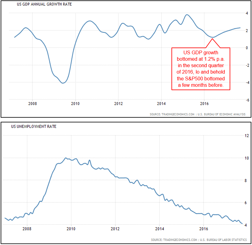
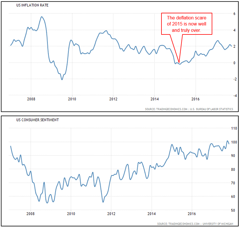
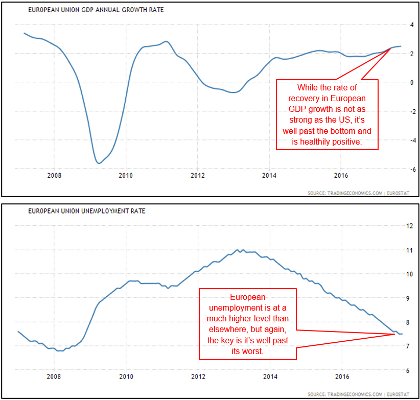
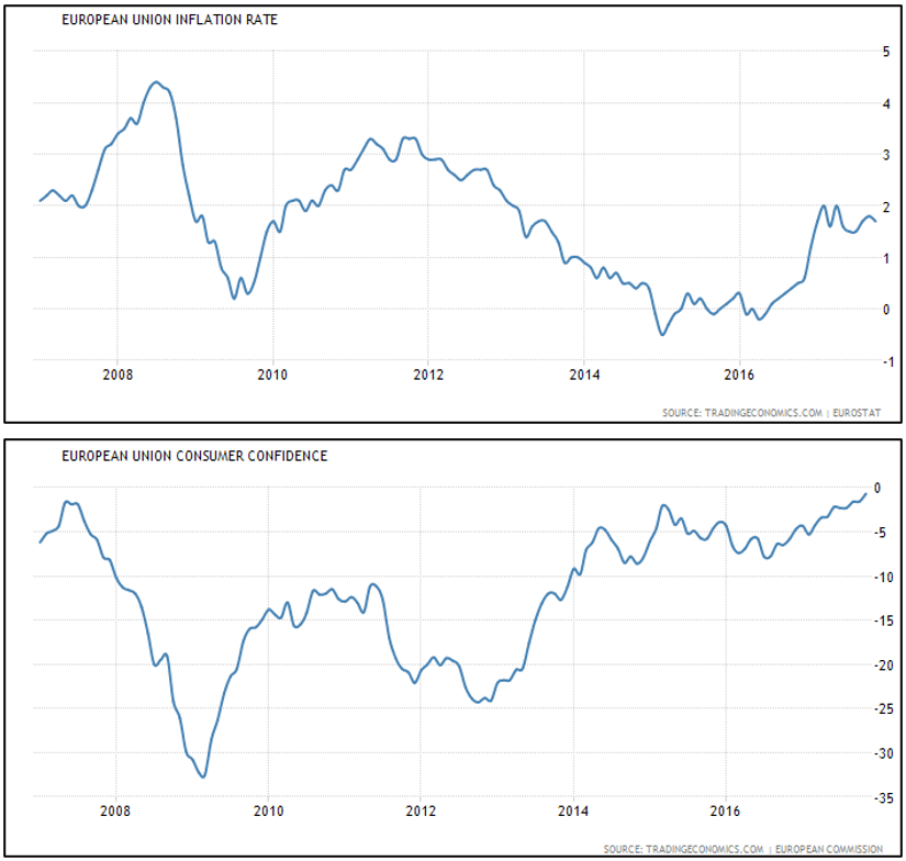
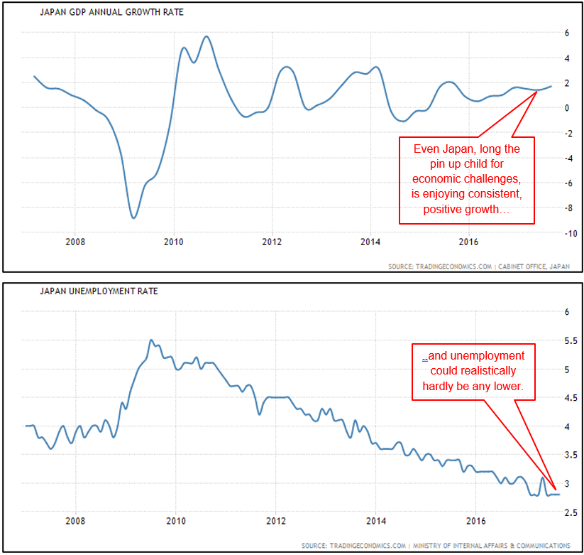
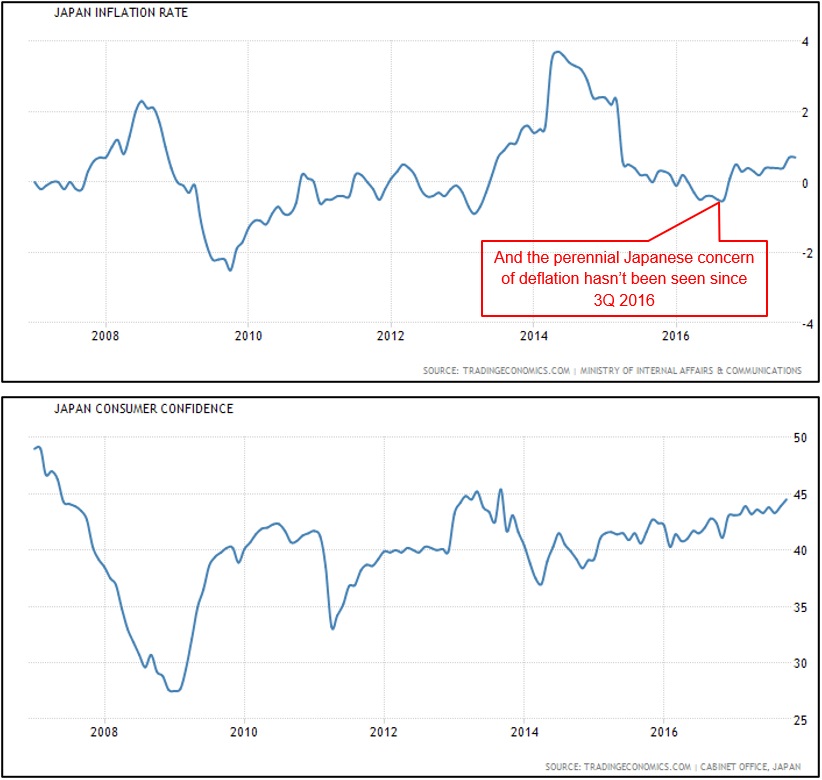
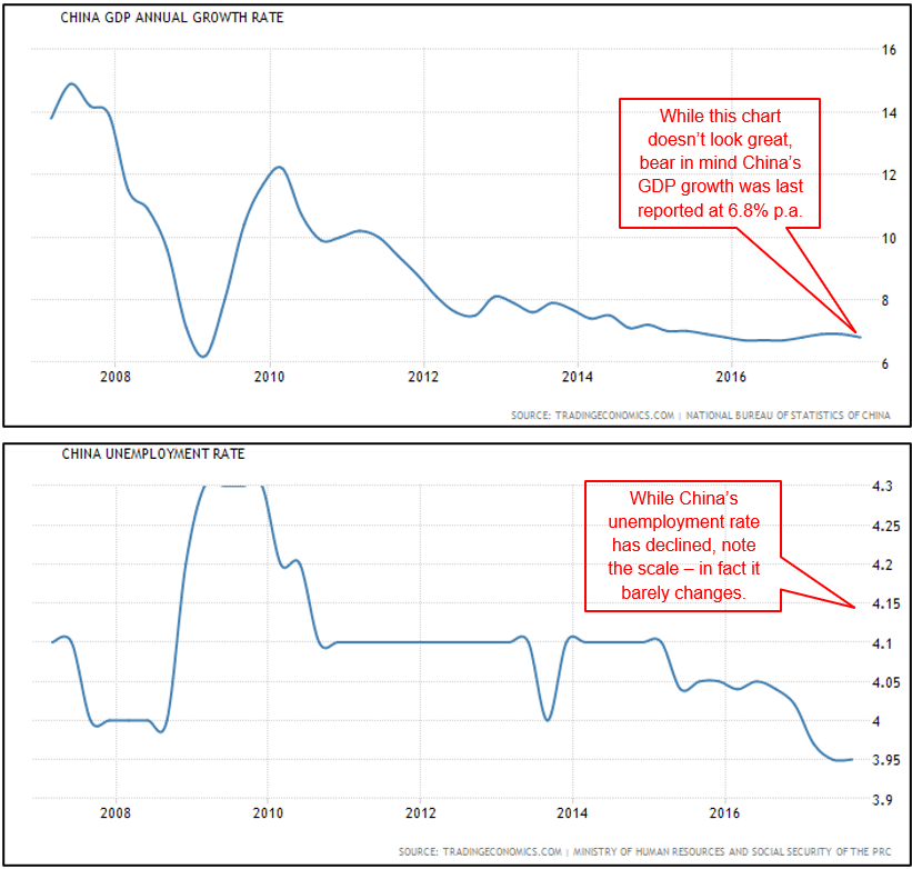
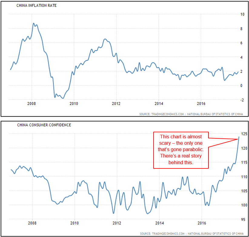
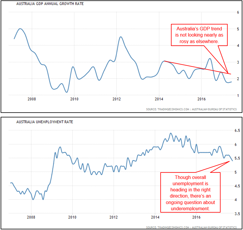
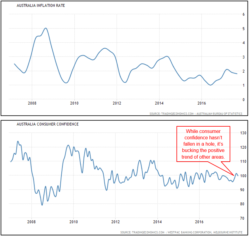
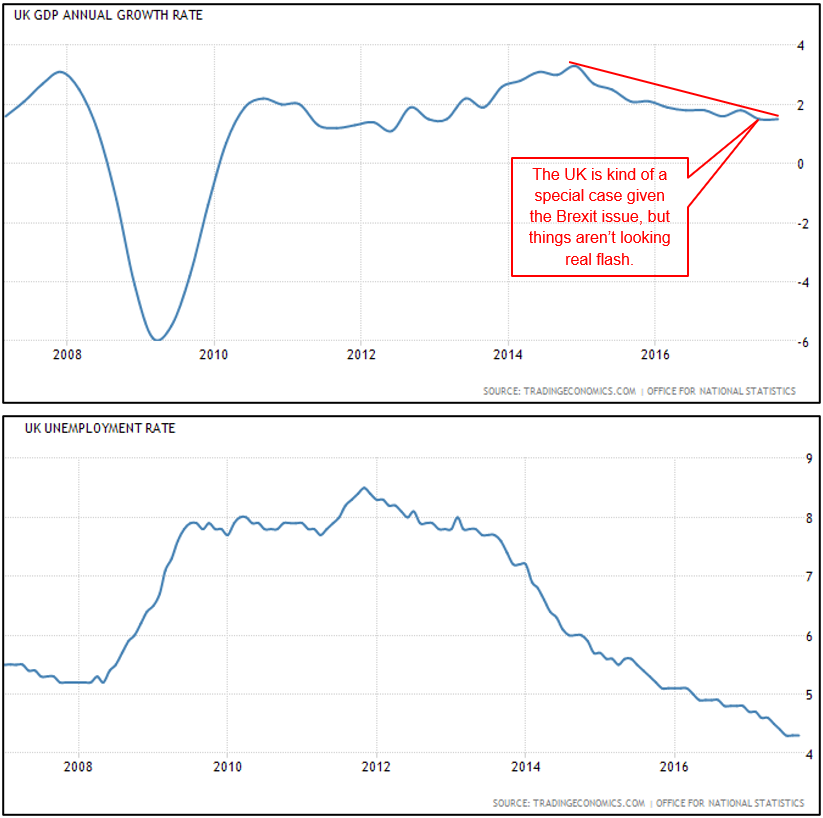
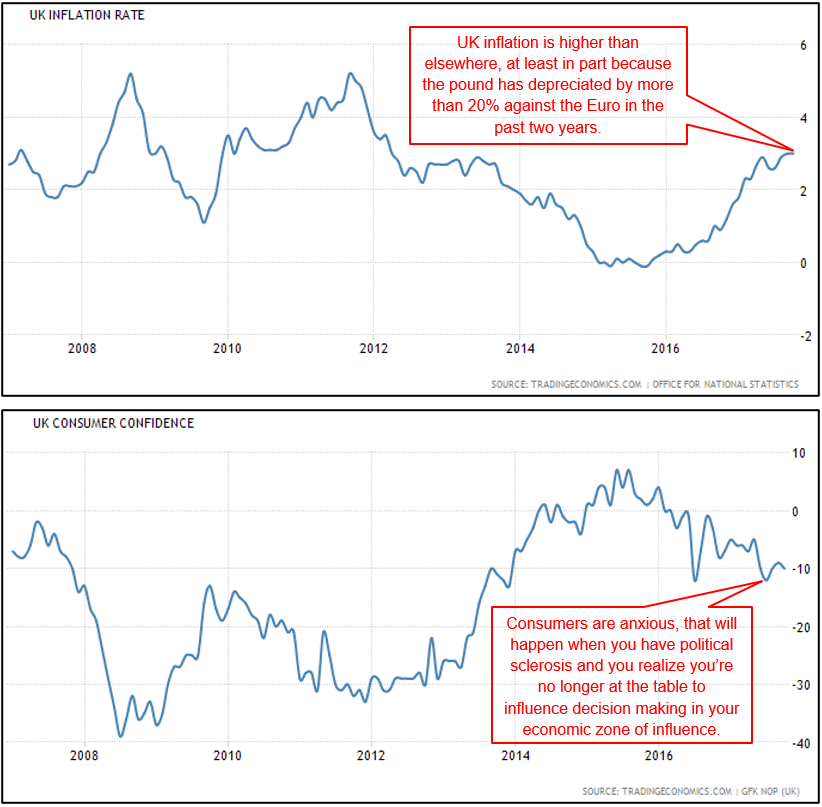
Sometimes it’s easier to see things in pictures and the charts below give a basic but effective illustration of just what a purple patch most of the world’s major economies are in right now. After years of post-GFC stimulation, sweating over potential sovereign bond defaults, stressing about deflation and fretting about the risks of populist politics, basically all the charts are heading in the right direction at the moment… except maybe Australia’s.
They tell a reasonably consistent story of slow but positive GDP growth and strong consumer sentiment – what should be good conditions for financial markets.
US
European Union
Japan
China
Australia
UK
One thing to remember about charts: they’re great for showing where we’ve been, but they don’t necessarily tell us where we’re going.


