Buying residential property in Melbourne has been a great way to make money, with an astonishing total return over the 31 years to 2016 of 11.2% per year. The problem is, the majority of that return was capital gain, and almost all of that gain was underwritten by buyers taking on more and more debt, to the point that Australian households are now the second most indebted in the world. At some point households simply won’t be able to take on more debt, and then what happens?
I know I’m venturing into an area where emotions can run high, partly because the average Australian has an awful lot at stake when it comes to property values. I’ll say up front I’m definitely not advocating anybody rushes out and sells their property holdings, I’m simply offering some observations about residential property from an investment point of view. They may be right, or they might be way off the mark.
Property prices and debt
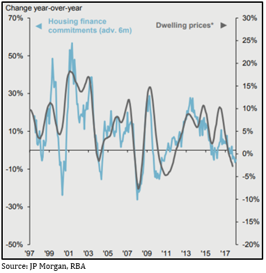
I don’t think it’s especially controversial to suggest there’s a logical relationship between the amount that people are prepared or able to borrow to buy property and how much they end up paying, but I reckon the two charts below kind of prove it.
Chart 1: RBA data suggests house prices have risen in line with the amount of household debt
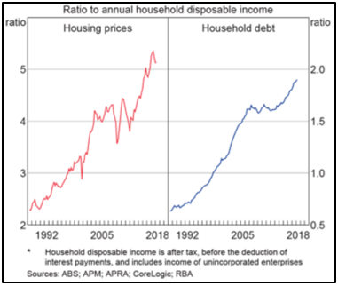
Chart 2: There’s also a close relationship between loan approvals and house price growth
Investing in property is, by definition, speculative
According to SQM the current ‘gross yield’, that’s the income you receive from rent before accounting for any taxes or costs, on Melbourne residential property is 2.9% per annum.
If you assume the property owner has a marginal tax rate of 37%, that brings it to an after-tax yield of 1.8%. Once you’ve accounted for all the other costs, such as management fees, body corporate fees, land tax, rates, insurances and what have you, you are very lucky to get a 1% ‘net yield’.
That same landlord could put their money in a term deposit paying 2.7% per annum; take out the 37% tax and the net yield is 1.7%, and there are no other costs to pay. Given that return is guaranteed by the government, we can call that the ‘risk-free rate of return’.
It’s a rock-solid law of investing that if the yield on an asset is less than the risk-free rate of return, then the investment is speculative, because the only way you can justify it is through capital gain. In other words, you’re banking on someone paying a higher price than you did.
Over the past 31 years, the capital gain on Melbourne housing has averaged 7.5% per year, so that speculative bet has been well rewarded, and it’s understandable for anybody to think that’s a well-established trend which is likely to keep going. The trouble is, it’s entirely reliant on people taking on more and more debt.
How expensive is residential property?
One way of working out the value of an investment is using what’s called a ‘price to earnings (PE) ratio’. That’s where you take the price of an asset and divide it by the earnings it generates per year; so if a $100 asset generates $10 of earnings per year, it’s $100 divided by $10, which gives you a PE ratio of 10 times.
The PE tells you how many years it would take for that investment to pay itself off and is effectively a measure of sentiment. If you’re pretty sceptical about an asset you’d want to get your money back sooner rather than later, so you might have a low PE of 4-5, but if you’re bullish on an asset you’ll be happier to have a higher PE.
You can use a PE ratio to measure the value of a share (it’s the share price divided by the earnings per share), or a property (the property value divided by the net yield). The current PE for the Australian share market is about 15 times. If we use the 1% net yield on property as above, that’s a PE of 100 (if you had a property worth $100,000 it would yield $1,000; $100,000 divided by $1,000 is 100).
That means Australian shares are currently 85% cheaper than Melbourne residential property. How can they be so out of whack? That would make a great dissertation topic for someone far smarter than me, but my hunch is debt has a lot to do with it. In 25 years in financial services I’ve yet to have a client tell me they’d be comfortable gearing a share portfolio to 80%.
Another comparison is M3 Property estimates the current yield on industrial property in Melbourne is 6.25%. Using similar costs as above you’d end up with a net yield almost four times that of residential property, or close to two and a half times the risk-free rate. Again, they seem way out of whack.
A final indicator of how expensive Melbourne’s residential property market is the Annual Demographia International Housing Affordability Survey, which compares how many multiples of median household income it takes to buy the median family home in 293 separate cities across nine different countries (Australia, US, UK, Japan, Hong Kong, Canada, New Zealand, Ireland and Singapore).
Melbourne is ranked as the sixth most unaffordable city (Hong Kong is the worst and Sydney is the second worst). Demographia rates a multiple of more than 5.1 times as ‘severely unaffordable’, and Melbourne’s is 9.9 (Sydney is 12.9).
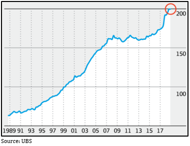
Australia’s growing pile of household debt
It’s cliched to talk about how much Australians love their property, and it’s reflected not only in how much they’re prepared to pay for it but that they fund those high prices by going into more and more debt.
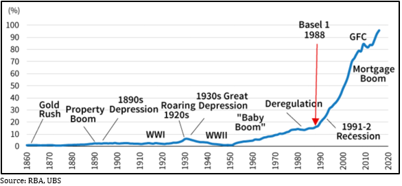
Chart 3 shows the amount of mortgage debt in Australia as a proportion of GDP and clearly shows when housing-related lending activity went parabolic. In 1988 the ‘Basel 1’ banking accord was introduced, which was an international agreement partly designed to make the banking system more stable by prescribing new limits for how much capital banks had to set aside as backing for different types of loans. Australian residential mortgages were considered relatively low risk, which meant the amount of capital required for them was set relatively low, meaning the return on equity for the banks from those loans was relatively high, so not surprisingly our local banks went to town lending to people to buy houses.
Chart 3: Australian mortgage debt as a proportion of GDP
By any measure, Australian households now carry a lot of housing-related debt. The Bank of International Settlements (BIS) ranks Australian households as the second most indebted in the world (behind the Swiss, go figure) and chart 4 compares Australia’s household debt as a proportion of GDP to some other OECD countries and clearly shows the inexorable march upwards.
Chart 4: Household debt as a proportion of GDP
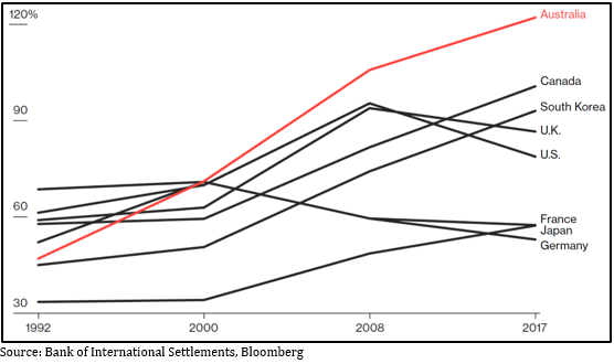
Something that strikes me, US household debt peaked at just below 100% of GDP right before the GFC smashed the property market, now it’s retreated to less than 80%. Ours is currently above 120%.
Chart 5 shows another measure: Australia’s household debt to disposable income. The remarkable thing here is it has grown at 10% compound per annum for the past 30 years. As they say, trees don’t grow to the sky; that is a phenomenal rate of growth in debt and at some point households simply won’t be able to gear up any further – everyone has to spend at least some of their income on living expenses.
Chart 5: Australia’s household debt to disposable income (%)
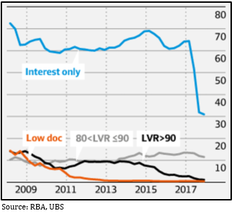
The interest only problem
When you take out a mortgage to buy a property, there are two components to the loan repayments: the ‘principal’, which is the actual amount you borrowed, and the ‘interest’ you pay on the principal. It’s been popular for property investors to take out ‘interest only’ loans, meaning for (usually) the first five years they only pay the interest costs and none of the principal.
Why would you do that? There are some sound tax reasons around maximising deductible debt, but it also significantly reduces the monthly repayments. For example, if you take out a $500,000 loan at 4.66% it’s the difference between paying $1,942 versus $2,582 per month. Over five years that $640 per month adds up as a lower drain on your cash flow. The problem is of course, after five years you’ve not made any dent in the principal at all.
From 2008-2017 interest only loans accounted for about two-thirds of all investment loans and over that time the total amount tripled to peak at about $600 billion. Then in 2017 the Reserve Bank got sufficiently worried about the property market that they instructed the banking regulator, APRA, to cut back the amount of interest only lending. Chart 6 shows the sharp drop off in interest only lending when APRA told the banks to limit it to 30% of all new loans.
Chart 6: the % of interest only investment loans fell away in 2017 after APRA told the banks to cut back
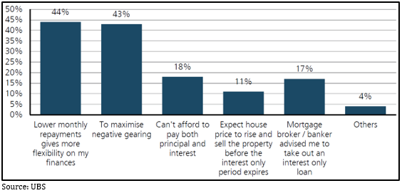
UBS recently did a study on why borrowers took out interest only loans – see chart 7. To begin with, terrifyingly, 5% of respondents didn’t even know whether they had an interest only or P&I loan; but 18% said they opted for interest only because they couldn’t afford P&I and 11% said they intended to sell the property before the loan rolled over to P&I. Also scarily, 17% said they took out an interest only loan because their mortgage broker told them to. All in all, the survey suggests at least half of all interest only borrowers don’t seem to have a solid grasp on what they’re doing.
Chart 7: Reason for taking out an interest only loan
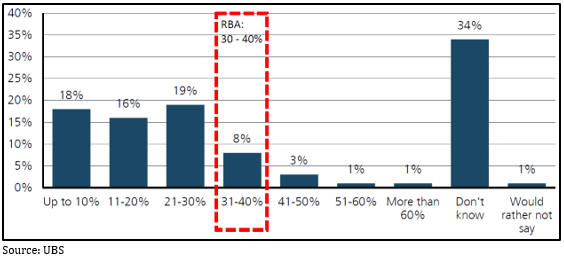
The same UBS survey also asked borrowers how much they thought their loan repayments would increase once it rolled over to P&I – see chart 8. The Reserve Bank reckons the average increase in monthly payments will be 30-40%, but worryingly, more than half under-estimated how much the increase will be, and again concerningly, more than a third had no idea, suggesting they’d not paid anywhere near enough attention.
Chart 8: Borrower’s estimate of the increase in mortgage repayments
The Reserve Bank estimates there’s a total of about $480 billion worth of interest only loans outstanding and $360 billion of those will roll over to principal and interest (‘P&I’) over the next three years. It also estimates that one-third of mortgages have less than a one month payment buffer. If all those numbers line up, that would imply one-third of the $480 billion of interest only loans have less than a one month buffer, so $160 billion worth. Of that, 18% say they won’t be able to afford the 40% jump in loan repayments when the loan rolls over to P&I, which is about $30 billion worth of loans. In a worst case scenario, that could point to a lot of forced property sales.
The banks have tightened credit standards
Until recently if you applied for a loan you would have to provide evidence of your income but not your expenditure. If the expenses in your loan application were less than a minimum amount the banks would simply use the so called Household Expense Measurement (HEM), which assumed $32,400 of expenses per year, to work out the amount they’d be prepared to lend to you.
After the recent Royal Commission into the banking and finance industry uncovered dodgy lending practices, the banks have been moving to tighten things up. Now they’re starting to require verification of both income and expenses, insisting on seeing things like bank and credit card statements. The upshot is the amount the banks are prepared to lend is estimated to drop by between 20-40% from previous levels – see chart 9.
Chart 9: New estimated borrowing limits based on revised expense estimates
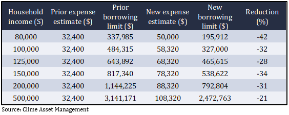
Obviously, that simply translates into less money people can spend on buying a property, which you can only presume will feed straight into lower prices.
The washup
I know there have been calls for years that Australian housing is overvalued and dire predictions that our banking system is overexposed to it. I’m not making any such forecasts, I’m simply pointing out that there’s a limit to how much debt Australian households can take on to buy a house. Chart 10 shows the general trend of Australian mortgage rates has been downward for the last 25 years, which has underwritten a steady increase in borrowing capacity. If interest rates have indeed bottomed, will that cycle reverse?
Chart 10: Australian fixed interest rates have been on a downward trend for 25 years
The Reserve Bank has kept cash rates at a record low of 1.5% for more than two years and there’s no sign they’ll be raising them any time soon. However, Australian banks source a lot of their funding from offshore and rates there have already started to move upwards. We’ve already seen three of the big four banks raise mortgage rates a couple of months ago and there’s every chance they will do the same again. When borrowers are so stretched any tweak to rates has a very real effect.
I should emphasise, I’m not forecasting a crash in housing prices, there are a lot of arguments that the majority of Australian borrowers are well positioned to weather a downturn (though sometimes it’s hard to unravel where those arguments might be pushing someone’s barrow). Also, the Reserve Bank is acutely aware of how important the housing sector is to the overall Australian economy and will almost undoubtedly move to support it if necessary, and as the market adage goes, it’s unwise to argue against a central bank. What I am wondering is how sustainable the increase in household debt is, and if the answer is it has to slow, stop or even reduce, then what happens to house prices?