Why have we got such low wages growth?

Why have we got such low wages growth?

One of the enduring economic conundrums over the past few years has been declining real wages growth across developed nations, because if wages aren’t growing then it’s a serious headwind for an economy to grow. The strange thing is, it’s difficult to pin down a particular reason for the flat wages, and the ominous thing is, you can make an argument that the combination of technology and globalization will continue to keep the pressure on.

Weak wages growth is endemic across developed nations

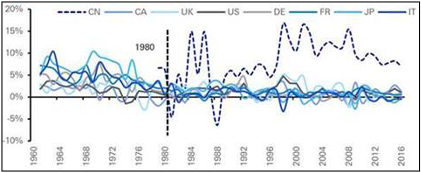
The only country that’s shown strong positive wages growth across the G8 since the start of this century is, surprise! surprise!, China – see chart 1 – but even that has recently been on a downward trend.

Chart 1: Year on year real wages growth across the G8
Source: Deutsche bank

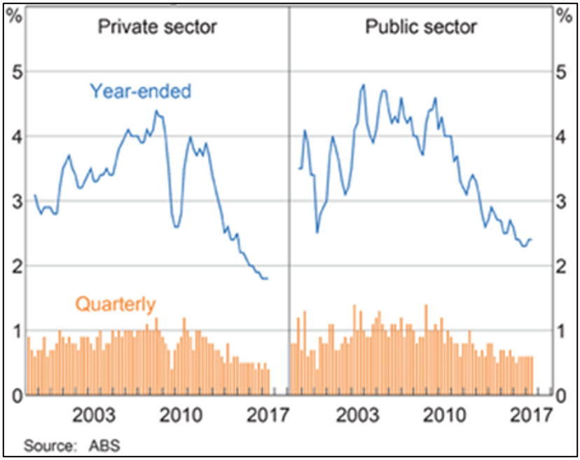
And Australia’s wages growth started to weaken after the GFC – see chart 2.

Chart 2: Australian wage price index growth

But why…

It’s worth remembering from the outset that like all things economic, you can point to many plausible reasons to explain low wages growth; and any one of them, or combination of them, could be right – it could also easily be the subject of a book as opposed to an article.

A couple of the popular ones are:

1. Low productivity growth

This argument is essentially that companies will only pay workers more if they are actually more efficient. So if a mining company increases its profits because the iron ore price has gone up, as opposed to its workers digging more ore out of the ground, then the workers shouldn’t necessarily benefit from that increased profitability.

Chart 3 shows quite a close relationship between Australian wages growth and productivity over the past five years, but very little similarity before that. So it begs the question, why would there suddenly be a close relationship?

Chart 3: Australian unit labour costs growth
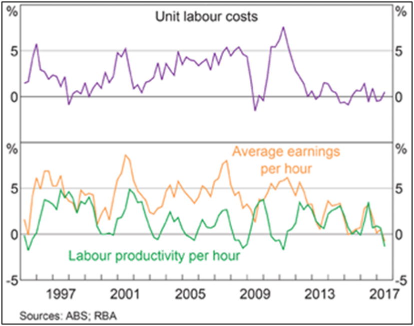

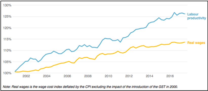
Also, while productivity growth has stagnated since the turn of the century in most developed nations – another of the great economic mysteries of our time – in Australia it’s risen about 25%. But chart 4 shows wages growth has been about half productivity growth over that time.

Chart 4: Australian real wages and productivity growth

2. Poor company profits

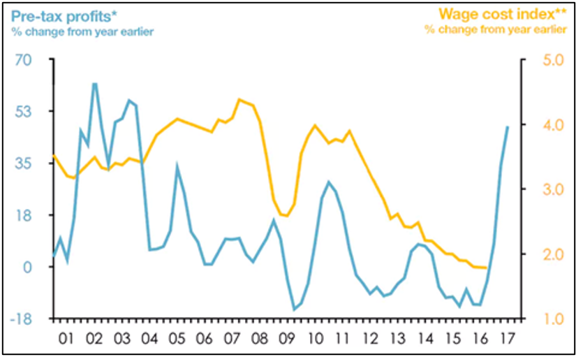
It makes sense that if companies aren’t making good profits they’re not going to pay higher wages. Chart 5 shows there is some relationship between company profits and wages, but it’s not a particularly close one.

Also, the wages growth line in the chart is lagged by nine months, to allow for a rise in profits to feed through to wages, but despite the sharp rise in pre-tax profits starting some 18 months ago, the latest data show Australian wages growth is, as Reserve Bank governor Philip Lowe recently noted, “the slowest since at least the mid-1960s”.

Chart 5: Australian pre-tax company profits and wages
Source: ABS, Saul Eslake, The Conversation
Note: pre-tax profits are rolling four quarters and wages are lagged three quarters

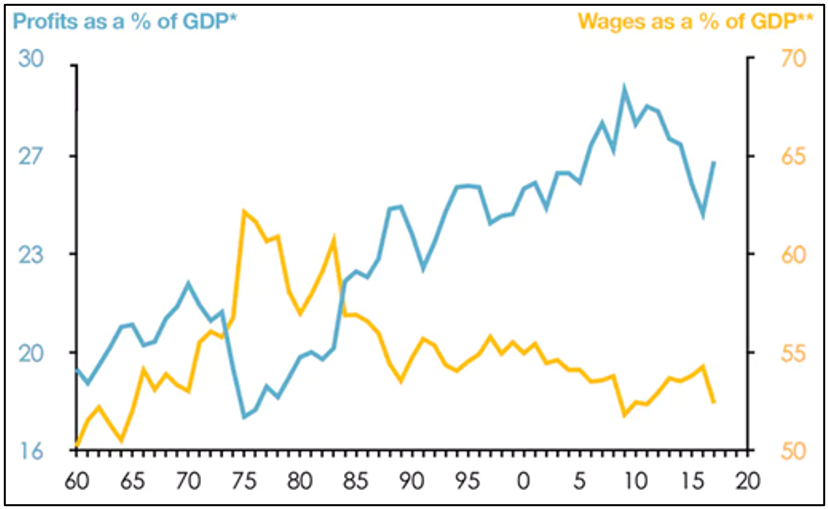
And for a bit of longer-term perspective, chart 6 shows the share of the overall economic pie going to profits continues to trend up toward record levels, while the share going to wages is doing the opposite.

Chart 6: The share of Australian national income going to profits vs. wages
Source: ABS, Saul Eslake, The Conversation


So arguments based on profits doesn’t seem to stand up either.

3. Regulatory changes

Once upon a time Australia, and much of the developed world, operated under ‘wage indexation’, but the inflationary ‘wages spiral’ of the late 1970s put an end to that.

Since the 1980s the combination of reduced union representation and successive governments on both sides of the political fence seeking to link wages growth to productivity has reshaped how wage rates are negotiated.

This actually strikes me as a more persuasive argument for the long-term reduction in labour’s bargaining power.

Technology and globalization

I have a slightly more convoluted theory on why wages growth is weak and it’s to do with the effects of technology and globalization combining to seriously undermine any bargaining leverage wage earners can wield.

About 25 years ago China set out to become the world’s factory, exploiting a vast workforce that was paid a fraction of their western counterparts. From that point the pressure on manufacturing wages grew as companies that compete against manufactured imports have to do the math: at what point does it no longer make sense to produce locally and you either have to send the work offshore or close down?

Currently about half of Australia’s manufactured imports come from low-wage countries, compared with less than 10%, 40 years ago. This is important given that 80% of the value of Australia’s imports comes from manufactured goods.

The only way developed world manufacturers could hope to compete was to increase efficiency, which has translated into replacing as many people with machines as possible and keeping down the wages of those workers that remained. Even today, with the inexorable rise in robotics and AI, the so-called ‘on-shoring’ of manufacturing back to developed countries is because those factories are largely automated and energy and logistics can be sourced cheaply enough to make it worthwhile.

That has seen the gradual elimination of well paid but low skilled manufacturing jobs where unions used to play a role in helping secure wage rises. One upshot of this for Australia has been the hollowing out of the manufacturing sector, with services now representing more than 60% of GDP and 80% of employment.

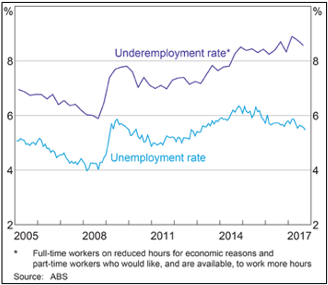
Now the unskilled and displaced are often ending up in the growing low paid services sector, such as aged care services and hospitality, which is reflected in our unemployment data: while headline unemployment over the last three years has declined to 5.5%, the underemployment rate has been trending upwards since the GFC from 6% to now be 8.5% – see chart 7.

Chart 7: Australia’s labour market – underemployment continues to trend upwards

The long reach of globalization is now starting to touch the upper end of the services sector as well, with increasing numbers of accounting firms, engineering, software development, design and what-have-you ‘off-shoring’ work to the likes of Vietnam and India. If Australian accountants and designers want to compete they either have to stay ahead on the quality curve or reduce their costs (wages).

With the rise of AI it’s not just low skilled jobs that are being targeted, rather it’s any industry where wages form a high proportion of costs. For example, in the U.S. there’s a radiology ‘robot’ that is 50% better than its human counterparts at diagnosing particular tumors, and law firms are talking about cutting the human cost of litigation from 70% to 2% by using technology.

It’s reached the point now where if labor demands higher wages for a multitude of jobs they are battling an equation that has offshore workers or robots on the other side of it. Combine that with record levels of household debt, the risk of losing a job means for big chunks of the workforce there’s not much incentive to go in hard on your annual salary review.

The benefits go to capital

The big winner from the suppression of wages is, of course, the owners of the capital, that is, the companies. As we saw above profits are strong and getting stronger.

If that’s the case it makes it all the more critical that companies pay their fair share of tax. If wages are stagnant so too will be income tax revenue yet countries like Australia face a growing welfare and healthcare burden. And yet for now countries across the world are engaged in a race to the bottom for corporate taxes; a beggar thy neighbor strategy that risks impoverishing everybody.

Like I said, there’s a multitude of reasons to account for low wages growth, and just as with most economic arguments there’s almost no way of proving which one is right. Admittedly some of the trends have not existed long enough to make anything other than assertions and it may change on a dime. I’m by no means arguing we should try to fight a rising tide, but there are seriously important issues involved that will shape our economies and societies in the years ahead.

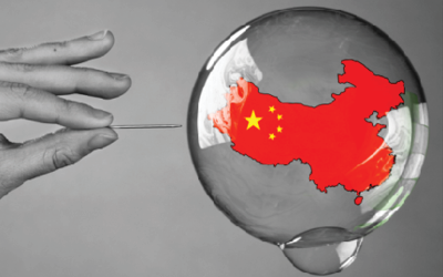
Is China the world’s biggest ever credit bubble?

Is China the world’s biggest ever credit bubble?

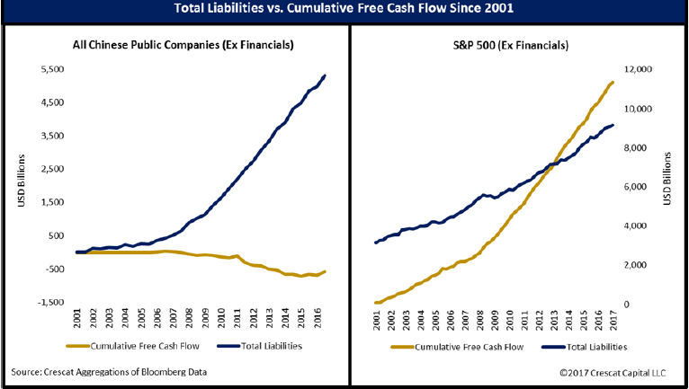
The entire world has benefited from the Chinese economic miracle and is praying it will continue. This article by US hedge fund Crescat Capital calls China the world’s biggest ever credit bubble, and argues, like all credit bubbles, it is bound to finish ugly, with serious knock on effects to those countries leveraged to Chinese growth – like Australia.

The China growth story is not likely a miracle of communist government central planning; it’s a massive credit bubble, almost certainly the largest ever. China’s impressive growth has come overwhelmingly and almost exclusively from unsustainable credit expansion combined with extensive, largely unprofitable domestic infrastructure expansion. In the last two decades, China has seen the largest construction boom in any country ever.”

It’s worth pointing out the article ‘talks Crescat’s book’, that is, their funds are positioned to profit if China falls over. Nevertheless, on an objective view some of the numbers they quote give pause for thought:

  • Much of China’s economic growth has been founded on an enormous expansion of credit, with household and corporate debt rising from 110% of GDP in 2009 to 210% today.
  • They argue there has been an enormous misallocation of capital to often unprofitable Fixed Asset Investment, that is, infrastructure projects, to prop up growth, starting at 23% of GDP in 2000 to 87% in 2016.
  • Much of that capital allocation has been in the form of loans to inefficient State Owed Enterprises (SOE’s).
Is China the world’s biggest ever credit bubble_chart1
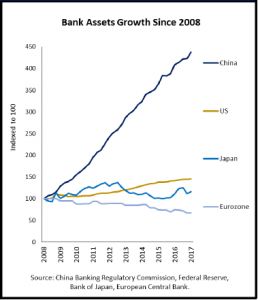
  • Between 2008 to 2017 the assets in China’s banking system (that is, loans made to customers that sit on their balance sheets), increased four-fold to US$35 trillion.
Is China the world’s biggest ever credit bubble_chart2
  • Based on banking assets as a proportion of GDP, China’s “banking bubble” is three times the size of the US’s just prior to the GFC.
  • Using what they consider to be conservative estimates, non-performing loans that have to be written off could be almost US$9 trillion. That would wipe out the Chinese banks’ capital base twice over, and government reserves are currently US$3 trillion. To recapitalize the banks through money printing would require the government to issue 37% of the total money supply.

As we’ve said in the past, China could carry on for years. But it pays to be vigilant.

China: big debts and scary yield curves

China: big debts and scary yield curves

Getting your head around what’s happening in China is really hard. Not only is it a complex economy, but it’s also a country that deals in very big numbers and has a government capable of pulling strings that almost no other country can. So trying to work out if the breathtaking rate of growth in China’s corporate debt as a proportion of GDP is something to worry about is complicated by arguments on both sides, but there’s also the fact that China has what’s called an ‘inverted yield curve’, which in most other countries would have alarm bells ringing as a precursor to recession.

The back story: how do you boost GDP growth? Easy, lots of credit

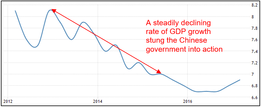
China’s GDP growth rate had slowed from a heady 8.1% in 2013 to a still extraordinary 7.0% midway through 2015 – see chart 1 below – and at the same time disinflation had taken hold with price growth at less than 1% per annum. Industrial production growth also fell from 19% per annum in 2009 to less than 6% by 2015. This was all a bit much for the government to bear: they have stated GDP targets that underpin their social ‘bargain’, where they keep growth high enough to maintain full employment and rising living standards and in return the people behave.


Chart 1: China’s GDP growth rate fell for three straight years
Source: tradingeconomics.com


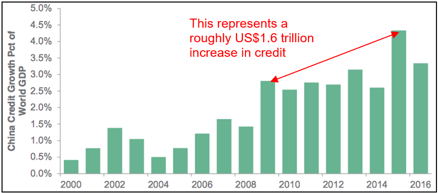
At the same time global growth was struggling to stay positive, so it wasn’t like China could rely on the pre-GFC formula of exporting its way to stronger growth. Instead, to boost growth the Chinese government pulled the same lever as they did in the wake of the GFC: a huge increase in domestic credit – a good old fashioned debt binge. Chart 2 illustrates just how dramatic that increase in credit was: China already had a history of high rates of credit growth, but 2015 and 2016 were a step change on that.


Chart 2: Chinese credit growth rose sharply in 2015 and 2016.
Source: Bloomberg


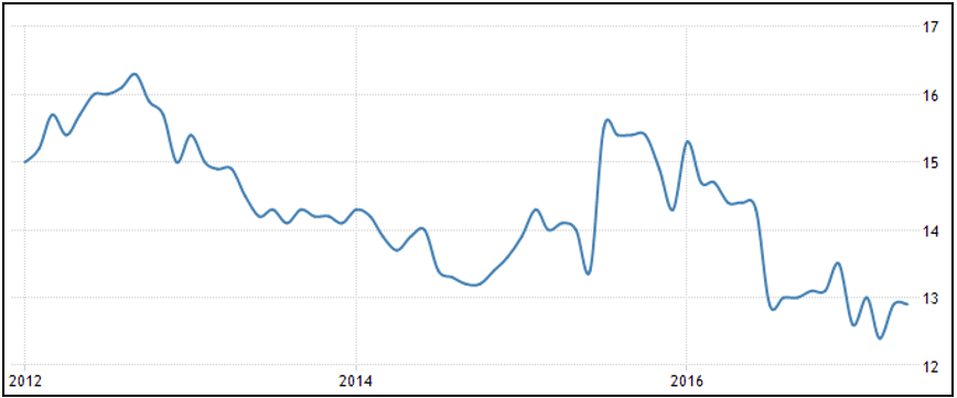
Bear in mind, chart 2 shows Chinese credit growth as a proportion of global GDP, which itself grew from US$60.1 trillion in 2009 to US$74.6 by 2015, so China’s credit had to increase from about US$1.6 trillion to US$3.3 trillion. Bloomberg estimates China’s total debt grew 465% in the 10 years to the end of 2016, and chart 3 shows credit growth peaked in 2015 at more than 15% per annum, which was more than double the rate of GDP growth.


Chart 3: Chinese credit growth peaked in 2015 at more than double the GDP growth rate
Chart 3: Chinese credit growth peaked in 2015  at more than double the GDP growth rate
Source: tradingeconomics.com


Where did all that credit go?

Some of the credit was sunk into residential property investment, where growth rates in prices went from -3% in 2015 to 12% by the end of 2016. But a huge portion was taken up by Chinese companies, many of them State Owned Enterprises (SOE’s). The Bank of International Settlements estimated corporate debt in China was equivalent to 168% of GDP, or US$18 trillion, at the end of 2016. To put that into some perspective, US business debt is currently about US$13.7 trillion or 73% of GDP, Australian business credit is 51% of GDP.

And what did those Chinese companies do with that debt? Certainly there was some investment in capex, but already the Chinese economy faces problems with overcapacity, especially in the heavy industries like coal, steel, cement and plate glass. In fact, the IMF estimates capacity utilization across those four sectors fell by an average of about 20% between 2008-15. Some of those businesses tried to grow their way out of trouble: invest in more plant and equipment to be able to lift production and hopefully revenue, but they became increasingly unprofitable and unable to service their debts.

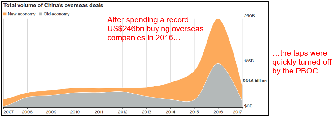
Other Chinese companies went on an overseas shopping spree, buying up a range of ‘new world’ businesses and brands ranging from the likes of software and tech companies to Volvo, Pirelli, the Inter Milan and AC Milan soccer teams, New York’s Waldorf Astoria and US film studios, as well as ‘old world’ businesses like resources and infrastructure (such as the Port of Darwin). In fact, corporate China announced a record US$246bn worth of overseas deals in 2016 – see chart 4 – more than double the previous record amount. At one point they were buying a German company on average every second week!


Chart 4: Chinese companies went on a credit-fueled overseas spending spree
Chart 4: Chinese companies went on a  credit-fueled overseas spending spree
Source: Bloomberg


But chart 4 also shows that even the Chinese central bank must have done a double take when they saw deals like a little known property developer buying the Chicago Stock Exchange and a loss-making iron ore producer buying a UK computer game developer. Indeed the government has made reining in corporate debt levels a priority, after the Governor of the People’s Bank of China said “non-financial corporate leverage [i.e. businesses outside the banking sector] is too high”.

Subsequently credit conditions have tightened up considerably, but that raises a new problem.


How do you unscramble the omelet?

It’s one thing to declare credit growth has to be brought under control, it’s another thing to do that without crashing the system: there are companies taking out new borrowings to finance the existing ones. This is where the Chinese government’s range of tools at their disposal is going to be critical. They can simply direct banks to stop lending to particular sectors or use their considerable financial reserves to prop companies up.

The catch is there is a certain portion of total loans outstanding that will realistically never be repaid, but the government can’t let a state owned company go bankrupt. In its annual report last year S&P estimated non-performing loans at about 6% (others have it at more than double that) of its sample of 200 companies, but tellingly 70% of companies in the sample were SOE’s and they accounted for 90% of the debt. In May Moody’s cut the Chinese credit rating for the first time since 1989.

One way the government is trying to deal with the non-performing loans is setting up ‘credit committees’, where the borrower and lender each appoint people to the committee and it tries to manage the debt. According to the Chinese Banking Regulatory Commission (CBRC) by the end of 2016 there were more than 12,800 such committees managing more than US$2.15 trillion worth of borrowings, which equated to 17% of total commercial bank loans. In one province alone the CBRC set up more than 1,300 committees covering 55% of corporate loans in the region.

Another method is to swap debt for equity, so the lender ends up holding a stake in the borrower. It’s estimated between RMB500 billion–1 trillion of such deals have been done, which have stopped about RMB3.5 trillion in loans from failing.

On the face of it that sounds like a good thing, save a company from failing and prevent job losses and the associated fall out. However, it creates risks of its own, with ‘zombie’ companies surviving only due to government protection rather than going out of business and enabling other, stronger companies to get a better market position and grow stronger. It’s what economists refer to as ‘creative destruction’.


Turning off the tap

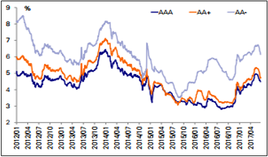
The final method used by the government to cap the growth of credit is through controlling the amount of liquidity by lifting interest rates or restricting who can borrow, which is a blunter instrument that can affect the entire market. An upshot of this has been a steep rise in Chinese corporate bond yields, as shown in chart 5. What that means is when companies want to raise money by selling bonds they have to pay higher and higher rates on them, which obviously makes life even more difficult for those that are struggling to service existing debt already.


Chart 5: Chinese corporate bond yields have seen a steep rise since late 2016
Chart 5: Chinese corporate bond yields  have seen a steep rise since late 2016
Source: Deutsche Bank


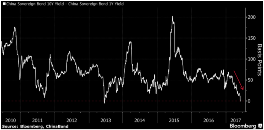
Something of real note is that recently the Chinese yield curve ‘inverted’, which means short-term yields on government bonds went higher than longer-term yields – see chart 6. That is an entirely abnormal situation given usually the buyer of a bond will require more compensation the longer they are exposed to the risk of the issuer defaulting. It’s only the second time this has ever happened in China and would normally suggest the market expects the economy to slow sharply in the medium-term.


Chart 6: the Chinese government bond yield curve has ‘inverted’
Source: Bloomberg


In the US, the yield curve has inverted seven times since the 1960’s and every time it preceded a recession. The last time the Chinese yield curve inverted the economy did not recess, which may well happen again this time, but it certainly indicates the market is under stress. Indeed, the idiosyncrasies of the Chinese bond market may make comparisons with the US meaningless: it’s nowhere near as deep and there are a lot more short-term bonds issued than long-term, and it is nowhere near as unregulated.


What does it mean?

As I said at the beginning, China is an incredibly complex beast. Some parts of the Chinese story beggar belief, like since 2009 China has increased its money supply by more than the entire US money supply; China has 260% of its economy in cash compared with 75% in the US; the Chinese banking system is now the biggest in the world at US$34 trillion, meaning Chinese banks are nearly three times the size of the economy while the US$7 trillion US banking system is equivalent to 40% of its economy; the amount the Chinese banking system has increased its assets since 2009 took the US banks 150 years to accumulate.

These are all staggering facts and prompt many questions and arguments. How can the Chinese money supply go up more than three-fold yet the currency over that period hasn’t changed in value? While a strong currency can be a matter of political pride, an overvalued currency makes for ridiculously cheap foreign purchases, be they companies, resources or houses.

The doomsayers point to the heydays of a rampant Japanese economy when Japanese companies were buying assets all over the world funded by more and more debt and every one of the top ten global banks were all Japanese. Their asset/debt bubble deflated by 85%, leaving the economy moribund for decades and battling deflation ever since. Perhaps it’s a case of history rhyming?

You can also draw on other lessons from the past. For instance, since 1990 every emerging market economy that saw the ratio of private sector debt to GDP increase by more than 30% in a decade experienced a banking crisis: China’s ratio increased by 93% in the nine years since 2007 to be 211% of GDP.

An obvious question is: what could be the catalyst? I have no idea, but bear in mind the Asian Financial Crisis of 1998, characterized by artificially high exchange rates and excessive debt build up, was triggered by Thailand floating its currency. Not many people would have connected those dots.

On the other hand, China bulls point out the government has done a remarkably good job managing what has been the greatest social transformation in history. It has tools at its disposal that western central banks can only dream about and government reserves that would be capable of recapitalizing the banking system. Plus, the gloom crew has been calling a Chinese debt bubble for years.

The issues touched on here could easily take up a whole book, if not two or three. Unfortunately when you’re talking an excess of debt bad things tend to happen, but while this is another example of a situation that warrants careful attention, it could easily go on for a lot longer than anyone might expect. Meanwhile the Chinese stock market is more than 20% cheaper than the US and China single handedly accounts for one third of global GDP growth. We need to hope it keeps going.

Steward Wealth monthly review February 2016

Steward Wealth monthly review February 2016

Monthly Roundup

Feb table


It’s human nature to worry. It’s programmed into us, after all if our ancestors didn’t worry about enough things they were in danger of being something’s dinner. So when good things come along it can be tricky to refocus – we’re wary those lovely autumn leaves might turn into a sabre tooth tiger.

There are only two things to focus on when it comes to share markets: valuations and earnings. If earnings are being delivered and valuations are cheap, there’s a whole lot less to worry about. Headlines announced with dread during February that global shares entered a bear market, which undoubtedly sounds worrying but means valuations have necessarily become cheaper. At the same time we also got the earnings results from both our local and U.S. companies, both of which were pretty good.

Here in Australia our interim reporting season saw just over half the companies deliver results that were above forecasts and more than half saw earnings upgrades for the next 12 months, which is significantly more than we usually see. If you were to exclude the resources companies those numbers get even better.

In the U.S., fourth quarter earnings didn’t look quite as happy with an overall drop of 3% year on year, but once again if you take out those troublesome energy companies the numbers went up. And U.S. companies overall seem to be in rudely good health, with free cash flow per share at a 20 year high, net debt to earnings at a 20 year low and capex (an indicator of future growth) running above the long term trend.

So prices have gone down and earnings are up. Sounds like a bargain?

With the ongoing focus on oil it’s interesting to note that the price bounced some 25% from its February low – see the chart below.

Oil price

Oil price

Source: IRESS


The oil market is all about supply right now. In the last two years demand went up by 3.1 million barrels a day, which is a fair amount and around the longer term average. But over the same period supply went up by 5 million barrels a day, largely because of those pesky shale oil drillers in the U.S., which between them added 4 million barrels a day in just four years – see the chart below. That excess of supply has been going in to storage, but they’re running out of places to stash it.

World oil supply outpacing demand

World Oil


During the month the Saudis and the Russians agreed to freeze production at January levels, but that was close to record highs. Someone’s going to blink and there will be casualties.

We’ve written a few times about the unforeseen consequences of running the greatest monetary policy experiment in history, and they’re still finding their way to the light of day, like bubbles seeping up through a volcano. The excess oil supply is one of those consequences: there are a lot of shale oil companies that would never have been able to raise the money to do all that drilling if credit markets weren’t so dysfunctional.

Another is emerging market debt, where private credit as a proportion of GDP has increased from 75% in 2009 to 125% now. Over that same period emerging market debt that is denominated in U.S.$ has increased from U.S.$1.6tn to U.S.$3.3tn and a fair chunk of that was to energy companies.  So there are a few things to worry about still.

Apparently when people worry they tend to run out and buy gold, thus its title as a ‘safe haven asset’. Gold’s had a great rally, enjoying its best start to the year since 1980 – see the chart below.

Gold price

Gold price

Source: IRESS


But gold seems to be a bit picky about its crises: it hit a 12 month low only six weeks after Lehman Brothers failed in 2008 but then rallied during the European sovereign bond crisis only to collapse again just when Cyprus looked like it was going to sink the EU. The other reason investors apparently buy gold is as a hedge against inflation, but there’s still no sign of that around anywhere. Go figure.

If you look closely enough there will always be things to worry about. After all, since 1960 only three years have avoided a correction of more than five per cent and we’ve seen a 10% correction on average every second year. But if you take a step back, you’ll see that over time markets have a happy tendency to keep trending up – see the chart below.

Australia stock market index Volatility since WW2

Aust Stock

What is driving the markets down?

What is driving the markets down?

It’s pretty easy to get your hands on financial market commentary these days, between newspapers, websites, podcasts, tip sheets, broker reports and even dedicated financial TV channels. The thing is most of them focus on the story of the day: they’re like a windsock showing which way the wind is blowing at the time. When it comes to explaining why global financial markets have corrected heavily in the past six months, so far they’ve attributed it to oil prices, Chinese growth, recession fears in the U.S., rising U.S. dollar, the falling Chinese renminbi, declining earnings, monetary policy excesses. So what is really driving markets?

Bear markets are usually attributable to some kind of catalyst, there is normally something pretty definite to point your finger at, but this time it’s not so clear. That’s not to say there’s no reason, it’s just more that it looks like there’s a bunch of them all working together. Let’s look at some candidates.

Some equities markets peaked around April/May last year:

AUSUK


But the S&P500 really fell out of bed in August 2015, having gone sideways for quite a while.

 USSANDP


So what happened back then? Was it the oil price? Interestingly, around the time the Australian and U.K. markets started to fall oil was in the middle of an almost 50% rally, which peaked on 23 June. It then fell 40%, finishing that downward leg on 24 August. Also interestingly, the S&P500 fell 11% between 17-25 August – perhaps no coincidence?

 WTIS


Then again, oil had suffered a big tumble before that, falling 58% between June 2014 and January 2015, during which time the S&P500 went up 6%:

 WTIS 5 year


When oil finished that first (precipitous) leg down in January 2015 I don’t recall any talk of credit defaults or EM problems, so it’d be kind of surprising if that was behind the equities markets deciding to start tumbling.

Tellingly, the correlation between oil and equities has now spiked to almost 1, meaning the prices move up and down in lock step (-1 means they go in the exact opposite direction to one another):

Correlation between the S&P 500 and Brent crude Oil, monthly

Brent crude oil


But then two points: first, back in August the correlation was about 0.6, so why did the equities market start to fall? Secondly, does that number really tell us anything? I mean, isn’t it part chicken and egg (is oil following equities or the other way around?) and part ‘correlation doesn’t equal causation’?


Does U.S. GDP give us a hint? It peaked at 2.7% in the March quarter of last year and then started heading downwards:


USGDP


Whilst that would be very convenient, a couple of points to remember: GDP data doesn’t get reported until the month after the period to which it refers, so the fact that the June quarter was lower than March wasn’t reported until 30 July. So the timing doesn’t account for non-U.S. markets and the S&P didn’t really start falling until two weeks later – why would there have been a delayed response? Also, believe it or not, the long-term correlation between GDP and the stock market is zero – they bear no relation to one another.

How about Earnings Per Share, after all, that’s what you’re buying at the end of the day. According to the chart nelow earnings started to drop off a good 12 months before the S&P500 started its nasty correction.

SandP change


Was it Chinese growth? Admittedly Chinese economic statistics are probably not the most reliable, but for what it’s worth the GDP data didn’t look disastrous at the time; definitely a downward trend but no gapping down to cause such a big hissy fit surely:


China GDP

Also, U.S. exports to China account for less than 1% of GDP. On that basis China’s manufacturing data barely affects the U.S.

Was it the rising U.S.$?


Fred


The U.S.$ started rising sharply around July 2014, a full year before the S&P500’s correction.

Now here’s a genuine looking culprit for triggering a selloff: the Chinese currency devaluation, the first leg of which took place on Monday 10 August 2015. The S&P’s correction started 17 August – a bit odd they waited a week if this was the catalyst, but it’s the closest thing so far.

USDCNY


So why would that be such a cause of concern for the S&P500? Frankly, I’ve no idea. According to JP Morgan however, the initial reaction to the August renminbi devaluation set off a string of stop losses, that is the market fell through a specific level that forced traders to sell even more and so setting off a chain reaction. They claim the end result was a whole lot more about that than China.

Final attempt: there has been a huge correction in credit markets. Hopefully you’ve been reading our blog articles which talked about this, but the commodities selloff sparked concern that a bunch of companies that had borrowed money either on the bond or loans markets would struggle to meet repayments. That of course increases the likelihood of default, which causes the spreads to blow out, i.e. the margin of safety demanded by lenders to those companies. This is also reflected in the Credit Default Spreads, which are like insurance policies that you can buy that pay out if a company defaults on a loan. The higher the price of the insurance, the more the market thinks the company is going to default. The chart below measures CDS costs in Australia, but the picture is the same offshore as well.

 ITRAXX


The problem is, once again the timing doesn’t really match up.

The bottom line then is that it’s really hard to find a single reason to hang your hat on as to why financial markets have been so weak over the past six months. It really does look like there’s a bunch of factors working together, and when there are so many moving parts, you’re never going to know when things have bottomed out.

Which brings me back to our standard response: we can’t tell you when markets will bottom (and neither can just about anybody else), but we can tell you if we think there’s value. Here are the most recent tipping point tables from our asset allocation consultant with current levels marked in and showing the projected 10 year annualised returns.


tipping point table

When markets are projected to return better than 10% p.a. compared with a risk free investment returning about 3%, it tells you there is value there.