2023 – the scorecard
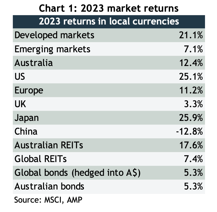
2023 started off with all kinds of dire forecasts, there had never been such an overwhelming consensus that the US economy would slump into recession and take share markets with it. But not only did the economy power through, so did share markets, and despite a choppy start to the year, they finished with a powerful rally that saw respectable returns across the board – see chart 1.
As well as a strong performance out of the US, Japan had a storming year on the back of solid earnings growth, finishing at the highest since its legendary boom of the 1980s, and Germany, where the economy continues to flirt with recession, is also trading at all-time highs, as is India.
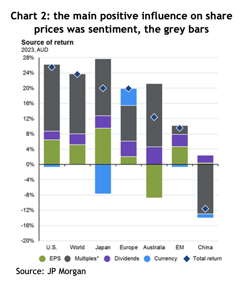
The story of last year was pretty much the mirror image of the previous year: 2022 saw markets fall because of negative sentiment, known as “PE compression”, whereas 2023 was largely about PE expansion, or positive sentiment. What that means is that theoretically share prices should go up (or down) by the same amount as earnings growth + dividends, and anything more or less than that is attributable to sentiment, that is, whether investors are feeling bullish or bearish, which is measured by changes in the price to earnings (PE) ratio that people are willing to pay. The grey bars in chart 2 show just how much of a contribution that positive change in sentiment added to returns in 2023.
It was all about inflation
The positive change in sentiment was all driven by changes in the outlook for inflation and interest rates, or more specifically, the market’s perception of whether central banks have finished increasing rates and, if so, when will they start cutting them?
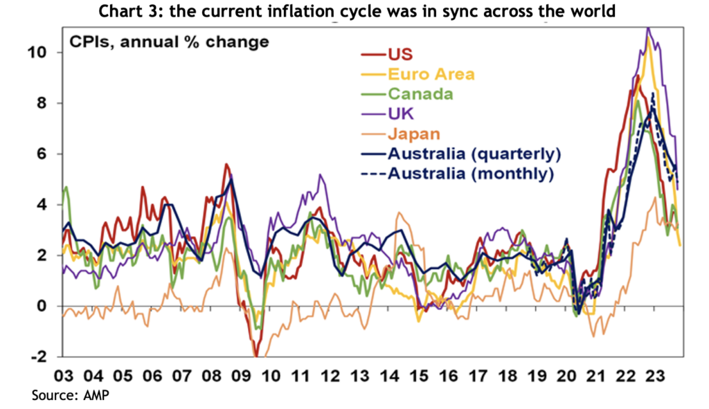
Inflation rates across the world have indeed fallen considerably, but how much of that is attributable to central banks increasing interest rates is unclear. It’s pretty conspicuous that, despite the variability in when and how different central banks responded, the cycle we’ve just experienced has played out similarly across the developed world: inflation rates started rising sharply in 2020, peaked for most countries around the middle of 2022, and have been falling at a pretty similar pace since – see chart 3.
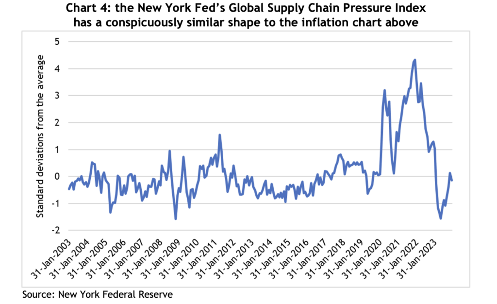
There’s a school of thought that disruptions to the supply chain were a significant contributor to inflationary pressures. The New York Federal Reserve Bank compiles an index that tracks pressure across global supply chains, see chart 4, and it traces a similar path to the inflation chart above. For a little context, the COVID-induced bottlenecks in the supply chain saw the index peak at almost 4.5 standard deviations above the average, which puts it so far out of the norm that the theoretical likelihood of it happening is close to zero. That kind of event is inevitably going to have serious consequences.
Likewise, raising interest rates aims to control inflation by reducing demand, but in the US, demand has remained very strong, indeed, GDP growth was 5.1% in the September quarter! So with demand going up, it’s hard to argue inflation coming down is because of higher interest rates.
Critically, in its last meeting for 2023, the US Federal Reserve acknowledged they think rates have peaked and the next move will be down. That lit a fire under financial markets, with both share and bond prices jumping, and kicking off furious speculation as to when the first cuts will come and how deep they’ll be.
Here in Australia, speculation is rife as to whether the Reserve Bank has also finished with rate rises, with some economists forecasting rate cuts before the end of 2024.
Lessons from 2023
As always, there are lessons to be learned (and perhaps relearned) from what happened in financial markets last year.
Macroeconomic forecasting is really hard (if not useless): at the end of 2022, there had never been such an overwhelming consensus among economic forecasters, and central bankers, that economies across the developed world were headed for recession. Forecasts for inflation were uniformly high, and for GDP growth, uniformly low. They weren’t even close.
There were dark mutterings from economists and central bankers reaching for the orthodox textbooks that unemployment rates were way too low for inflation to fall, and our new RBA Governor, Michelle Bullock, suggested Australia would need a jobless rate of 4.5% to relieve inflationary pressures, or a lazy 140,000 workers losing their job. Yet inflation rates have come down and unemployment rates remain at multi-decade lows.
The takeaway: the US Fed has hundreds of PhD economists and still can’t guess where inflation, unemployment or GDP growth will be less than a year out, but they continue to dominate headlines. You’re better off ignoring them, and certainly don’t let them influence your financial decisions.
It’s also worth bearing in mind, given markets have rallied on speculation of rate cuts, for that to happen implies not only that central banks believe inflation is under control, but that economic growth is softening to the extent it needs a boost from lower interest costs. There’s no guarantee on that.
Geopolitics is noise: there has been no shortage of geopolitical headwinds for financial markets to negotiate over the past couple of years. The Russian invasion of Ukraine was supposed to crush economic growth because of higher commodity prices, tension between the US and China had the media in a froth, and then another war in the middle east threatens to escalate. Yet markets have gone onwards and upwards.
The fact is, while wars are tragic and terrible and sabre rattling might keep us up at night, markets will only suffer enduring effects if corporate earnings take a hit.
Market concentration is not necessarily a bad thing: by the middle of last year, the US market had risen about 20%, but it had come entirely from the top 10 stocks. Bearish commentators were warning that investors in the US market were taking bigger and bigger risks because the weighting of the top 10 companies in the S&P 500 had never been so high, hitting 32%. By the end of the year, those 10 stocks had risen 62%, while the bottom 490 had gone up by a far more pedestrian 8%.
Australian investors should have no concerns about market concentration, given the top 10 companies in the ASX 200 account for more than 46% of the index.
It’s entirely possible the top 10 companies in an index could underperform or even fall, but if the rest of the rest of the companies in the index perform strongly, it will generate a good return. If a portfolio was comprised of nothing but the top 10 companies, obviously the risks are different, but some simple diversification can address those problems.
Bonds can be just as volatile as shares: traditional portfolio construction includes an allocation to bonds based on the theory that they reduce portfolio volatility and can act as a counter-correlated airbag to share markets.
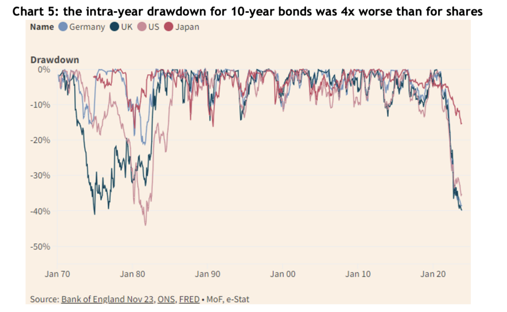
While 2023 was nowhere near as bad for bonds as the record losses of 2022, they were still far more volatile over the year than shares, indeed, as chart 5 shows, the intra-year drawdown for US, German and UK 10-year bonds was around 40%, more than four times the drawdown of the S&P 500 and ASX 200 at their worst.
The outlook for 2024
While there are still a few bears growling about potential recessions, most forecasts are for equity markets to rise in 2024, and it’s even easier to find bond market bulls (though a lot of them are bond fund managers, so you have to be wary).
Australia
Australian company earnings dropped by more than 8% in 2023, having gone up by 16% the year before. One of our asset allocation consultants, farrelly’s, estimates long-term trend earnings growth for Australian companies at 3% per year, so given the recent fluctuations, it’s hardly surprising the current forecast is for about 1.2% earnings growth for 2024.
Of course, Australian shares typically pay a generous dividend by international standards, of about 4.4%, add 1.2% to that and you’d get a 6.6% return, which compares to a 30-year average annual return of 9.2%. We could reach that higher number if the PE ratio continues to expand, or if earnings are better then forecast. Of course, for those who benefit from franking credits, you can add an extra 1.4% to those numbers.
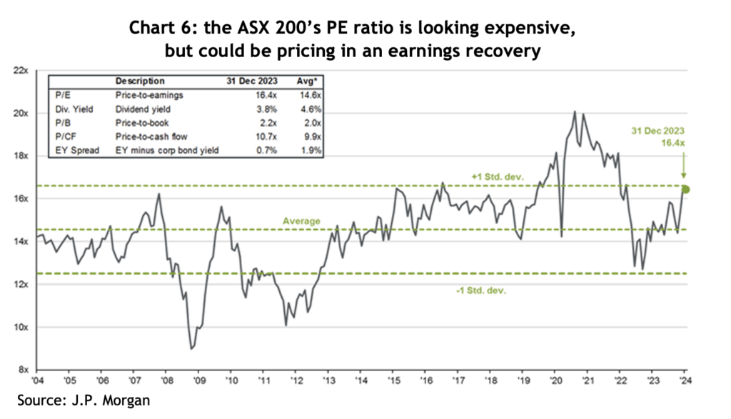
The ASX 200 finished 2023 on a forward PE ratio of 16.4x – see chart 6, which compares to a 20-year average of 14.6x. On that basis, it looks a little expensive, but it could simply be the market factoring in an earnings recovery.
United States
This is where things get really interesting. As noted above, in 2023 the US market was dominated by a handful of mega-cap tech companies, while the ‘bottom’ 490 stocks were pretty pedestrian by comparison.
The S&P 500 finished 2023 on a PE ratio of 19.5x, a hefty 17% premium to the 30-year average of 16.6x – see chart 7. However, if you break that down, the top 10 companies were on a PE of 27x, while the rest were on 17x. In other words, the ‘rest’ of the market is not expensive by historical standards.
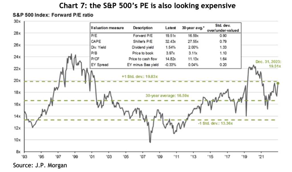
J.P. Morgan argues the market is not especially expensive given companies reported free cash flow margins 30% higher than they were only 10 years ago, with a lot of that growth coming from the big tech companies. US funds management group, GMO, also points out that US corporate profitability, as measured by return on sales, has averaged 7% since 1997, compared to 5% before that – that’s a whopping 40% higher.
For 2024, the average forecast for the US market across 20 different international financial groups is a gain of 10.2% – for what that’s worth (which isn’t much). Of more relevance, corporate earnings are forecast to grow by 11.5%, plus the S&P typically pays a dividend yield of around 1.5%, which comes to 13%, roughly in line with the last 15 years average return of 13.8%, but comfortably above the 30-year average of 10.1%.
Something that plays on every asset allocator’s mind is chart 8 – which shows how extreme the US’s outperformance compared to the rest of the world has been since the GFC. Not surprisingly, most allocators look at that chart and immediately reduce the weighting to US shares. There are many explanations for the outperformance, not the least of which is that areas like Europe have been mired in an austerity mindset since 2009. There are, of course, two ways the gap could close: the US could fall heavily, or the rest of the world could make huge gains – or the trend could keep going. Unfortunately, there is no way of knowing.
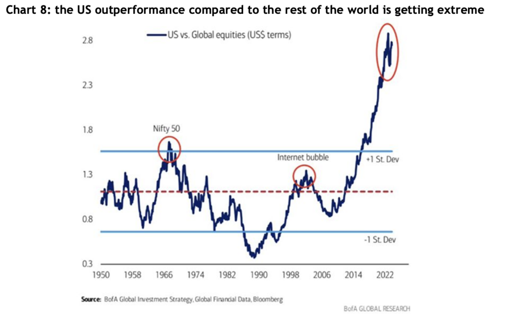
Notably, in terms of valuations, the rest of the world (ex the US), is trading on a PE ratio of 12.9x, compared to a 20-year average of 13.1x, so fractionally on the cheap side. However, that’s a 34% discount to the US, which is the highest in at least 20 years.
Here are a few interesting observations, based on historical return for the US:
- In late November last year, the S&P 500 made a new high since January 2022, i.e. it had been more than a year, and on the 14 previous occasions that’s happened, the market rose by an average of 14% over the following year and was positive 93% of those times
- Since 1928, when the S&P has gone up by more than 20% in a calendar year, the average gain the following year was 11.4%, and it was positive 65% of the time
- Since 1933, the fourth year of the presidential cycle has seen an average return of 6.7%, and is positive around 70% of the time
- Deposits into money market funds last year were 13x more than what went into equities, taking total deposits to a record US$6 trillion, which on their own are expected to generate US$300 billion in interest income
Emerging markets
With a forward PE ratio of only 11.9x, the emerging markets look cheap compared to developed markets, however, that number is bang on the 25-year average and they’ve looked cheap for years and have underperformed the developed markets badly since the end of the GFC – see chart 9.
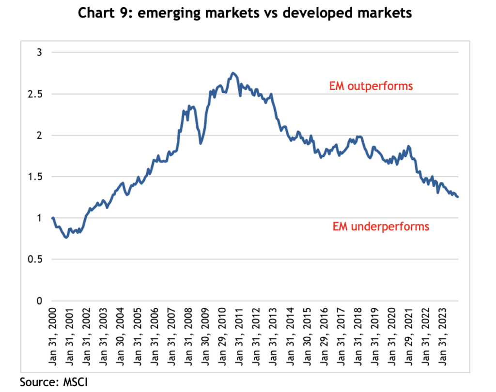
At a 26% weighting in the EM index, China is the 600-pound gorilla in the asset class, and it had a miserable 2023, falling almost 13%. Much of that is because the government refused to inject COVID stimulus at the household level, unlike western governments, forcing families to draw on their savings to get through extended lockdowns, and leaving consumers reluctant to spend once restrictions were lifted.
On top of that, the property sector, which was estimated to have contributed as much as 20% to GDP growth, is in disarray. The government has actively supported the rapid development of the electric vehicle industry, and now China makes more EVs than the rest of the world combined. It is possible that will be a strong new source of growth for the economy over the coming years.
By contrast, India, which is 17% of the index, is shooting the lights out, returning 20.3% in 2023 and hitting a new all-time high, and 15.8% per annum for the last three years. A combination of favourable demographics and a booming tech sector has proven to be a terrific tailwind.
Emerging markets returns tend to go in long cycles and appear to be linked to long-term trends in the US$, and trying to guess where currencies are going is even harder than share markets. The bottom line is that when an asset class is as cheap as EM is at the moment, it makes sense to have at least some weighting.
Real assets
Traditionally one of the more interest rate sensitive sectors, real assets, like property and infrastructure, have been beaten up badly over the course of the current interest rate cycle, but they turned sharply at the first hint that rates have peaked. In late October last year, the VanEck Global REIT ETF (REIT) was down by almost 40% from its peak, but then rallied more than 40% by the end of the year.
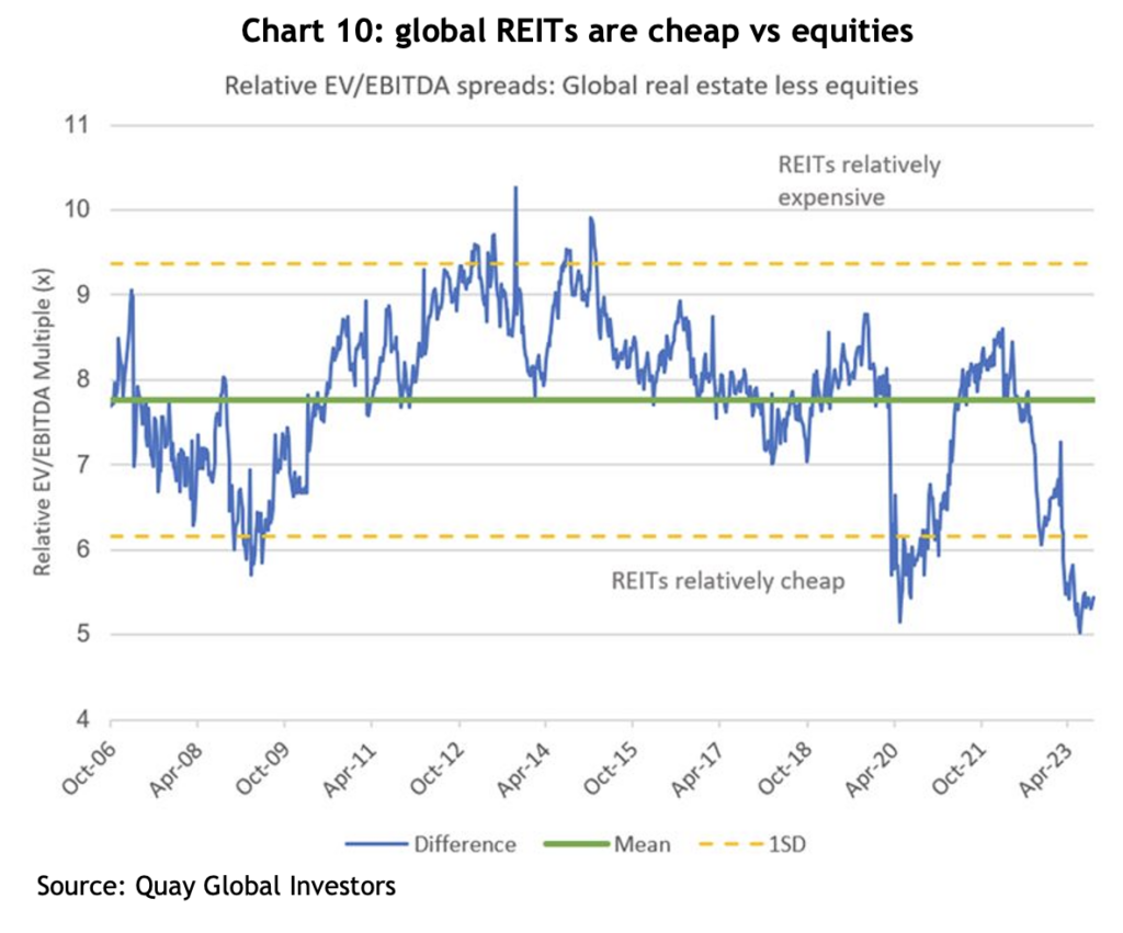
Chart 10 shows the relative earnings multiple that global REITs is trading on compared to equities puts them very much on the cheap side relative to the long-term average. The level of EBITDA hasn’t changed significantly, but the multiple it’s trading on has been derated to levels similar to the GFC and the COVID sell off, which is all sentiment-driven.
Small cap companies
Small cap companies is another asset class that has been brutalised over the past couple of years, both in Australia and internationally, to the point where they are now trading at multi-decade lows relative to large caps – see chart 11.
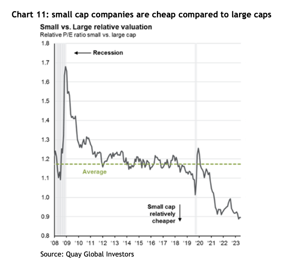
Notably, the US small cap index, the Russell 2000, jumped 26% from its lows at the end of October. Once again, since the index’s inception in 1979, there have been 21 previous occasions where it has rallied more than 20% in 50 days, and the average increase one year later was 16.5%, and it has never been lower. That compares to the average 12 month return of 10.5%.
Again, given how relatively cheap small caps are, it makes sense to have at least some allocation.
Fixed income
One of most popular sayings in financial markets recently has been, “Bonds are back!” The argument is that investors are now receiving a yield to invest in government bonds, unlike a few years ago where yields were approaching zero and, in many cases, actually went negative!
The prospects for bonds depends entirely on what happens with interest rates and inflation. Being paid to hold them is a start, but bond prices can be quite volatile – as discussed above.
Private credit continues to grow its share of the commercial lending market in the US, Europe and Australia. We remain strong supporters of well managed private credit backed by strong levels of security and low LVRs, with returns comfortably above those offered by bonds and, typically, zero volatility in the underlying unit price.
Conclusion
Financial markets have a knack for surprising, and 2023 was a great example of that. The headwinds that caused mayhem a couple of years ago have dissipated, but whether they become the tailwinds the market is hoping for is yet to be seen.
After what turned out to be a year of good returns in 2023, there are sound fundamental arguments to support a positive view on share markets for 2024, and there are certainly asset classes and sub-sectors that look relatively cheap.
